Header
Settings
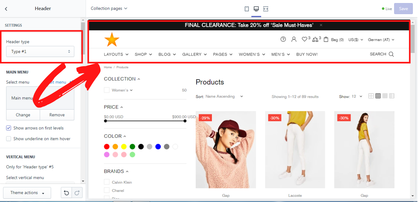
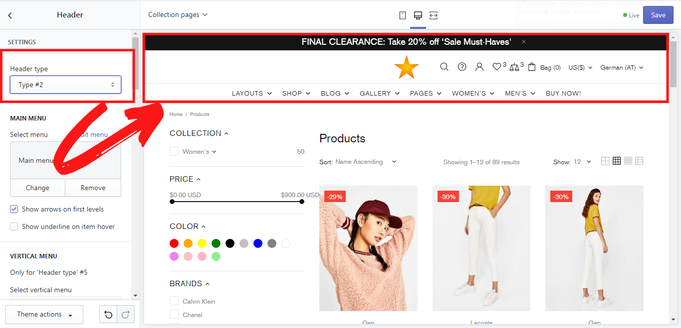
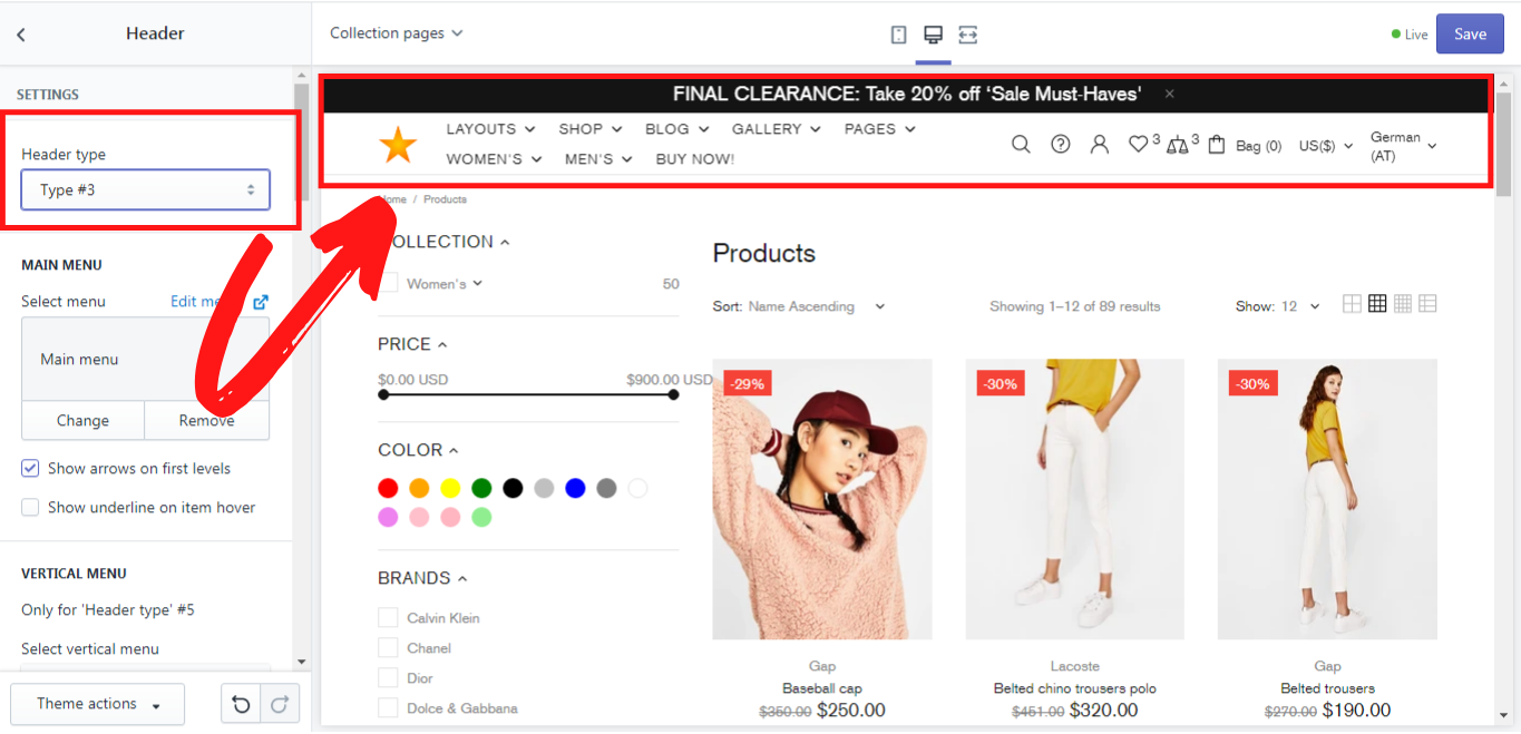
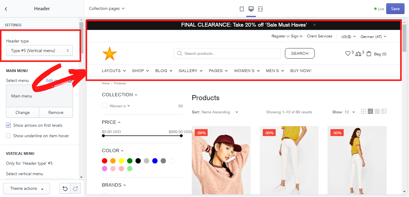
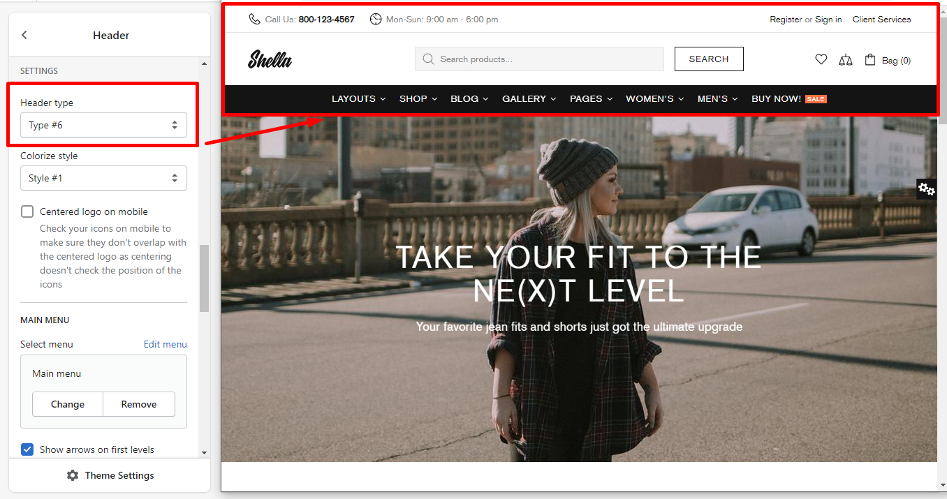
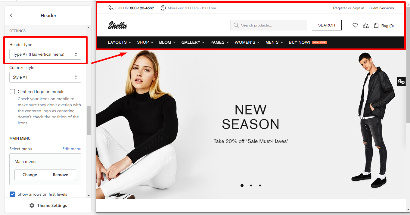
Header type
In this section, you can choose the header type. There are 5 header types:
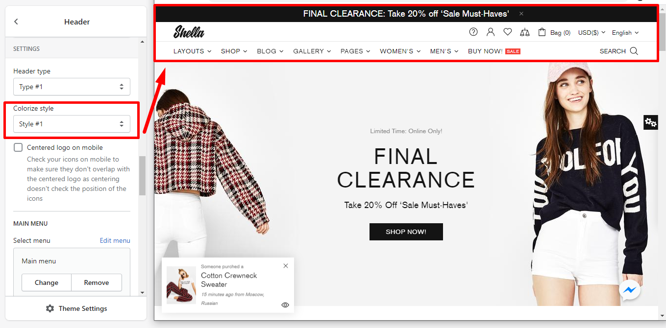
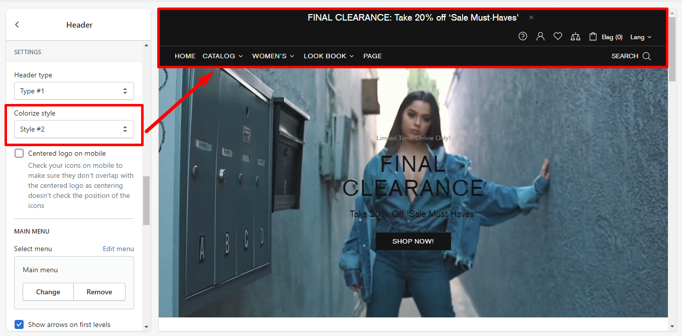
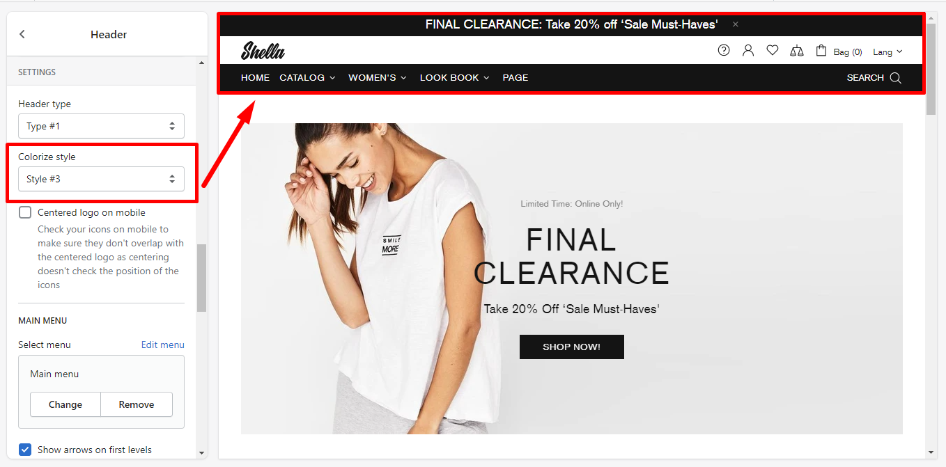
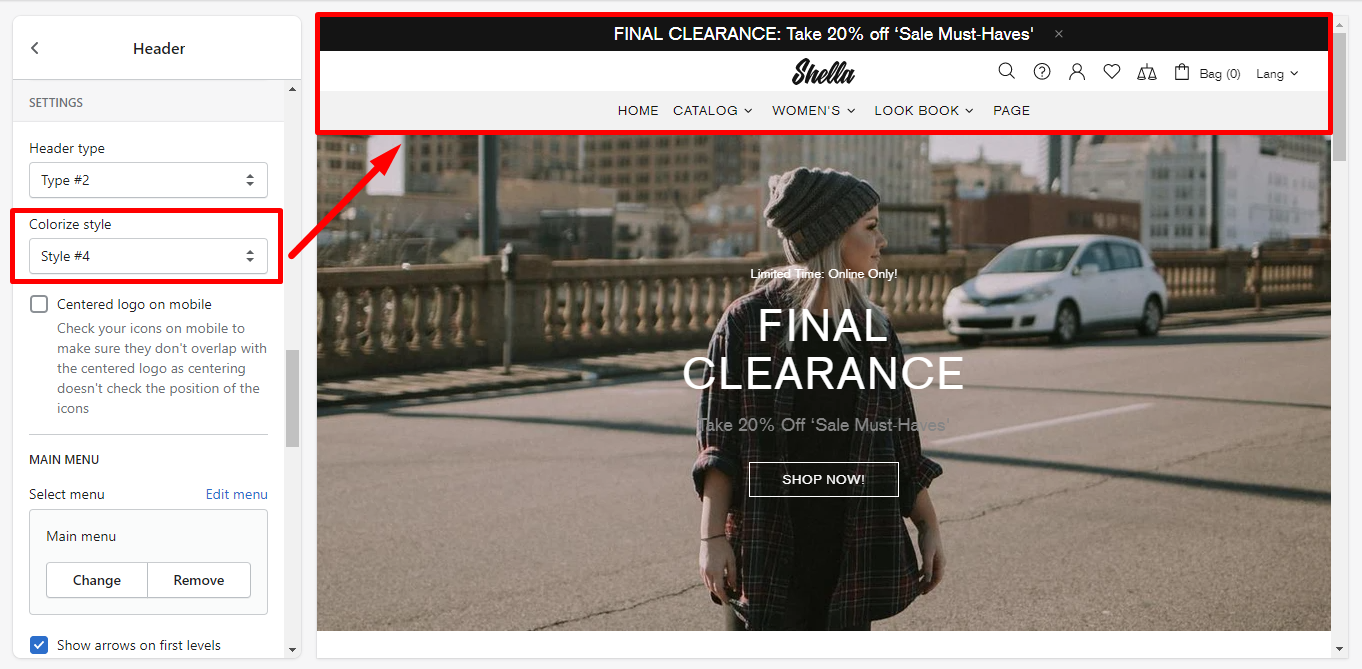
Colorize style
Here you can choose one of the proposed Colorize styles. The theme includes 4 styles:
Centered logo on mobile
Enable an option if you want the Logo to be displayed in the center on mobile.
Please note, you may also need to check if the icons do not overlap the Logo on mobile view. Centering doesn't check the position of the icons.
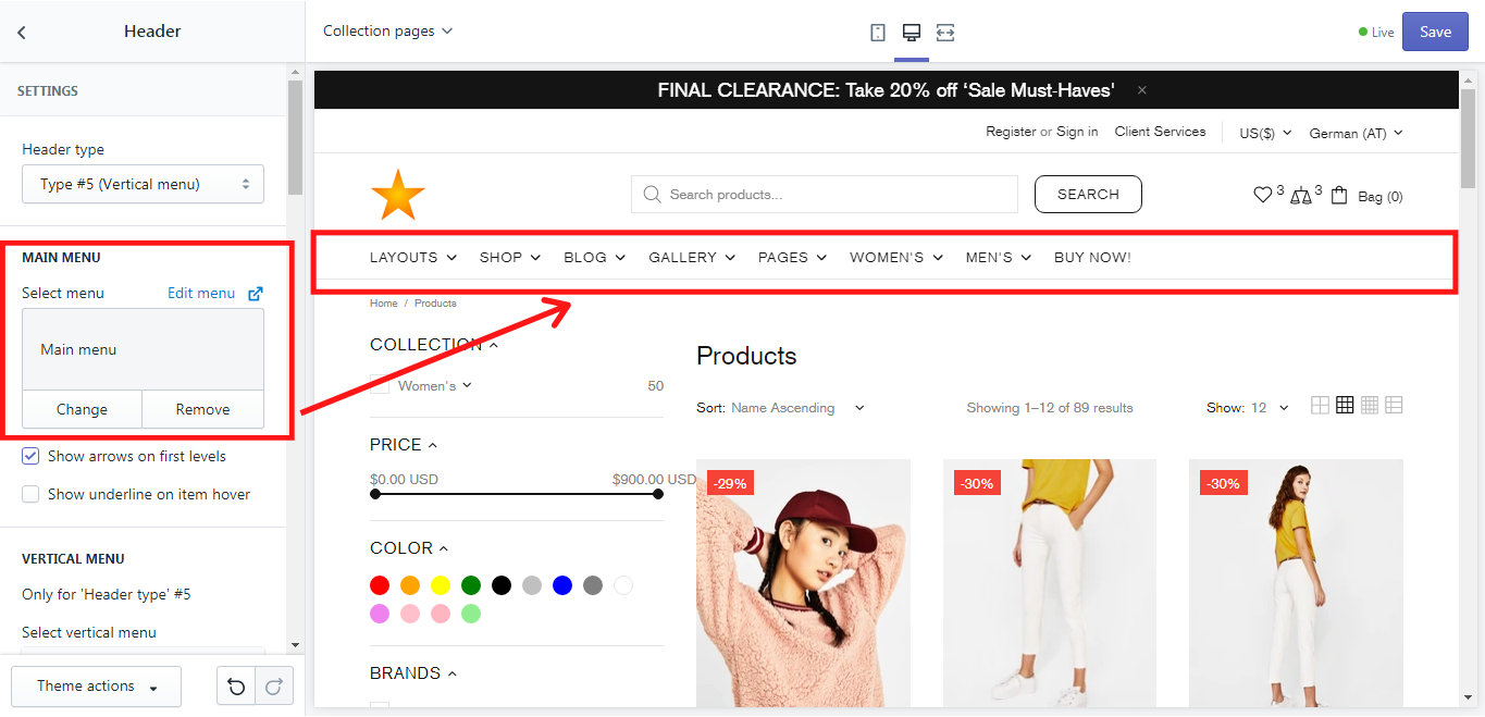
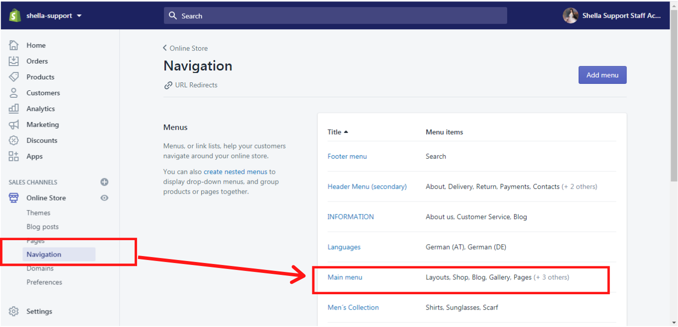
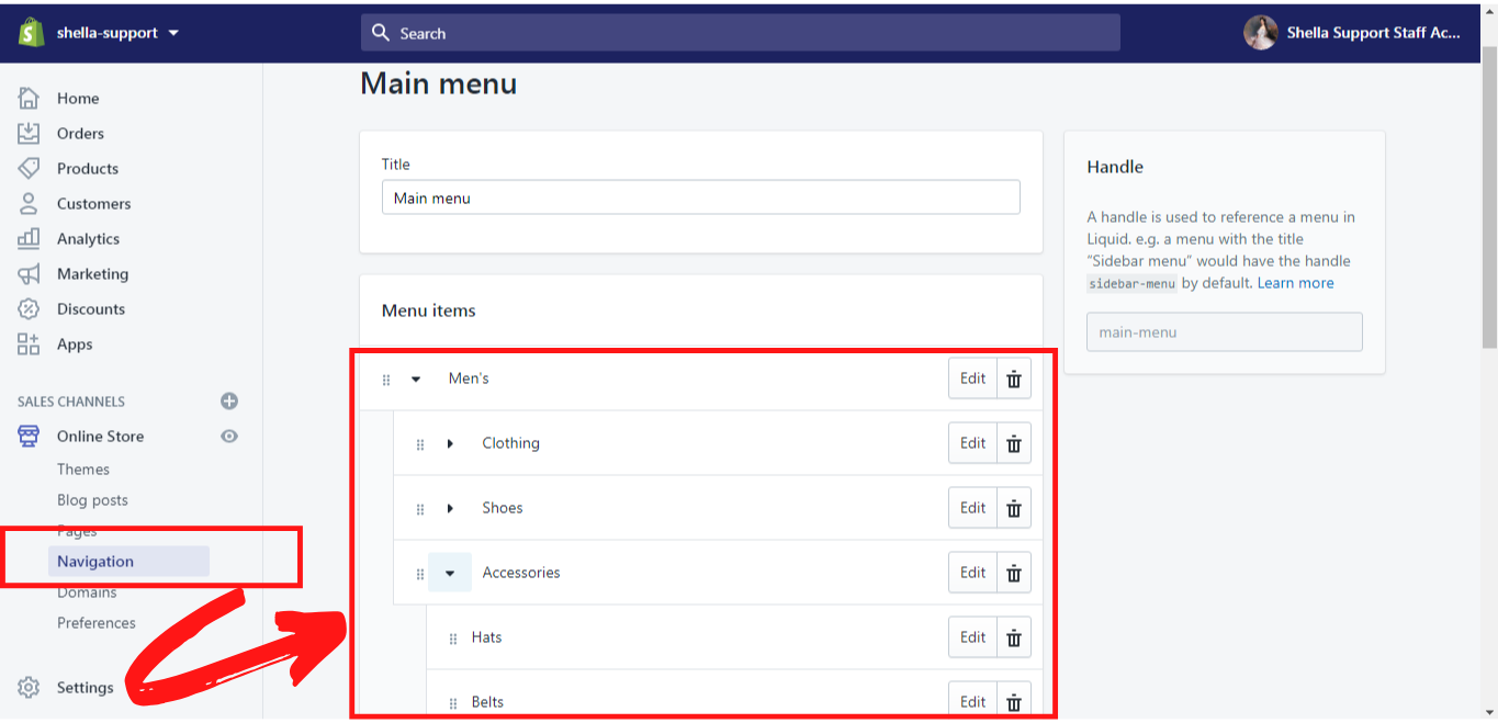
Main Menu
In this section, you can select a menu, that will be used in the header. This menu needs to be created in your Shopify Admin -> Navigation first and then it can be selected, changed, or edited. How to create such a menu you can read here.
This is how the main menu looks like in your Shella theme:
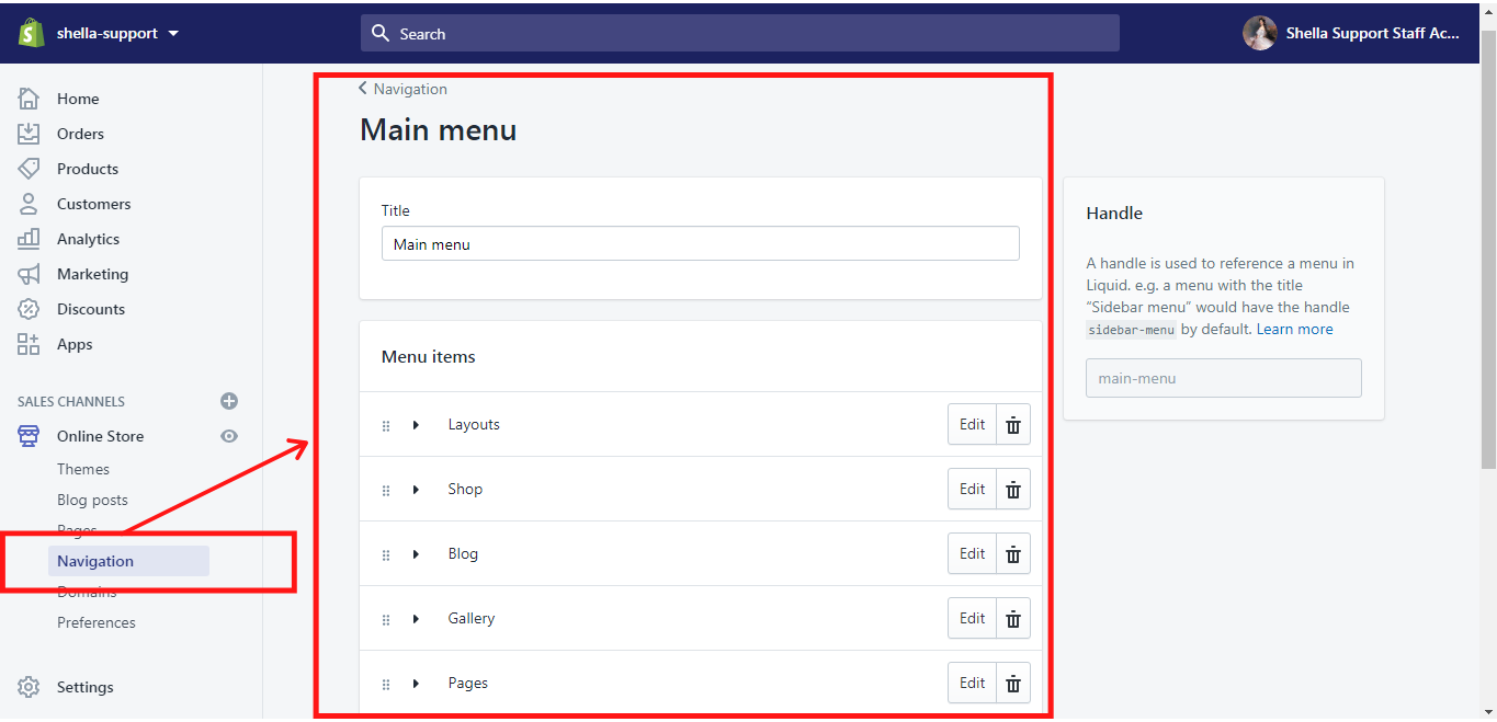
And this is how the main menu looks like in your Shopify Admin:
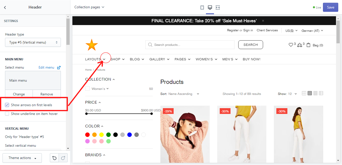
Show arrows on first levels
If you enable this option, the arrows will be shown on the first levels of the main menu:
Show underline on item hover
If you enable this option, the text of the menu item will be underlined when the mouse cursor hovers over the name of the menu item in the main menu.
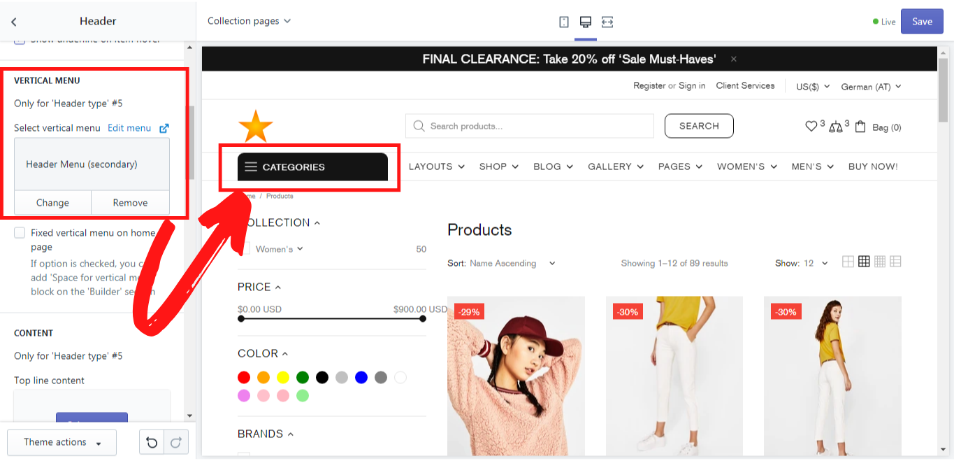
Vertical Menu
A vertical menu is available for the header type # 5 only. In this section, you can select a menu, that will be used in the vertical menu. This menu needs to be created in your Shopify Admin -> Navigation first and then it can be selected, changed, or edited. How to create such a menu you can read here.
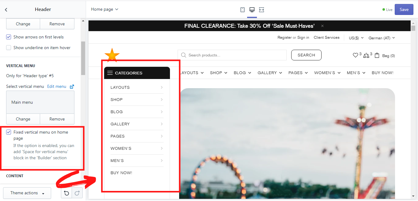
Fixed vertical menu on home page
If you choose this option, you need to add 'Space for vertical menu' block in the 'Builder' section for the vertical menu to have its own space. To do so choose the Home page, then go to Sections -> Builder. Otherwise the menu will be over the other content on the home page.
-
Add “Space for vertical menu”:
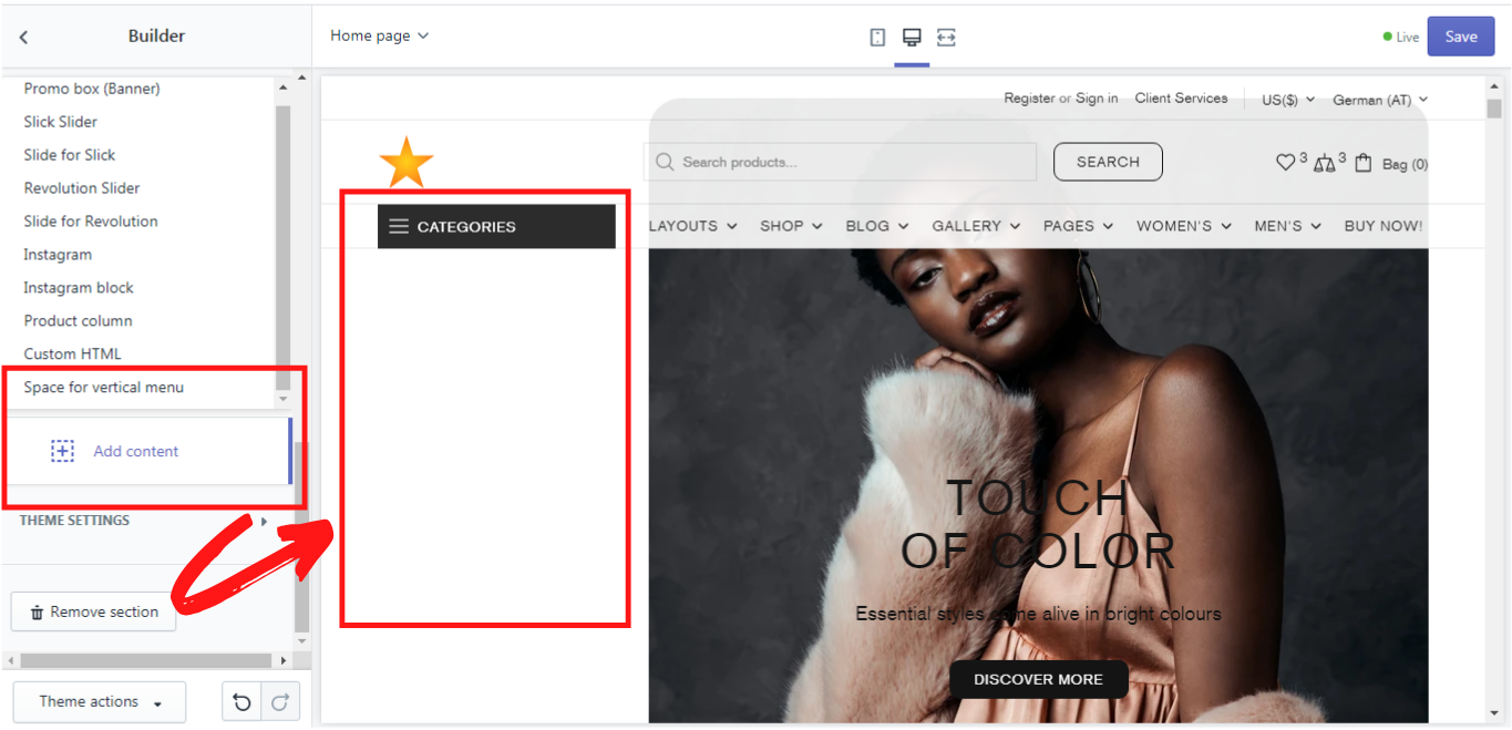
Once you click on “Space for vertical menu” a new block will appear, where you will need to select the menu. Once you select the menu the name of this block will be automatically renamed from “Space for vertical menu” to the name of the menu you select. Make sure, that this block is on the very top, over all other blocks in the content section. It can be dragged when clicking on the shopify default button and reordered to the needed place.
-
Fixed vertical menu on the home page
If you want your vertical menu to be displayed as a fixed menu without a dropdown list, you can enable this option. Make sure, that you have added a “Space for vertical menu” first:
Content
This option is available for the header type # 5 only. Here you can add some additional information in the top line content of the header. Simply select the page with the information you need. In the Shella theme there are some default pages, which you can edit with your information.
This is where you can select them in Shella theme:
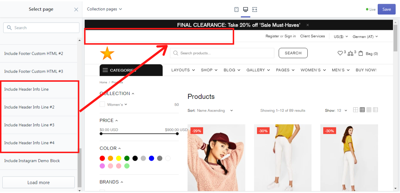
And this is where you can edit them in your Shopify Admin-> Online Store -> Pages. Then click on the page and edit it with your information:

More information about how to add and edit pages you can find here.
Sticky Header
Sticky state
Here you can choose in which version (desktop, mobile, both or none) the header should be sticky when scrolling down the page. There are 4 options that you can choose: desktop and mobile (the header remains sticky both in the desktop and mobile version), only desktop (the header remains sticky in the desktop version only), only mobile (the header remains sticky in the mobile version only), and disable. If you choose “Disable” the header will not be sticky when scrolling down the page.
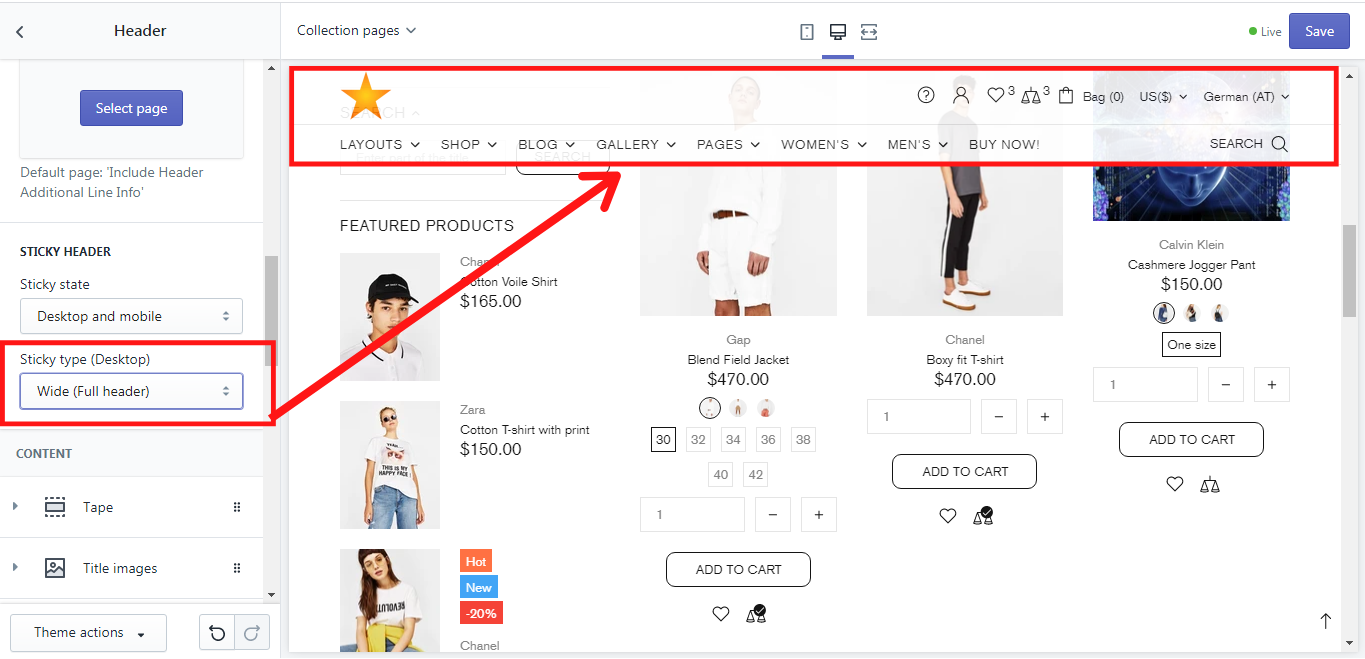
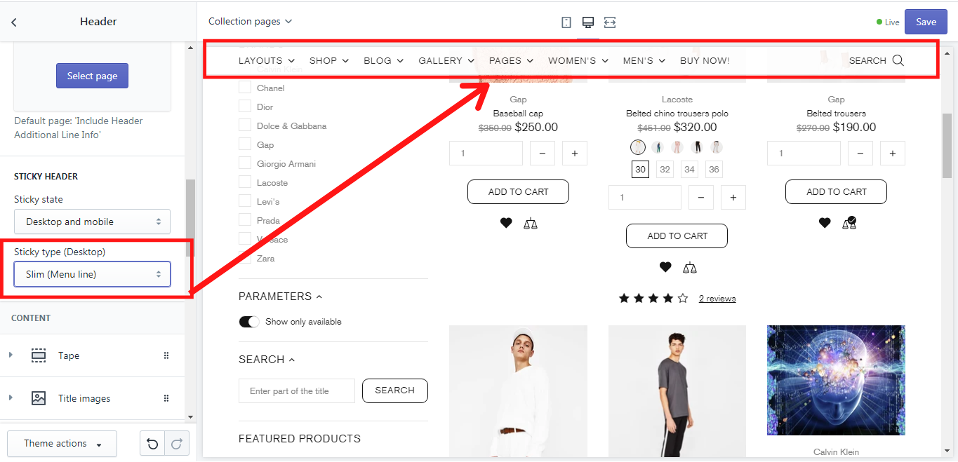
Sticky type (Desktop)
You can also choose the type of sticky header for the desktop version. There are 2 of them: “Wide”, where the whole header with all information lines and menus will be shown, and “Slim”, where only the menu line will be displayed.
Wide sticky header:
Slim sticky header:
Content
In order to make your header useful, helpful, and well organized you need to think about its content: what information should be shown and where - depends on your preferences. No matter what header type you have chosen, its content can be changed individually in the Shella theme. You can change the content of the header using different dynamic blocks when adding new content. There are several blocks for the header: Title images, Labels, Icons (for the first level), Info line, Tape, Mega menu, Mega -> Promo box, Mega -> Brands, Mega -> Products, Mega -> Custom HTML, Mega -> Subscription, Advanced menu (4 levels). You can find them all when clicking on “Add content”:
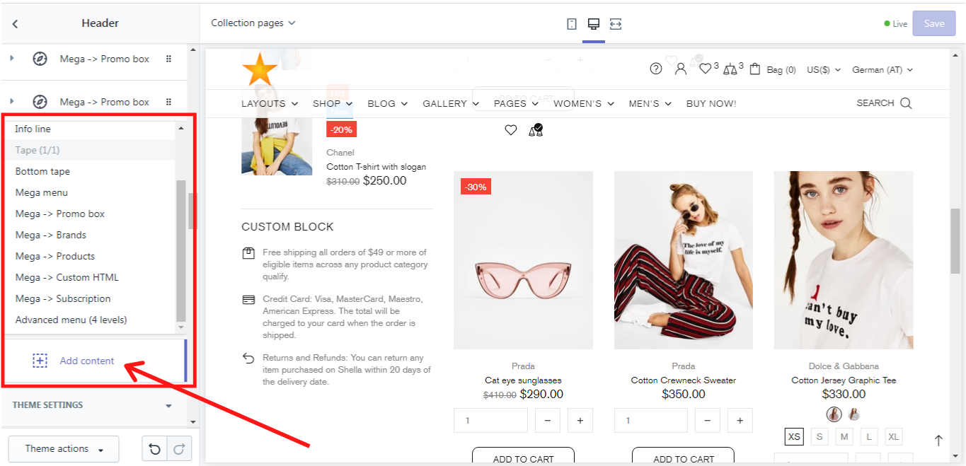
Content blocks
Now let's take a deep look at each content block.
Title images
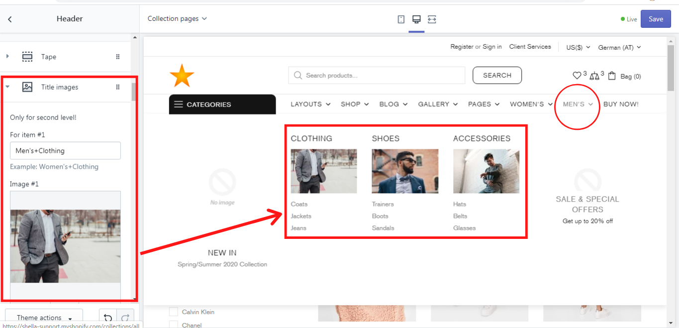
“Title images” block enables you to add images to the titles of subsections in the Mega menu. For example, in the main menu there is a section Men´s. When one hovers the mouse over it, the Men´s Mega menu is displayed, where various subsections and promo boxes may be shown. In our example, the subsections are clothing, shoes, and accessories.
Now if we want the title of the subsections to have images we add the block “Title images”, where images can be added to up to 5 items. If you have less than five subsections, leave the other ones blank. In order to add a title image for the item #1, we type “Men's+Clothing”, then we select the desired image for image #1, additionally, we can change the size of the image on the size scale from 100 to 300 px. We have added 3 images to each subsection and this is what we have got:
Labels
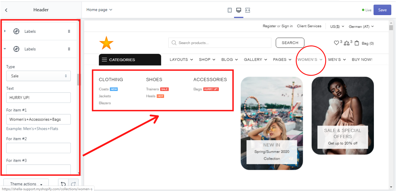
If you need a special label, e.g. NEW, HOT, SALE to be shown near the title of the subsection you have to add a block “Labels”. In this block, you can add labels to 15 items. If this is not enough for you, you can add more blocks “Labels”. Now let's go deeper into this block.
Type
The block “Labels” has 3 label types: NEW, HOT, SALE, which can be chosen from the dropdown list. Each label has its color: new - blue, hot - orange, sale - red. Once you choose any label out of this list, it will be shown in front of each item you add to “For item #1 - #15” in this block. For each new type a new “Labels” block is required.
Text
If you need another label for your item, which is not offered in the types, you can write the name of the label in the text field. No matter what name of the “Type” was selected, it will be automatically changed to your label text using the original type’s color, e.g.: Active now!
For item #1 - #15
In these fields you need to write for which title the label is required, e.g.: Men's+Shoes+Flats.
Example:
In our example we have set the following labels:
NEW - for Women's+Clothing+Coats
HOT - for Women's+Shoes+Heels
SALE - for Women's+Shoes+Trainers
HURRY UP!- for Women's+Accessories+Bags (Although the Type here is “Sale” we have written our own label text “HURRY UP!” in the Text field and only the original color of the label type “Sale” remains, but the text is different.)
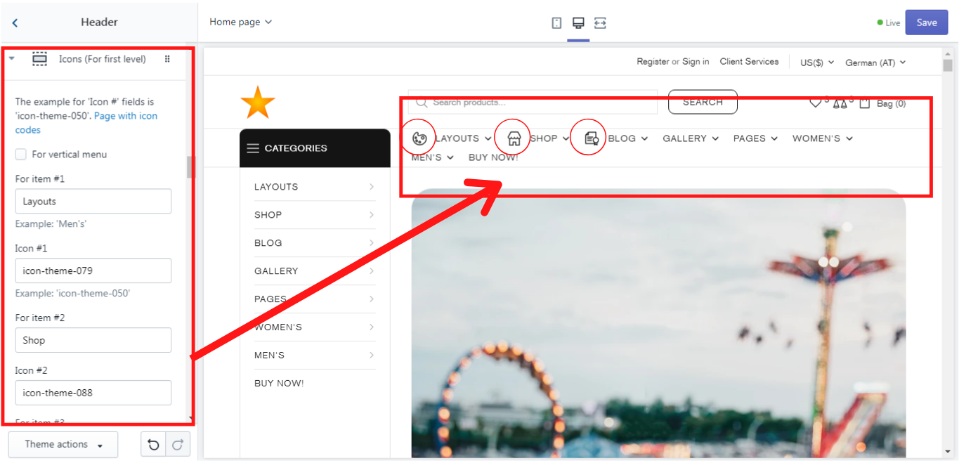
Icons (For the first level)
If you want each menu section to have an icon, you need to add the block “Icons”. The icons can be added both for horizontal and for vertical menu. The icon codes you can find here .
Example of the icons in the horizontal menu:
For item #1
Layouts
Icon #1
icon-theme-079
For item #2
Shop
Icon #2
icon-theme-088
For item #3
Blog
Icon #3
icon-theme-023
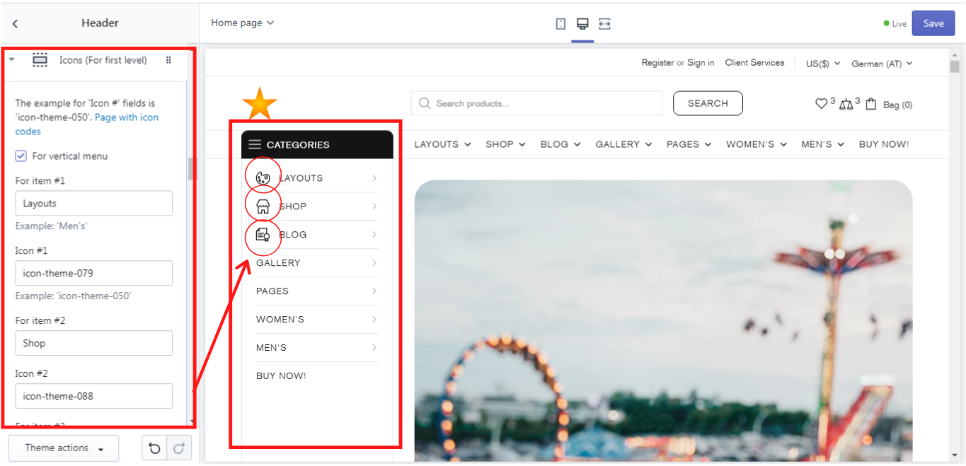
If you enable the option “For vertical menu” the icons will be added to the vertical menu only.
Example of the icons in the vertical menu:
For item #1
Layouts
Icon #1
icon-theme-079
For item #2
Shop
Icon #2
icon-theme-088
For item #3
Blog
Icon #3
icon-theme-023
In this block you can add up to 20 icons. If this is not enough for you, you can add another block “Icons (For the first level)”.
Info line
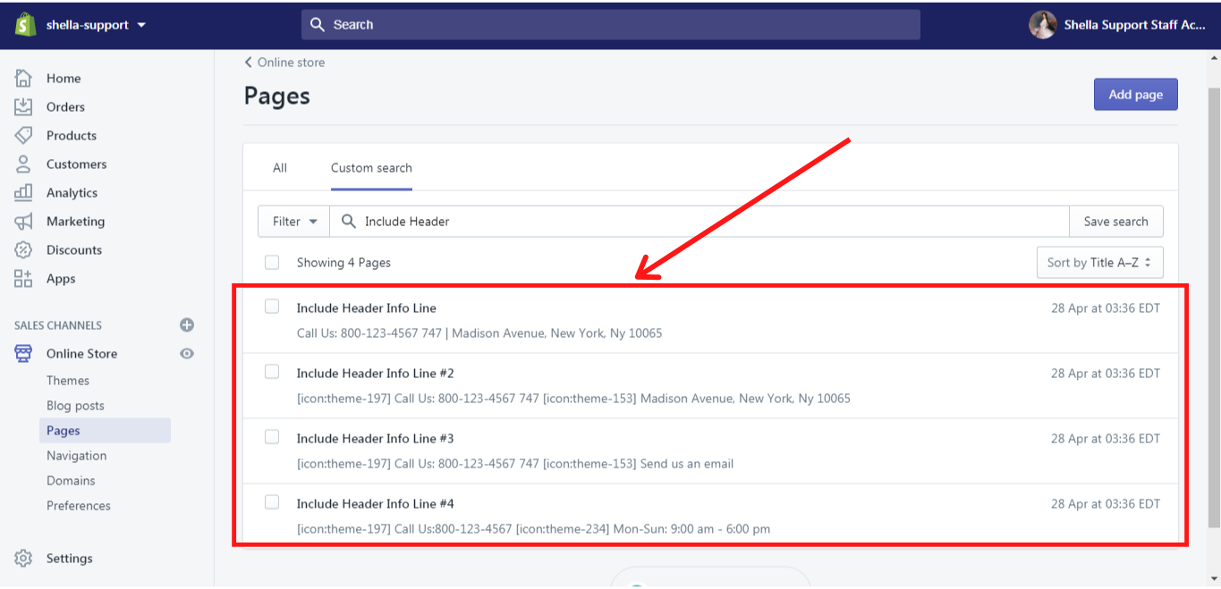
This block allows you to add additional information to the very top of the header, e.g.: call us, phone number, etc. The block “Info line” can be added only once! In order to add the page content there, you need to select the page with the proper information. If no page is selected, the default page “Include Header Info Line” will be used. In the Shella theme there are some default pages, which you can edit with your information.
This is how the info line looks like in the Shella theme:
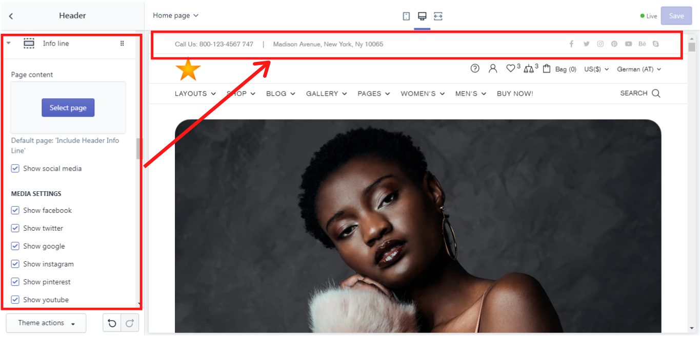
And this is where you can edit the pages in your Shopify Admin-> Online Store -> Pages. Then click on the page and edit it with your information:
More information about how to add and edit pages you can find here.
You can also decide, whether social media should be displayed in your info line if you have any from the suggested list in “Media settings”. Please note, that the links to your social media accounts should be added in your Shella Admin -> Theme settings -> Social Media -> Social accounts.
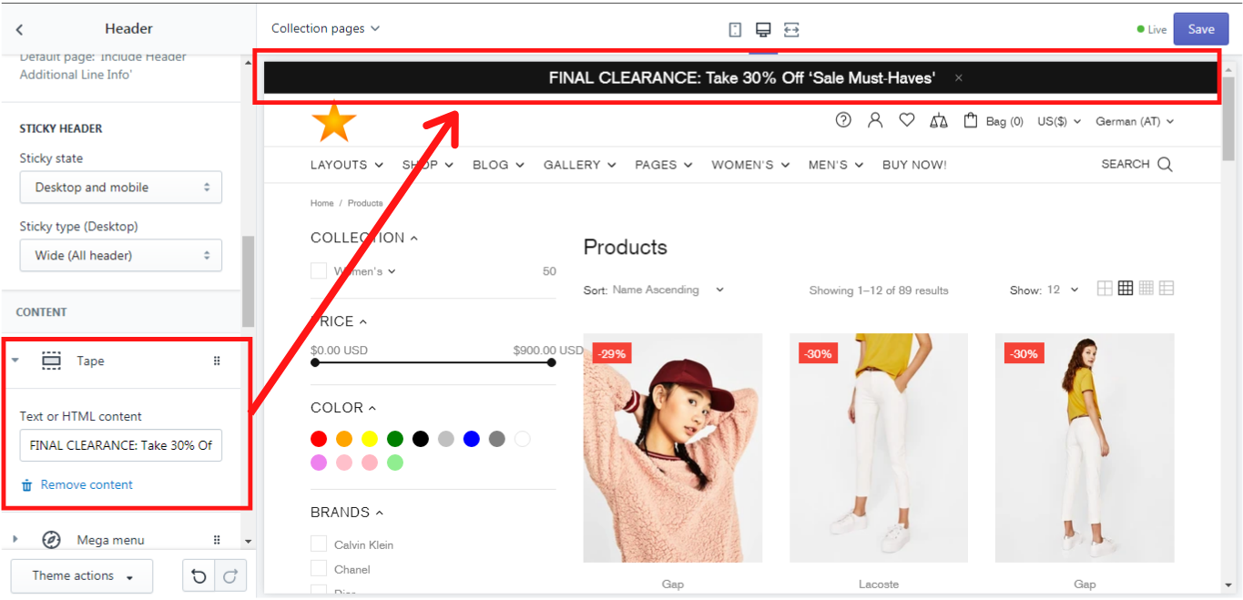
Tape
A tape is sort of an information line at the very top of the header which can be closed by the customer. It can be added only once. You can always change its content by writing a new text or HTML content, and of course, the tape can be always removed as a content block:
Megamenu
A mega menu block allows you to organize and customize the menu items, inside of the dropdown menu section. This is a multifunctional block, which enables one to add additional content, such as promo-boxes, brands, products, etc. Before you start working with the Mega menu block, make sure, that you have created all menu items needed for this menu section in your Shopify Admin -> Navigation. How to add and edit menu items in your online store you can read here
We will show you how it may look on an example of the “Men’s” menu.
These were our steps:
-
In the Navigation, we have added a menu item “Main menu”:
-
In the “Main menu” we have added all needed menu items including a menu item “Men’s”.
-
In “Men’s” we have added some other menu items with the dropdown menus:
Now we can get back to the “Mega menu” block in the Shella theme and customize it.
General
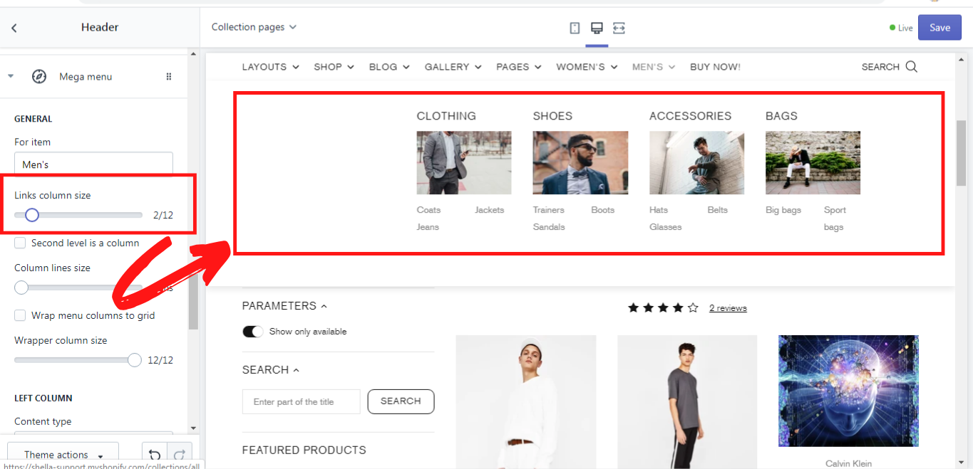
Here are some general settings for the mega menu. In the field “For item”, you should type the name of the menu item, for which the mega menu is created. In our example, it is “Men’s”.
Since we have already added the blocks “Title images” before (check it above), we can customize the size of their columns on the size scale “Links column size” from 1 to 12:
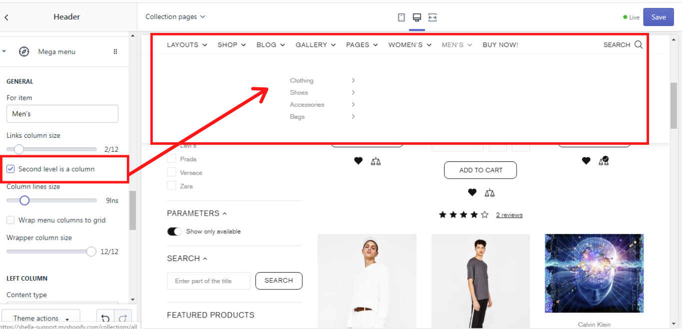
Second level is a column
If you enable this option, the menu items in the second level will be displayed like this:
Column lines
This option enables you to decide how many lines of the menu items should be displayed in one row. There is a scale, where you can change the number of lines from 1 to 50. If you choose 1 the columns will look like this:
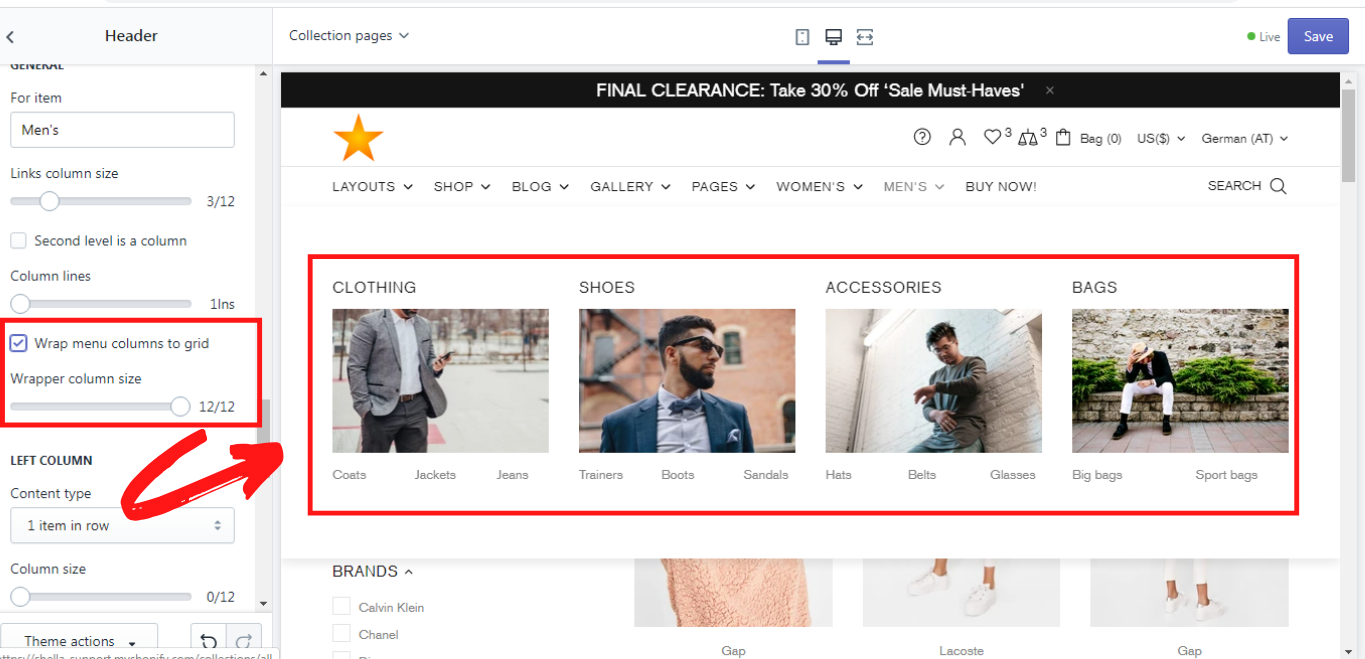
Wrap menu columns to grid
This option enables you to order all the menu columns in one block:
LEFT COLUMN
This section allows you to customize a menu item for the promo box in the left column. Here you can decide how many items should be displayed in one row of promo box on the left side by choosing the content type. A column size can also be selected on the size scale from 0 to 12. How to add a promo box you can read in the section Mega -> Promo box.
RIGHT COLUMN
This section allows you to customize a menu item for the promo box in the right column. Here you can decide how many items should be displayed in one row of promo box on the right side by choosing the content type. A column size can also be selected on the size scale from 0 to 12. How to add a promo box you can read in the section Mega -> Promo box.
VERTICAL MENU
Mega -> Promo box
Promo box is an additional option for the mega menu. It enables you to add a promotion (banner), brands, products, pages, etc.inside of the dropdown menu. From the previous section you might have known that the columns for promo boxes can be positioned both on the left and on the right sides in the dropdown menu. You can also choose only one side for this purpose. It is up to you. Now let's check on the example, how one can work with the promo box and how it may look like. In the section “Mega menu” we have created a mega menu for the “Men’s”. We will proceed with working with this menu item. A new content block for the Mega menu “Men’s” will be added. This content block is called Mega -> Promo box.
Title
Here you can write a title of the banner that will be displayed above the banner´s image in the promo box. This is optional, of course.
GENERAL
In this section you can add a URL for the banner that will redirect your customers to the needed page, when clicking on the banner. Simply click on it and choose the desired page from the dropdown list, or you can paste a link that is not on this list.
IMAGE
In order to make your banner more attractive for the clients, you can add an image for it. The recommended image size is 1440 x 550 pixels. The size of the image can be changed on the image size scale from 200 to 2000 pixels. You can also add an image mask and choose the level of its opacity on the image mask opacity scale from 0.1 to 1.0. An image mask is sort of the color cover which can be put over the image in order to give it a particular shade of color if it has some opacity, or to cover it completely with the color if the opacity level is at maximum.
TEXT
Here you customize the text content for your banner in the promo box. There are 3 text lines that can be added. Delete the line value for the text or button if you want to hide the element and use '
' for a line break. Of course the style of the text content can be changed in “Colorized style”, where you can choose one of six possible styles for this purpose.
BUTTON #1 - #2
For each banner in the promo box you can add two buttons, which can be customized. There are three customization options for the buttons: button text, URL for the button, and button style. In the button text you can write the title of the button, e.g.: Shop now, or More. In the URL for the button insert the link to which the client should be redirected when clicking on the button and in the button style you can choose one of the button styles which are offered in the dropdown list.
OTHER CONTENT
LIST
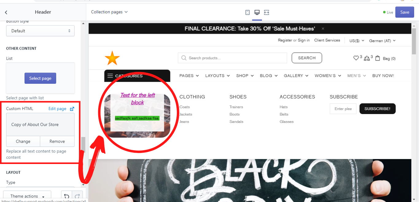
Custom HTML
This option allows you to replace the whole text content in the promo box with the page content. How to add and edit a page you can read here. This is an example of it:
LAYOUT
Here you can choose the type of layout for the text in the promo box. Shella theme offers a lot of types for the layout, simply choose the one, that suits best for your store.
ANIMATION
In this section you can work on the animation, position, and opacity of the image in the banner of your promo box. You can decide whether the image should have an animation when being hovered over with the mouse cursor by choosing the proper option from “Moving image on hover to”. The positioning of the image can also be set in the “Static image position”. Just choose one of the available options from the dropdown list. In the same way you can decide whether or when the banner image in the promo box should have an opacity. In the dropdown list “Image opacity” the options static, hover, static, and hover or none can be chosen for this purpose.
EXAMPLE Promo box (OTHER CONTENT SETTINGS)
Now let’s see what we get when we add and customize our Promo box for the Mega menu “Men’s”. If we don't use an option, we leave it blank. So, these are our settings for the Promo box:
Title: (no title was written)
GENERAL
URL for banner: All Collections
Image: (the image was selected)
Image size: 400px
Image mask: red
Image mask opacity: 0.3
TEXT
Text line #1: Sale
Text line #2: -20% to all
Colorize style: Style #1
BUTTON #1
Button text: Shop now
URL for button: All Collections
Button style: Clean
OTHER CONTENT
List: (not selected)
Custom HTML: (not selected)
LAYOUT
Type: Type #3 (Ribbon bottom the image) Please note! For this type no buttons will be shown!
ANIMATION
Move image on hover to: Center
Static image position: None
Image opacity: None
LEFT COLUMN
Content type: 1 item in row
Column size: 0/12
RIGHT COLUMN
Content type: none
Column size: 0/12
We have also deleted the block “Title images” in order to concentrate your attention on the “Promo box” block only.
So after all these settings, we have got the following dropdown menu for the menu item “Men’s”:
Mega -> Brands
You can add brands in the right or in the left column of the dropdown menu the same as banners of promo box and customize them, writing their title, pasting an URL for the title, choosing how many images should be displayed in one row. Moreover you can add images for brands and resize them, using a scale for image size from 50 to 300 px. For each image an URL can be selected. In one such “Mega -> Brands” block you can add up to 10 images for brands and customize them.
- Mega menu (For item “Men´s”)
- Mega menu -> Promo box
- Mega -> Brands
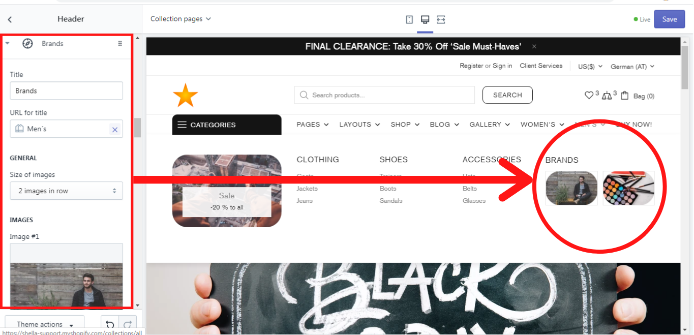
We will show you an example of such a block in the menu item “Men´s” where we have the following settings:
Title: Brands
URL for title: Men´s
GENERAL
Size of images: 2 images in a row
IMAGES
Image #1: (an image was added)
Image size #1: 80px
URL #1: All Collections
The second image had the same settings. This is what we´ve got:
LEFT COLUMN
Content type: 1 item in row
Column size: 3/12
RIGHT COLUMN
Content type: 1 item in row
Column size: 3/12
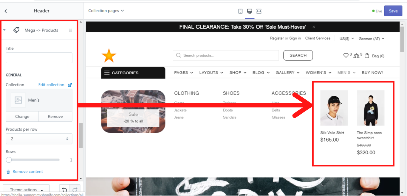
Mega -> Products
You can add products in the right or in the left column of the dropdown menu same as banners of promo box or brands and customize them, writing their title; selecting the proper collection, from which the products should be shown; choosing how many images should be displayed in one row, using the dropdown menu “Products per row”, and selecting the number of products on the “Rows” - scale from 1 to 6.
- Mega menu (For item “Men´s”)
- Mega menu -> Promo box
- Mega -> Products
We will show you an example of such a block in the menu item “Men´s” where we have the following settings:
Title: (no title)
GENERAL
Collection: Men´s
Products per row: 2
Rows: 1
And this is what we´ve got:
LEFT COLUMN
Content type: 1 item in row
Column size: 3/12
RIGHT COLUMN
Content type: 1 item in row
Column size: 3/12
Mega -> Custom HTML
This block allows you to add the whole page as a content. How to add end edit a page you can read here. In this block you can add a title and an URL for the title, or you can leave both these fields blank, if no title is needed. Once you write the title, the block will get its name automatically. So in order to add a page content you need to select the page you want to be displayed in the dropdown menu.
- Mega menu (For item “Men´s”)
- Mega menu -> Promo box
- Mega -> Custom HTML
We will show you an example of such a block in the menu item “Men´s” where we have the following settings:
Title: About us
URL for the title: About our store
GENERAL
Page content: About our store
LEFT COLUMN
Content type: 1 item in row
Column size: 3/12
RIGHT COLUMN
Content type: 1 item in row
Column size: 3/12
Column size: 3/12
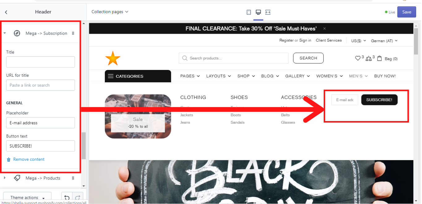
Mega -> Subscription
This block allows you to add the subscription section in the dropdown menu. You may write a title and an URL for this bock or you can leave them blank. Once you write the title, the block will get the same name automatically. In the placeholder write the text that should be displayed, e.g.: “E-mail address”, and then write the button text, e.g. “SUBSCRIBE”.
- Mega menu (For item “Men´s”)
- Mega menu -> Promo box
- Mega -> Subscription
We will show you an example of such a block in the menu item “Men´s” where we have the following settings:
Title: (no title)
URL for the title: (no URL)
GENERAL
Placeholder: E-mail address
Button text:
And this is what we´ve got:
LEFT COLUMN
Content type: 1 item in row
Column size: 3/12
RIGHT COLUMN
Content type: 1 item in row
Column size: 3/12
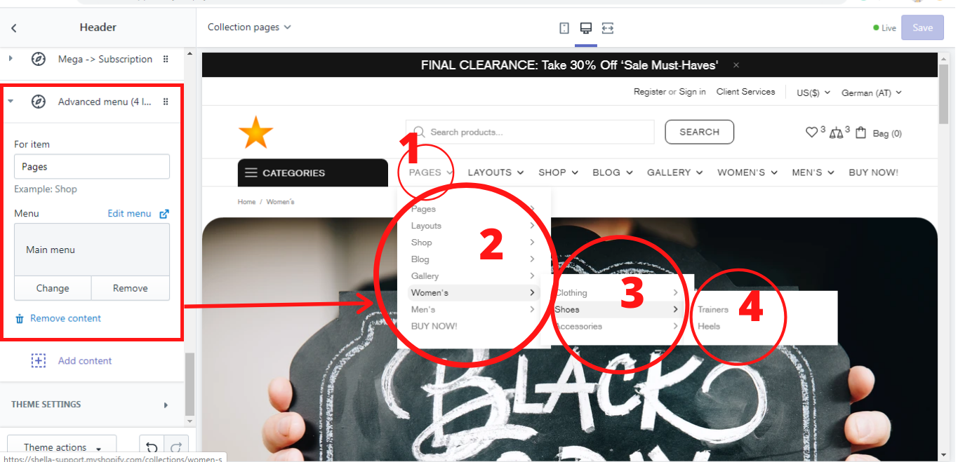
Advanced menu (4 levels)
This block enables you to have up to 4 levels in the header menu. All you need here is to decide for which menu item you do want to have a 4 levels menu and select the proper menu from the list. In our example we have the following settings:
For item: Pages
Menu: Main menu
And this is what we´ve got: