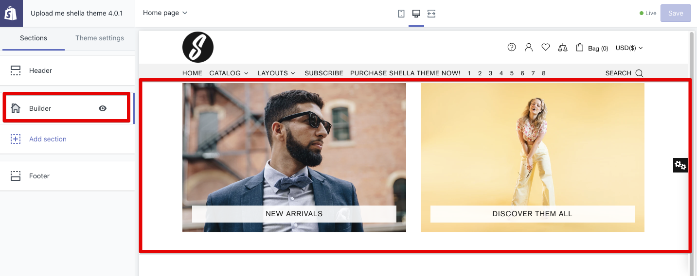
Builder section
The “Builder” block on the Home page is a massive block, which allows you to add different content blocks, such as promo box (banners), various sliders, pages, product columns, videos, space for vertical menu, etc. This block can be added to any place on the home page, either straight after the header or before the footer, etc. We will get deeper into each of these blocks in the next sections.
Settings
In this section, you can configure the settings for all content sections.
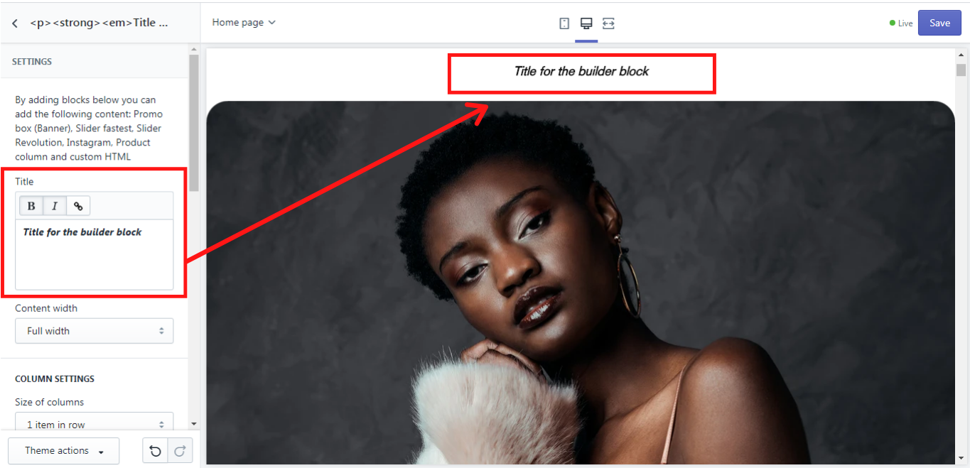
Title
Here you can add a title for your builder block, which will be shown on the page. You can customize its font and add a link if needed:
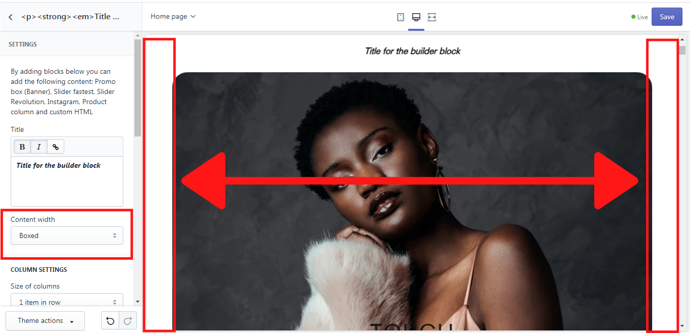
Content width
This option enables you to choose the width of the content. It may be either full or boxed. If it is full the image of this block is displayed in full width on the home page. Once it is boxed, you will see some space between the image and the home page on the left and right sides. In our example, we will show you the boxed width of the content:
Column Settings
Here you can choose how many items should be shown in one row, using a dropdown menu “Size of items”.
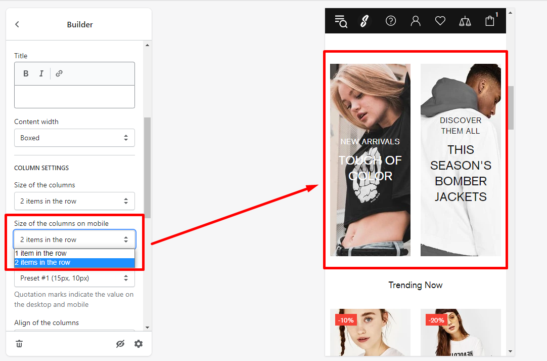
The option “Size of the columns on mobile” allows you to set the number of items in the row on mobile: “1 item in the row” or “2 items in the row”:
In the dropdown list of “Margins for columns”, you can choose the type of the margins for the columns.
The position of the columns can also be set in this section. Just use a dropdown list of the ”Align of columns” and select the proper option.
The option “Disable column paddings” allows you to remove space between the columns in the builder block.
In the “Mobile content precedence” you can decide in which order the content blocks should be displayed in the mobile version, by writing the order, e.g.: “2,1,3”.
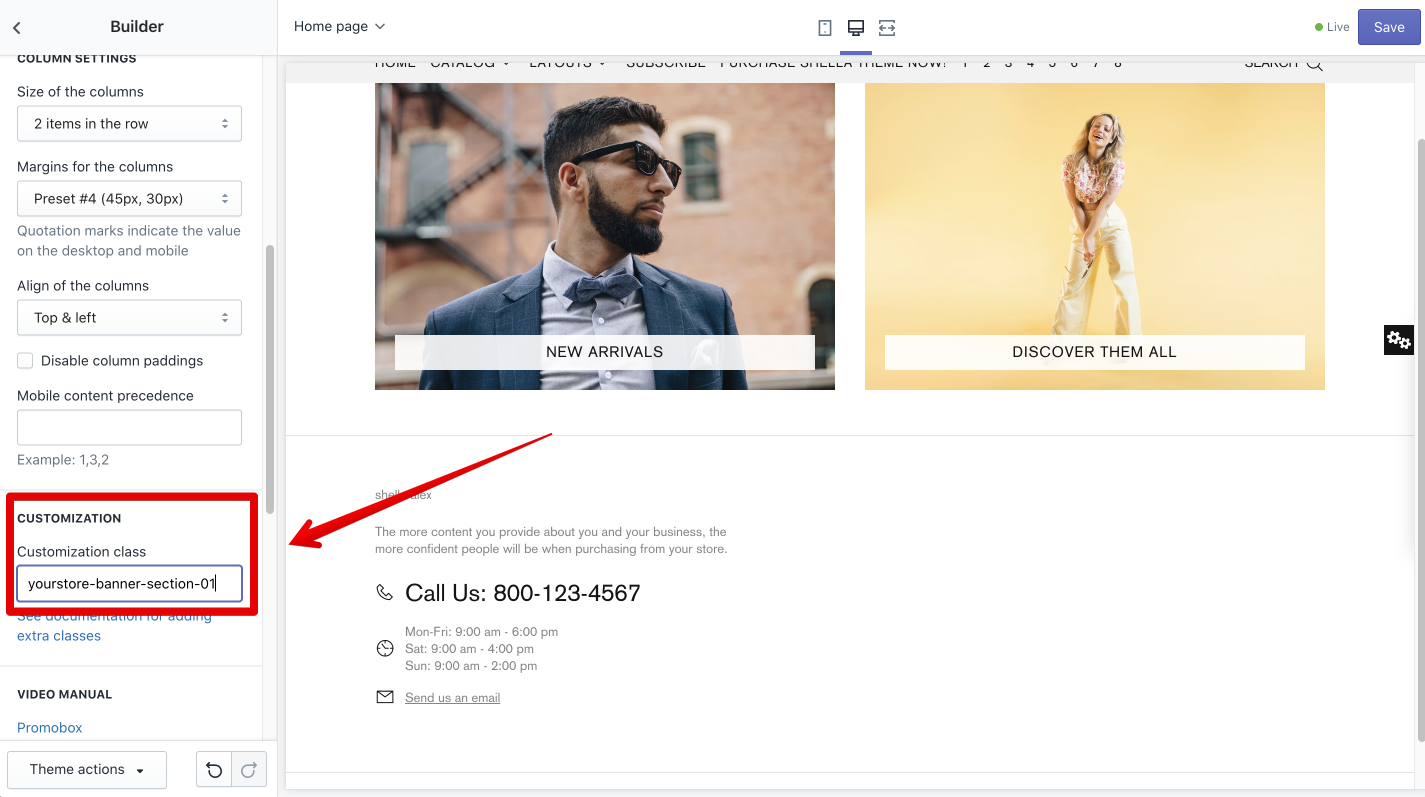
Customization
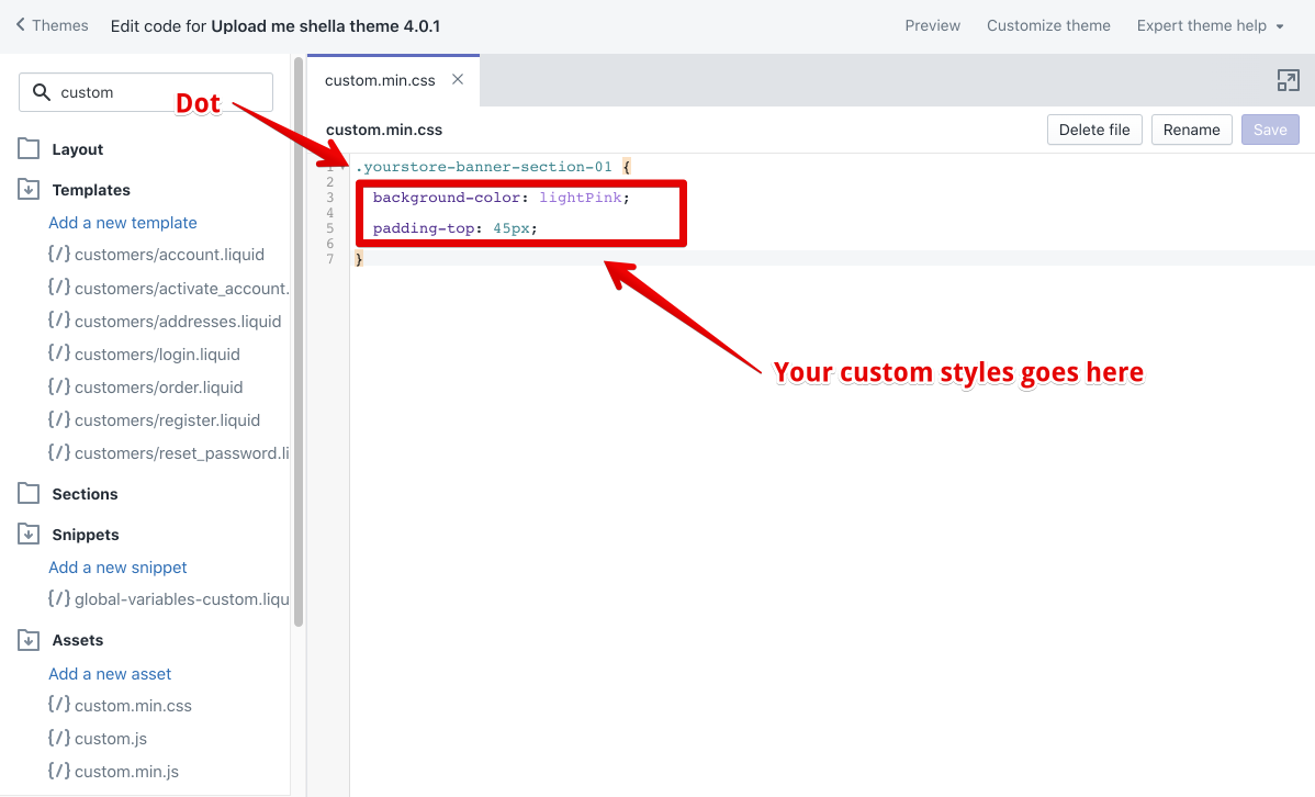
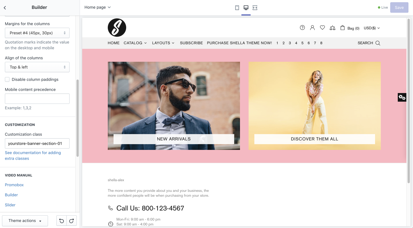
Customization classYou may add a custom CSS class to the Builder section. It helps if you need to apply custom changes.
Please note, this is an advanced option, you should have developer skills to work with CSS styles, or hire a developer to complete this task for your store.
Add Builder section, add content, configure the section.
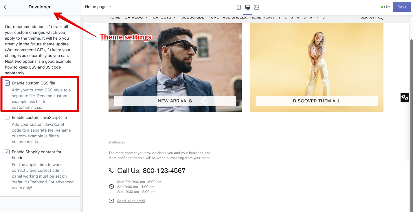
In case you need to add additional style, you may use the customization class option.
The customization class should be unique, it may include the Latin letters, numbers and dashes. Spaces and other chars are not allowed.
Enable the custom.css file at the Theme settings -> Developer
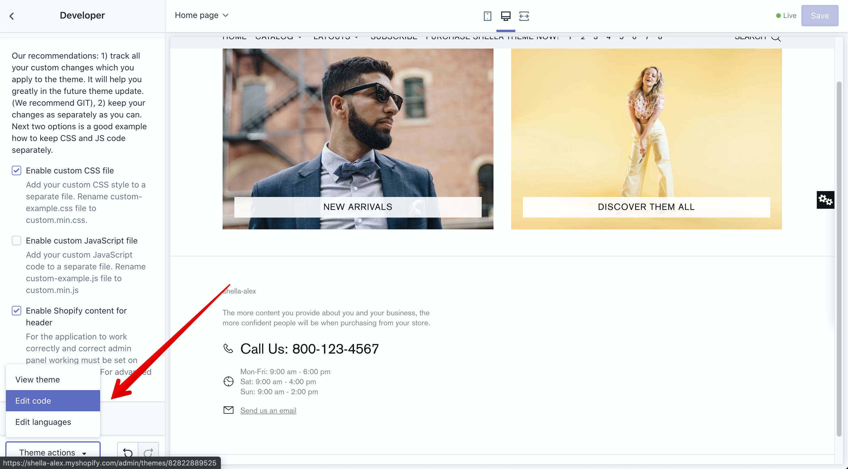
Open the source file editor at the Theme actions -> Edit code
Find and open the assets/custom.min.css file
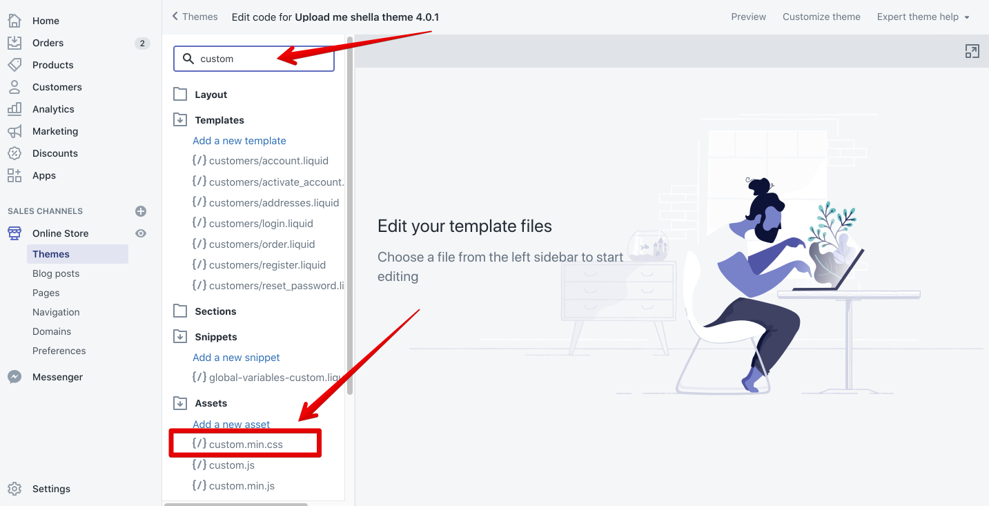
Add your custom CSS class and custom styles.
The example code shows how to add a background color and top padding
Read more information about the CSS
Please, note. If you see the CSS term for the first time, you should hire a person how are familiar with it.
The result.
Content
Here you can add, edit, and remove the content blocks in the “Builder” section. We will describe the functionality of each content block below.
Promo box (Banner)
GENERAL
In this section you can add a URL for the banner that will redirect your customers to the needed page, when clicking on the banner. Simply click on it and choose the desired page from the dropdown list, or you can paste a link that is not on this list.
IMAGE
In order to make your banner more attractive for the clients, you can add an image for it. You can add an image both for a desktop and a mobile version, and it can be a different picture, with different sizes. The recommended image size for the desktop is 1440 x 550 pixels. The size of the image can be changed on the “Image size” scale from 200 to 2000 pixels. The recommended image size for the mobile version is 540x550px. The size of the mobile image can be changed on the “Mobile image size” scale from 200 to 2000 pixels. For the mobile version you can also set the horizontal position using a “Horizontal position for mobile image” scale from 0 to 100%, where 50% is a center position, 0% - move to the left, 100% - move to the right. The settings will be disabled if you choose “Auto image adaptation height” in Layouts ->Height, which will come further in the promo box settings.
You can also add an image mask and choose the level of its opacity on the “Image mask opacity” scale from 0.1 to 1.0. An image mask is sort of the color cover which can be put over the image in order to give it a particular shade of color if it has some opacity, or to cover it completely with the color if the opacity level is at maximum.
TEXT
Here you can customize the text content for your banner in the promo box. There are 3 text lines that can be added. Delete the line value for the text or button if you want to hide the element and use '<br>' for a line break. Of course the style of the text content can be changed in “Colorized style”, where you can choose one of six possible styles for this purpose.
BUTTON #1 - #2
For each banner in the promo box you can add two buttons, which can be customized. There are three customization options for the buttons: button text, URL for the button, and button style. In the button text you can write the title of the button, e.g.: Shop now, or More. In the URL for the button insert the link to which the client should be redirected when clicking on the button and in the button style you can choose one of the button styles which are offered in the dropdown list.
OTHER CONTENT
LIST
Custom HTML
This option allows you to replace the whole text content in the promo box with the page content. How to add and edit a page you can read here
VIDEO
If you want to have a video on your Home page, you can add it here in the Promo box. If this is a YouTube or Vimeo link, you can simply insert it in “YouTube or Vimeo video URL”. If the source of the video is different, you can upload it in Shopify Admin-> Settings-> Files and add a link here. Once you have uploaded the video, copy its URL and paste in “Video URL”. You can also decide whether the video should have an autoplay or a control, simply by enabling or disabling such options like “Video autoplay” and “Video controls”
LAYOUT
Here you can choose the type of layout for the text in the promo box. Shella theme offers a lot of types for the layout, simply choose the one, that suits best for your store. Additionally, you can choose the proper content position on the desktop and height of the image. The size of the columns can be chosen from the dropdown list. In the section “Layouts” one can also decide for which version the promo box content should be visible mobile and desktop, only mobile or only desktop.
ANIMATION
In this section you can work on the animation, position, and opacity of the image in the banner of your promo box. the option “Image parallax” is available here. You can choose the suitable parallax type for you or disable it. Please note, that if the block height is not in the automatic adaptation mode, then the strength of the parallax effect will be adjusted to the selected height. If the height is too large for the image, the parallax effect may be minimal or not manifested at all. You can decide whether the image should have an animation when being hovered over with the mouse cursor by choosing the proper option from “Moving image on hover to”. The positioning of the image can also be set in the “Static image position”. Just choose one of the available options from the dropdown list. In the same way you can decide whether or when the banner image in the promo box should have an opacity. In the dropdown list “Image opacity” the options static, hover, static, and hover or none can be chosen for this purpose. You can select the needed animation option for the text from the dropdown list in “Text animation”. This option is available for the Layout type #1 (Text over the image) only.
EXAMPLE Promo box (OTHER CONTENT SETTINGS)
Now let’s see what we get when we add and customize our Promo box (Banner) for the “Builder” block on the Home page. We have added 2 Promo Boxes (Banners). One was for the image, and another one for the video. These were our settings:
Promo box (Banner) #1:
GENERAL
URL for banner: All Collections
Image: (an image was added)
Image size: 1450px
Mobile image: (no mobile image was selected, which is why in the mobile version the same picture will be displayed)
Mobile image size: 750px
Horizontal image for mobile image: 50%
Image mask: none
Image mask opacity: 0.5
TEXT
Text line #1: Pomo box
Text line #2: Banner
Colorize style: Style #4
BUTTON #1
Button text: Shop now
URL for the button: All Collections
Button style: Default
LAYOUT
Type: Type #1 v1 (Text over the image)
Content position on the desktop: center
Size of the column: ½ from the line
Visible: Desktop and mobile
Promo box (Banner) #2:
Since the second banner is a video, we will not mention any other settings except video settings. We have added a YouTube link in the field “YouTube or Vimeo video” and have enabled “Video controls”.
COLUMN SETTING
Size of columns: 2 items in a row
Margins in columns: None
Align of columns: Right and left
Mobile content precedence: 2,1
Slick Slider
“Slick Slider” is a “Builder” block, which enables you to add images as sliders on your home page to make an effect of an animation. One can set the time of the speed, with which the sliders will be changed. In order to have such an effect on your page, you need to add a block “Slick Slider” first and then add blocks “Slides for Slick”, where you can select the images for the sliders and customize them. The number of “Slide for Slick” blocks depends on the number of slides you want to have.
LAYOUT
Here you can choose the height of the image from the dropdown list of the “Height”. The “Minimum height” can be set on the scale from 0 to 1000px. The size of the columns can be chosen from the dropdown list “Size of the column”. The sliders have arrows or bullets, which help to navigate to the next or to the previous slider. You can choose either one of them, both of them or none for your sliders. One can also decide how often the sliders should be changed by the next ones using the “Speed (seconds)” scale from 2 to 15 seconds.
Slide for Slick
After you have added the content block “Slick slider” you can add the block “Slide for Slick” and customize it.
GENERAL
In this section you can add a URL for the slide that will redirect your customers to the needed page, when clicking on the slider. Simply click on it and choose the desired page from the dropdown list, or you can paste a link that is not on this list.
IMAGE
You can add an image both for a desktop and a mobile version, and it can be a different picture, with different sizes. The recommended image size for the desktop is 1440 x 550 pixels. The size of the image can be changed on the “Image size” scale from 200 to 2000 pixels. The recommended image size for the mobile version is 540x550px. The size of the mobile image can be changed on the “Mobile image size” scale from 200 to 2000 pixels. For the mobile version you can also set the horizontal position using a “Horizontal position for mobile image” scale from 0 to 100%, where 50% is a center position, 0% - move to the left, 100% - move to the right. The settings will be disabled if you choose “Auto image adaptation height” in Layouts ->Height, which will come further in the settings. You can also add an image mask and choose the level of its opacity on the image mask opacity scale from 0.1 to 1.0. An image mask is sort of the color cover which can be put over the image in order to give it a particular shade of color if it has some opacity, or to cover it completely with the color if the opacity level is at maximum.
TEXT
Here you can customize the text content for your slide. There are 3 text lines that can be added. Delete the line value for the text or button if you want to hide the element and use ‘<br>’ for a line break. Of course the style of the text content can be changed in “Colorized style”, where you can choose one of six possible styles for this purpose.
BUTTON #1 - #2
For each banner in the promo box you can add two buttons, which can be customized. There are three customization options for the buttons: button text, URL for the button, and button style. In the button text you can write the title of the button, e.g.: Shop now, or More. In the URL for the button insert the link to which the client should be redirected when clicking on the button and in the button style you can choose one of the button styles which are offered in the dropdown list.
OTHER CONTENT
Custom HTML
This option allows you to replace the whole text content in the promo box with the page content. How to add and edit a page you can read here
VIDEO
If you want to have a video on your Home page, you can add it here in the Promo box. If this is a YouTube or Vimeo link, you can simply insert it in “YouTube or Vimeo video URL”. If the source of the video is different, you can upload it in Shopify Admin-> Settings-> Files and add a link here. Once you have uploaded the video, copy its URL and paste in “Video URL”. You can also decide whether the video should have an autoplay or a control, simply by enabling or disabling such options like “Video autoplay” and “Video controls”
LAYOUT
Here you can choose the type of layout for the text in the promo box. Shella theme offers a lot of types for the layout, simply choose the one, that suits best for your store. Additionally, you can choose the proper content position on the desktop and height of the image. The size of the columns can be chosen from the dropdown list. In the section “Layouts” one can also decide for which version the promo box content should be visible mobile and desktop, only mobile or only desktop.
ANIMATION
In this section you can work on the text animation. You can select the needed animation option for the text from the dropdown list in “Text animation”. This option is available for the Layout type #1 (Text over the image) only.
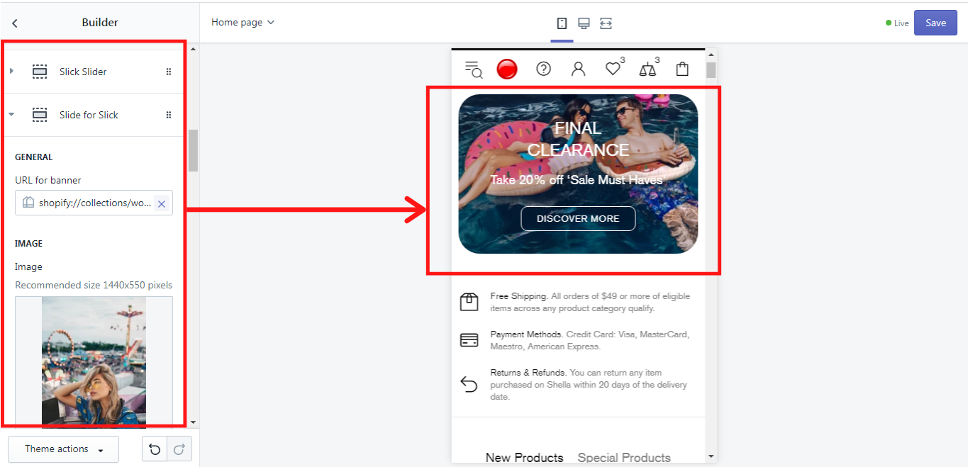
EXAMPLE Slick slider
Now let’s see what we get when we add and customize our blocks “Slide for Slick” directly after the block “Slick slider” on the Home page. We have added 1 “Slick Slider” block and then 3 “Slide for Slick” blocks. These were our settings:
“Slick Slider” block settings:
LAYOUT
Height: Auto adaptation to the image
Min height: 0 px
Size of column: ½ from the line
Arrows: enabled
Speed (seconds): 7
All 3 “Slide for Slick” blocks settings:
GENERAL
URL for banner: All Collections
Image: (3 images were added, 1 to each block)
Image size: 1100px
Mobile image: (no mobile image was selected, which is why in the mobile version the same picture will be displayed)
Mobile image size: 550px
Horizontal image for mobile image: 50%
Image mask: none
Image mask opacity: 0.5
TEXT
Text line #1: FINAL
CLEARANCE
Text line #2: Take 20% off “Sale Must-Haves”
Colorize style: Style #1
BUTTON #1
Button text: DISCOVER MORE
URL for the button: All Collections
Button style: Secondary
LAYOUT
Type: Type #1 v4
ANIMATION
Text animation: Translate Bottom
And this is what we have got. This is a mobile version of the “Slick Slider” block. Here is the third image displayed:
Revolution Slider
“Revolution Slider” is a “Builder” block, which enables you to add images as sliders on your home page to make an effect of an animation. And you can even choose what kind of slide transitions it will be. This is the main difference between the “Revolution Slider” and “Slick Slider”. One can set the time of the speed, with which the sliders will be changed. In order to have such an effect on your page, you need to add a block “Revolution Slider” first and then add blocks “Slide for Revolution”, where you can select the images for the sliders and customize them. The number of “Slide for Revolution” blocks depends on the number of slides you want to have.
LAYOUT
Here you can choose the height of the image from the dropdown list of the “Height”. The “Minimum height” can be set on the scale from 0 to 1000px. The size of the columns can be chosen from the dropdown list “Size of the column”. The sliders have arrows or bullets, which help to navigate to the next or to the previous slider. You can choose either one of them, both of them or none for your sliders. One can also decide how often the sliders should be changed by the next ones using the “Delay (seconds)” scale from 3 to 15 seconds. If you enable the option “Preload spacer”, the space for the “Builder” section, where the “Revolution Slider” is built-in will be removed for ca. 2-3 seconds while the store page will be loading. Once the page is loaded the whole block will be displayed again.
Slide for Revolution
GENERAL
In this section you can add a URL for the slide that will redirect your customers to the needed page, when clicking on the slider. Simply click on it and choose the desired page from the dropdown list, or you can paste a link that is not on this list.
IMAGE
You can add an image both for a desktop and a mobile version, and it can be a different picture, with different sizes. The recommended image size for the desktop is 1440 x 550 pixels. For the mobile version you can also set the horizontal position using a “Horizontal position for mobile image” scale from 0 to 100%, where 50% is a center position, 0% - move to the left, 100% - move to the right. The settings will be disabled if you choose “Auto image adaptation height” in Layouts ->Height, which will come further in the settings.
TEXT
Here you can customize the text content for your slide. There are 3 text lines that can be added. Delete the line value for the text or button if you want to hide the element and use ‘<br>’ for a line break. Of course the style of the text content can be changed in “Colorized style”, where you can choose one of six possible styles for this purpose.
BUTTON #1 - #2
For each banner in the promo box you can add two buttons, which can be customized. There are three customization options for the buttons: button text, URL for the button, and button style. In the button text you can write the title of the button, e.g.: Shop now, or More. In the URL for the button insert the link to which the client should be redirected when clicking on the button and in the button style you can choose one of the button styles which are offered in the dropdown list.
OTHER CONTENT
Custom HTML
This option allows you to replace the whole text content in the promo box with the page content. How to add and edit a page you can read here
VIDEO
If you want to have a video on your Home page, you can add it here in the Promo box. If this is a YouTube or Vimeo link, you can simply insert it in “YouTube or Vimeo video URL”. If the source of the video is different, you can upload it in Shopify Admin-> Settings-> Files and add a link here. Once you have uploaded the video, copy its URL and paste in “Video URL”. You can also decide whether the video should have an autoplay or a control, simply by enabling or disabling such options like “Video autoplay” and “Video controls”
LAYOUT
Here you can choose the type of layout for the text on the slide. Shella theme offers a lot of types for the layout, simply choose the one, that suits best for your store. Additionally, you can choose the proper content position on the desktop and height of the image.
EFFECTS
In this section, you can add the unique effects, which make the block “Slide for Revolution” so extraordinary. First of all, you can set a time for the particular slide, which will be needed for the slide transition. It may differ from another slider’s time settings, or it can be the same if you choose 0 on the “Delay” scale from 0 to 60 seconds.
In “Slide animation” you can add the code for the slide transitions. The codes for this purpose you can find in Slide Transitions.
In “HTML layer animation” you can add the code for the layer transitions. The code for this purpose you can find in Layer Transitions.
If you need the parallax effects for the image or its content, you may set it on the “Parallax of image” scale from 0 to 16 and on the “Parallax of content” scale from 0 to 16.
This block allows you to add your or some other Instagram content to your home page. Make sure, that this block is placed over all other content blocks. Please note, once you add a block “Instagram block” additionally to the block “Instagram”, the automatic uploading of the Instagram images by user name or tags will be disabled.
GENERAL
If you want some images from your Instagram account to be automatically displayed on the home page, write your Instagram user name in the field “User name”:
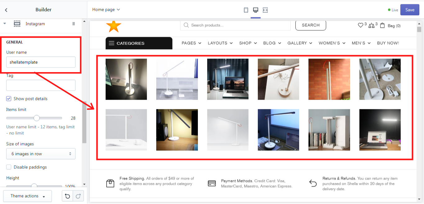
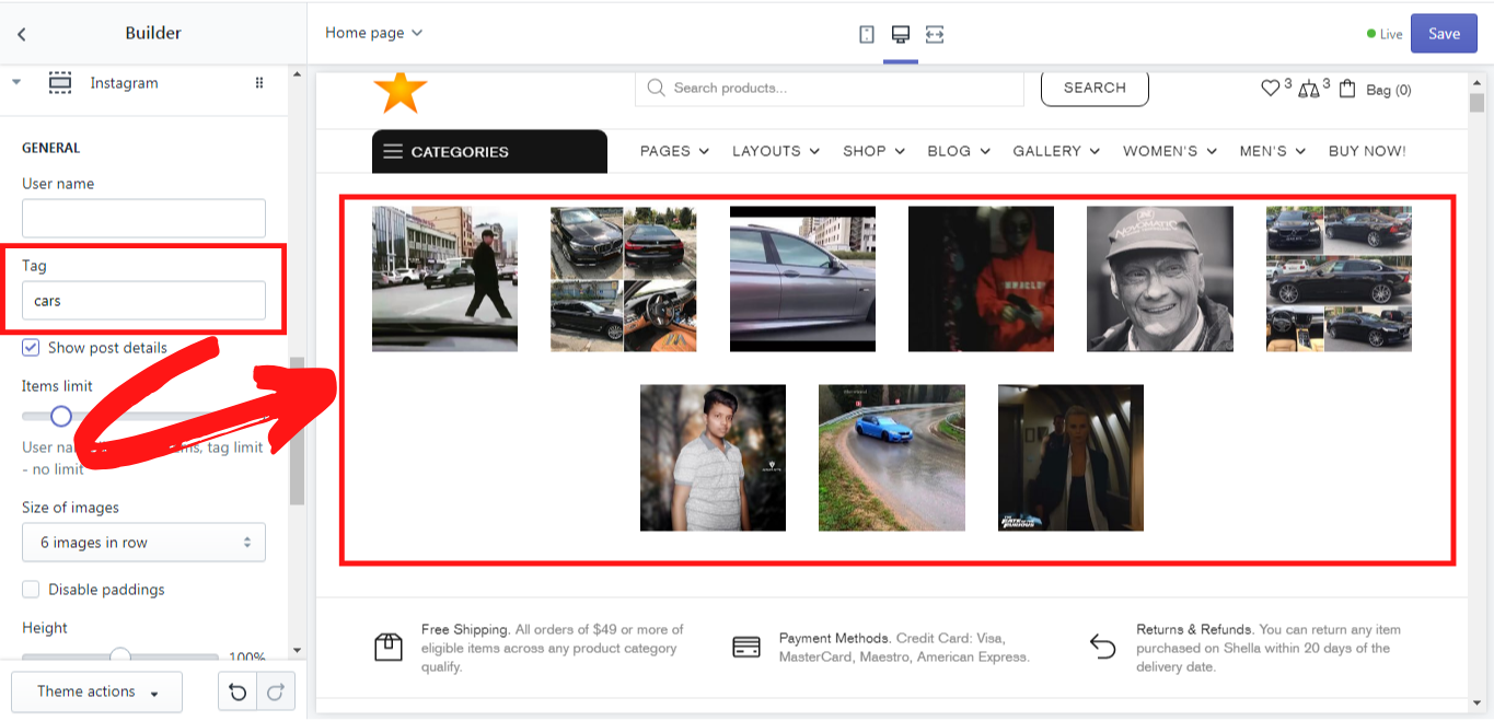
If you want to have some random images from the Instagram to be automatically uploaded with the particular tag, remove your user name from the field “User name” and write the tags you need in the field “Tags”. Once you write some tags, e.g.: ‘cars’ all images with this tag on Instagram will be automatically displayed on the home page:
If you enable the option “Show post details” the number of comments and likes will be shown on the image once it is hovered over with the mouse. On the “Items limit” scale from 1 to 50 you can choose the limit of the images that will be displayed when you write either your user name or tags. The amount of images that will be displayed from your Instagram account is limited to 12 images by default, however, you can set this number to less than 12. The images from tags do not have any limits. You can set the limit of their amount on the same scale.
In the “Size of the images”, one can choose the amount of images that should be displayed in the row.
If one doesn’t want to have any space between the images, use the option “Disable paddings”.
On the scale “Height” from 0 to 100% one can set the height of the images, where 0 is an auto-size of the image, 100 - a square image, less than 100 - a landscape, more than100 - a portrait.
In this block one can also use the option “Disable lazy loading” if needed.
LAYOUT
Here you can choose the size of the column for the whole “Instagram” block. Simply pick up the needed option from the dropdown list in the “Size of the column”.
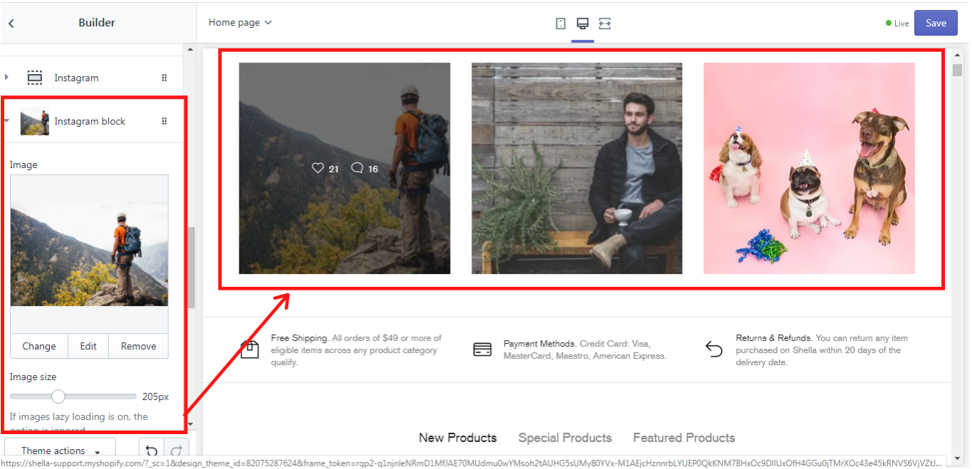
Instagram block
This block should be added after the block “Instagram”. The number of the “Instagram blocks” depends on the number of images you want to be displayed. This is a static block, where you can add or change your Instagram images. The image size can be changed on the “Image size” scale from 150 to 300 pixels. If you choose the option “Enable format “PJPEG” no transparent images will be available for this block. One can also decide whether the lazy load should be enabled here. If you ant your clients to be redirected to a particular page when clicking on the image, you can insert an URL in this block. In the fields “Likes” and “Comments” the random numbers can be written. These numbers will be shown on the images when one hovers over them with the mouse cursor. We have added 3 “Instagram blocks” and this is what we have got:
Product column
This block enables you to add a product column into the “Builder” block on the Home Page. Since this is a column, we highly recommend adding it together with some other blocks, like Promo box (Banner) or Custom HTML. Otherwise you will have a Product column and a big blank space on the Home page, which doesn't make sense. If you decide to follow our advice, please do not forget to change the number of items in the row in Builder -> Settings -> Column settings -> Size of the columns. Now let´s get deeper into the settings of the “Product column” block.
GENERAL
Here you can add a title of the column, that will be displayed on the desktop. This is optional of course. In order to have some products shown in the product column, you need to select the proper collection from the list in “Collection”. The number of the products displayed in this column can be set on the “Maximum products in the column” scale from 1 to 6.
LAYOUT
In the “Size of the column” you can choose the needed size for the product column from the options offered in the dropdown list.
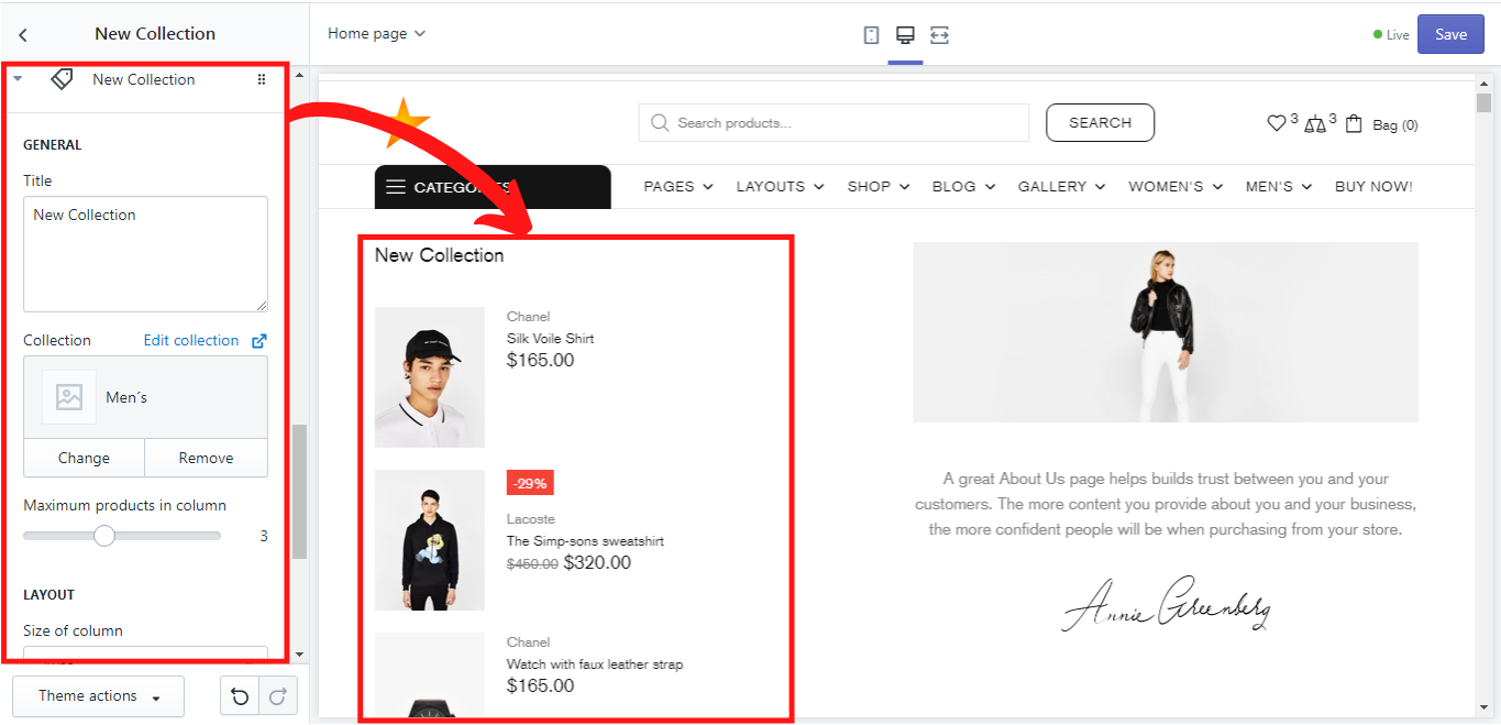
This is an example of the “Product column” block, that we have added together with the “Custom HTML” block (more about this block you can read in the next section) and have changed the number of items in the row (2 items in one row) in Builder -> Settings -> Column settings -> Size of the columns:
If you want for instance to have a Product column not on the left but on the right side of the page, simply drag the “Product column” block under the other block. In our example, it would be a “Custom HTML” block.
Custom HTML
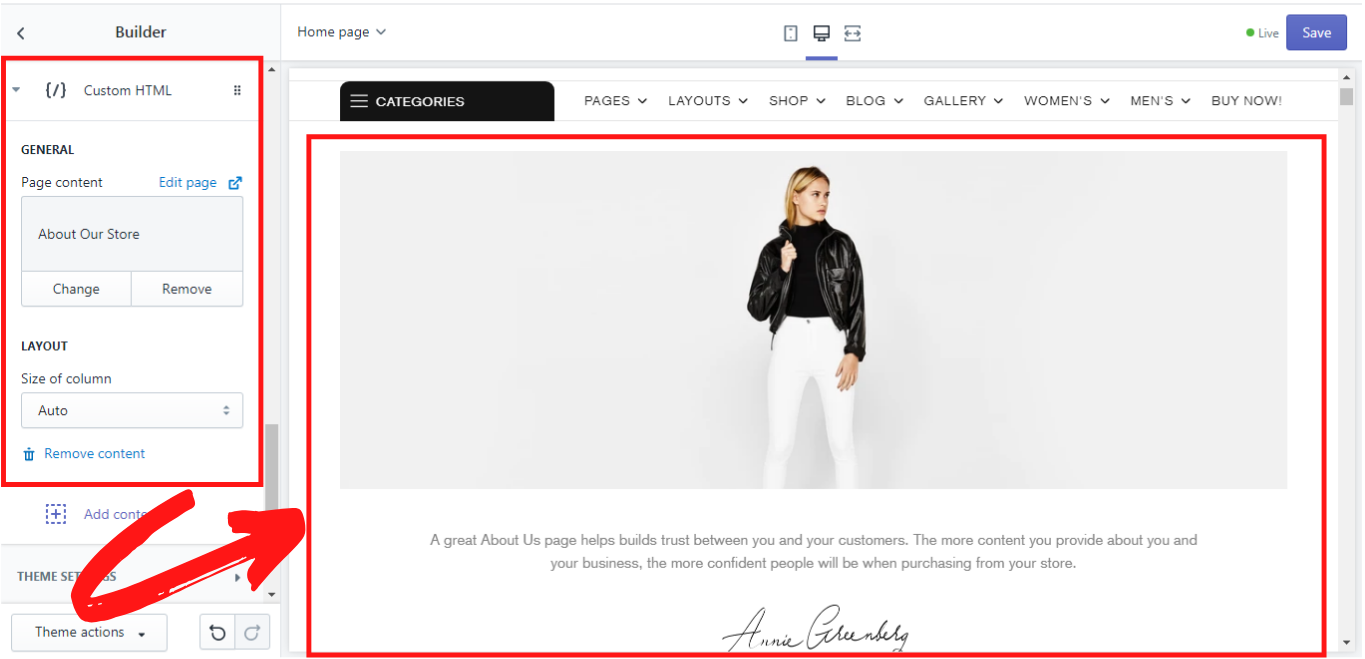
This block allows you to add the whole page as a content in the “Builder” block on the lookbook page. Simply select the desired page from the list in the GENERAL -> “Page content” and choose the proper size in the dropdown list in LAYOUT -> “Size of the column”:
Space for vertical menu
This option is for the header type #5. When you add a block “Space for vertical menu”, the vertical menu in the header type #5 will have its own space for the dropdown or for the fixed vertical menu. Otherwise the menu will be over the other content on the home page.
Add “Space for vertical menu”:
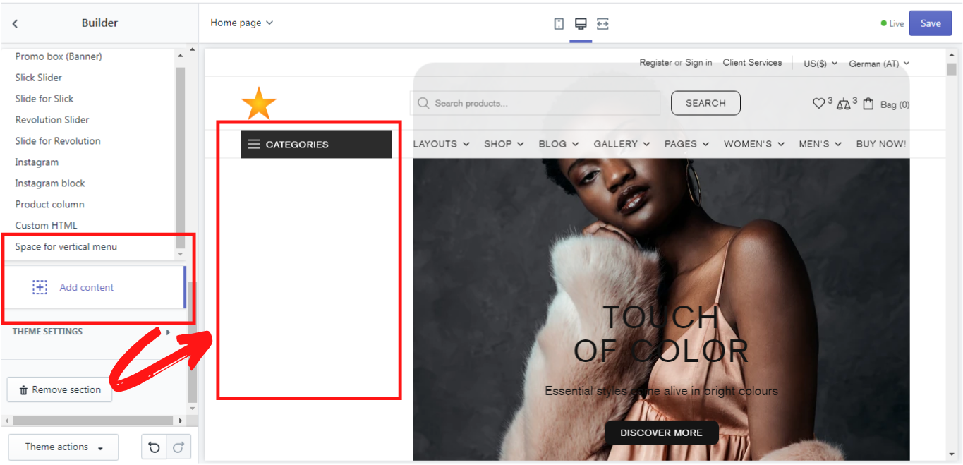
Once you click on “Space for vertical menu” a new block will appear, where you will need to select the menu. Once you select the menu the name of this block will be automatically renamed from “Space for vertical menu” to the name of the menu you select. Make sure, that this block is on the very top, over all other blocks in the content section. It can be dragged when clicking on default shopify symbol and reordered to the needed place.