Sidebar
Quick overview
Detailed video tutorials
- Intro
- Sidebar position
- AND / OR filter logic
- Filter by product variants
- Filter by product tags, type, vendor
- Collection switcher
- Price silder, filter by title, content blocks
In this block you can manage your sidebar and decide what it should display: various filters, promo boxes, pages, subscriptions, etc. The positioning and the visibility settings you can check in the Theme settings -> Collection Page.
If there are some empty filter sections which you would like to hide, you may enable the option “Hide empty filter section”
CONTENT
In this section, you can manage your content for the sidebar by adding the content blocks. There are 10 content blocks available for the sidebar, five of them can be added only once:
“Current filters”, “Parameters”, “Collections”, “Filter by price” and “Filter by title”.
The other five can be added several times: “Filters”, “Products”, “Custom HTML”, “Promo Box (Banner)” and “Subscription”. Let’s take a look at each of these blocks.
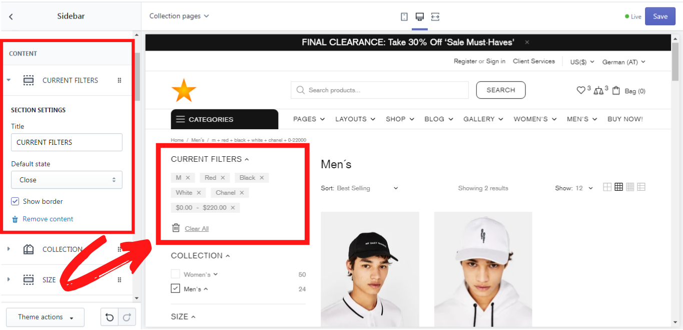
Current filters
This block shows all filters that the customers have selected. You can give this block a title and choose its default state: open or close. If you want this block to be separated from the other ones, enable the option “Show border”.
Parameters
This block enables one to filter the products by their availability. You can give this block a title and choose its default state: open or close. If you want this block to be separated from the other ones, enable the option “Show border”. You can check the default setting 'Show only available' in the Theme settings -> Collection page.
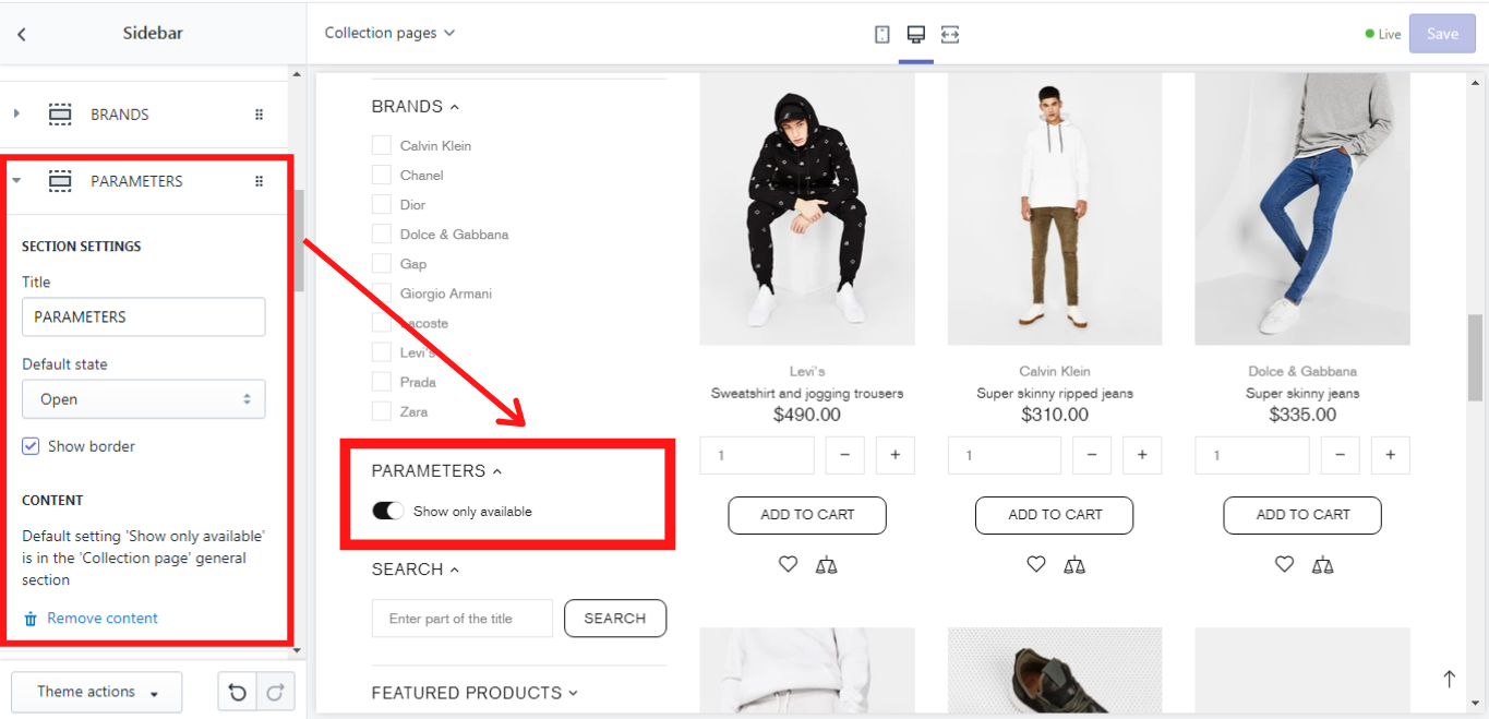
Since version 4.4 you may show the filter logic switcher.
Your visitors may select filter logic mode 'AND' or 'OR'
'AND' - shows products that has all selected attributes. 'Black' AND 'XXL'. Narrow filter results.
'OR' - shows products that has a least one selected attribute. 'Black' OR 'XXL'. Wide filter results.
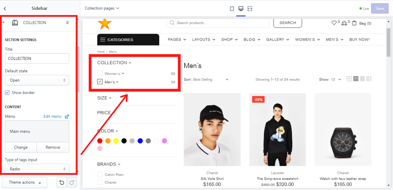
Collections
This block shows all filters that the customers have selected. You can give this block a title and choose its default state: open or close. If you want this block to be separated from the other ones, enable the option “Show border”. In “Menu” you can choose from which menu the collections should be displayed in the sidebar.
Type of tags input
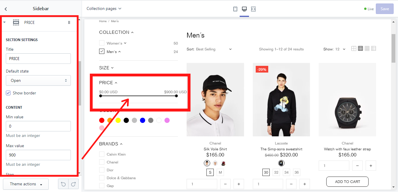
Filter by price
This block shows all filters that the customers have selected.
You can give this block a title and choose its default state: open or close. If you want this block to be separated from the other ones, enable the option “Show border”.
In the “Content” there is a possibility to add a minimum and amaximum value for the price scale filter in the sidebar. One can also add a “Step” for the price filter. Please note that all the values should be an integer.
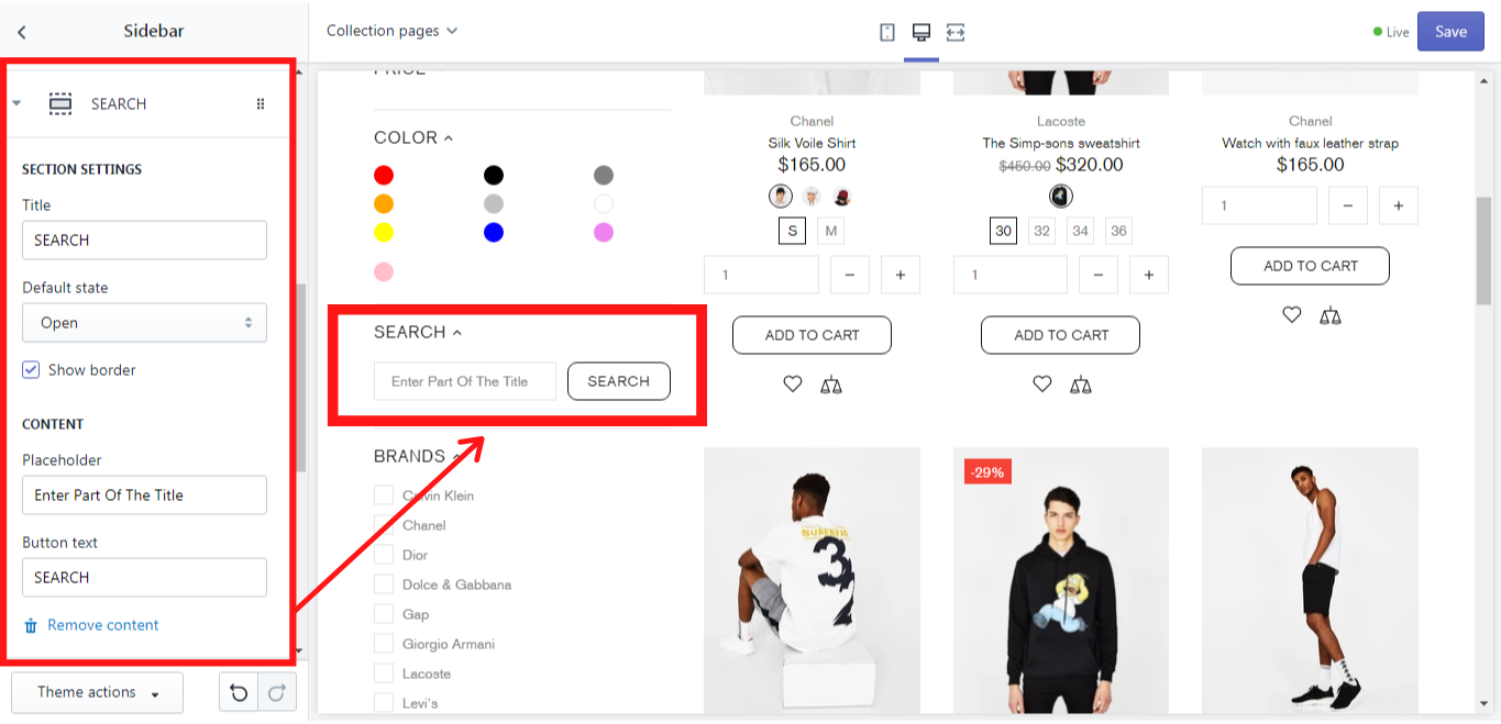
Filter by title
This block enables one to filter the products by their title and description.
SECTION SETTINGS
You can give this block a title and choose its default state: open or close. If you want this block to be separated from the other ones, enable the option “Show border”.
CONTENT
In the “Placeholder” you can write a text that should be displayed. In the “Button text” you can write the text for the button.
In our example, we have used this block for the “Search” with the following settings:
Title:
SEARCH
Placeholder:
Enter Part Of The Title
Button text:
SEARCH
And this is what we have got:
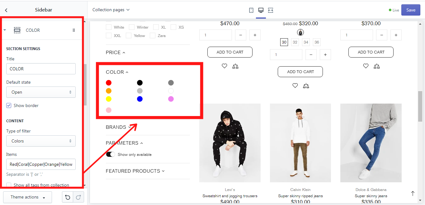
Filters
This block enables one to filter the products by their type which you can choose in the content.
SECTION SETTINGS
You can give this block a title and choose its default state: open or close. If you want this block to be separated from the other ones, enable the option “Show border”.
CONTENT
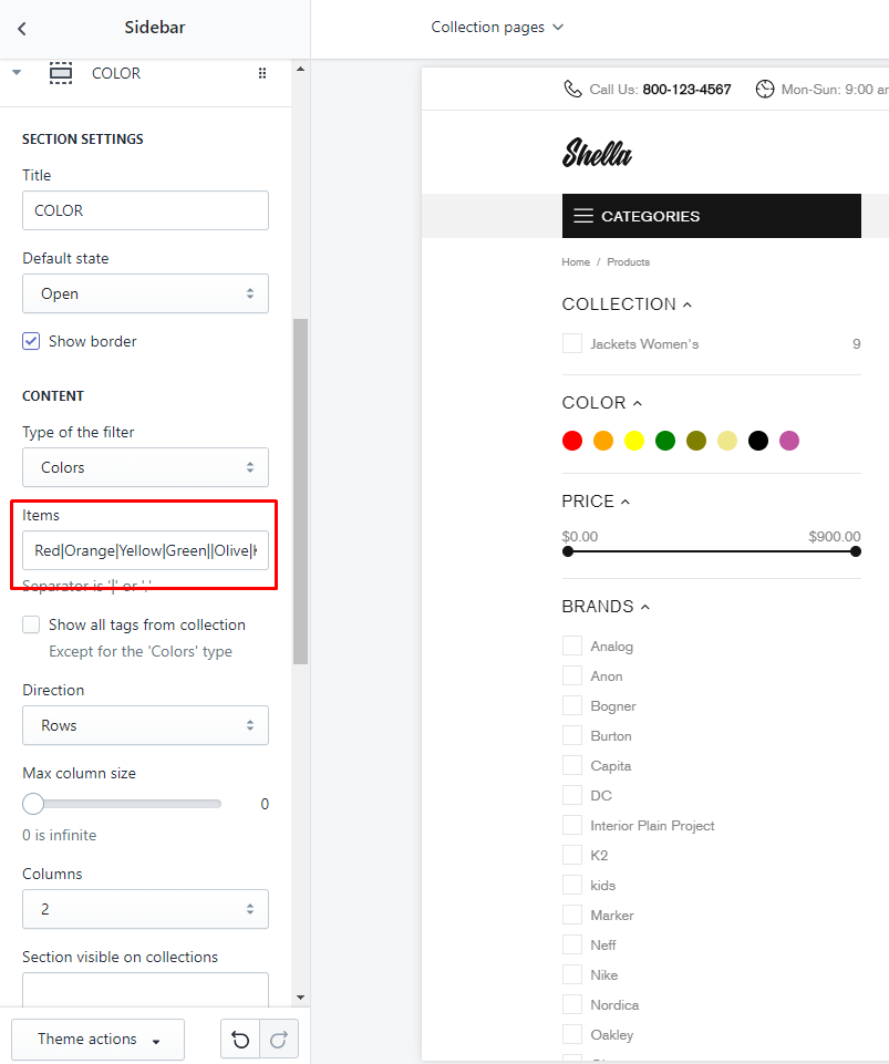
In the “Type of filter” one can choose the filter type: “Tags”, “Colors”, “Vendors”, “Product types”. In the “Items” you can write the items, that should be shown in the filter for the checkmark. The items should be separated by '|' or ','. If you enable the option “Show all tags from the collection” the filter will show all tags added to this collection, except the case when you choose the “Color” type, because for this type only colors will be displayed.
In the “Direction” you can choose how the tags should be displayed: in a row or in columns.
On the “Max column size” scale from 0 to 30, you can choose how many items should be shown in one column, if you choose “Columns” in the “Direction”. In the “Columns” you can choose how many columns should be displayed in the filter block: 1,2 or 3 columns. In the “Section visible on collections” you can write on which collection pages this “Filter” block should be shown. If there are several collections, please use a separator '|'. If you do not write anything in this field this “Filter” block will be displayed on all collections by default.
In our example, we have used this block for the color filter with the following settings:
Title:
COLORS
Type of filter:
Colors
Items:
Red|Coral|Copper|Orange|Yellow|Green|Emerald|Olive|Khaki|Aqua|Black|Silver|Blue|Grey|White|Light blue|Purple|Lilac|Violet|Pink|Plum|SandyBrown|LightPink|LightGreen
Direction:
Columns
Max columns size:
3
Columns:
3
And this is what we have got:
Sidebar filters work with product tags. You should add the corresponding tags.
How to add color options to collection sidebar
-
Go to your Shopify Admin -> Products;
-
Select Product;
-
Add tags to at least one product;
-
Save changes
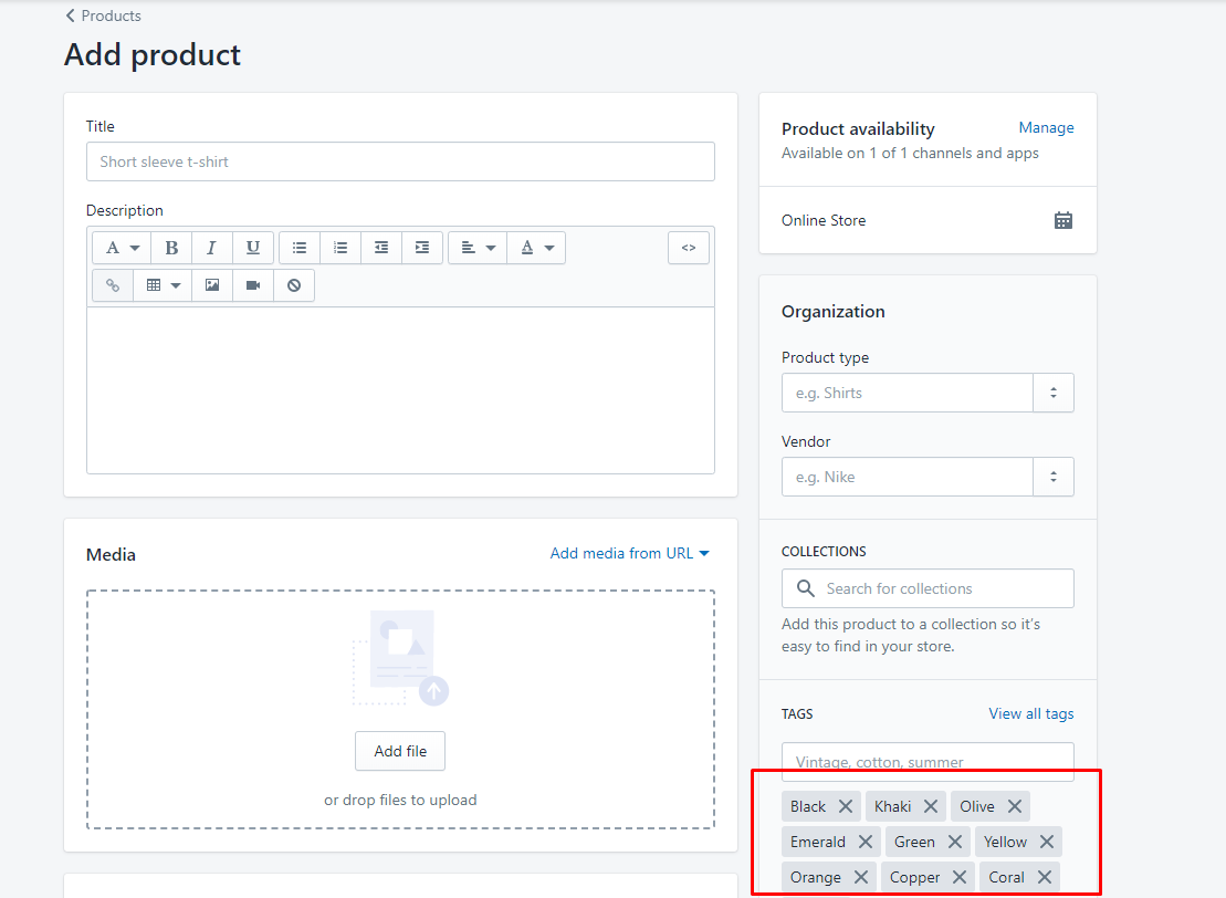
-
In your Shella theme Editor go to Sections -> Sidebar, choose Color section and add the same list of Tags
-
Save changes.
Here is a video manuals on how to add color options
How To Add Variants To Existing Products || Shopify Help Center
Option filters
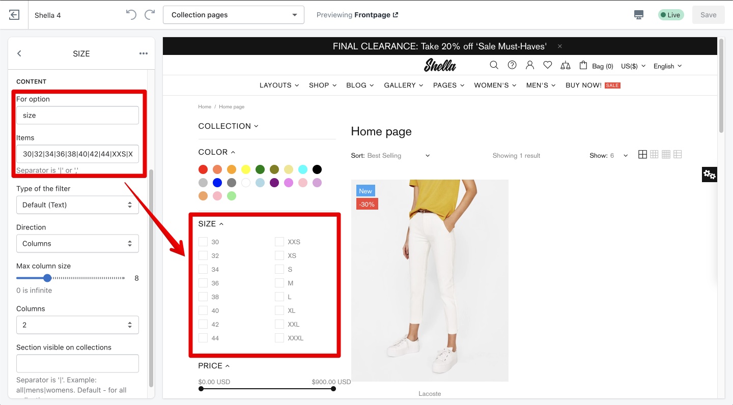
This block enables one to filter the products by their variants. Size, color, etc.
SECTION SETTINGS
You can give this block a title and choose its default state: open or close. If you want this block to be separated from the other ones, enable the option “Show border”.
CONTENT
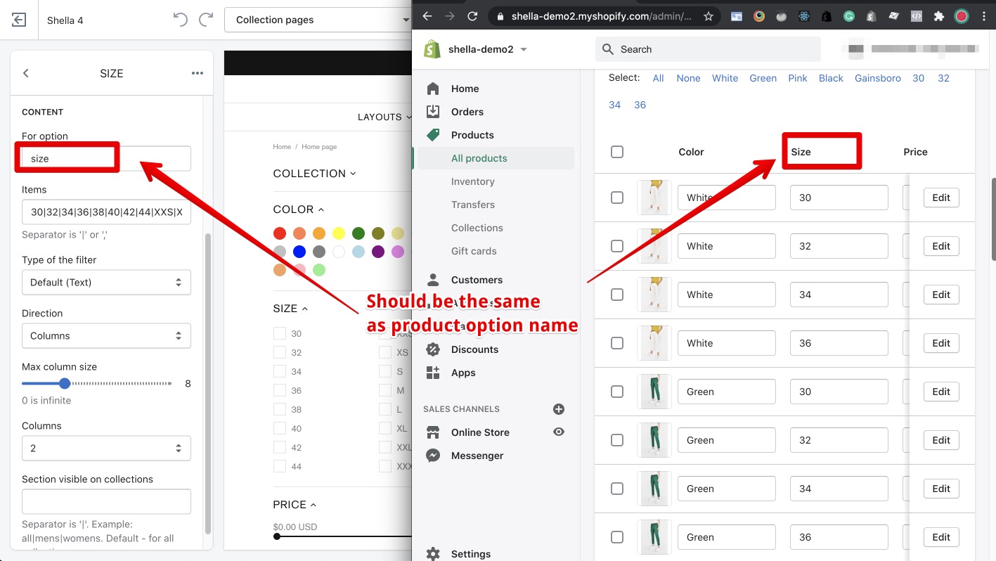
In the “For option” you should put the name of product option. The product option name should be equal to this option. Please, pay attention to each symbol.
In the “Items” you can write the items, that should be shown in the filter for the checkmark. The items should be separated by '|' or ','.
In the "Type of the filter" you may set the design of filter items. If shown as text list with checkboxes, or as color swatches.
In the “Direction” you can choose how the tags should be
displayed: in a row or in columns.
On the “Max column size” scale from 0 to 30, you can choose how many
items should be shown in one column, if you choose “Columns” in the “Direction”.
In the “Columns” you can choose how many columns should be displayed
in the filter block: 1,2 or 3 columns.
In the “Section visible on collections”
you can write on which collection pages this “Filter” block should be shown.
If there are several collections, please use a separator '|'. If you do not write anything
in this field this “Filter” block will be displayed on all collections by default.
In our example, we have used this block for the color filter with the following settings:
Title:
SIZE
For option:
size
Type of the filter
Default (text)
Items:
30|32|34|36|38|40|42|44|XXS|XS|S|M|L|XL|XXL|XXXL
Direction:
Columns
Max columns size:
8
Columns:
2
And this is what we have got:
The 'Option filters' block works based on the product variants.
How to add filter by product variants.
-
Go to your Shopify Admin -> Products;
-
Select Product;
-
Configure the product variants;
-
Save changes
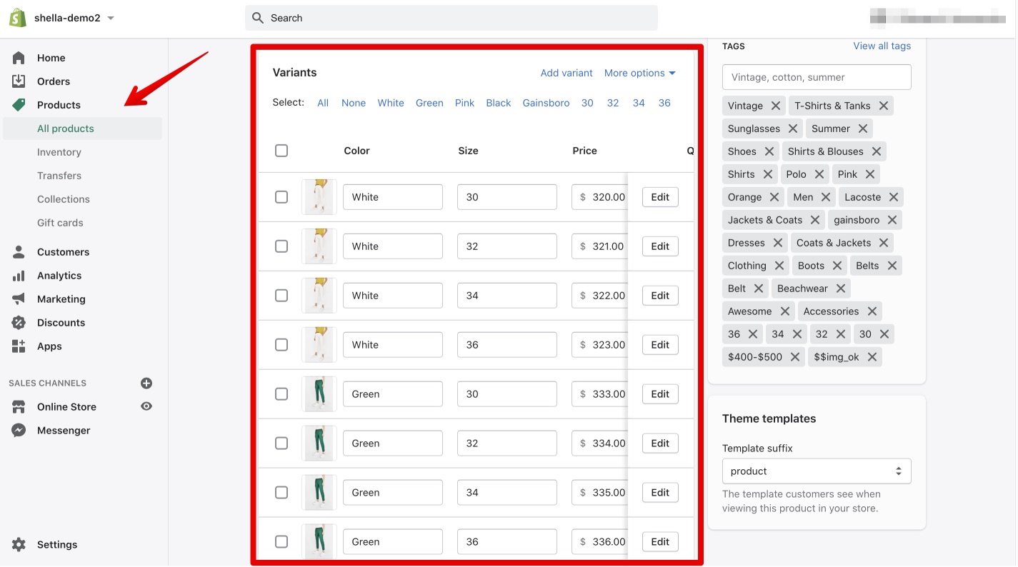
-
In your Shella theme Editor go to Sections -> Sidebar
-
Add 'Option filter' block
-
Configure the 'For option' and 'Items'
-
Save changes.
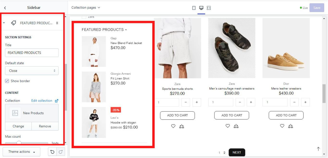
Products
This block allows you to show products from other collections in the sidebar.
SECTION SETTINGS
You can give this block a title and choose its default state: open or close. If you want this block to be separated from the other ones, enable the option “Show border”.
CONTENT
In the “Collection” you can select the collection, which products should be displayed in the sidebar. On the “Max count” scale from 0 to 10 products, one can choose the number of products that should be displayed. If you select “0” the infinite number of products will be displayed. In the “Products type” you can choose which size of the image the products should have: short or full.
This is how it may look like:
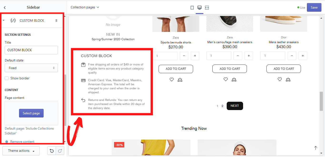
Custom HTML
This block allows you to add a page as a content in the sidebar.
SECTION SETTINGS
You can give this block a title and choose its default state: open or close. If you want this block to be separated from the other ones, enable the option “Show border”.
CONTENT
In the “Page content” you can select the page, that should be displayed in the sidebar. If no page is selected, a default page “Include Collections Sidebar” will be displayed. How to add and edit a page you can read here This is how this block looks like:
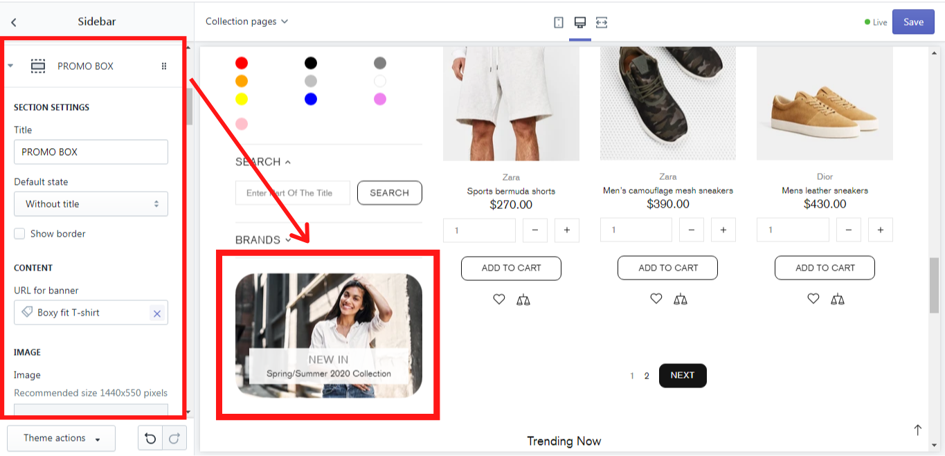
Promo box (Banner)
This block enables you to add a banner to the sidebar.
SECTION SETTINGS
You can give this block a title and choose its default state: open or close. If you want this block to be separated from the other ones, enable the option “Show border”.
CONTENT
In this section you can add a URL for the banner that will redirect your customers to the needed page, when clicking on the banner. Simply click on it and choose the desired page from the dropdown list, or you can paste a link that is not on this list.
IMAGE
In order to make your banner more attractive for the clients, you can add an image for it. The recommended image size for the desktop is 1440 x 550 pixels. The size of the image can be changed on the “Image size” scale from 200 to 2000 pixels. You can also add an image mask and choose the level of its opacity on the “Image mask opacity” scale from 0.1 to 1.0. An image mask is sort of the color cover which can be put over the image in order to give it a particular shade of color if it has some opacity, or to cover it completely with the color if the opacity level is at maximum.
TEXT
Here you customize the text content for your banner in the promo box. There are 3 text lines that can be added. Delete the line value for the text or button if you want to hide the element and use '
' for a line break. Of course the style of the text content can be changed in “Colorized style”, where you can choose one of six possible styles for this purpose.
BUTTON #1 - #2
For each banner in the promo box you can add two buttons, which can be customized. There are three customization options for the buttons: button text, URL for the button, and button style. In the button text you can write the title of the button, e.g.: Shop now, or More. In the URL for the button insert the link to which the client should be redirected when clicking on the button and in the button style you can choose one of the button styles which are offered in the dropdown list.
OTHER CONTENT
LIST
Custom HTML
This option allows you to replace the whole text content in the promo box with the page content. How to add and edit a page you can read here.
VIDEO
If you want to have a video on your Home page, you can add it here in the Promo box. If this is a YouTube or Vimeo link, you can simply insert it in “YouTube or Vimeo video URL”. If the source of the video is different, you can upload it in Shopify Admin-> Settings-> Files and add a link here. Once you have uploaded the video, copy its URL and paste in “Video URL”. You can also decide whether the video should have an autoplay or a control, simply by enabling or disabling such options like “Video autoplay” and “Video controls”
LAYOUT
Here you can choose the type of layout for the text in the promo box. Shella theme offers a lot of types for the layout, simply choose the one, that suits best for your store.
ANIMATION
You can decide whether the image should have an animation when being hovered over with the mouse cursor by choosing the proper option from “Moving image on hover to”. The positioning of the image can also be set in the “Static image position”. Just choose one of the available options from the dropdown list. In the same way you can decide whether or when the banner image in the promo box should have an opacity. In the dropdown list “Image opacity” the options static, hover, static, and hover or none can be chosen for this purpose.
This is how a block “Promo box (Banner)” may look like in the sidebar:
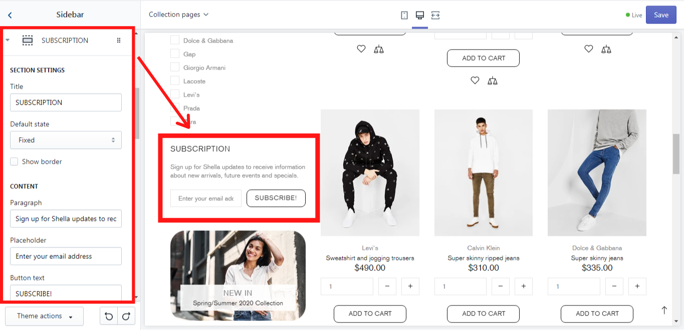
Subscription
This block enables you to add a “Subscription Form” to the sidebar.
SECTION SETTINGS
You can give this block a title and choose its default state: open or close. If you want this block to be separated from the other ones, enable the option “Show border”.
CONTENT
Here you can add the content for this form by writing the needed text in the “Paragraph”. In the “Placeholder” the text may also be added if such need arises. In the “Button text” one can add a text for the button.
This is how this block may look like: