Content
In this section, you can configure the content that should be displayed on the collection page.
SETTINGS
Add option to show 'sort by', 'information', 'products count', 'grid' controls on mobile.
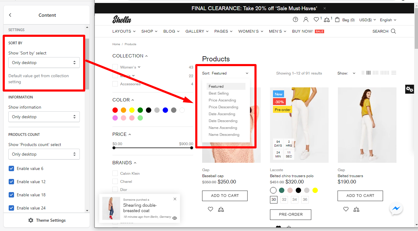
Settings -> Sort By
This block enables you to show “Sort by” option “Only on desktop” or “Desktop and mobile”. Customers will be able to sort products in the collection by featured, best-selling, price ascending, price descending, etc. You may choose an option “Hide” if you do not want to show the “Sort by” option on your store.
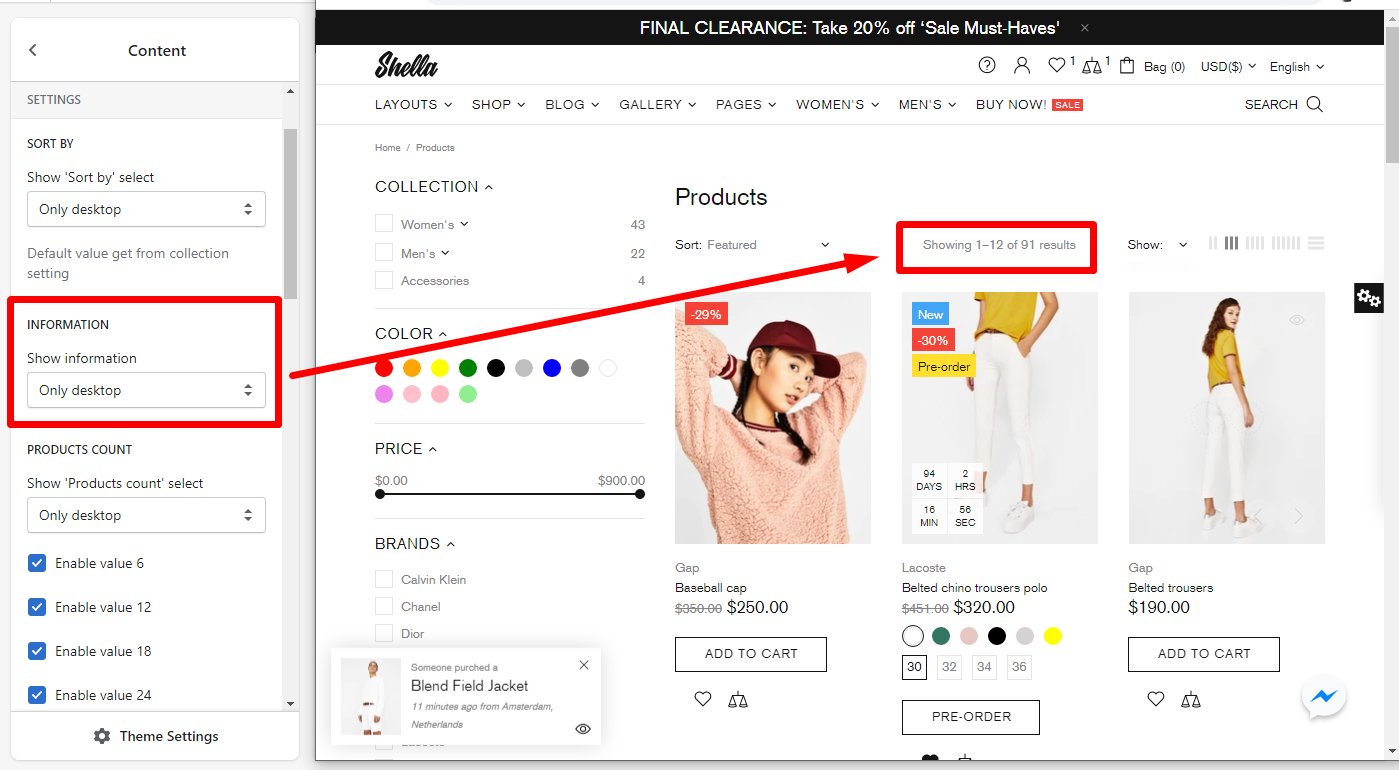
Information
Here you can decide if to display the number of the results “Only on desktop” or “Desktop and mobile”. Or set the option “Hide” to disable showing information on the collection page.
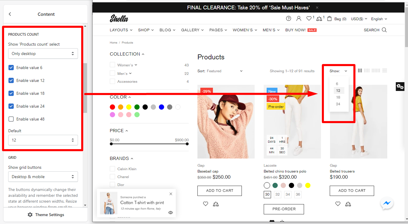
Products count
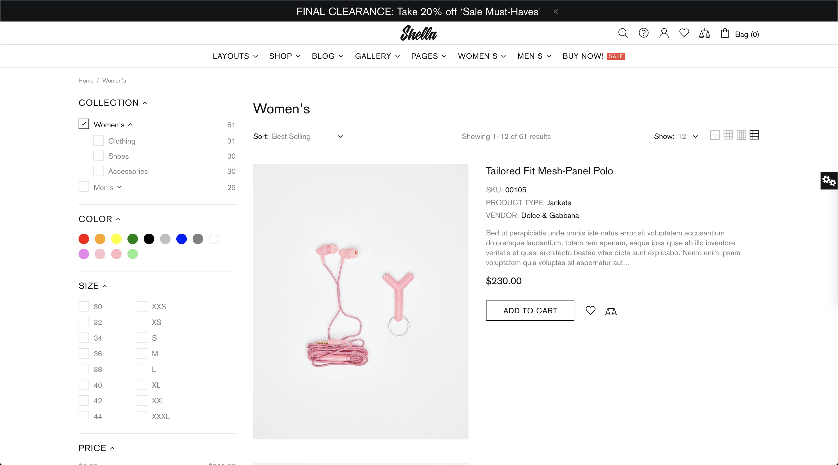
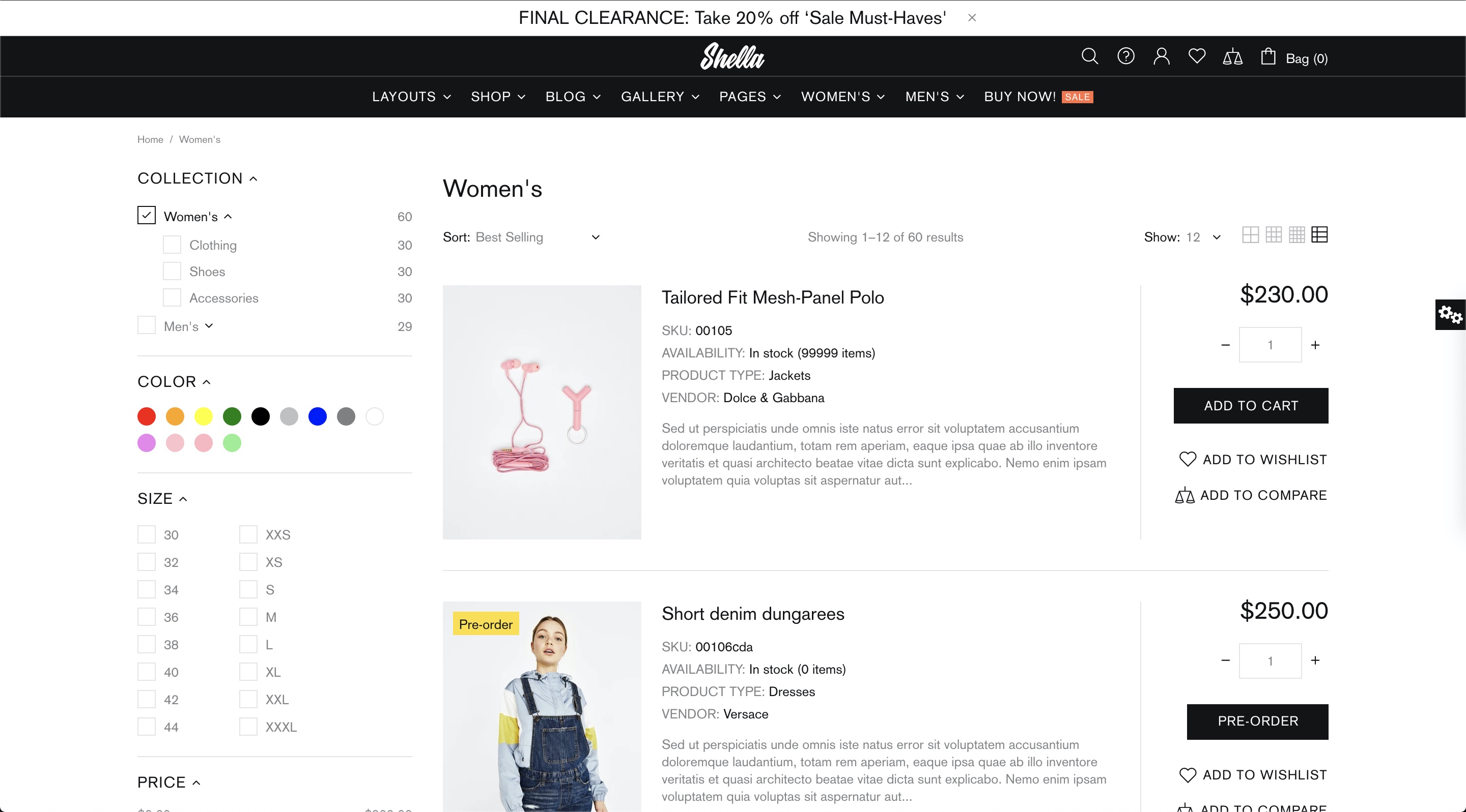
Here you can choose if to show 'Products count' select by enabling an option “Only on desktop” or “Desktop and mobile”. Or choose “Hide” to disable the option. In this block, one can enable the number of products that should be displayed on one page in the collection. The available values are 6, 12, 18, 24, 48. You can also choose the default number of products that should be displayed on one page in the collection, simply choosing the needed number from the dropdown list in the “Default”.
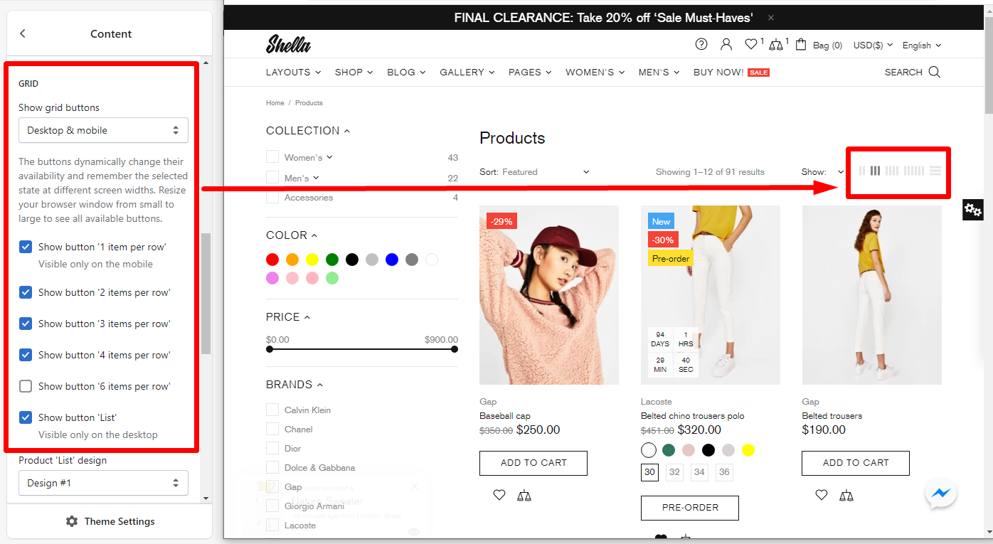
Grid
In this block, you can decide if to "Show grid buttons" on desktop and mobile, or disable an option.
The grid view button options will be shown on the collection page: 2 products per row, 3 products per row, 4 products per row, 6 products per row and list. You can decide whether all of them, some or one should be displayed, simply by enabling the “Show button 1-6 items per row” or “Show button “List”:
Product 'List' design
Enable tooltip
If you enable this option, the tooltips will be displayed on the collection page.
Default products per row (Extra large)
Here you can choose how many products should be displayed on the extra large screen by choosing the proper option from the dropdown list.
Default products per row (Large)
Here you can choose how many products should be displayed on the desktop by choosing the proper option from the dropdown list.
Default products per row (Medium)
Here you can choose how many products should be displayed on the laptop by choosing the proper option from the dropdown list.
Default products per row (Small)
Here you can choose how many products should be displayed on the tablet by choosing the proper option from the dropdown list.
Default view grid (Extra small)
Here you can choose how many products should be displayed on the mobile by choosing the proper option from the dropdown list.
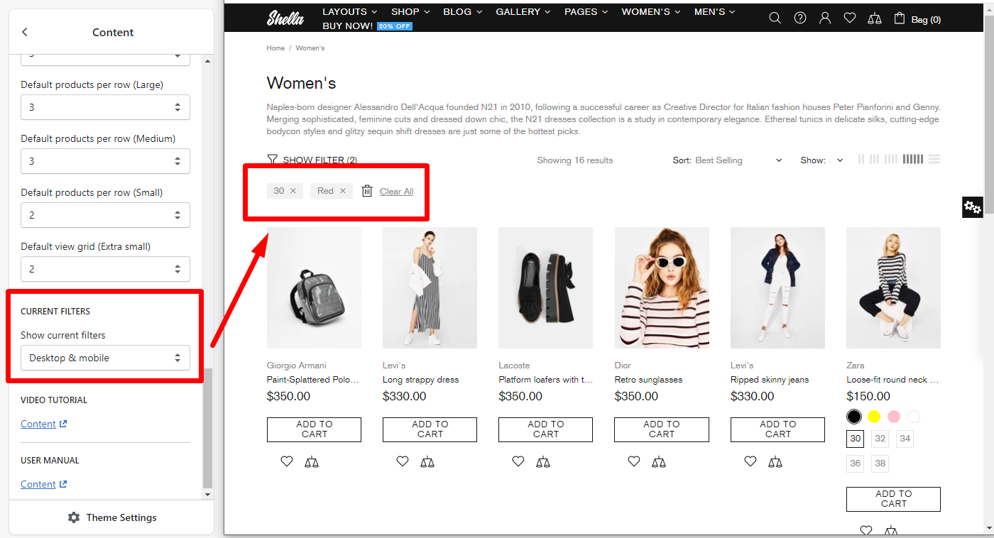
Current filters
In case you need to show selected filters on desktop, mobile or both, you may choose one of the options from the dropdown list: “Only mobile”, “Only desktop” or “Desktop and mobile”. Or disable the option by choosing “Hide”.
CONTENT
Here you can add a Promo Box (Banner) as a content block on the collection page.
Promo box (Banner)
GENERAL
In this section you can select a collection in the “For collection”, for which you want this banner to be created and add a URL for the banner that will redirect your customers to the needed page, when clicking on the banner. Simply click on it and choose the desired page from the dropdown list, or you can paste a link that is not on this list.
IMAGE
In order to make your banner more attractive for the clients, you can add an image for it. You
can add an image both for a desktop and a mobile version, and it can be a different picture,
with different sizes. The recommended image size for the desktop is 1440 x 550 pixels. The size
of the image can be changed on the “Image size” scale from 200 to 2000 pixels.
The recommended image size for the mobile version is 540x550px. The size of the mobile image can
be changed on the “Mobile image size” scale from 200 to 2000 pixels. For the
mobile version you can also set the horizontal position using a “Horizontal position for
mobile image” scale from 0 to 100%, where 50% is a center position, 0% - move to
the left, 100% - move to the right. The settings will be disabled if you choose “Auto image
adaptation height” in Layouts ->Height, which will come further in the promo box settings.
You can also add an image mask and choose the level of its opacity on the
“Image mask opacity” scale from 0.1 to 1.0. An image mask is sort of the color
cover which can be put over the image in order to give it a particular shade of color if it has
some opacity, or to cover it completely with the color if the opacity level is at maximum.
TEXT
Here you can customize the text content for your banner in the promo box. There are 3 text lines
that can be added. Delete the line value for the text or button if you want to hide the element
and use '
' for a line break. Of course the style of the text content can be changed in
“Colorized style”, where you can choose one of six possible styles for this
purpose.
BUTTON #1 - #2
For each banner in the promo box you can add two buttons, which can be customized. There are three customization options for the buttons: button text, URL for the button, and button style. In the button text you can write the title of the button, e.g.: Shop now, or More. In the URL for the button insert the link to which the client should be redirected when clicking on the button and in the button style you can choose one of the button styles which are offered in the dropdown list.
OTHER CONTENT
LIST
Custom HTML
This option allows you to replace the whole text content in the promo box with the page content. How to add and edit a page you can read here
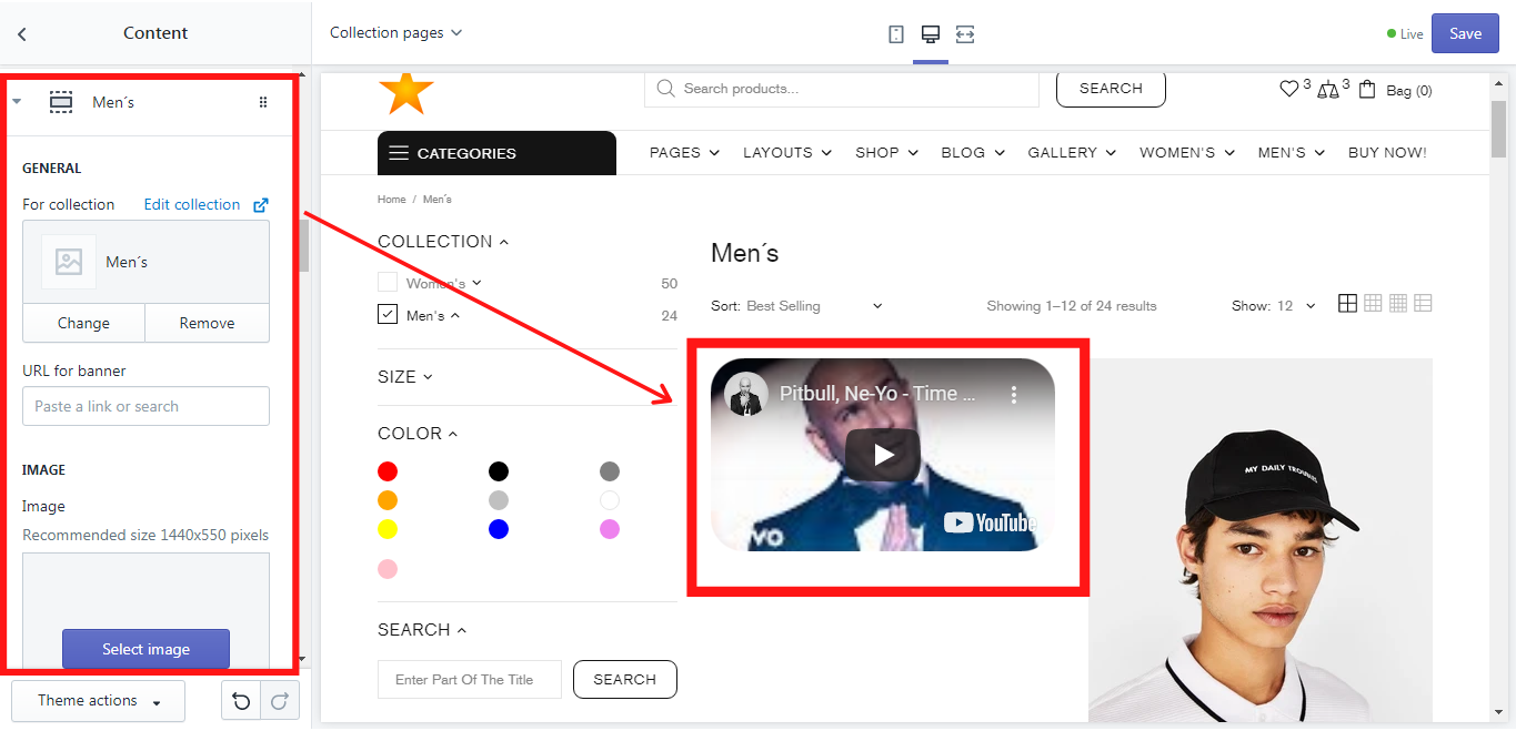
VIDEO
If you want to have a video on your Home page, you can add it here in the Promo box. If this is a YouTube or Vimeo link, you can simply insert it in “YouTube or Vimeo video URL”. If the source of the video is different, you can upload it in Shopify Admin-> Settings-> Files and add a link here. Once you have uploaded the video, copy its URL and paste in “Video URL”. You can also decide whether the video should have an autoplay or a control, simply by enabling or disabling such options like “Video autoplay” and “Video controls”.
LAYOUT
Here you can choose the type of layout for the text in the promo box. Shella theme offers a lot of types for the layout, simply choose the one, that suits best for your store. Additionally, you can choose the proper content position on the desktop. In the section “Layouts” one can also decide for which version the promo box content should be visible: mobile and desktop, only mobile or only desktop.
ANIMATION
In this section you can work on the animation, position, and opacity of the image in the banner of your promo box. the option “Image parallax” is available here. You can choose the suitable parallax type for you or disable it. Please note, that if the block height is not in the automatic adaptation mode, then the strength of the parallax effect will be adjusted to the selected height. If the height is too large for the image, the parallax effect may be minimal or not manifested at all. You can decide whether the image should have an animation when being hovered over with the mouse cursor by choosing the proper option from “Moving image on hover to”. The positioning of the image can also be set in the “Static image position”. Just choose one of the available options from the dropdown list. In the same way you can decide whether or when the banner image in the promo box should have an opacity. In the dropdown list “Image opacity” the options static, hover, static, and hover or none can be chosen for this purpose. You can select the needed animation option for the text from the dropdown list in “Text animation”. This option is available for the Layout type #1 (Text over the image) only.
EXAMPLE
In our example, we have added a video as a Promo Box for the collection page: