Colors
In this section, you can change colors at everything on your store page
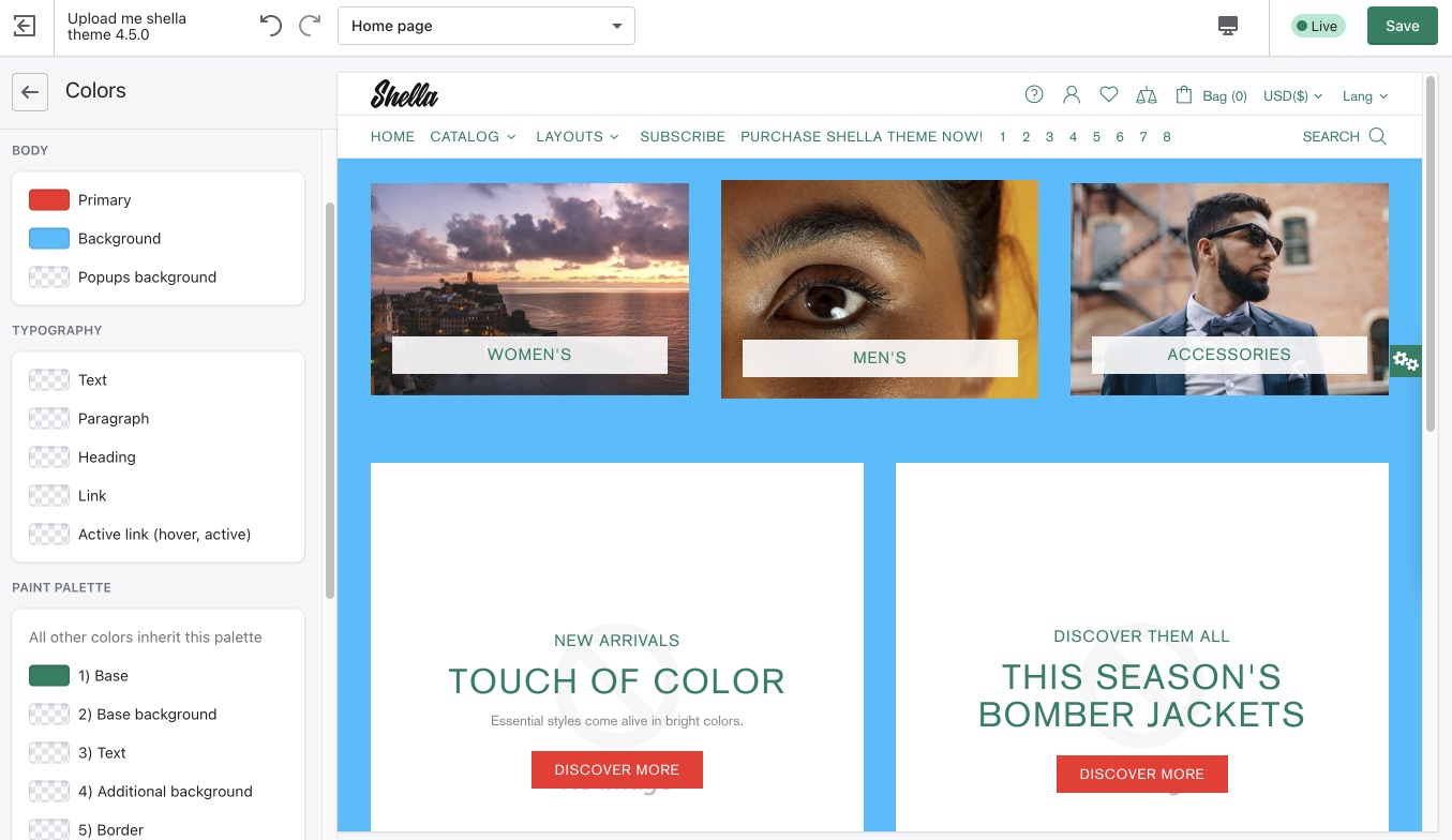
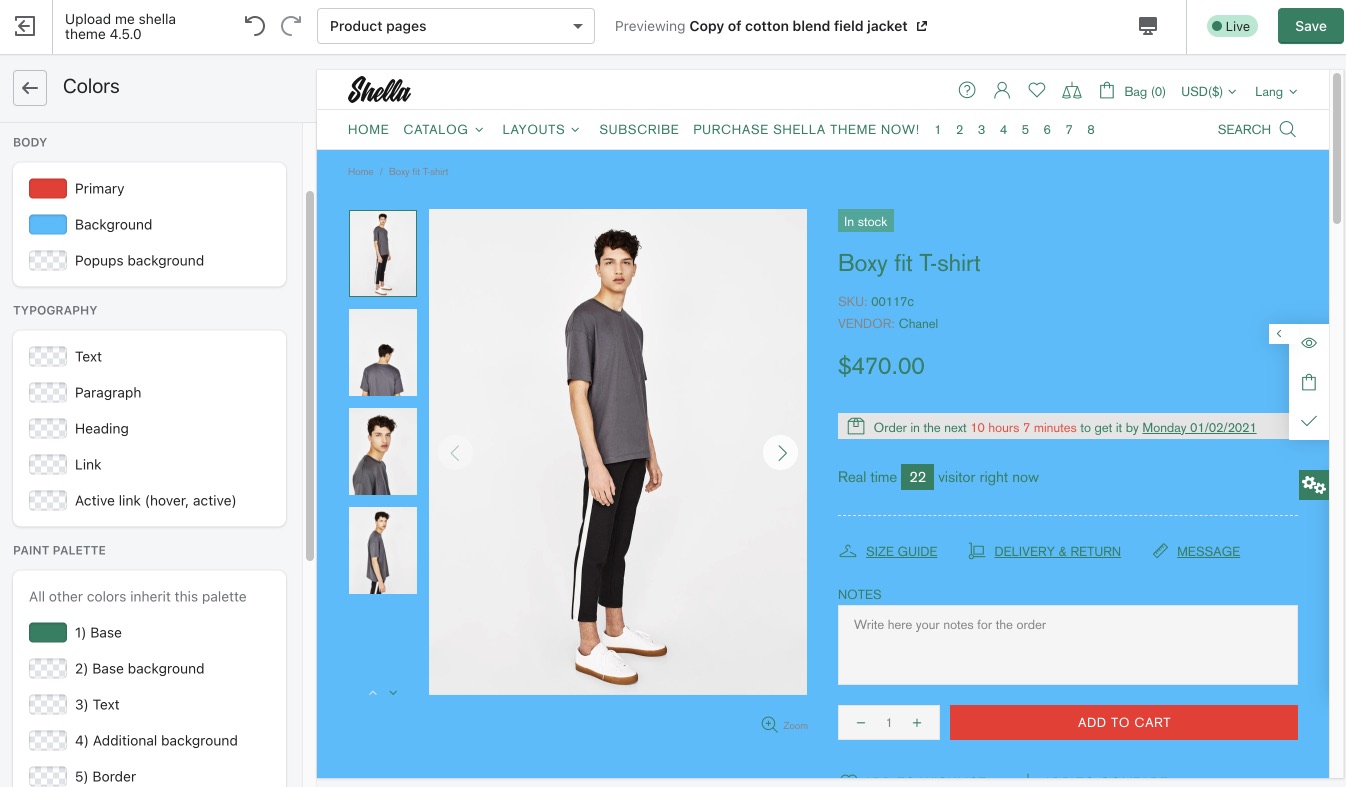
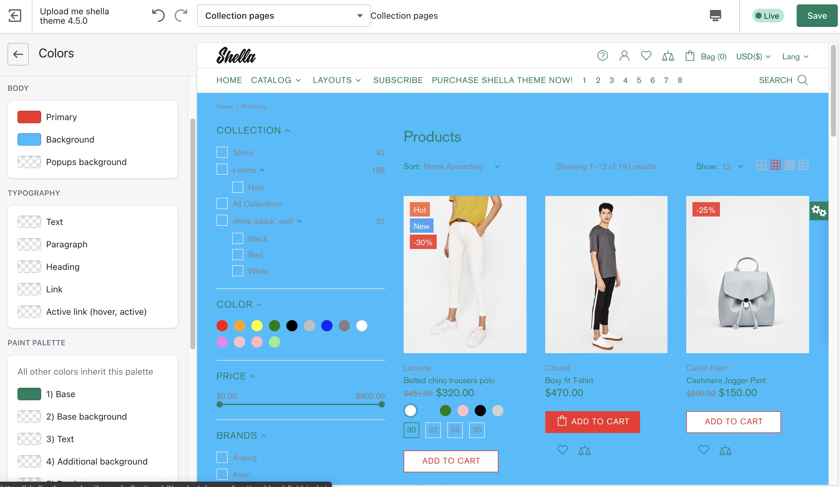
Global
Primary & Background for page body
Home page
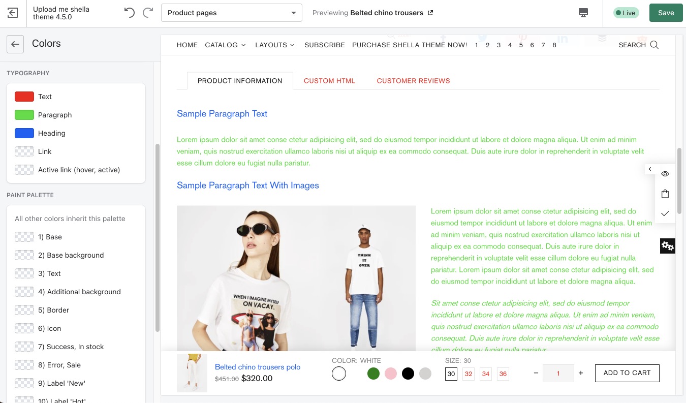
Product page
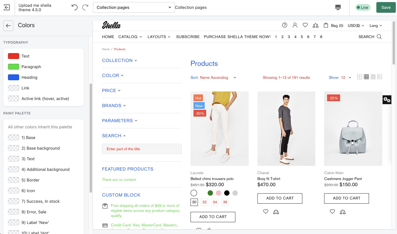
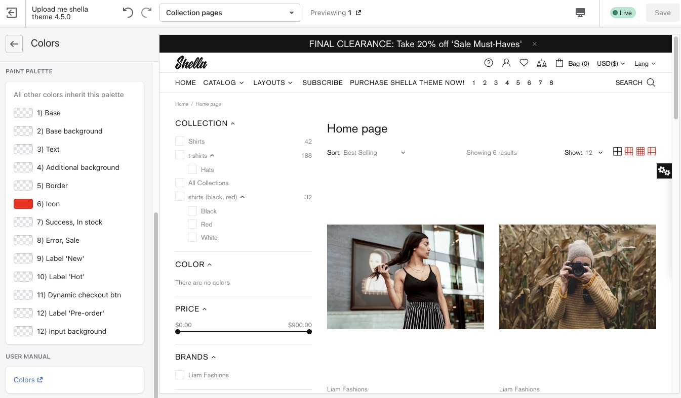
Collection page
Text & Heading
Text (red) - for placeholder, drop-down inputs, info messages, etc
Headings (blue) - for block headings
Collection page
Product description
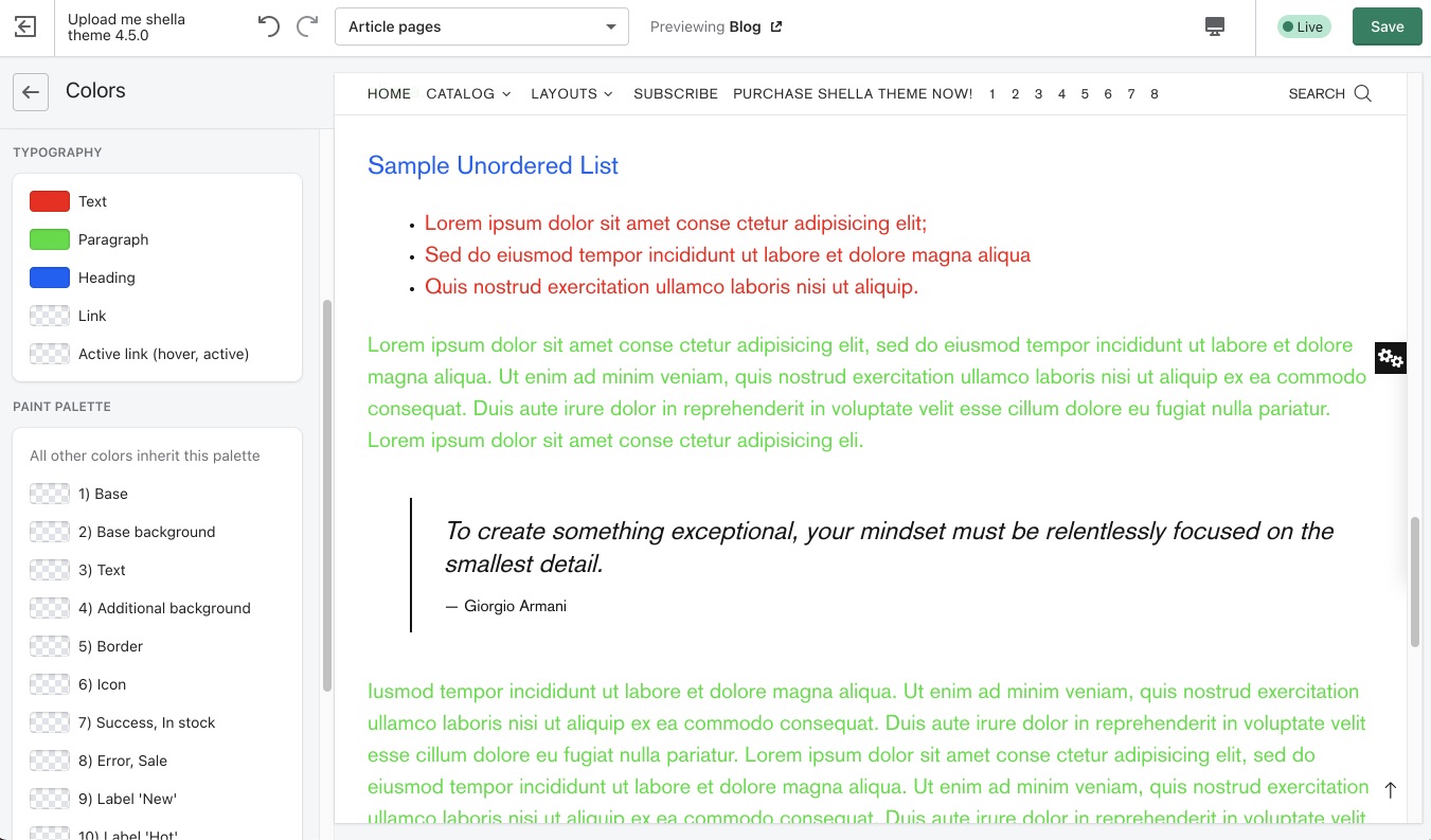
Blog post
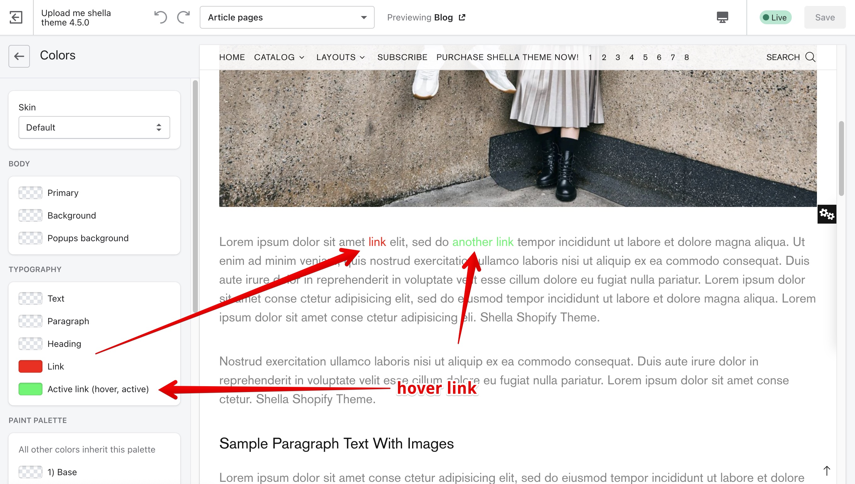
Link & Active link
Popup background
BUTTONS
Here you may configure the colors for buttons
Default button
Here you may configure background, border and text colors. For default and hover (active) button states.
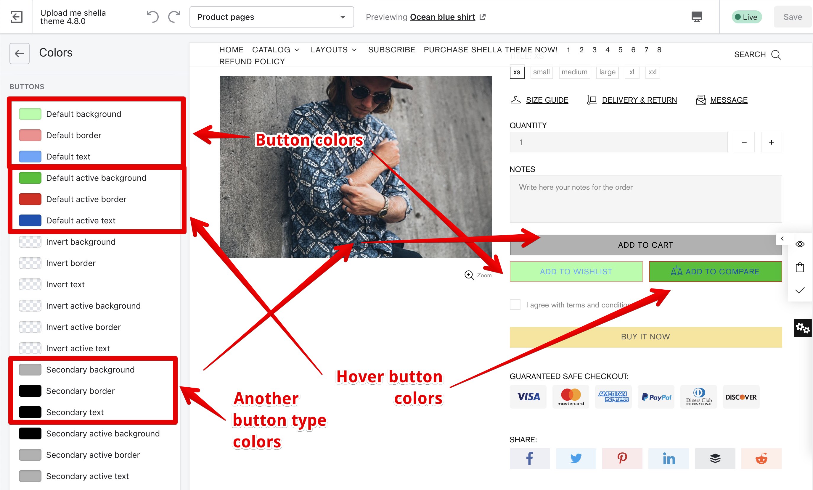
The button type depends of selected skin. Here are examples of default buttons
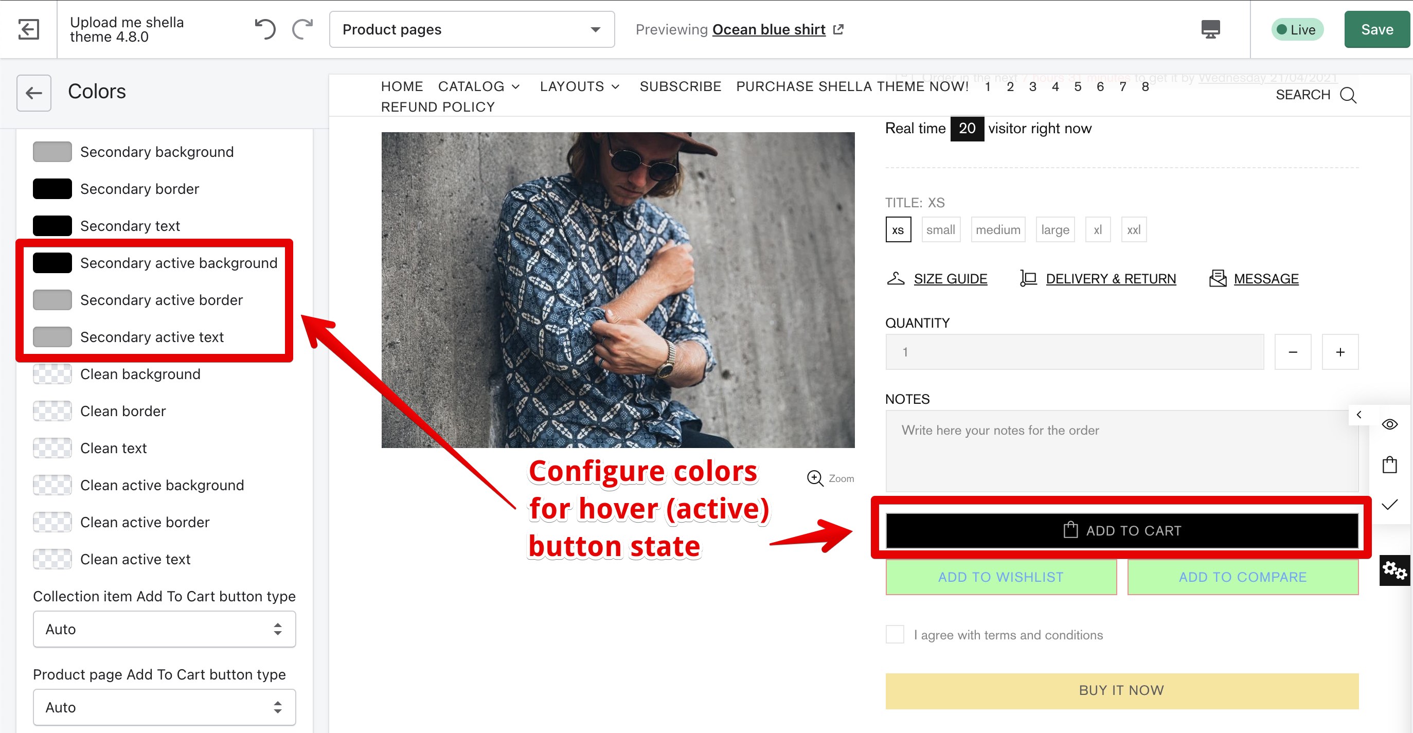
Secondary button
You may configure the colors for second button type. For default button state (like on previous image) and hover button state.
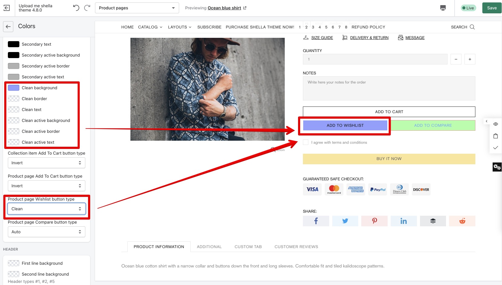
Clean, invert buttons
Clean and invert are another type of buttons, you may configure colors in the same way as for default & secondary buttons
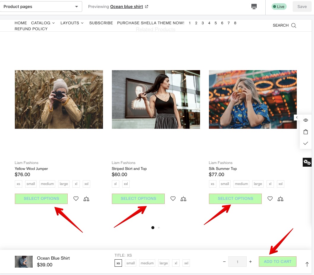
Configure button type
You may change the button type for:
- Add to cart button @ collection page
- Add to cart button @ product page
- Wishlisht button @ product page
- Compare button @ product page
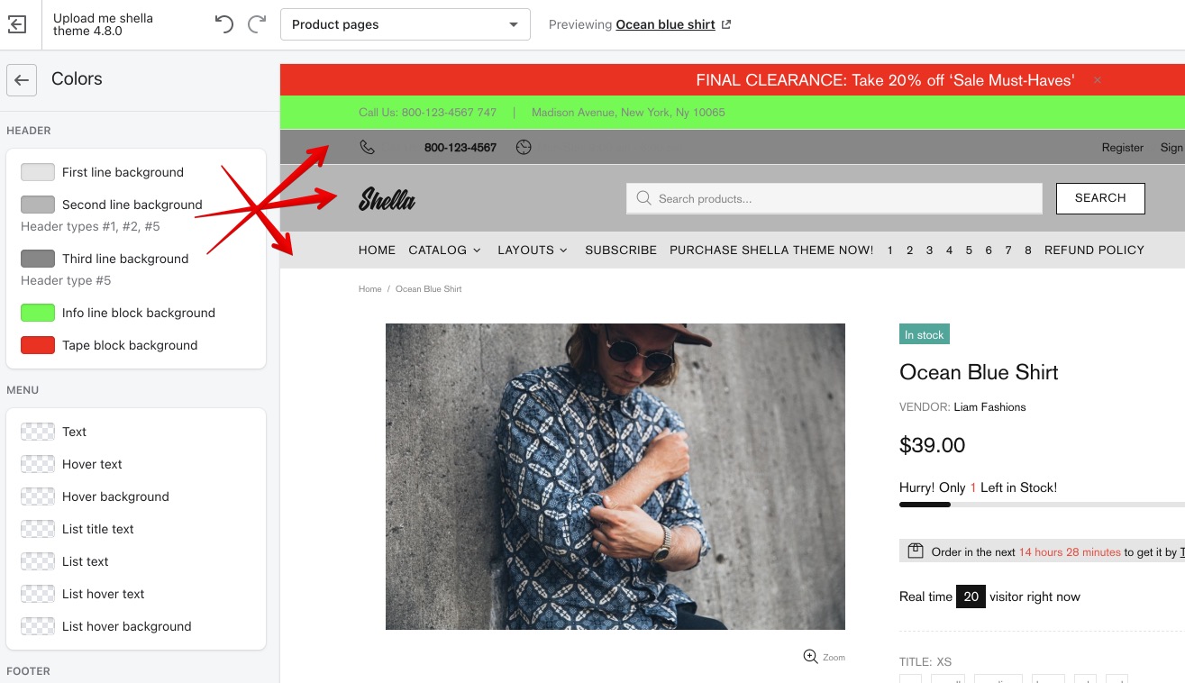
Header
Here you may configure the header backgrounds. The header line number depends on the header type. Please check the example for header type #5
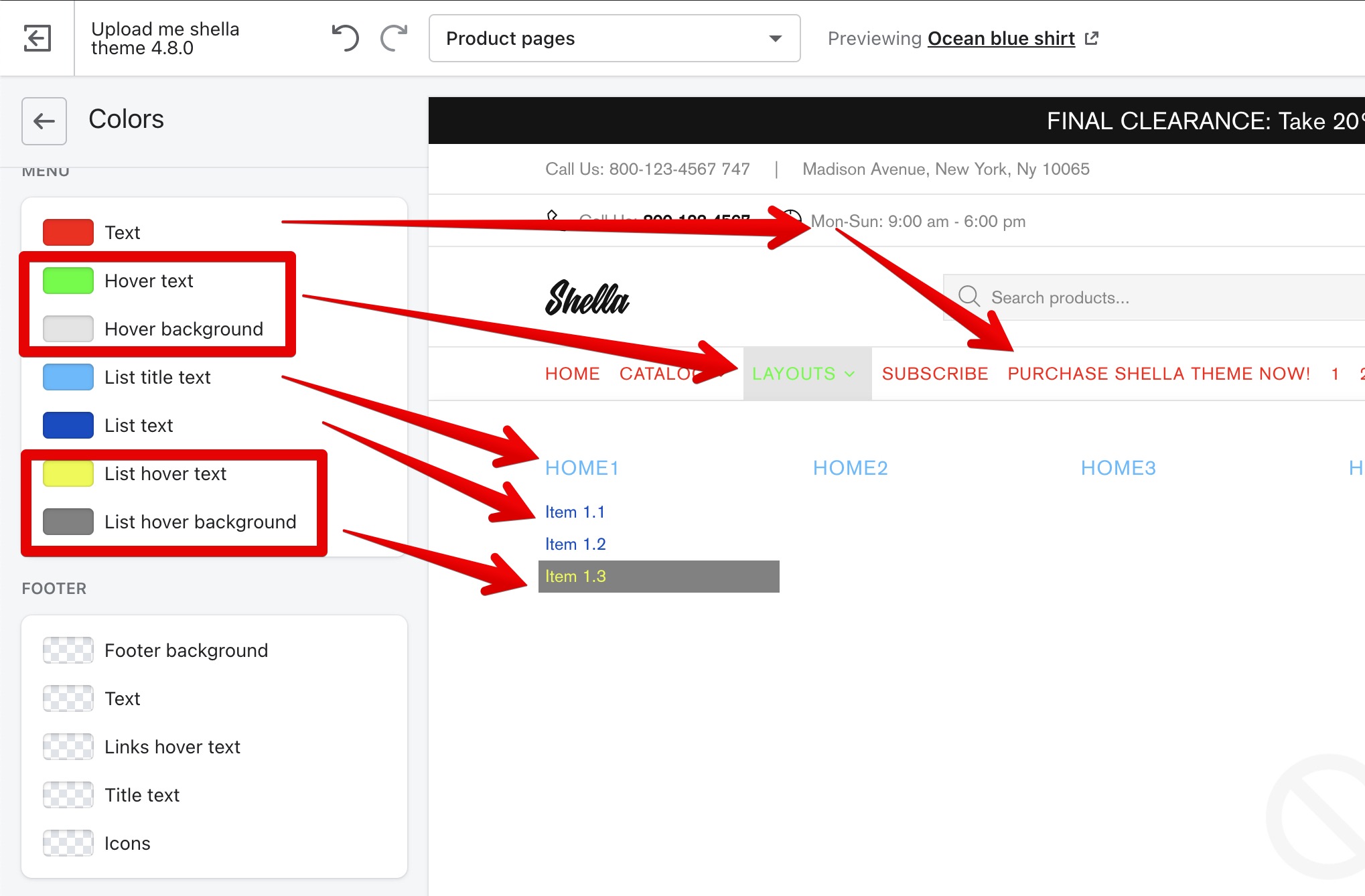
Menu
Here you may configure the menu colors
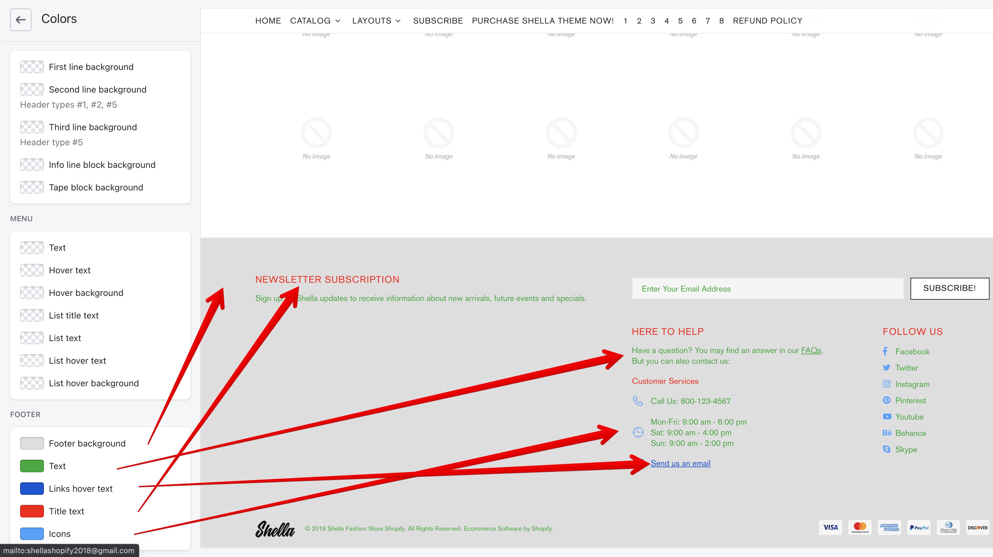
Footer
Here you may configure the footer colors
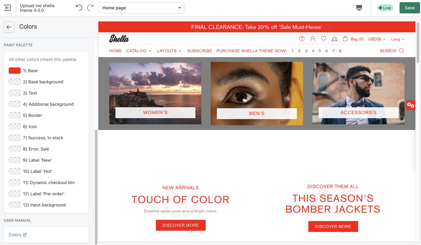
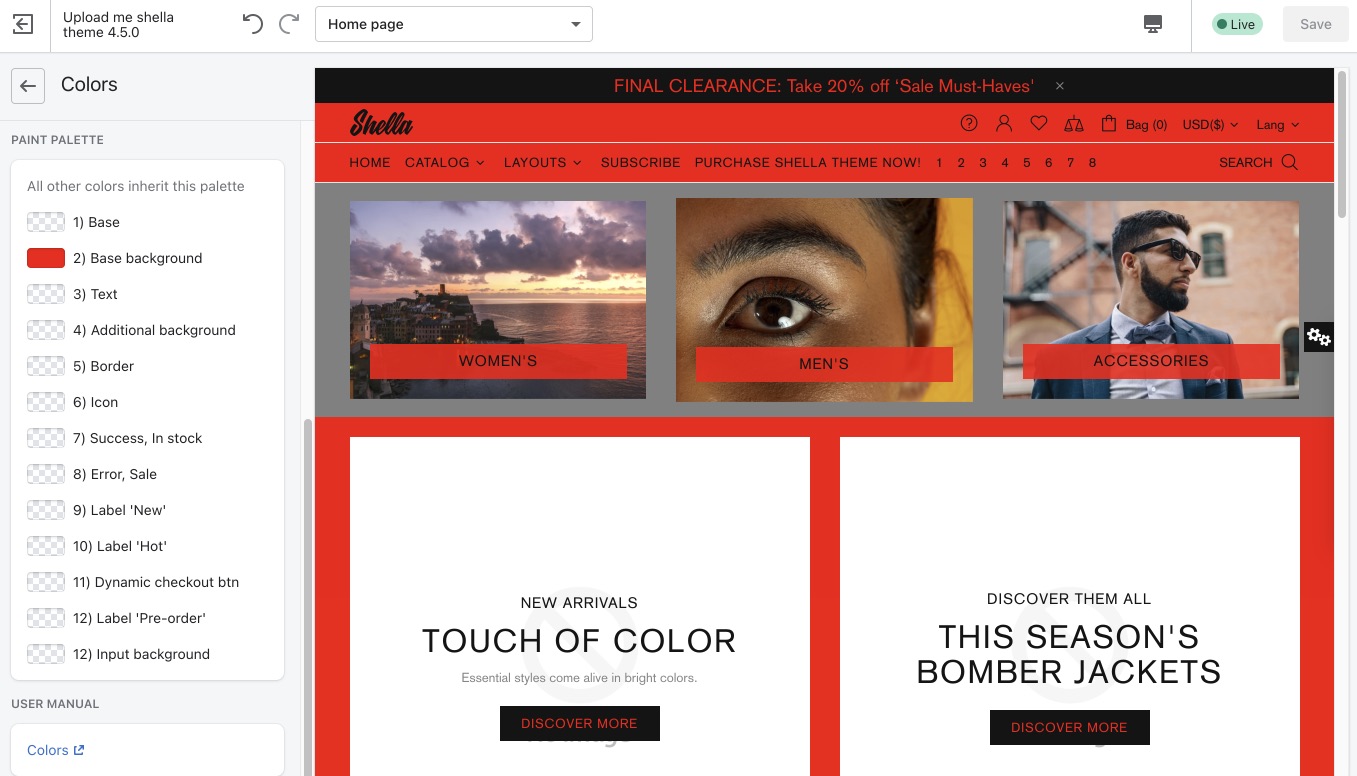
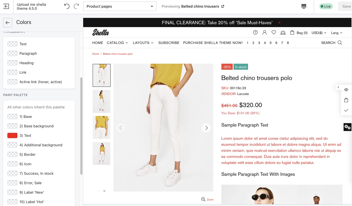
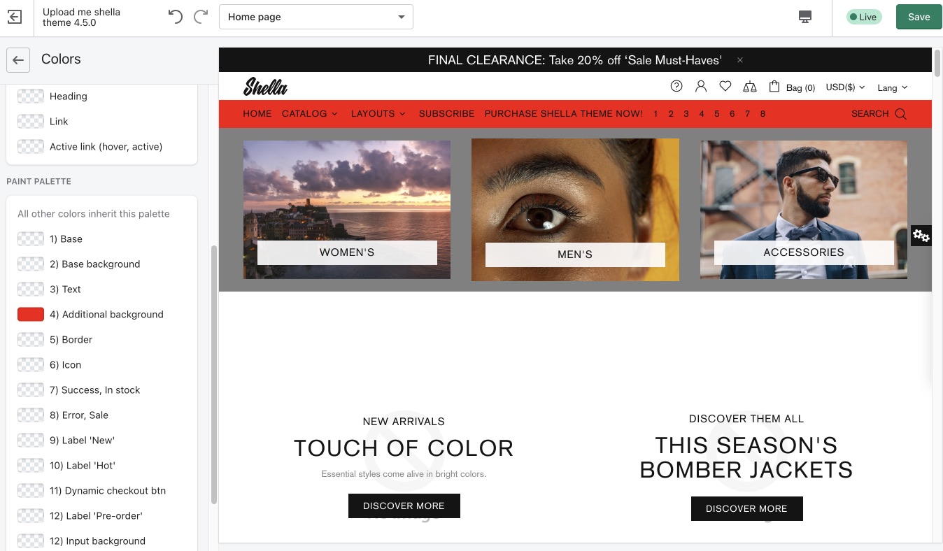
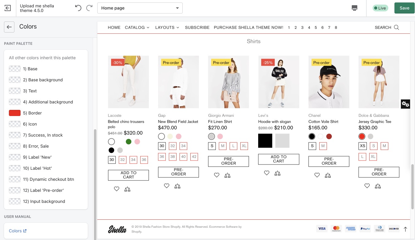
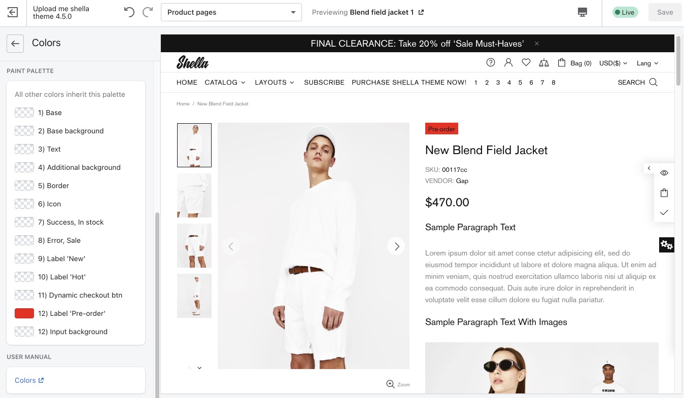
Paint Palette
Here you can change the colors for the base, base background, text, additional background, borders, icons, diverse labels, such as success or “In stock”, error or “Sale”, “New”, “Hot”, and for the dynamic checkout button.
Base
Base background
Text
Additional background
This option applies for headers with two backgrounds
Border
Icon
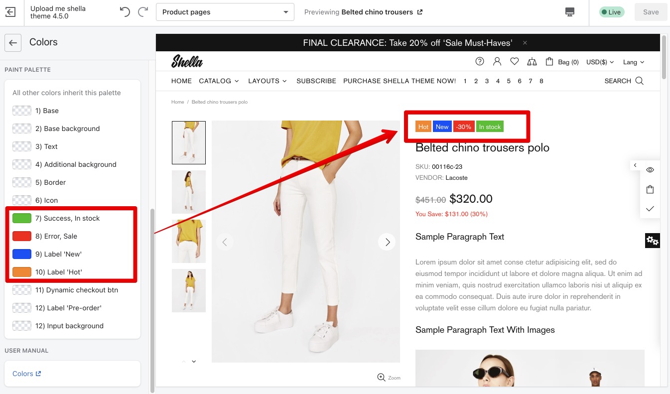
Success, In stock & Error, Sale, & Label 'New' & Label 'Hot'
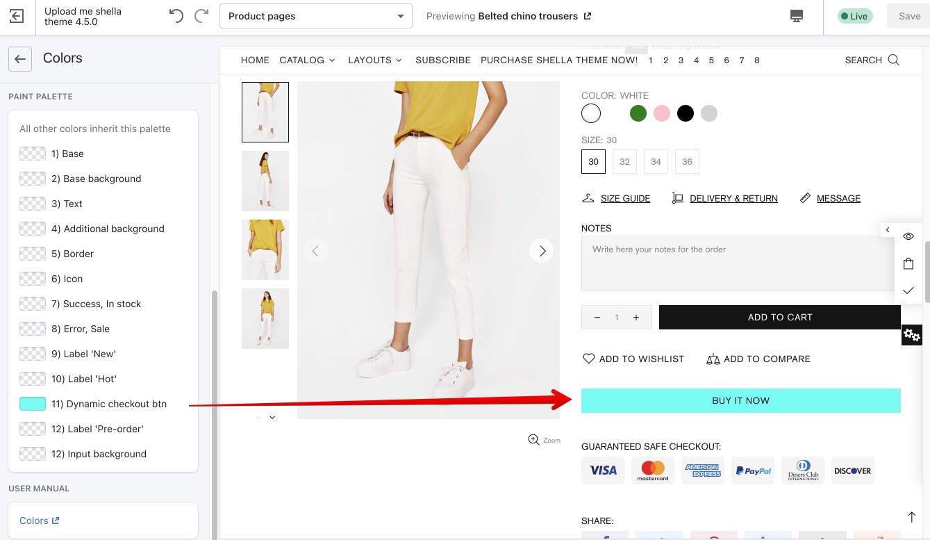
Dynamic checkout btn
Label 'Pre-order'
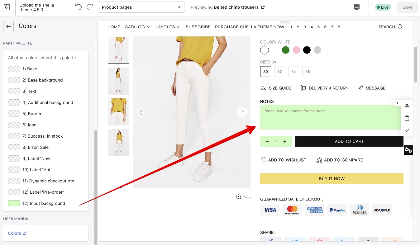
Input background