Product Page & Quick View
This section includes settings to configure the product info page and the quick view popup.
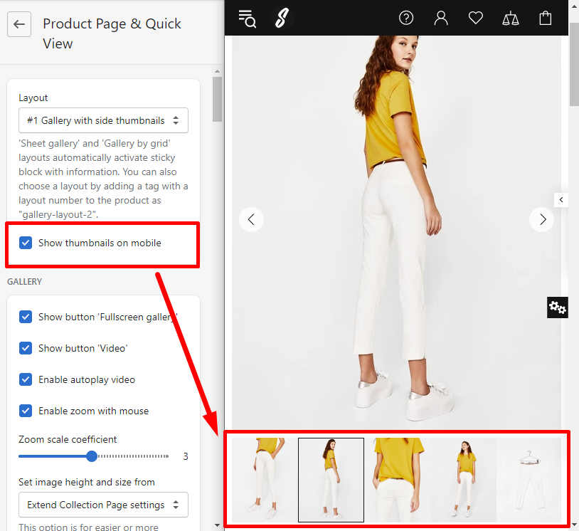
Layout
Here you can choose a layout that suits best for your product info page and a quick view popup. The theme includes five layouts:
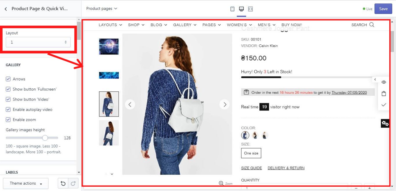
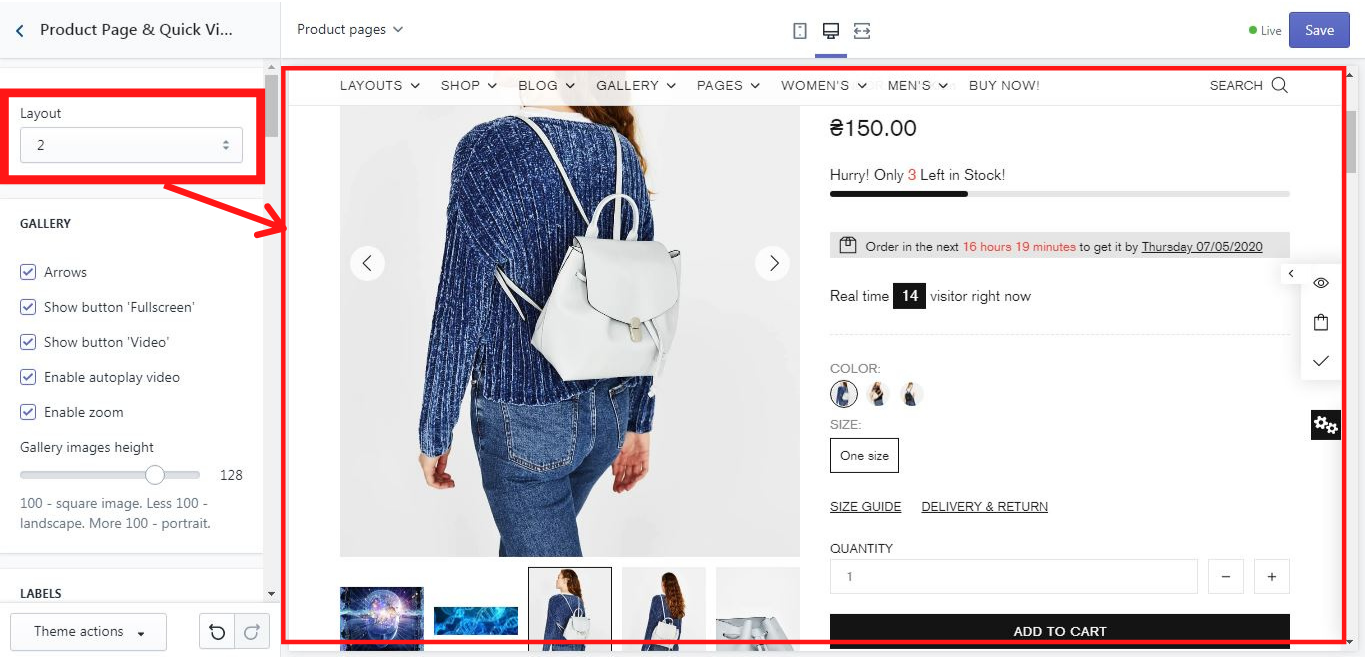
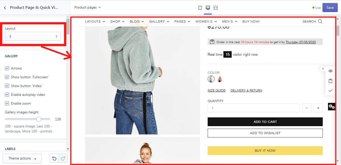
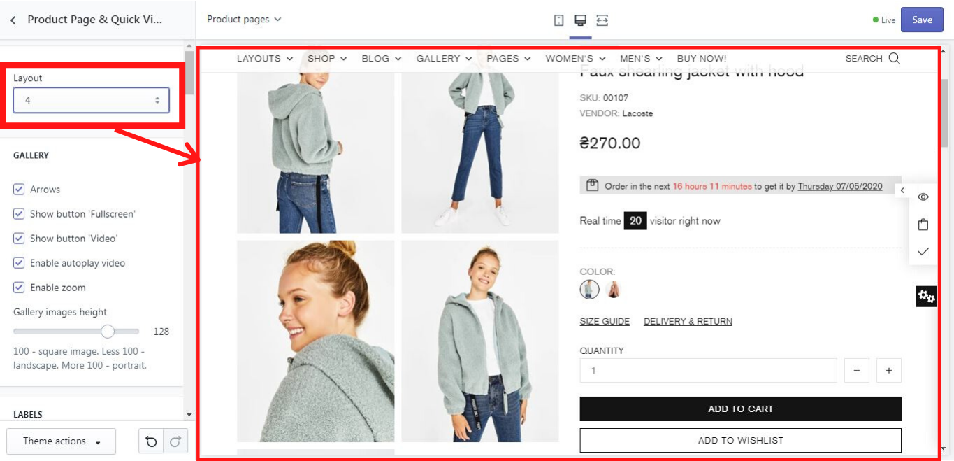
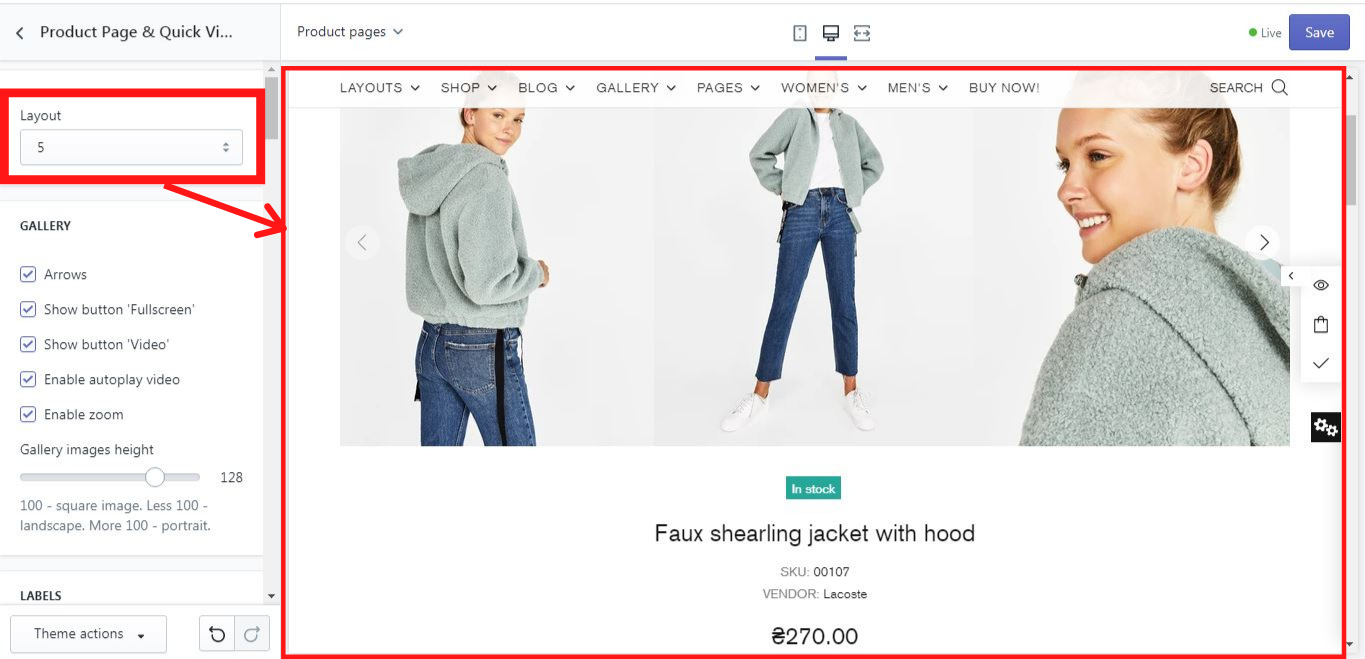
The layout option applies to all products at your store.
You may have different product page layouts per product. Add gallery-layout-1 tag to the product, where 1 is the number of layout from 1 to 5.
Example: Add the gallery-layout-3 tag to product to enable layout #3 for this product
Show thumbnails on mobile
If you enable this option, the gallery images will be shown on mobile view
Gallery
Here you can configure the product’s gallery.
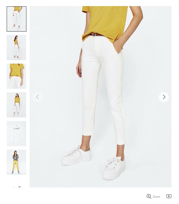
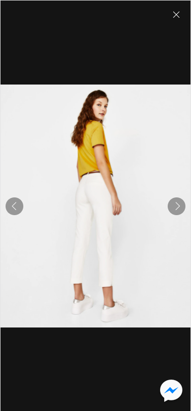
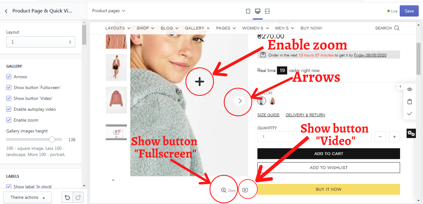
Enable Fullscreen gallery popup
If you enable this option, the product images popup will be shown both on desktop and mobile view.
Show button 'Fullscreen gallery'
If you enable this option, the zoom button under the main image will be shown. The button activates a full-screen popup.
Please note, the button will be activated only with the enabled option “Enable fullscreen gallery popup”
Show button 'Video'
If you enable this option, the “Video” button under the main image will be shown.
This button navigates to the first product video. The visitor may navigate to the video media using arrows or thumbnails.
Enable autoplay video
If you enable this option, the product video will be played automatically. Disable this option, if you need to play video on click.
Enable zoom
This option enables zoom inside the main image container. The zoom will be activated by the mouse hover on the main image.
Zoom scale coefficient
This option enables you to determine zoom ratio inside the main image container. Use the scale to change the parameters from 1.1 to 5.
Set image height and size from “Extend Collection Page settings” if you want to leave parameters applied at Theme settings -> Product -> Collection Page -> Image. Or choose “Set this section settings” to customize images on product pages regardless of the collection page settings.
Gallery images height
Here you can set the proportion for the image container. Please note, the product image should have the same proportion as the image container. If they have a different proportion, you will see a white space on the left/right or top/bottom.
The default value is - 128
100 to show square image container
50 to show the 'landscape' proportion
150 to show the 'portrait' proportion
Image resize
Here you have 5 image resize options:
- Auto - if you choose this option, ignore the previous option of the image height (in % of the width). The image container and the image size are generated based on source image dimensions.
- Contain - CSS object-fit = contain. If you choose this option, the image will look like: object-fit demo.
- Cover - CSS object-fit = cover. If you choose this option, the image will look like: object-fit demo.
- Stretch by width - in this option, the image width fits the container width. It is centered vertically. If the image height is more than the container, cut the image from the top and the bottom. If the image height is less than the container, add white space at the top and the bottom of the image.
- Stretch by height - in this option, the image height fits the container height. The image is centered horizontally.
Image resize on mobile
Here you can decide if to resize product images automatically, by choosing an option "Auto".
Enable an option "Use settings like on desktop", if you want to apply this section settings for mobile view.
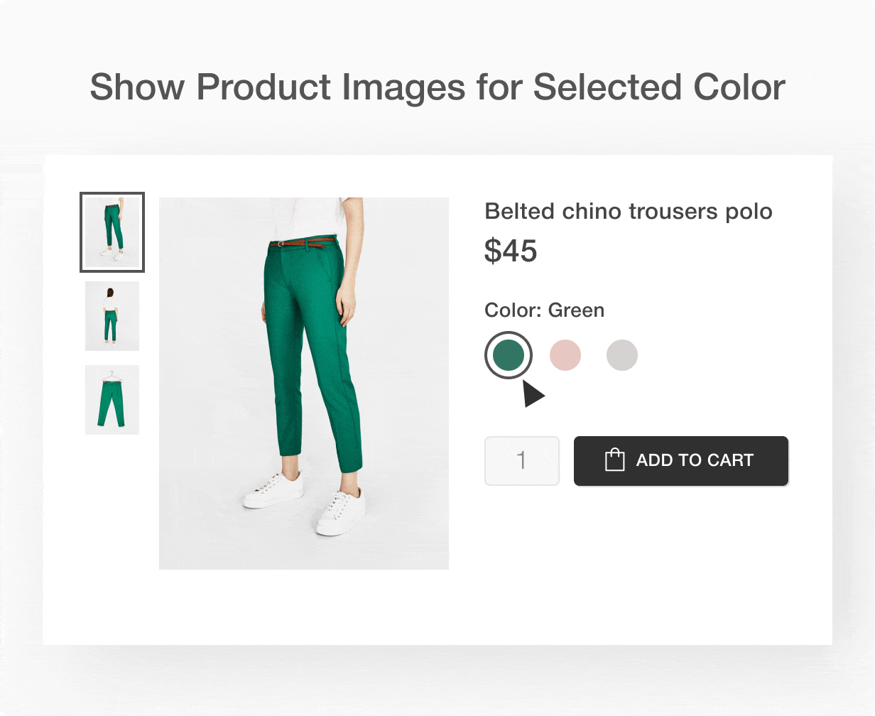
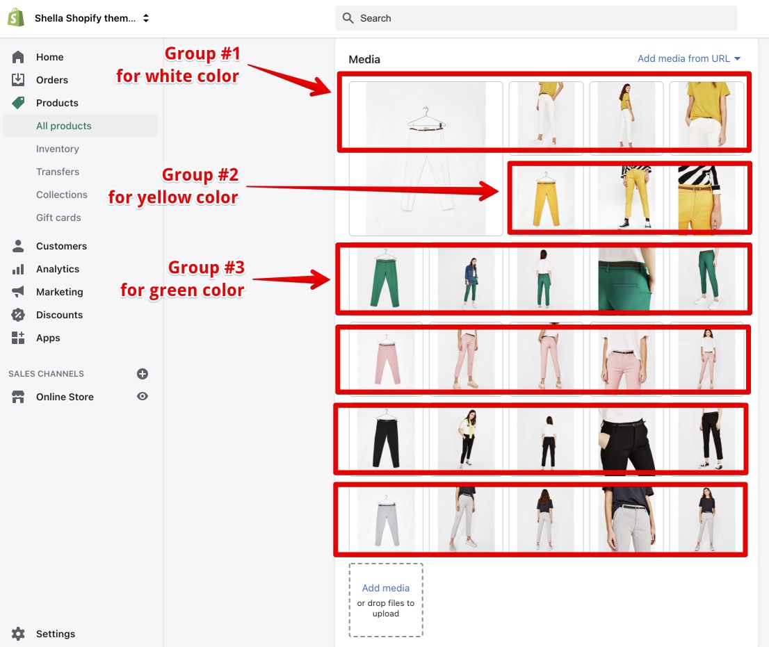
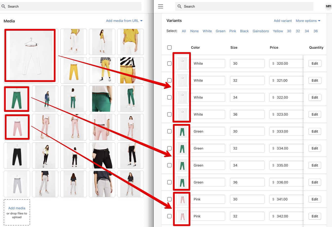
Group gallery by options
View Demo
Disable - don't group images
Enable - group product image for all products at your store
Activate with tag 'group-gallery' - group product images only for tagged products. Add the group-gallery tag to products you need to group product images.
Group product feature requires the product media configuration.
-
group product images at Shopify Admin -> Product.
-
configure first image of the group to product variants
Check the following video tutorial for the example, how to group product images.
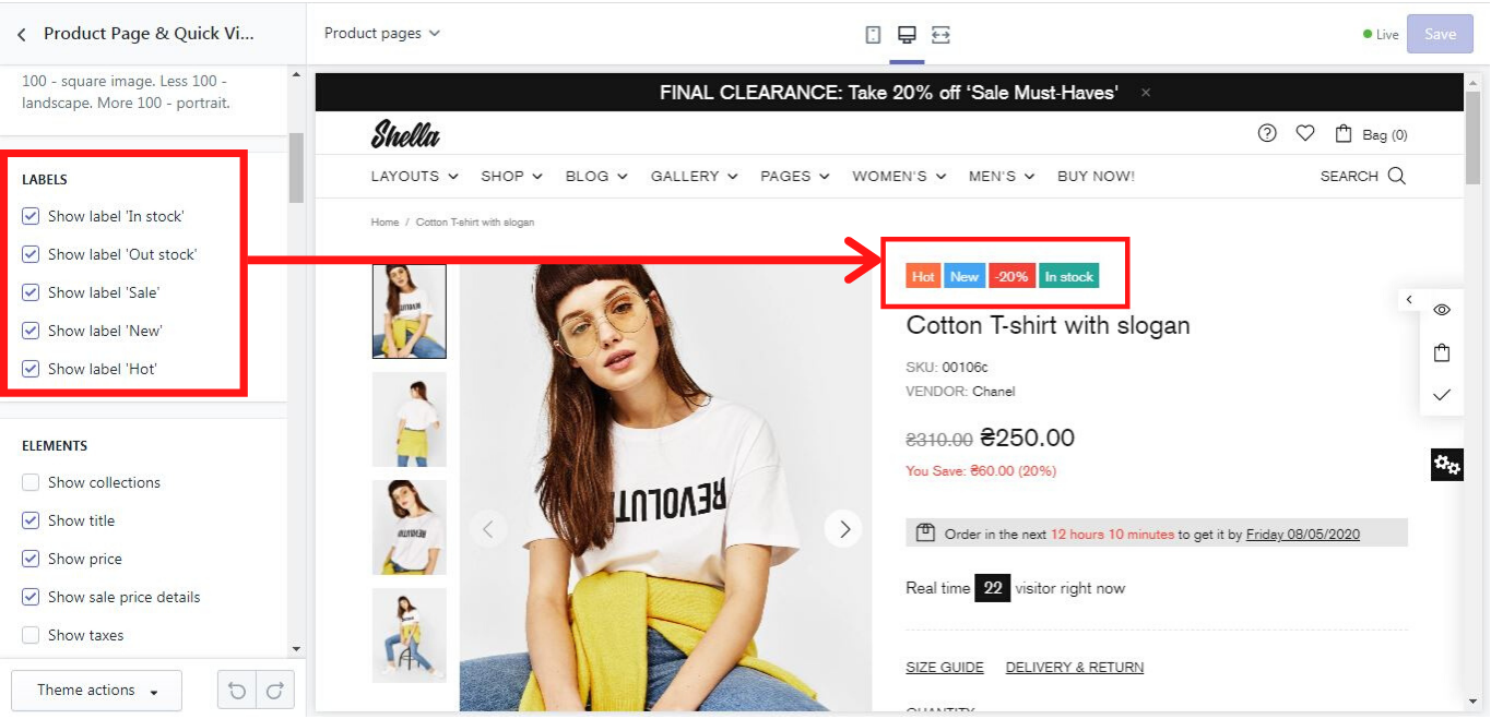
Labels
Here you can configure the product labels.
You may disable labels for all store products.
Two conditions are required to show the product label:
- Enable labels at theme settings.
- Configure the product.
Show label 'In stock'
If you enable this option, the “In stock” label will be shown for products with enabled inventory tracking and quantity bigger than zero.
Show label 'Pre order'
If you enable this option, the "Pre order" label will be shown for products with enabled inventory tracking and zero quantity.
Show label 'Out of stock'
If you enable this option, the “Out of stock” label will be shown for products with enabled inventory tracking and zero quantity.
Show label 'Sale'
If you enable this option, the “Sale” label will be shown for products with configured "compare at" price.
Show label 'New'
If you enable this option, the “New” label will be shown for products with metafield labels.new = true
The metafield format:
Namespace = labels
Key = new
Value type = string
Value = true
Check this help page for more details about the product meta fields
Show label ''Hot''
If you enable this option, the “Hot” label will be shown for products with metafield labels.hot = true
The metafield format:
Namespace = labels
Key = hot
Value type = string
Value = true
Check this help page for more details about the product meta fields
Tips
Please note, no capital letters are allowed in the metafield format!
More information about how to create a metafield you can find in our video tutorial: 20 Metafields. Product tabs, labels, countdown, video and size guide at Shella Shopify theme
Elements
Here you can configure the elements for the product info page & the quick view popup.
You may show or hide any element:
Show collections
If you enable this option, the product's collections will be shown.
Show title
If you enable this option, the product’s title will be shown.
Place for product description
Select the location of product description.
Description tab (or accordion) is good choise for long description.
Product information section is good choise for short description to show it just after the product price and before add to cart button.
Show price
If you enable this option, the product’s price will be shown.
Show sale price details
If you enable this option, the "compare at" price will be shown.
Show taxes
If you enable this option, the tax text will be shown.
Show SKU
If you enable this option, the product’s SKU will be shown.
Show barcode
If you enable this option, the product’s barcode will be shown.
Show availability
If you enable this option, the product’s stock status will be shown.
Show type
If you enable this option, the product’s type will be shown.
Show vendor
If you enable this option, the product’s vendor will be shown.
Show reviews
If you enable this option, the product reviews will be shown. Please note, the product reviews app needs to be installed! At our demo, we use a free Product Reviews app.
Hide reviews counter
If you enable this option, only review stars will be shown. The number of reviews will be hidden.
Hide empty reviews
This option allows you to hide the 'no reviews' text if a product has zero reviews.
Show countdown
This option enables you to show the sale countdown timer:
Three conditions are required for this block:
- Enable this option
- Set 'compare at' price for the product
- Add metafield with the sale end date. countdown.date = '2020-10-29 17:10:09'
Meta field format:
Namespace = countdown
Key = date
Value type = string
Value = date in format YYYY-MM-DD HH:MM:SS ( example - 2020-10-29 17:10:09 )
Check this help page for more details about the product meta fields
Show options (variants)
This option allows you to show the product’s variants.
Show notes
If you enable this option, the customer will be able to write some notes to the order in the special “Notes” field.
Show button 'Size guide'
If you enable this option, a “Size guide” popup will be shown.
Content for 'Size guide'
Here you can set content for the size guide popup. Add and edit page at Online store -> Pages. If no page is selected for the content for “Size guide”, a page “Include Popup Size Guide” will be selected by default.
An HTML example of it you can find here:
<div class="container container--sm px-0">
    <p class="mb-50 text-center">This is an approximate conversion table to help you find your size. If you have already purchased an item by our brand, we recommend you select the same size as indicated on its label.</p>
</div>
<div class="row mt-60">
    <div class="col-12 col-md-9">
        <h4 class="mb-15 text-center">Women’s apparel sizing</h4>
        <div class="table-wrap">
            <table class="table-size-guide responsive-table table-center mb-35">
                <tbody>
                    <tr>
                        <th>INTERNATIONAL</th>
                        <th>XS</th>
                        <th>S</th>
                        <th>M</th>
                        <th>L</th>
                        <th>XL</th>
                        <th>XXL</th>
                        <th>XXXL</th>
                    </tr>
                    <tr>
                        <td>EUROPE</td>
                        <td>32</td>
                        <td>34</td>
                        <td>36</td>
                        <td>38</td>
                        <td>40</td>
                        <td>42</td>
                        <td>44</td>
                    </tr>
                    <tr>
                        <td>US</td>
                        <td>0</td>
                        <td>2</td>
                        <td>4</td>
                        <td>6</td>
                        <td>8</td>
                        <td>10</td>
                        <td>12</td>
                    </tr>
                    <tr>
                        <td>CHEST FIT (INCHES)</td>
                        <td>28"</td>
                        <td>30"</td>
                        <td>32"</td>
                        <td>34"</td>
                        <td>36"</td>
                        <td>38"</td>
                        <td>40"</td>
                    </tr>
                    <tr>
                        <td>CHEST FIT (CM)</td>
                        <td>716</td>
                        <td>76</td>
                        <td>81</td>
                        <td>86</td>
                        <td>91.5</td>
                        <td>96.5</td>
                        <td>101.1</td>
                    </tr>
                    <tr>
                        <td>WAIST FIR (INCHES)</td>
                        <td>21"</td>
                        <td>23"</td>
                        <td>25"</td>
                        <td>27"</td>
                        <td>29"</td>
                        <td>31"</td>
                        <td>33"</td>
                    </tr>
                    <tr>
                        <td>WAIST FIR (CM)</td>
                        <td>53.5</td>
                        <td>58.5</td>
                        <td>63.5</td>
                        <td>68.5</td>
                        <td>74</td>
                        <td>79</td>
                        <td>84</td>
                    </tr>
                    <tr>
                        <td>HIPS FIR (INCHES)</td>
                        <td>33"</td>
                        <td>34"</td>
                        <td>36"</td>
                        <td>38"</td>
                        <td>40"</td>
                        <td>42"</td>
                        <td>44"</td>
                    </tr>
                    <tr>
                        <td>HIPS FIR (CM)</td>
                        <td>81.5</td>
                        <td>86.5</td>
                        <td>91.5</td>
                        <td>96.5</td>
                        <td>101</td>
                        <td>106.5</td>
                        <td>111.5</td>
                    </tr>
                    <tr>
                        <td>SKORT LENGTHS (SM)</td>
                        <td>36.5</td>
                        <td>38</td>
                        <td>39.5</td>
                        <td>41</td>
                        <td>42.5</td>
                        <td>44</td>
                        <td>45.5</td>
                    </tr>
                </tbody>
            </table>
        </div>
        <h4 class="mb-15 text-center">Men’s apparel sizing</h4>
        <div class="table-wrap">
            <table class="table-size-guide responsive-table table-center">
                <tbody>
                    <tr>
                        <th>INTERNATIONAL</th>
                        <th>XS</th>
                        <th>S</th>
                        <th>M</th>
                        <th>L</th>
                        <th>XL</th>
                        <th>XXL</th>
                        <th>XXXL</th>
                    </tr>
                    <tr>
                        <td>EUROPE</td>
                        <td>32</td>
                        <td>34</td>
                        <td>36</td>
                        <td>38</td>
                        <td>40</td>
                        <td>42</td>
                        <td>44</td>
                    </tr>
                    <tr>
                        <td>US</td>
                        <td>0</td>
                        <td>2</td>
                        <td>4</td>
                        <td>6</td>
                        <td>8</td>
                        <td>10</td>
                        <td>12</td>
                    </tr>
                    <tr>
                        <td>CHEST FIT (INCHES)</td>
                        <td>33-35"</td>
                        <td>36-38"</td>
                        <td>39-41"</td>
                        <td>42-44"</td>
                        <td>45-47"</td>
                        <td>48-50"</td>
                        <td>51-53"</td>
                    </tr>
                    <tr>
                        <td>CHEST FIT (CM)</td>
                        <td>84-89</td>
                        <td>91-97</td>
                        <td>88-104</td>
                        <td>107-112</td>
                        <td>114-119</td>
                        <td>122-127</td>
                        <td>129-134</td>
                    </tr>
                    <tr>
                        <td>WAIST FIR (INCHES)</td>
                        <td>28"</td>
                        <td>30"</td>
                        <td>32"</td>
                        <td>34"</td>
                        <td>36"</td>
                        <td>38"</td>
                        <td>40"</td>
                    </tr>
                    <tr>
                        <td>WAIST FIR (CM)</td>
                        <td>71</td>
                        <td>76</td>
                        <td>81</td>
                        <td>86</td>
                        <td>91.5</td>
                        <td>96.5</td>
                        <td>101.5</td>
                    </tr>
                    <tr>
                        <td>SKORT LENGTHS (SM)</td>
                        <td>76</td>
                        <td>77.5</td>
                        <td>79</td>
                        <td>81</td>
                        <td>82.5</td>
                        <td>84</td>
                        <td>85.5</td>
                    </tr>
                </tbody>
            </table>
        </div>
    </div>
    <div class="col-12 col-md-3 pt-40">
        <img src="https://cdn.shopify.com/s/files/1/0026/2956/6516/files/size-guide.png?3075023775676419967" alt="Size Guide" />
        <div class="mt-40 fs">
            <h6 class="mb-0">CHEST:</h6>
            <p class="m-0">Around the fullest part of the neck, at the base.</p>
            <h6 class="mb-0">WAIST:</h6>
            <p class="m-0">Around the narrowest part of the waist.</p>
            <h6 class="mb-0">HIPS:</h6>
            <p class="m-0">Around the widest point of the hips.</p>
            <h6 class="mb-0">SKORT LENGTHS:</h6>
            <p class="m-0">From the crotch to the anklebone on the inside of the leg.</p>
        </div>
    </div>
</div>
Unique 'Size guide' popup per product
Create the unique 'Size guide' for each product via Metafields.
Meta field format:
- Namespace = sizeguide
- Key = html
- Value type = string
- Value = [Your HTML code]
Check this help page for more details about the product meta fields
Show button 'Delivery return'
If you enable this option, a delivery information popup will be shown.
Content for 'Delivery return'
Here you can set content for the delivery info popup. Add and edit page at Online store -> Pages. If no page is selected for the content for “Delivery return”, a page “Include Popup Delivery Return” will be selected by default.
An HTML example of it you can find here:
<h4 class="mb-10">Shipping</h4>
<ul class="list-sm mb-30">
    <li>Complimentary ground shipping within 1 to 7 business days</li>
    <li>In-store collection available within 1 to 7 business days</li>
    <li>Next-day and Express delivery options also available</li>
    <li>Purchases are delivered in an orange box tied with a Bolduc ribbon, with the exception of certain items</li>
    <li>See the delivery FAQs for details on shipping methods, costs and delivery times</li>
</ul>
<h4 class="mb-10">Returns And Exchanges</h4>
<ul class="list-sm">
    <li>Easy and complimentary, within 14 days</li>
    <li>See conditions and procedure in our return FAQs</li>
</ul>
Show button 'Message'
Shows the link to open contact us form popup.
You may edit texts at Theme actions -> Edit languages. It uses the same texts as at the contact us page.
Show quantity
If you enable this option, the product’s quantity input will be shown.
Buttons layout
Here you can set the layout of the buttons:
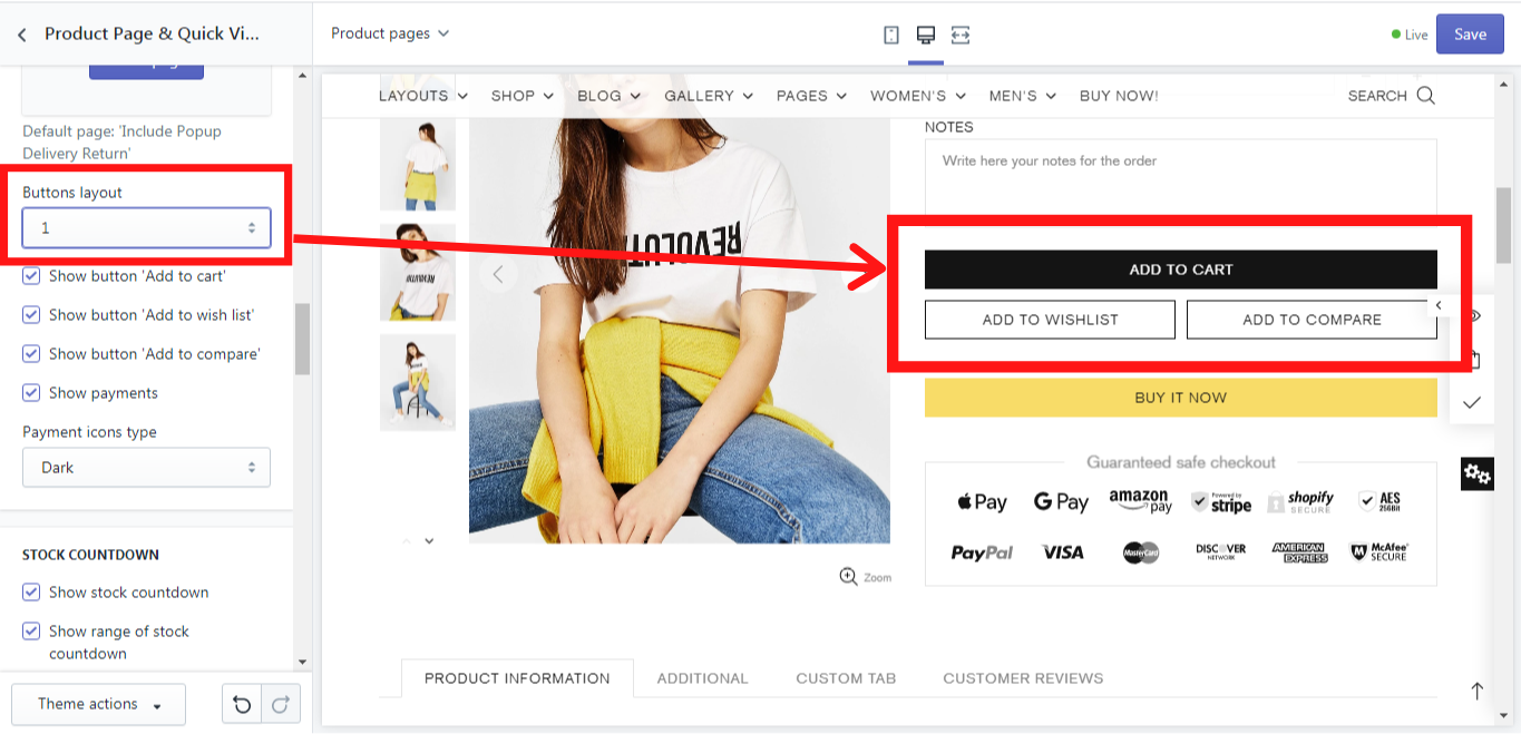
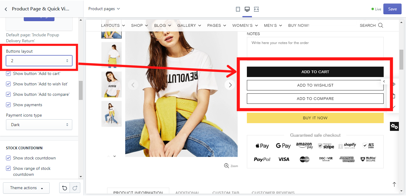
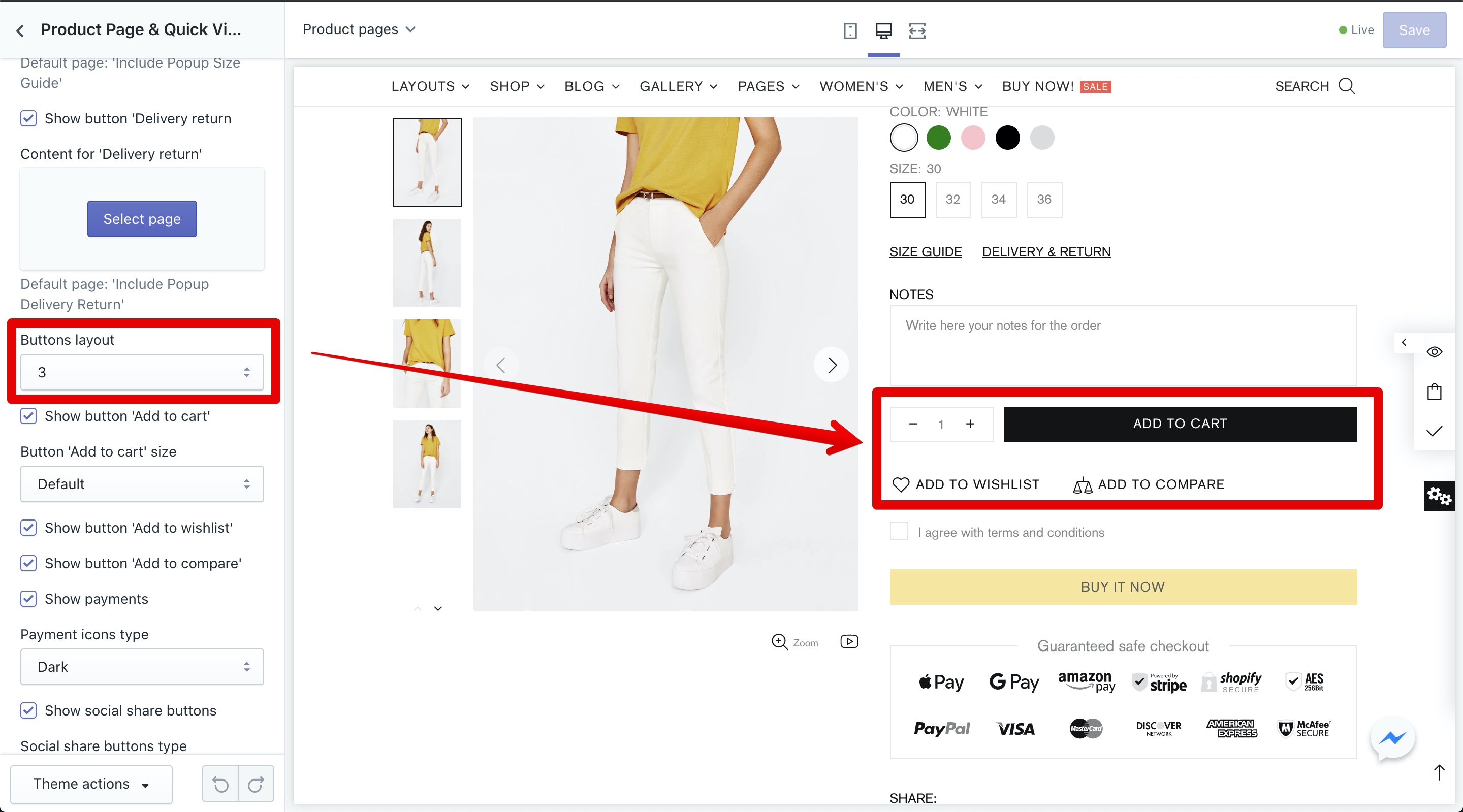
Show button 'Add to cart'
If you enable this option, an “Add to cart” button will be shown.
Show button 'Add to wish list'
If you enable this option, an “Add to wish list” button will be shown.
Show button 'Add to compare'
If you enable this option, an “Add to compare” button will be shown.
Show payments
If you enable this option, the payment icons will be shown.
Payment icons type
Here you can set the icon style. Dark - for the light background color, light - for a dark background color.
Show social share buttons
Show 'Share on Facebook', 'Share on Pinterest' buttons.
Social share buttons type
Select social share buttons size.
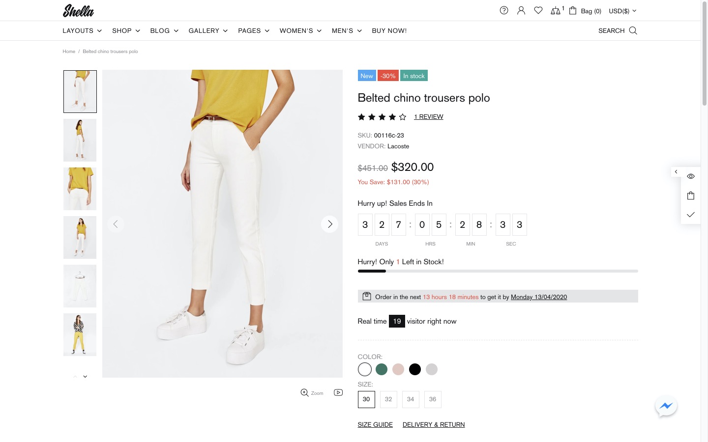
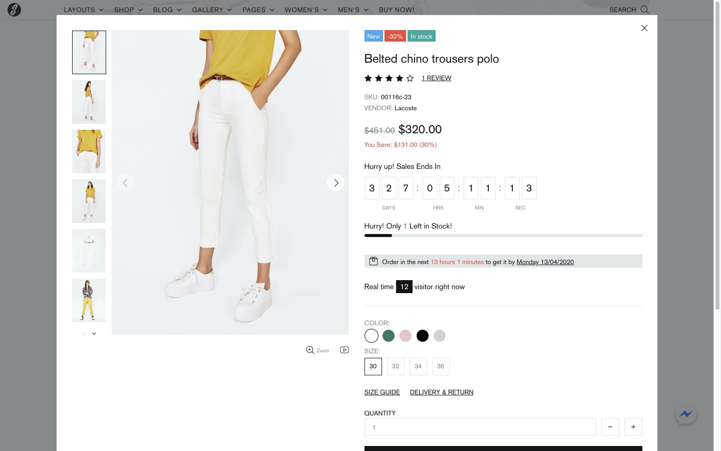
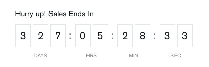
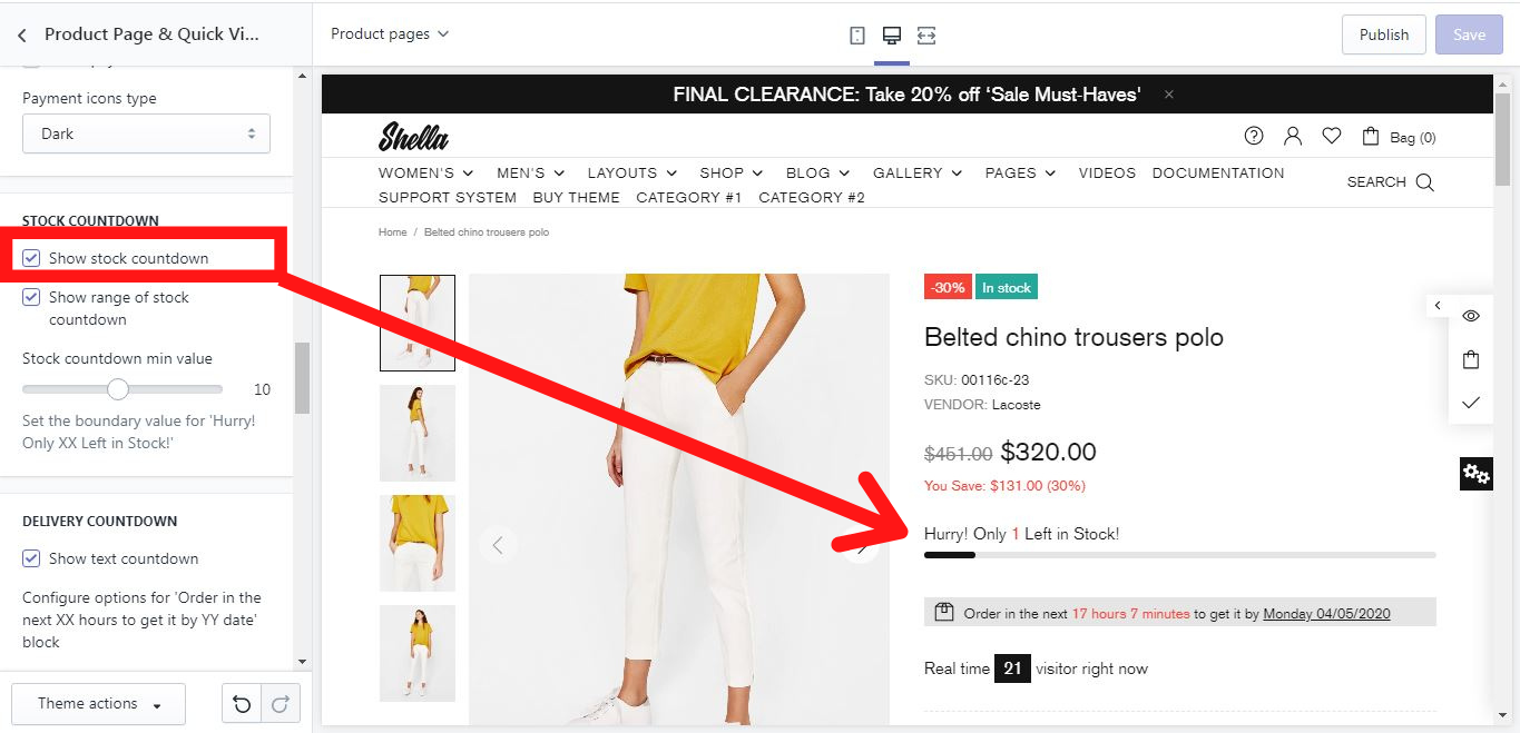
Stock Countdown
Show stock countdown
If you enable this option, the product’s stock countdown will be shown like this:
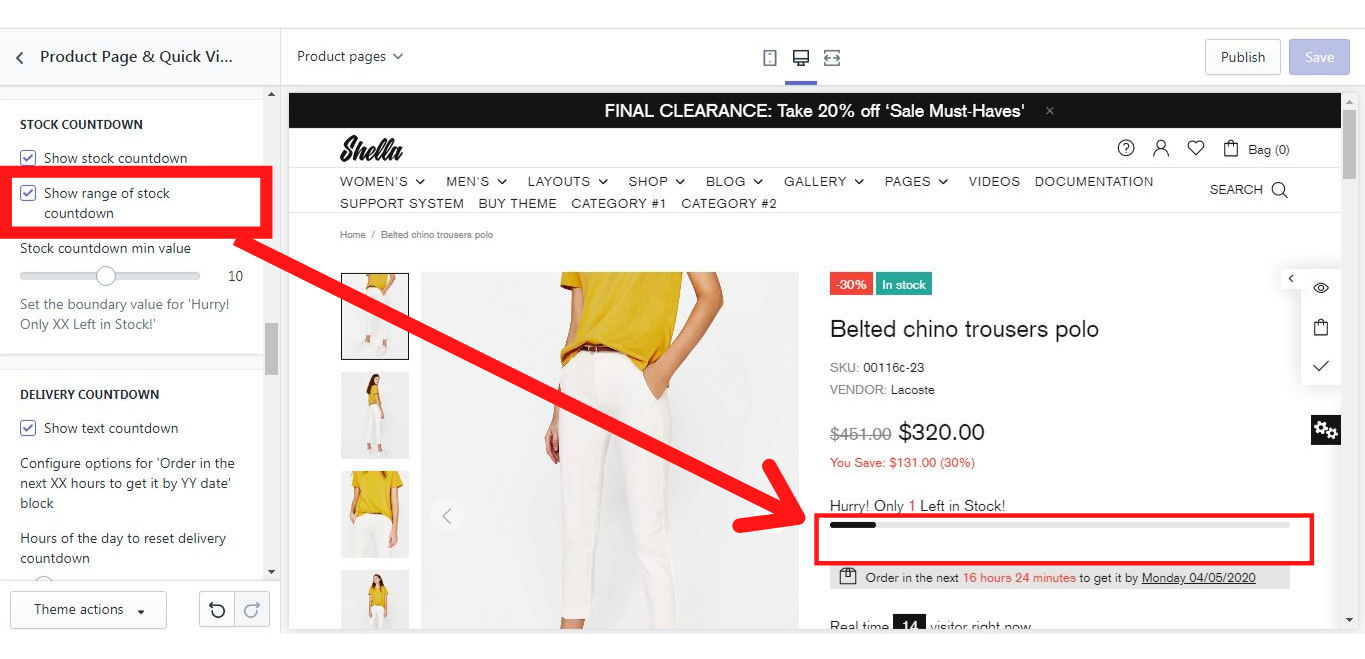
Show range of stock countdown
If you enable this option, a range of the stock countdown for the product will be shown like this:
Stock countdown min value
This option enables you to set the boundary value for 'Hurry! Only XX Left in Stock!'
DELIVERY COUNTDOWN
Show text countdown
If you enable this option, the delivery text countdown will be shown like this:
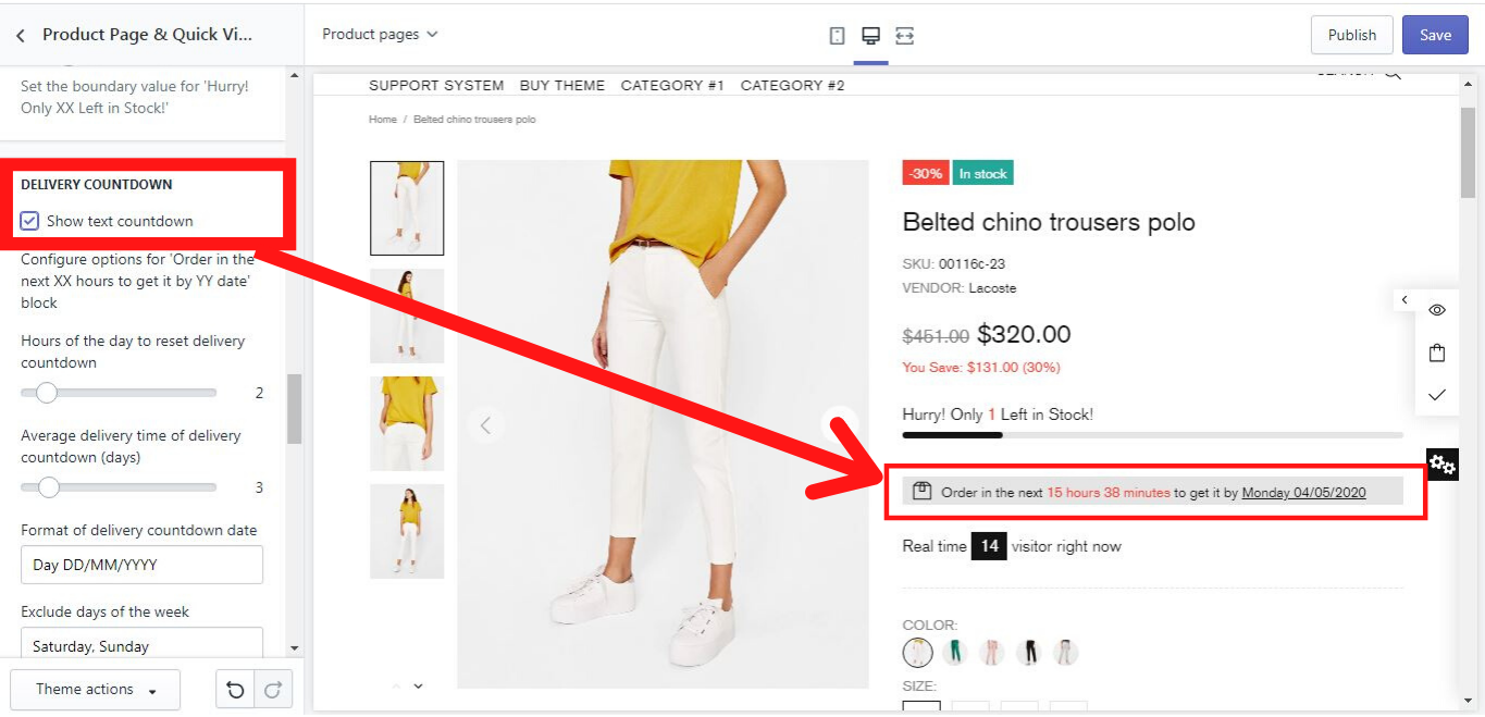
Configure options for 'Order in the next XX hours to get it by YY date' block:
-
Hours of the day to reset delivery countdown
This option enables you to set hours of the day, till which the order should be done, to reset the delivery countdown.
Example:
If the current time is 10:45 AM and you set 15 hours, then the system will show “Order in the next 4 hours15 minutes to get it by…”
-
Average delivery time of delivery countdown (days)
This option enables you to set the average number of days, at which the delivery will be done.
Example:
If today’s date is Thursday 30/04/2020, and you set 3 days, then the system will show “Order in the next XX hours XX minutes to get it by Sunday 03/05/2020 “.
-
Format of delivery countdown date
Here you can set the format of the delivery countdown date manually. A lot of options are available. Some of them are listed below.
Example:
If you set Day DD/MM/YYYY, the system will show Monday 04/05/2020.
If you set Day MM/YYYY, the system will show Monday 05/2020.
If you set Day YYYY, the system will show Monday 2020.
If you set Day, the system will show Monday.
If you set DD/MM/YYYY, the system will show 04/05/2020.
If you set Day DD/MM/YY, the system will show Monday 04/05/20.
If you set DD/MM/YYYY Day, the system will show 04/05/2020 Monday.
-
Exclude days of the week
Here you can type manually which days should be excluded from the delivery countdown date.
Example:
If today’s date is Thursday 30/04/2020, you set 3 days for a delivery countdown date, and then in the field “Exclude days of the week” you typed Saturday, Sunday then the system will show “Order in the next XX hours XX minutes to get it by Monday 04/05/2020 “.
Visitors
Show real-time visitors
If you enable this option, the real-time visitors will be shown like this:
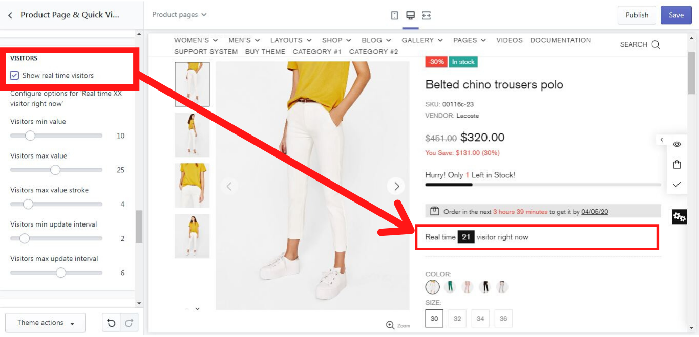
Configure options for 'Real-time XX visitor right now'
Visitors min value
Here you can set the minimum value of visitors, which can be shown in “Real-time XX visitor(s) right now”. You can choose the value from 1 to 50.
Visitors max value
Here you can set the maximum value of visitors, which can be shown in “Real-time XX visitor(s) right now”. You can choose the value from 1 to 50.
Visitors max value stroke
Here you can set the maximum value stroke of visitors, shown in “Real-time XX visitor(s) right now”. You can choose the value from 1 to 20.
Visitors min update interval
Here you can choose the minimum update interval in seconds, which changes the value of visitors at a particular time in seconds.
Visitors max update interval
Here you can choose the maximum update interval in seconds, which changes the value of visitors at a particular time in seconds.
Example for Configure options for 'Real-time XX visitor right now':
Visitors min value:
20
Visitors max value:
40
Visitors max value stroke:
10
Visitors min update interval:
3
Visitors max update interval:
6
Here the span of visitors in real-time is from 20 to 40, the value stroke is set for 10 and the visitors update interval in seconds has a span from 3 to 6 seconds. These settings mean, that every 3-6 seconds the visitor’s minimum value will increase from 1 to 10 visitors, and the maximum will remain 40.
Important! In order to avoid a span in the visitor’s update interval, the same value needs to be set both for visitors minimum and maximum update interval, e.g.: if you set 5 seconds both for visitors minimum and maximum update interval, the updates will be shown strictly every 5 seconds only.
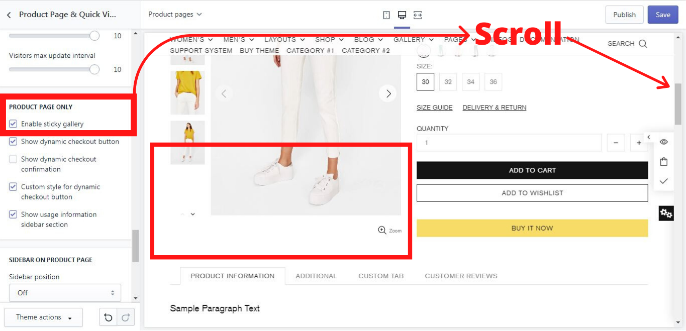
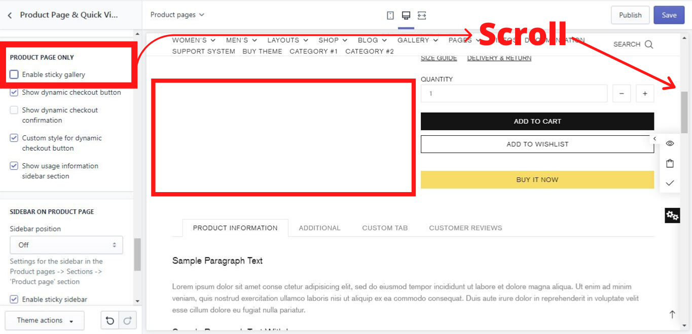
Product Page Only
Enable sticky gallery
If you enable this option, the image of the product remains sticky, which means it will be shown while scrolling down the product page until the button “BUY IT NOW”:
If you disable this option, there will be a blank white space, instead of the product´s gallery:
Show dynamic checkout button
If you enable this option, the button “BUY IT NOW” will be shown:
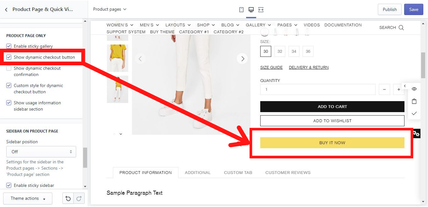
More information about dynamic checkout buttons you can find here: https://help.shopify.com/en/manual/sell-online/online-store/dynamic-checkout
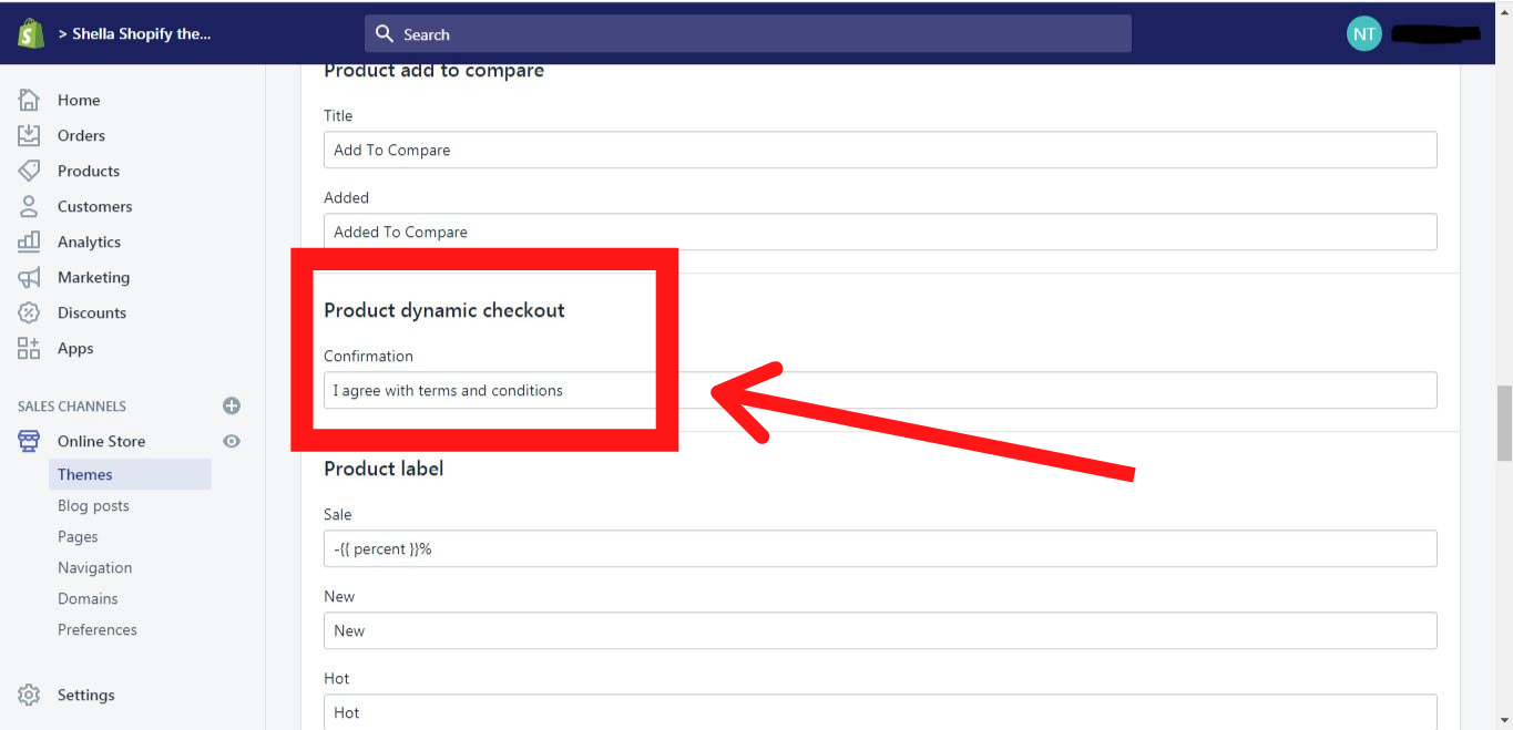
Show dynamic checkout confirmation
If you enable this option, the checkbox for the agreement with the terms and conditions will be shown:
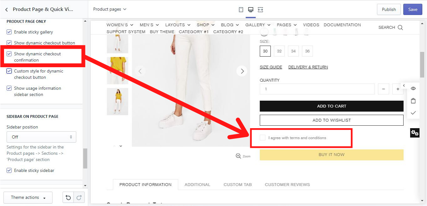
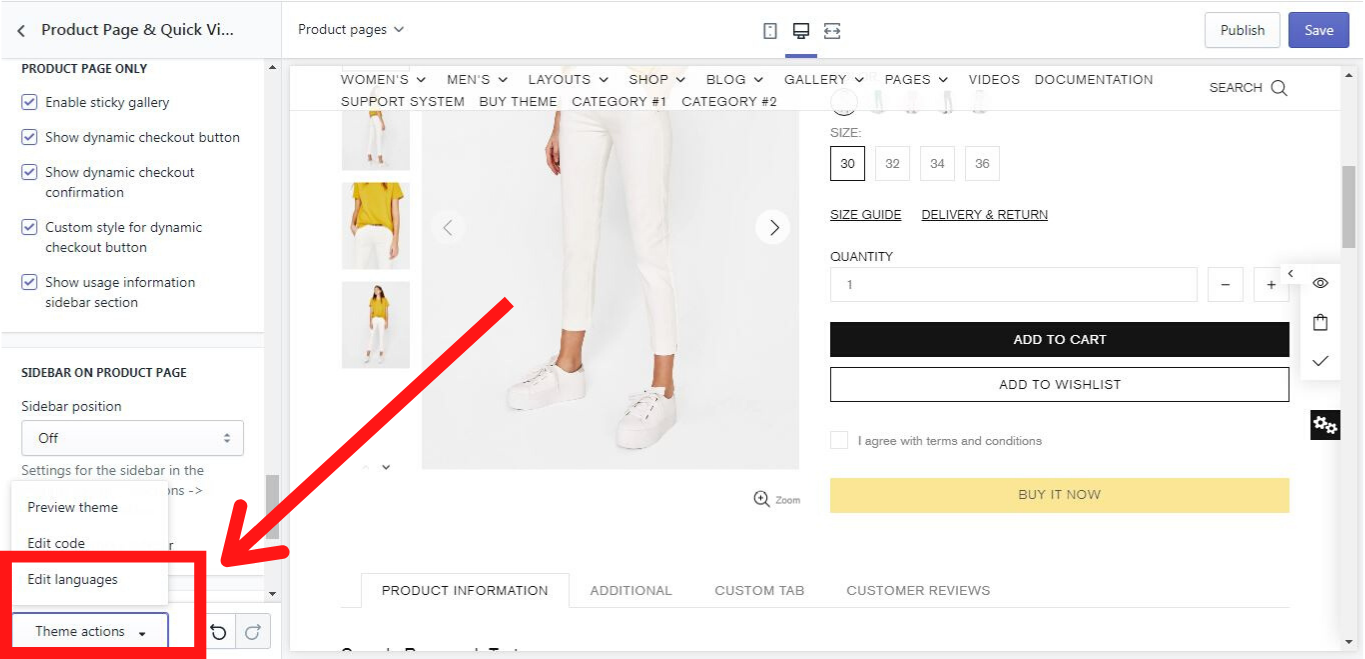
Please note, that the title of this checkbox can be changed in 3 steps:
Step 1: Theme actions -> Edit languages
Go to “Theme actions” and choose “Edit languages”.
Step 2: Products
Click on “Products”
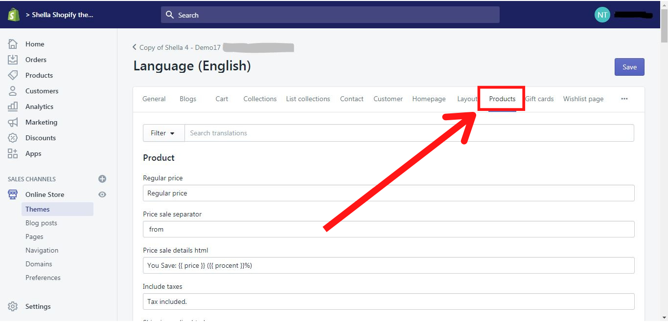
Step 3: Product dynamic checkout
Scroll to “Product dynamic checkout”
Custom style for dynamic checkout button
If you enable this option, you can customize your dynamic checkout button. In our theme it is yellow, but you can easily change its color and the font to the ones you like.
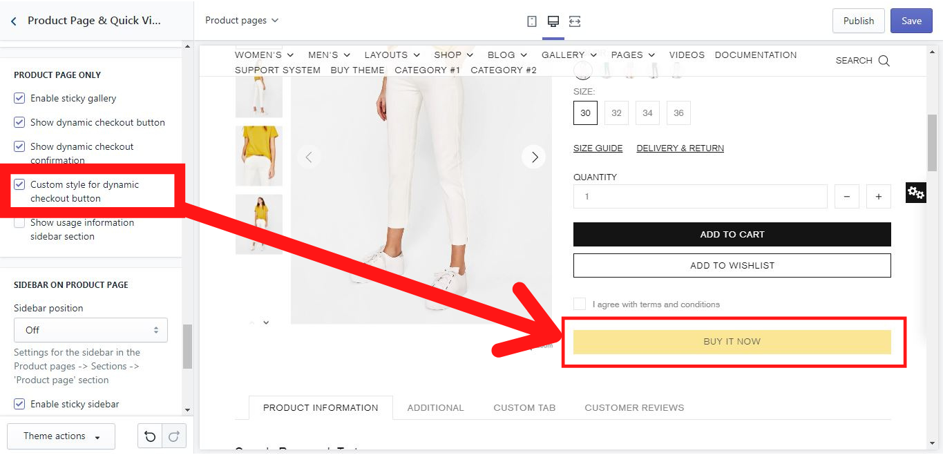
If you disable this option, the customization will not be applied.
More information about how to customize your dynamic checkout button you can find here: https://help.shopify.com/en/manual/sell-online/online-store/dynamic-checkout/customize-button
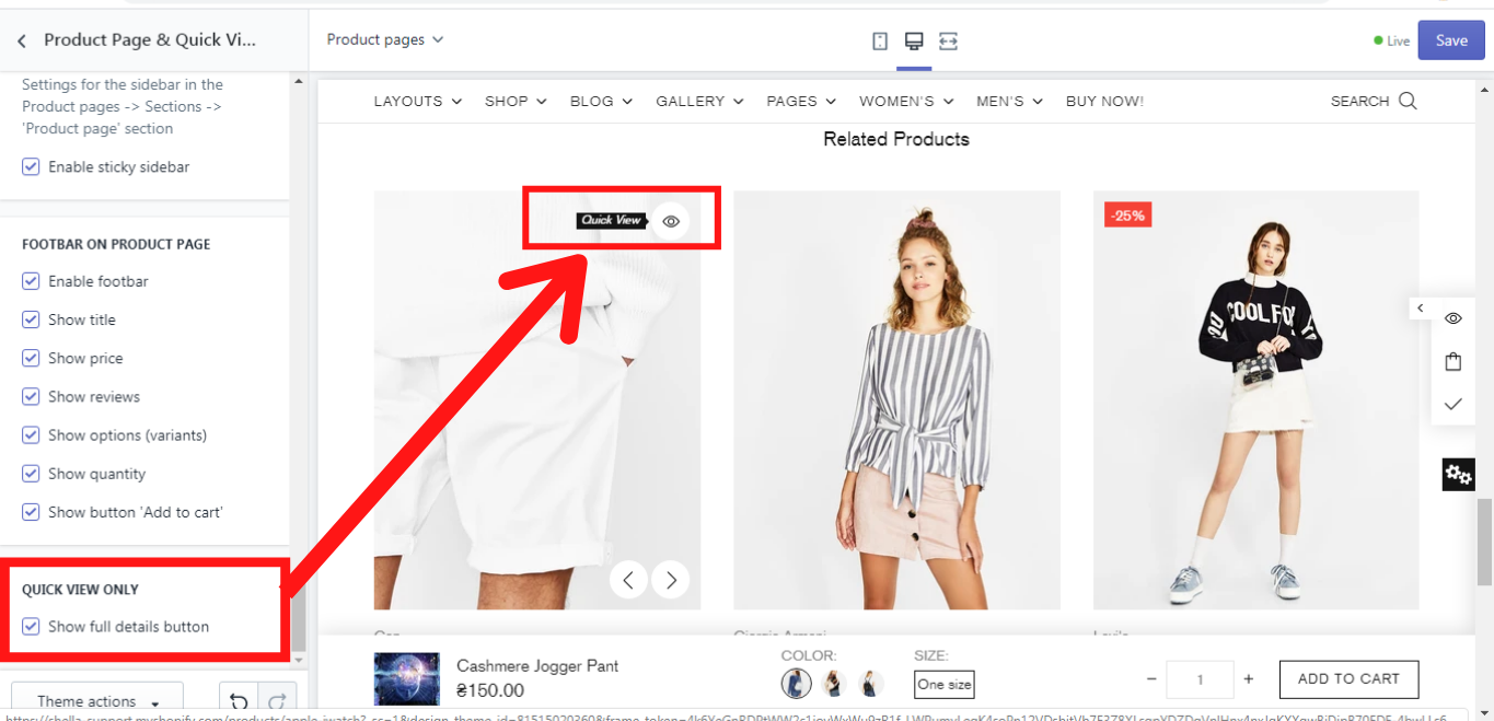
Show 'Related products' section
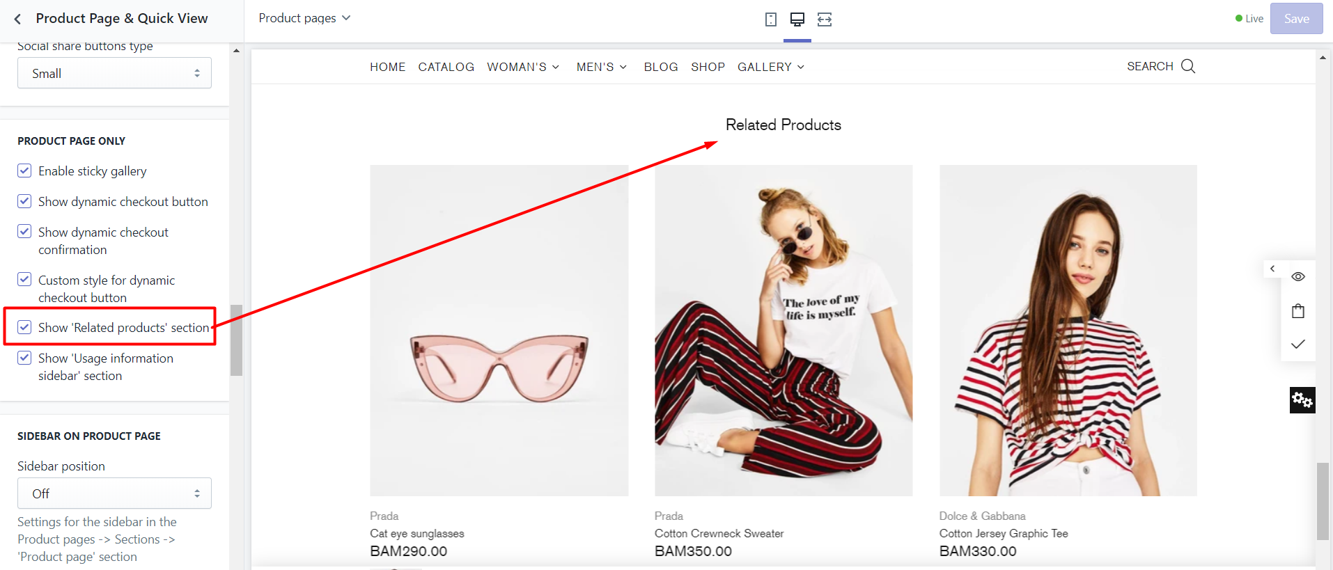
If you enable this option, a related product carousel will be shown on a product page
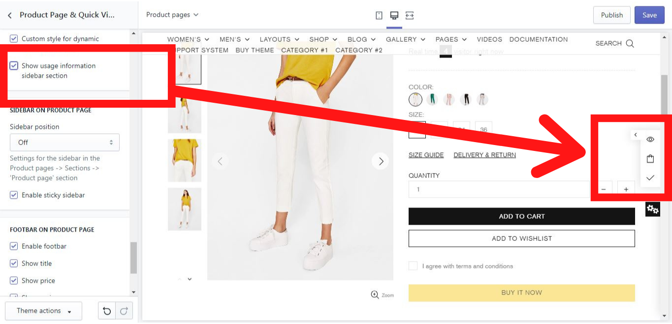
Show usage information sidebar section
If you enable this option, a usage information sidebar section will be shown. In this sidebar, you can see how many people are viewing the item, how many people have added it to a cart, and how many people have already bought the item.
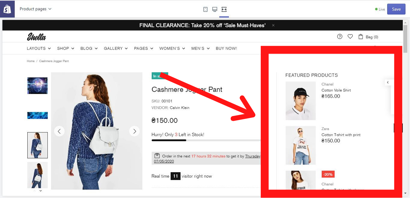
Sidebar on Product Page
If you enable this option, a sidebar will be shown on the product page. You can choose on which side of the product page it should be shown, left or right. In case you don´t want it to be shown, you can choose an option “Off” in the “Sidebar position”.
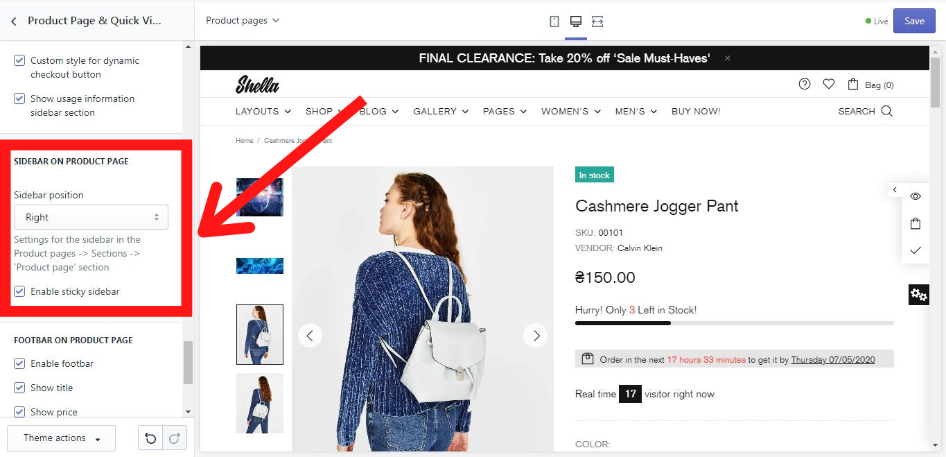
The option “Enable sticky sidebar” allows the sidebar to remain sticky on the product page while scrolling down the browser page. If you disable this option, there will be a blank white space on the left or right side of the product, when scrolling down the browser page.
Footbar on Product Page
Enable footbar
If you enable this option, a footbar will be shown on a product page:
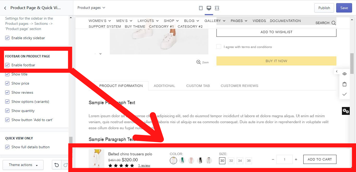
You can decide, what should be shown in the footbar simply by enabling or disabling the following information options for the product: title, price, reviews, options (variants), quantity, and a button “Add to cart”.
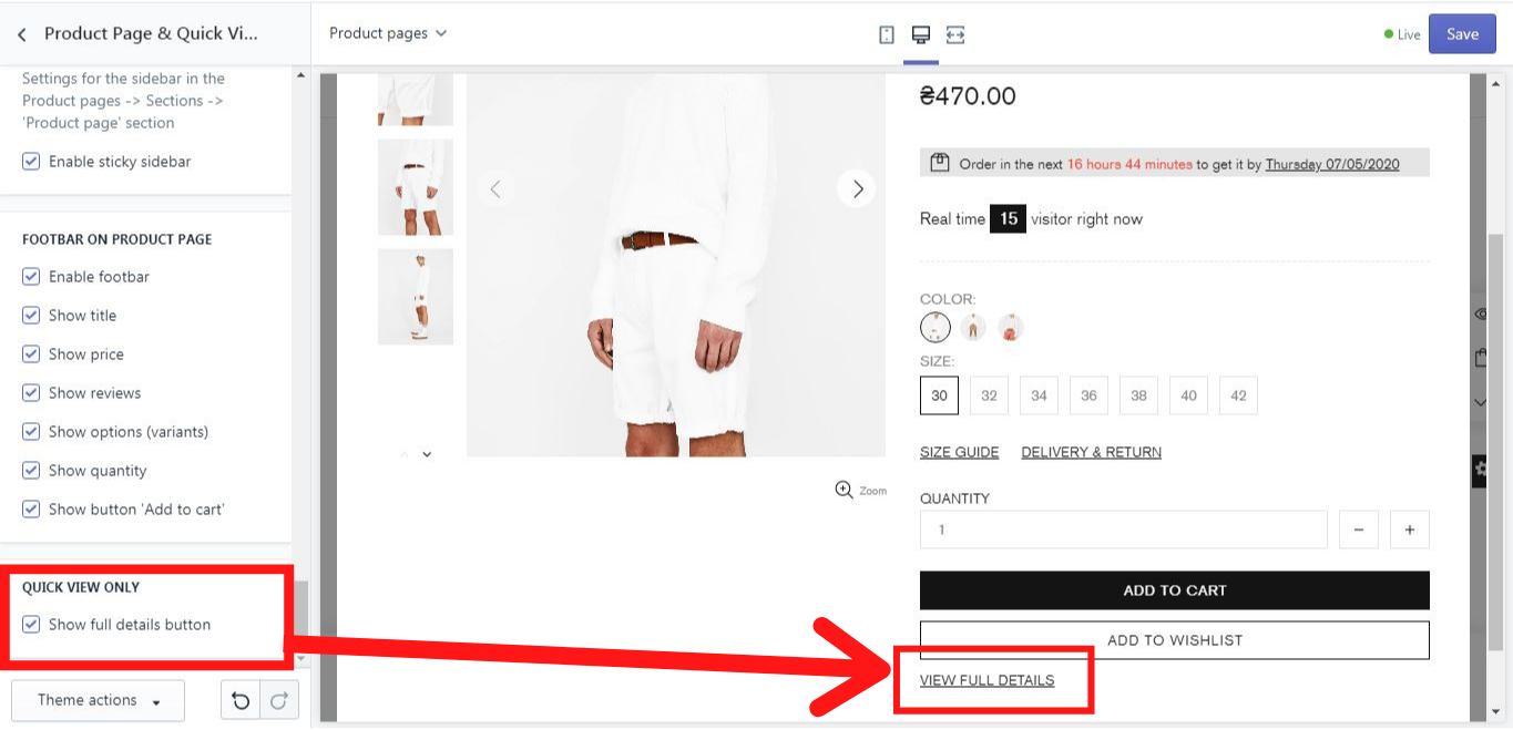
Quick View Only
Here you can decide whether a “View full details” button should be shown in the product’s quick view or not: