Header
Video manuals:
Header Options
| # | Name | Value | Description |
| 1 | Type | Type1, Type2, Type3, Type4, Type5 | Set header type |
| 2 | Logo image | Image, recommended size 128x54 px | Set store logo |
| 3 | Logo svg max width on mobile (< 540px) | Image | Set width |
| 4 | SVG logo | Show / hide SVG logo | |
| 5 | Code of SVG logo | Enter svg image code | |
| 6 | Adaptive centered logo on desktop (only for type #2) | true/false | If enabled - Move the centered logo to the side |
| 7 | Adaptive logo max width | Set logo width | |
| 8 | Content width |
Inherit global settings Full width Boxed |
Set container width. Use value from "Theme settings -> Layout -> Default content width" or overwrite it. |
| 9 | Tape min height | Value <= 50px | |
| 10 | Info line min height (desktop) | Value <= 75px | |
| 11 | Top line min height (desktop) | Value <= 75px | |
| 12 | Bottom line min height (desktop) | Value <= 75px | |
| 13 | Bottom tape height (desktop) | Value <= 100px | |
| 14 | Menu container horizontal paddings (desktop and only for type #4) | Value <= 30px | |
| 15 | Menu items horizontal paddings (desktop) | Value <= 20px | |
| 16 | Main menu min height (mobile) | Value <= 600px | |
| 17 | Secondary menu min height (mobile) | Value <= 600px | |
| 18 | Show menu arrows | Show / hide menu arrows | |
| 19 | Show underline on hover (desktop) | Show / hide underline effect on hover (desktop) | |
| 20 | Enable transparent | Show / hide transparent | |
| 21 | Show tape border | Show / hide tape border | |
| 22 | Show info line border | Show / hide info line border | |
| 23 | Show top line border | Show / hide top line border | |
| 24 | Show bottom line border | Show / hide bottom line border | |
| 25 | Show additional line border | Show / hide additional line border | |
| 26 | Show mobile border | Show / hide mobile border | |
| 27 | Menu | Navigation menu | Create and configure menu at "Online store -> Navigation -> Menus". Select main navigation menu. |
| 28 | Vertical menu (Only for header type #5) | Navigation menu | Create and configure menu at "Online store -> Navigation -> Menus". Select main navigation menu. |
| 29 | Fixed vertical menu on a home page | If option is checked, you can add a 'Space for vertical menu' block on a 'Builder' section | |
| 30 | Show vertical menu border | Show / hide vertical menu border | |
| 31 | Enable 'tooltips' | Show / hide Tooltips on elements | |
| 32 | Show button 'Search' | Show / hide Search button | |
| 33 | Show button 'Services' | Show / hide Services button | |
| 34 | Show button 'Account' | Show / hide Account button | |
| 35 | Show button 'Wishlist' | Show / hide Wishlist button | |
| 36 | Show button 'Compare' | Show / hide Compare button | |
| 37 | Show button 'Cart' | Show / hide Cart button | |
| 38 | Show button 'Currency' | Show / hide Currency button. Visible only with enabled global setting multiple currencies |
|
| 39 | Show button 'Language' | Show / hide Language button. For multiple languages install app 'Weglot Translate' or 'Langify' |
|
| 40 | Icon for button 'Cart' | Enter icon | Default: theme-109 |
| 41 | Language app |
Weglot Longify None |
Set used language application |
| 42 | Caption for language drop down | Enter caption | Default: English |
| 43 | Links list for language drop down | Choose menu | |
| 44 | Additional line info page content | Select page | Include Header Info Line #2 |
| 45 | Additional line info content | content | Make clean if you want to use selected above page |
| 46 | Show sticky logo (desktop) | true/false | Enable / Disable sticky logo (desktop) |
| 47 | Sticky logo image (desktop) | Set image | |
| 48 | Sticky logo image width | Set Sticky logo image width < = 200px | |
| 49 | Sticky |
Disable Desktop and mobile Only desktop Only mobile |
Set mode of sticky panel |
| 50 | Desktop sticky type |
Wide Slim |
Set Desktop sticky type |
| 51 | Ajax search | true/false | Enable / Disable ajax search |
Header Block: Info line
| # | Name | Value | Description |
| 1 | Page content | Select page |
Choose from pages list |
| 2 | Content | content | Make clean if you want to use selected above page |
| 3 | Show social media | true / false | Enable / Disable socila media |
| 4 | Enable tooltip | true / false | Enable / Disable tooltip |
| 5 - 12 | MEDIA SETTINGS | true / false | Enable / Disable media setting: Facebook, Twitter, Google, Instagram, Piniterest, YouBube, Behance, Skype |
Header Block: Bottom Tape
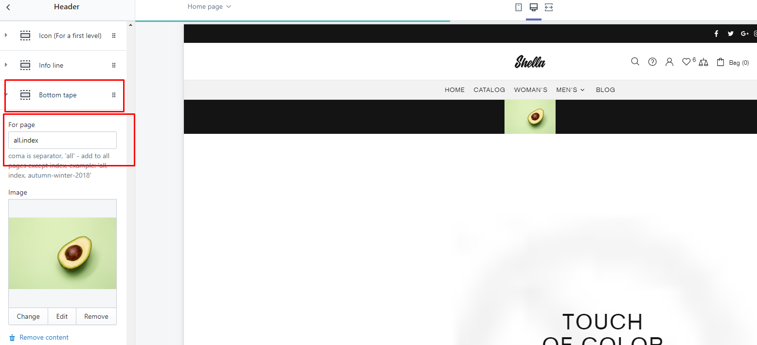
| # | Name | Value | Description |
| 1 | For page |
If you need to show this block for all pages, write: all,index P.S. Without quotes |
|
| 2 | Image | Choose image |
Header Block: Tape
| # | Name | Value | Description |
| 1 | Content | text | Text content |
| 2 | Delay | Delay in seconds when to show tape banner block | |
| 3 | Show once? | Tape banner behaviour if show on every page or remember user choice. | |
| 4 | Cookies life | How long remember user choice in cookies. |
Megamenu
This is parent block for mega menu drop down. Other menu related blocks should be linked to parent Mega menu block.
Video manuals:
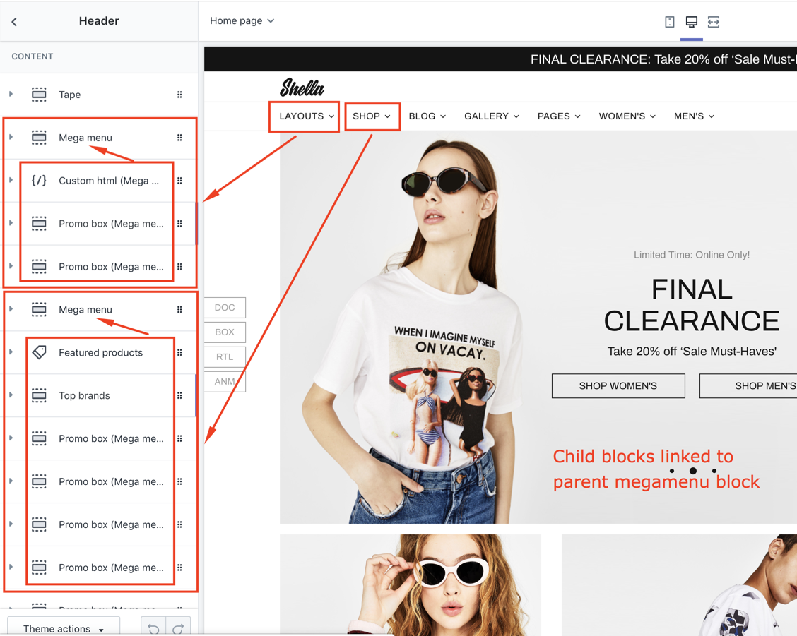
Megamenu (parent block)
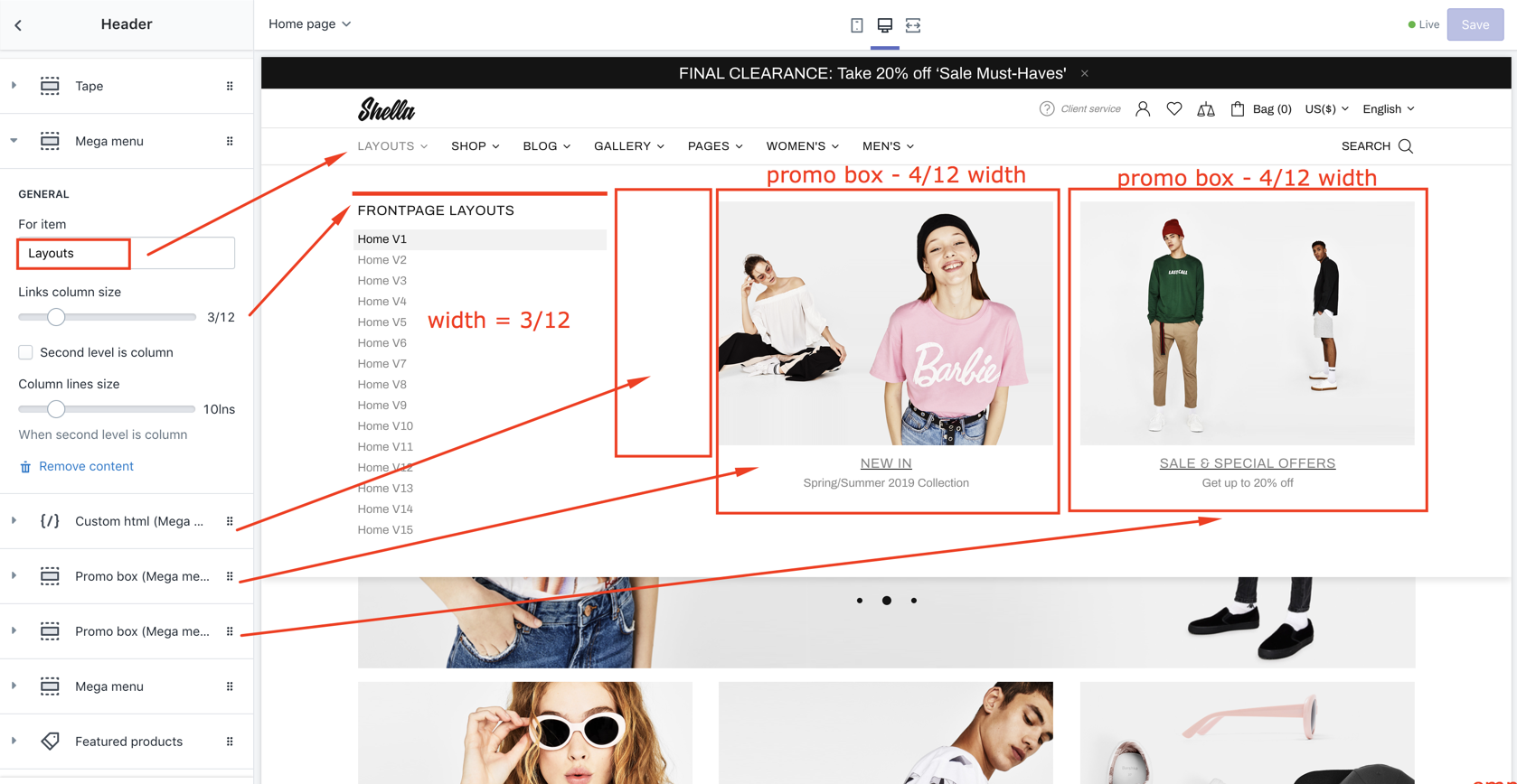
| # | Name | Value | Description |
| 1 | For item | Menu item name | Should match Navigation menu item name. |
| 2 | Links column size | number 1-12 | Set collection list width |
| 3 | Second level is column | true / false |
Example menu 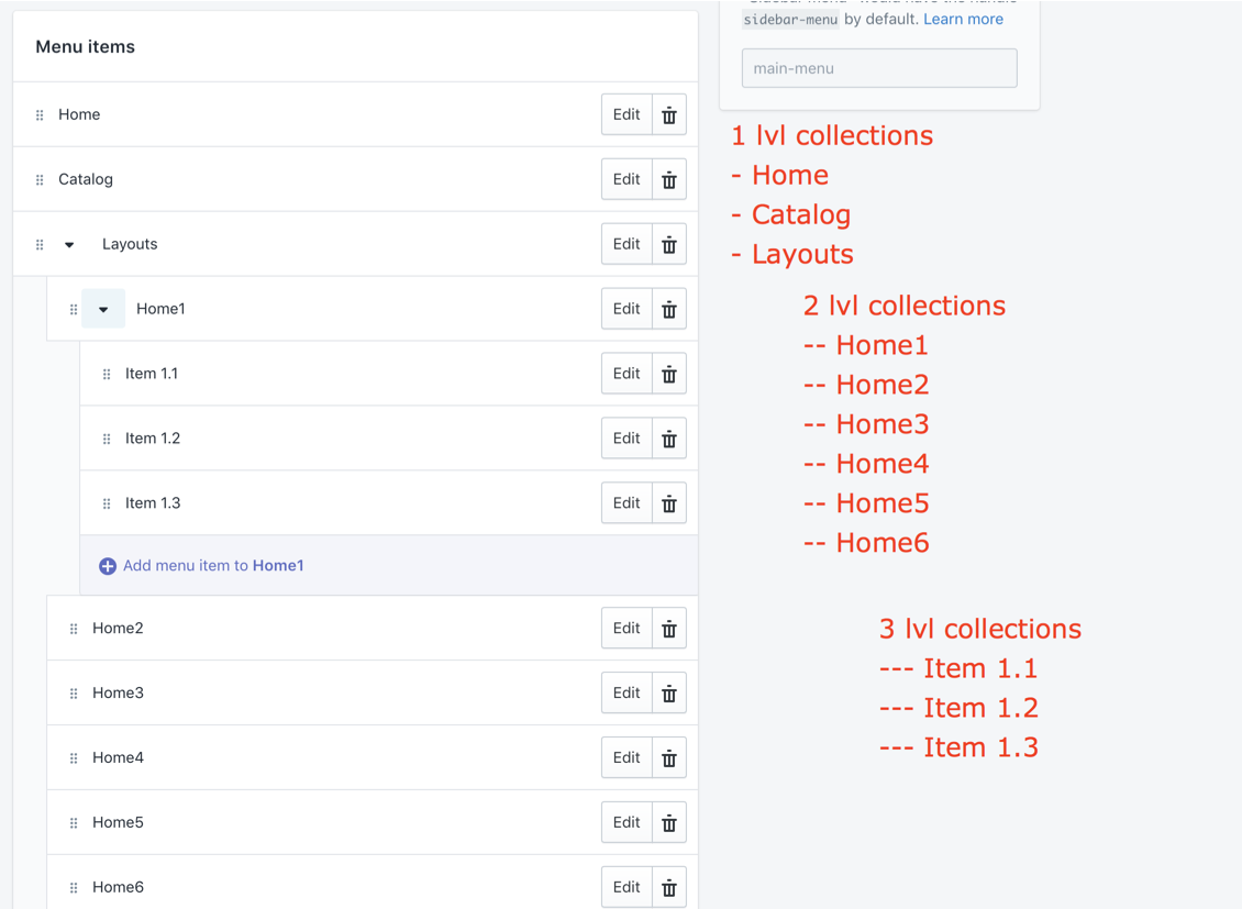
False (unchecked) 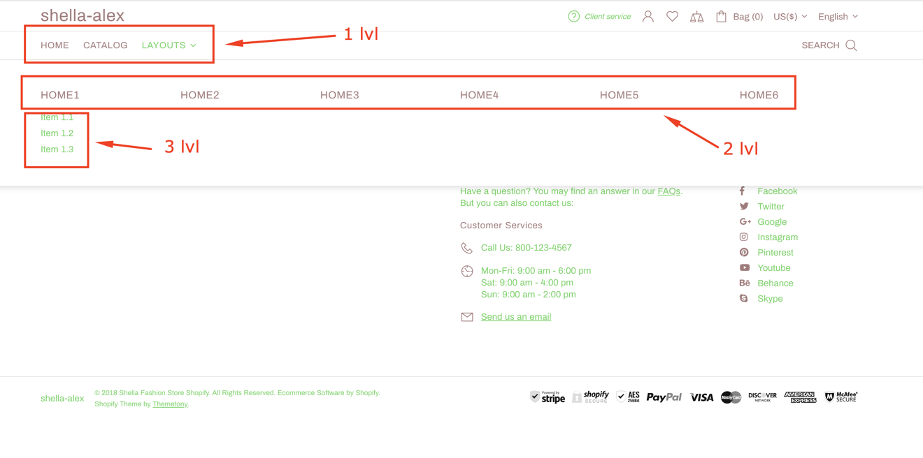
True (checked) 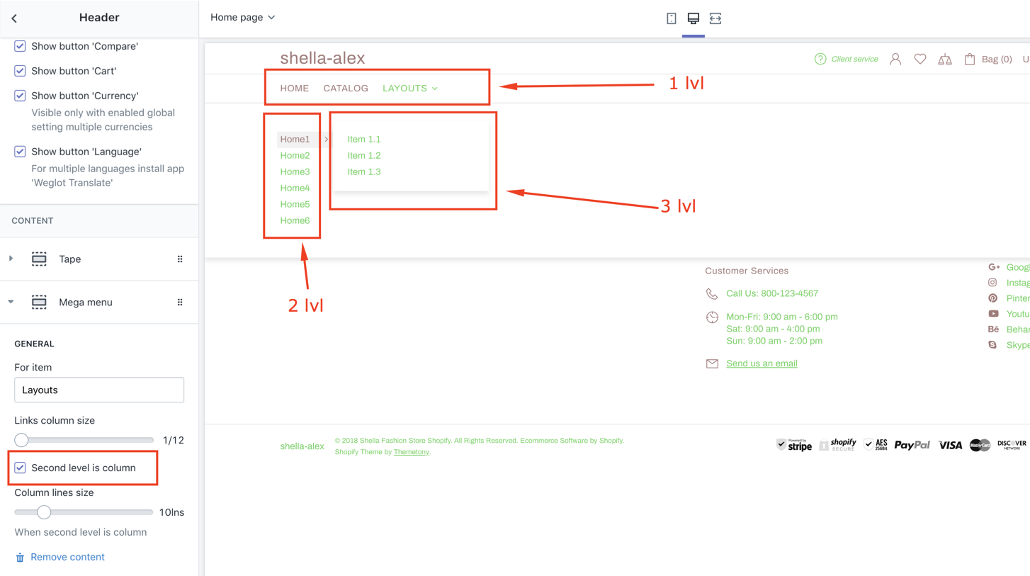
|
| 4 | Column lines size | number |
Set the column size. Works only when "Second level is column" option selected. 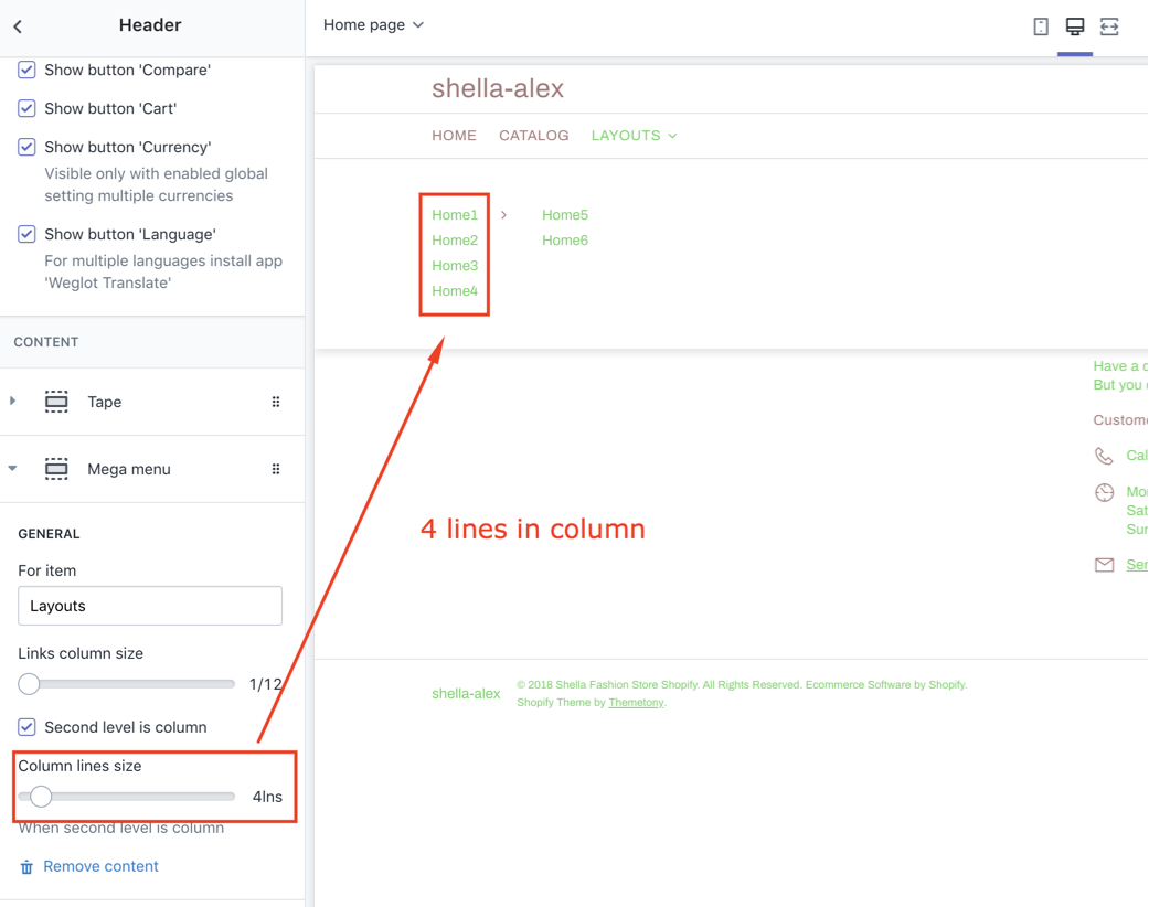
|
| 5 | Wrap menu columns to grid | true / false | Enable / Disable |
| 6 | Wrapper column size | Choose number | |
| 7 | Enable width limit | true / false | Enable / Disable |
| 8 | Width | Choose width <= 1000 px |
Products block
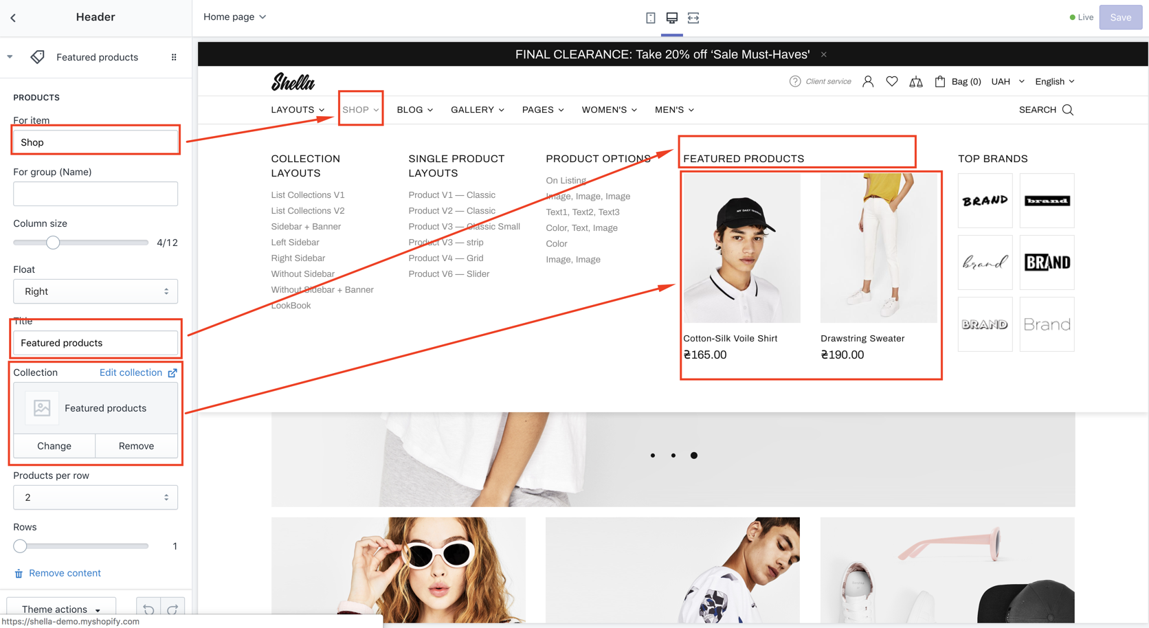
| # | Name | Value | Description |
| 1 | For item | Menu item name | Should match Navigation menu item name. |
| 2 | For group (Name) | Group name | You can group products. Refer to Group (Mega menu) block for more details. |
| 3 | Column size | number 1-12 |
Set Products block width 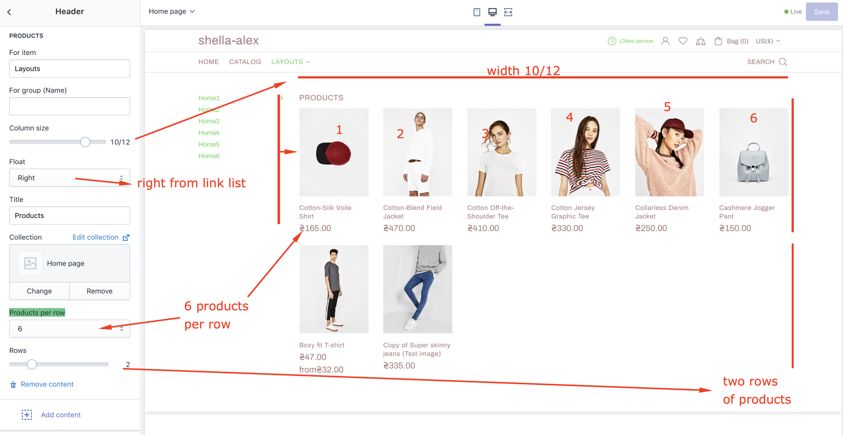
|
| 4 | Float | Left / right | Align block position |
| 5 | Title | text | Set block title |
| 6 | Collection | Product collection | Set collection to show products |
| 7 | Products per row | Set number of products per row | |
| 8 | Rows | Set number of rows |
Promo box
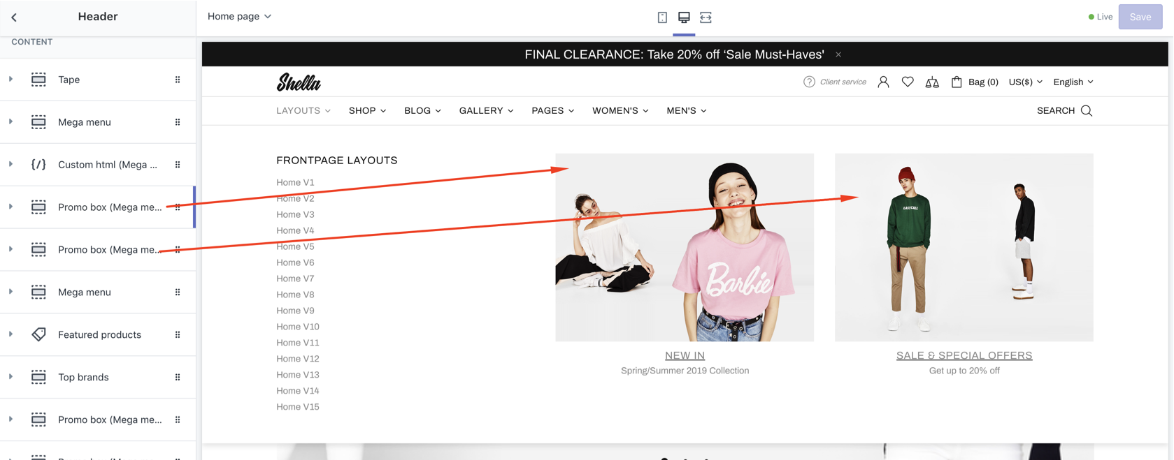
| # | Name | Value | Description |
| 1 | For item | Menu item name | Should match Navigation menu item name. |
| 2 | For group (Name) | Group name | You can group products. Refer to Group (Mega menu) block for more details. |
| 3 | Column size | number 1-12 |
Set block width |
| 4 | Float | Left / right | Align block position |
| 5 | Title | text |
Set block title
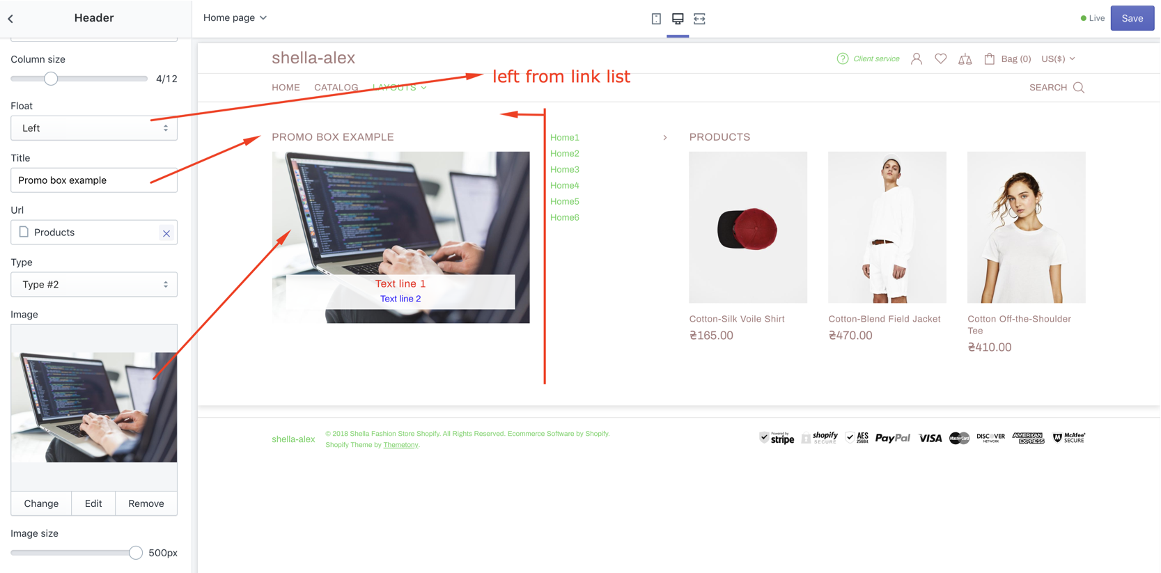
|
| 6 | Url | url | Set promo box URL |
| 7 | SETTINGS: Type |
Clean (without text)
Type #1
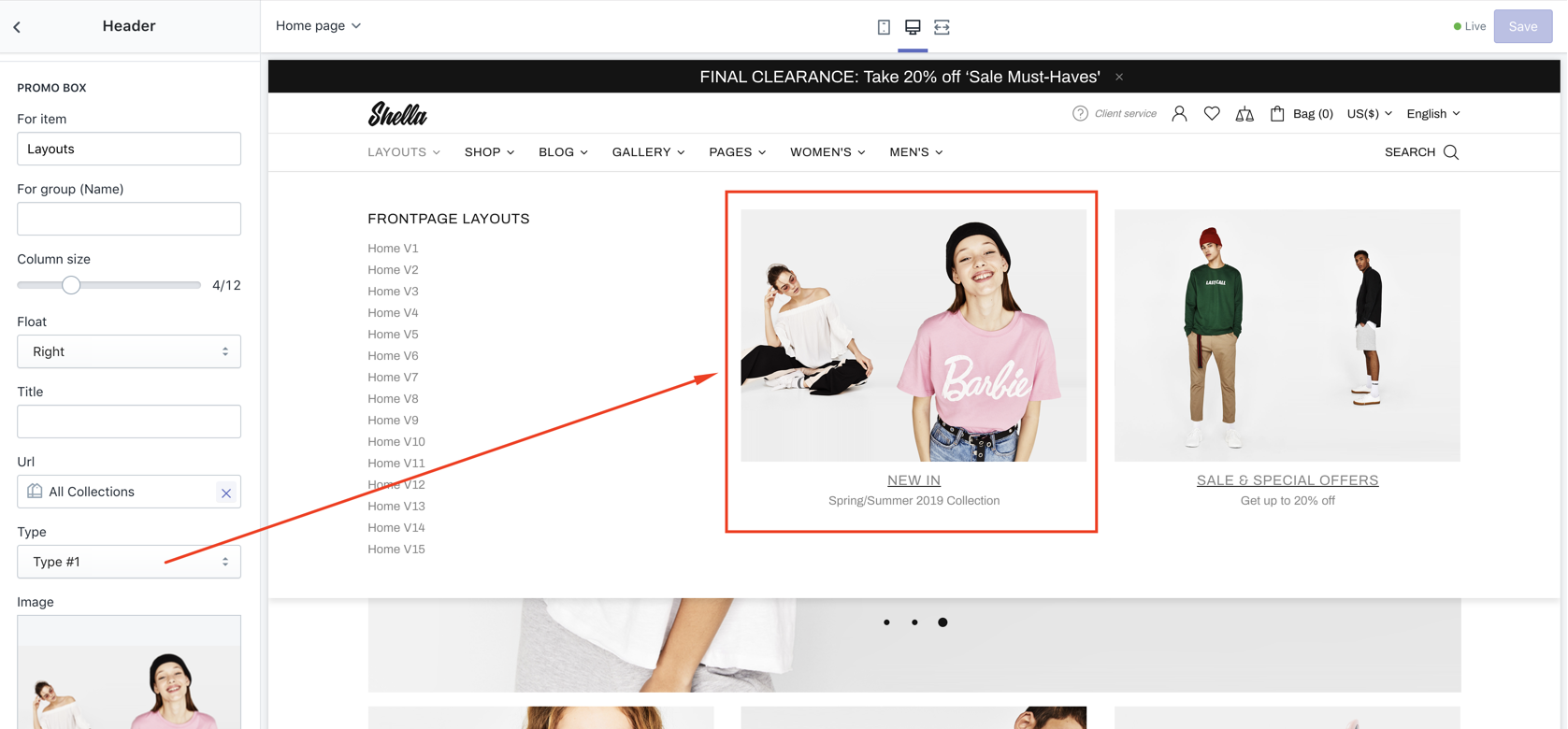
Type #2 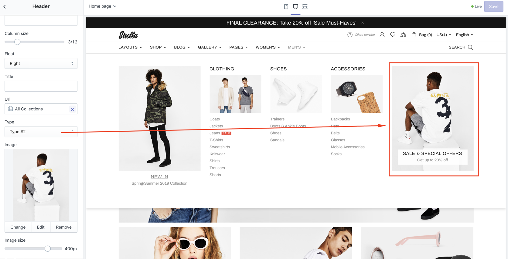
Type #3 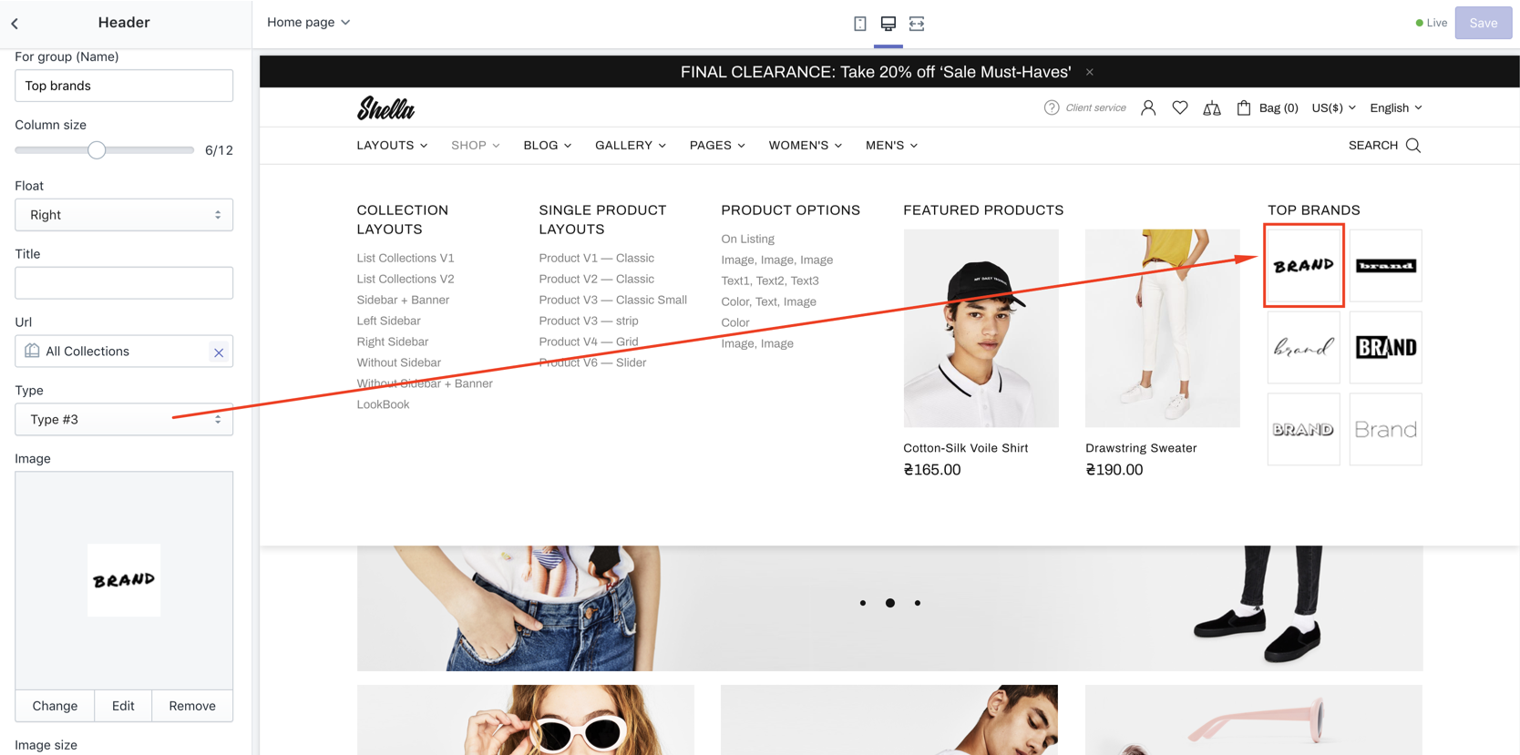
Type #4 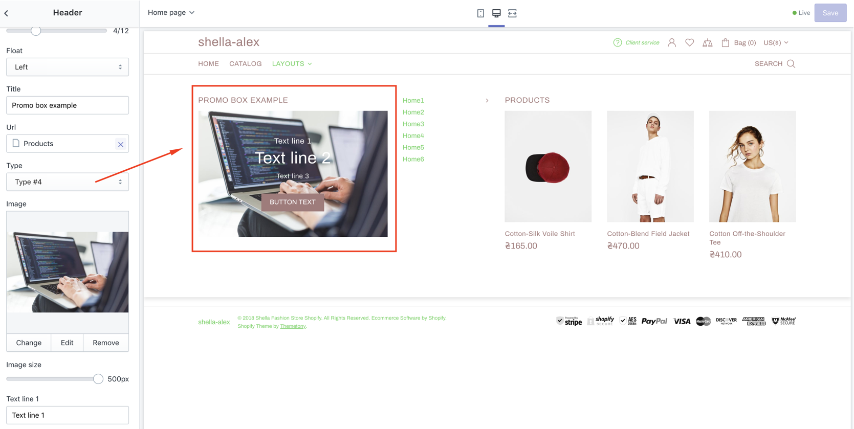
|
|
| 8 | Vertical position (Only for type #1) | Top Center Bottom |
Choose |
| 9 | Border image on hover | true/false | Enable/Disable |
| 10 | Image | Set promo box image | |
| 11 | Url for image | Choose url | |
| 12 | Image size | Set image size | |
| 13 | Enable format 'pjpg' | Enable / Disable format progressive jpg | |
| 14 | Enable lazy loading | Enable / Disable lazy loading | |
| 15 | Show text line 1 | Enable / Disable | |
| 16 | Text line 1 | Set text line 1 | |
| 17 | Show text line 2 | Enable / Disable | |
| 18 | Text line 2 | Set text line 2 | |
| 19 | Show text line 3 | Enable / Disable | |
| 20 | Text line 3 | Set text line 3 | |
| 21 | Show Show button #1 | Enable / Disable | |
| 22 | Button text #1 | Set Button text #1 | |
| 23 | Show button #2 | Enable / Disable | |
| 24 | Button text #2 | Set Button text #2 | |
| 25 | Show List | Enable / Disable | |
| 26 | List | Create and select menu | |
| 27 | Custom HTML or Template | Write your html here or choose code using Content Builder | |
| 28 - 30 | Url for text line #1 - 3 | Set Url for text line #1 - 3 | |
| 31 - 32 | Url for button #1 - 2 | Set Url for button #1 - 2 | |
| 33 | Video Url | Set Video Url | |
| 34 | Youtube or Vimeo video URL | Set Youtube or Vimeo video URL | |
| 35 | Autoplay | Enable / Disable | |
| 36 | Controls | Enable / Disable | |
| 37 - 39 | COLORS: Text line 1 - Text line 3 | Set text colors | |
| 40 - 41 | COLORS: Button style |
Inherit Type #1 Type #2 Type #3 |
Select button style Type #1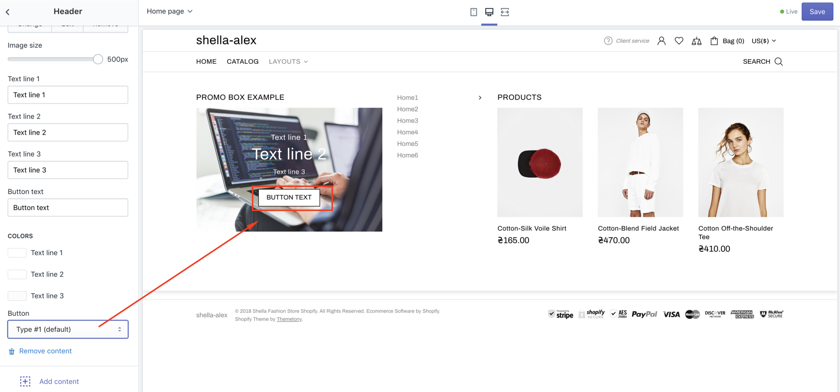
Type #2 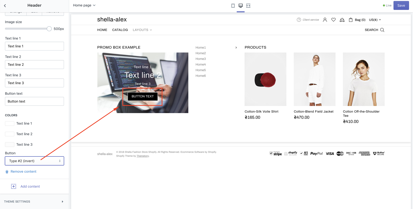
Type #3 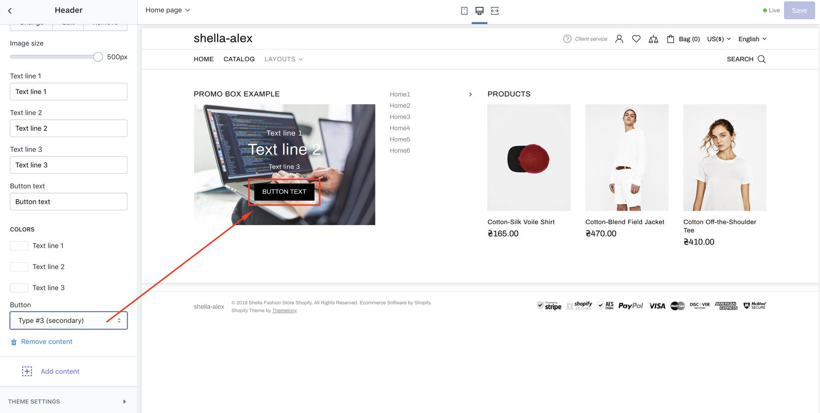
|
| 42 | COLORS: Background | Set color | |
| 43 - 46 | ANIMATIONS: From, To, From opacity, To opacity | Set animation for block. If you don't need any animation choose default in the both fields From and To |
Custom html
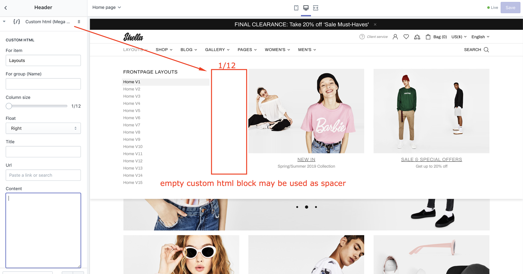
| # | Name | Value | Description |
| 1 | For item | Menu item name | Should match Navigation menu item name. |
| 2 | For group (Name) | Group name | You can group products. Refer to Group (Mega menu) block for more details. |
| 3 | Column size | number 1-12 |
Set block width |
| 4 | Float | Left / right | Align block position |
| 5 | Title | text | Set block title |
| 6 | Url | Set block URL | |
| 7 | Content | Set custom HTML content. You should be familiar with HTML and CSS. |
Subscription
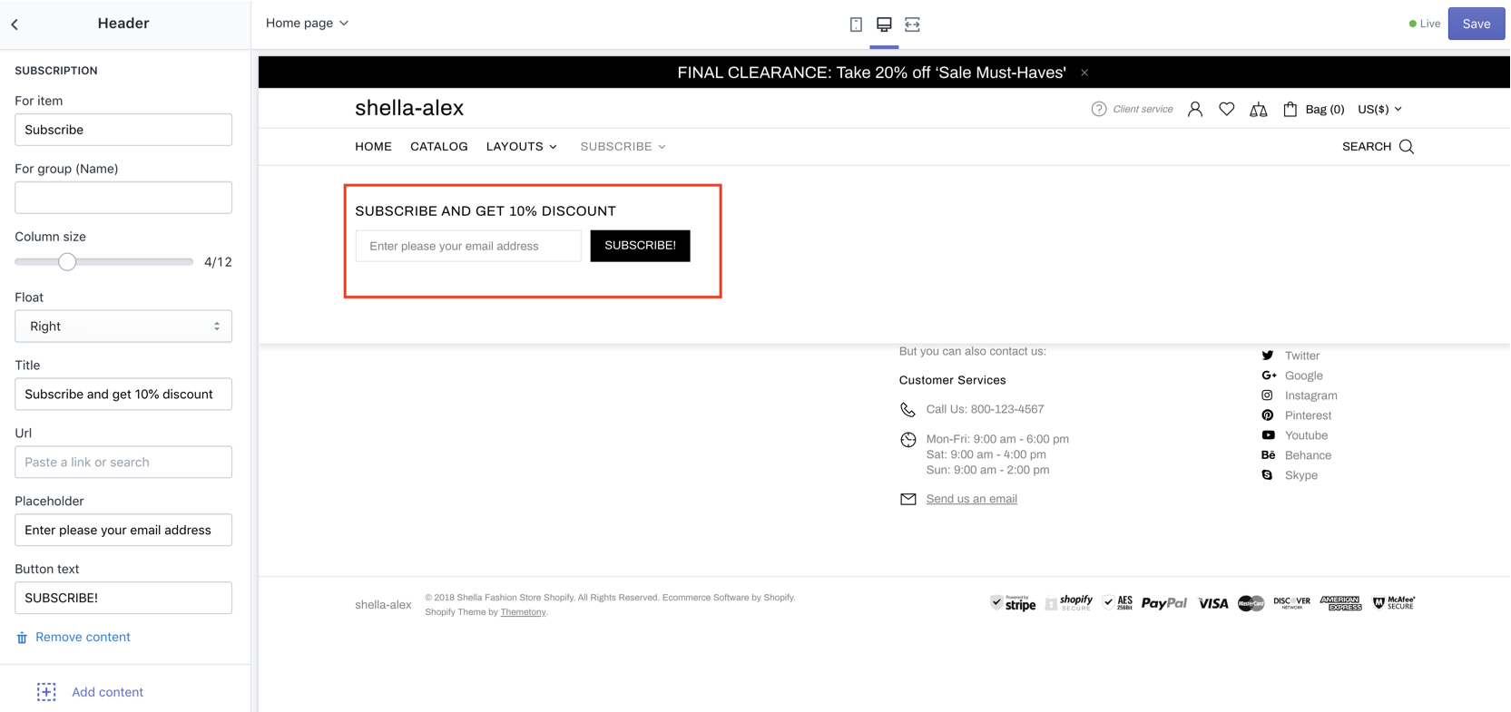
| # | Name | Value | Description |
| 1 | For item | Menu item name | Should match Navigation menu item name. |
| 2 | For group (Name) | Group name | You can group products. Refer to Group (Mega menu) block for more details. |
| 3 | Column size | number 1-12 |
Set block width |
| 4 | Float | Left / right | Align block position |
| 5 | Title | text | Set block title |
| 6 | Url | url | Set title URL |
| 7 | Placeholder | text | Set input placeholder |
| 8 | Button text | text | Set button text |
Group
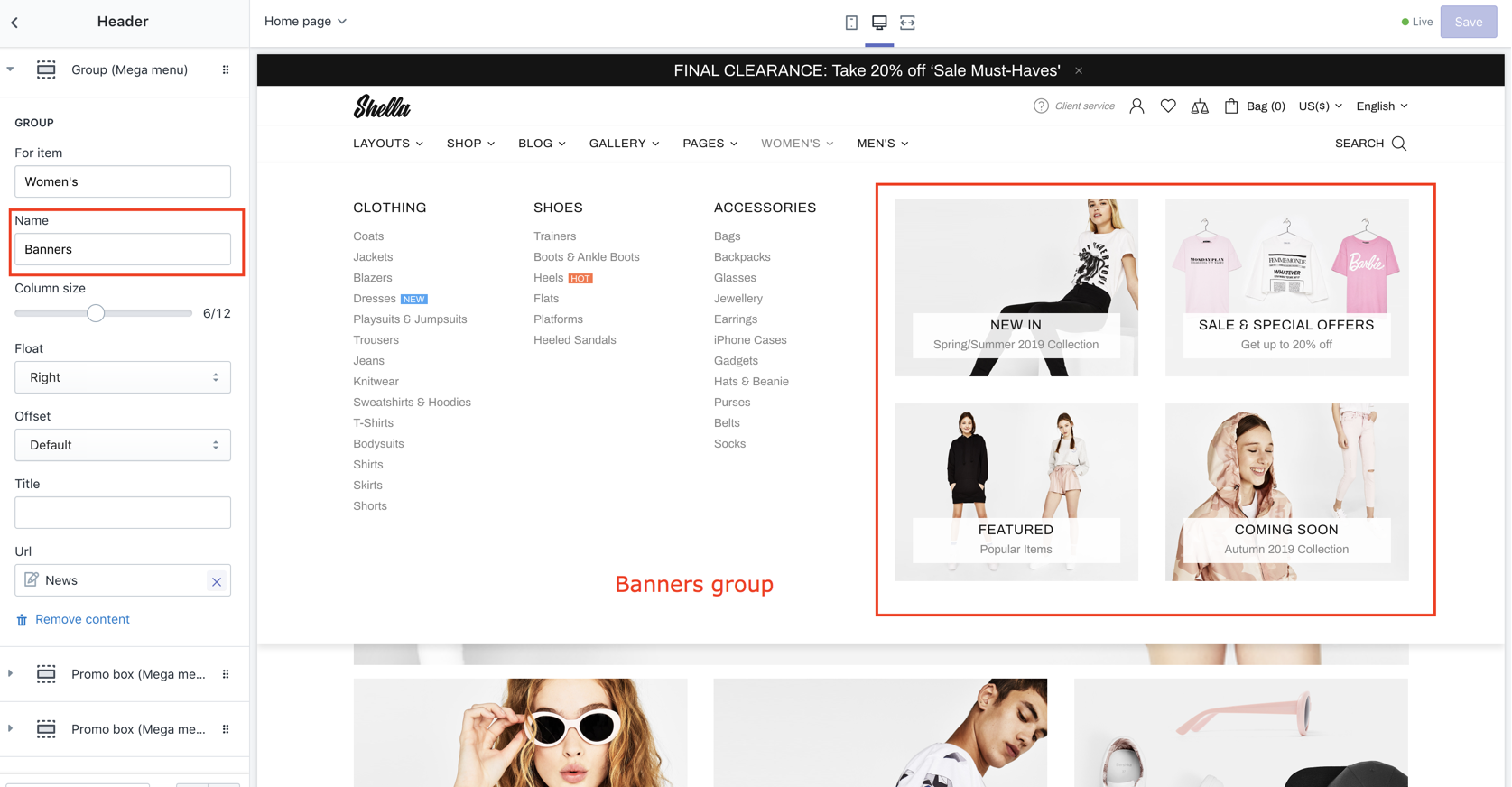
| # | Name | Value | Description |
| 1 | For item | Menu item name | Should match Navigation menu item name. |
| 2 | Name | Group name |
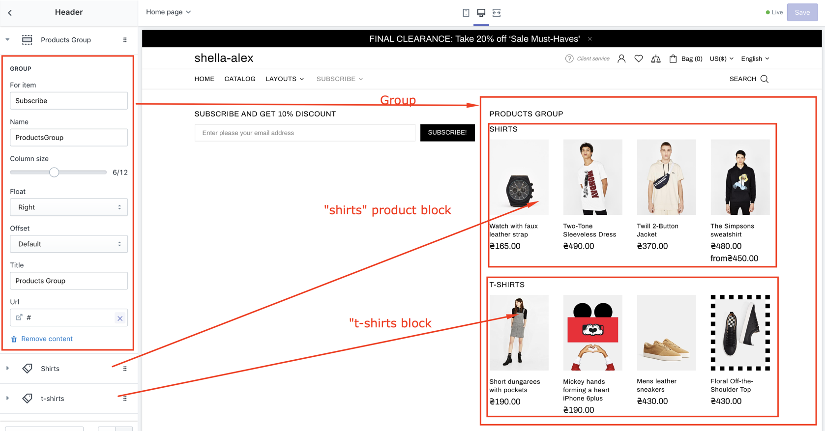
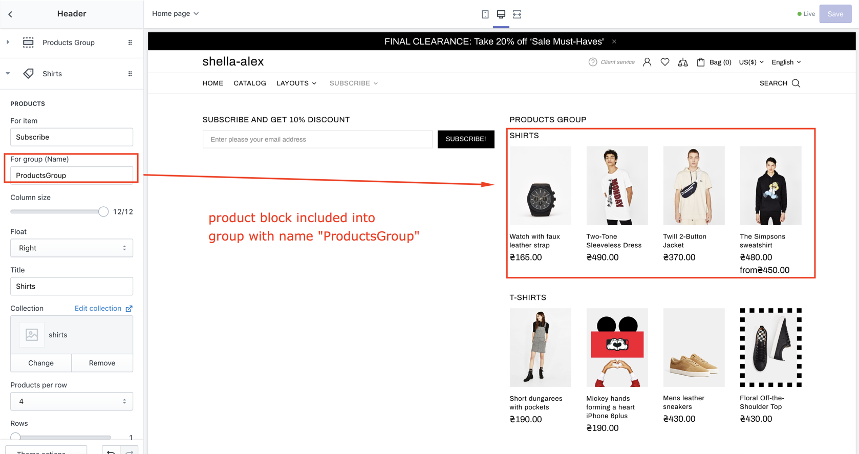
|
| 3 | Column size | number 1-12 | Set block width |
| 4 | Float | Left / right | Align block position |
| 5 | Offset |
Default Small |
Set group margin. Small adds 5px margings at left/right and 10px margin at bottom. |
| 6 | Title | text | Set block title |
| 7 | Url | url | Set block URL |
Title image
For second collection level only, when "Second level is column" disabled.
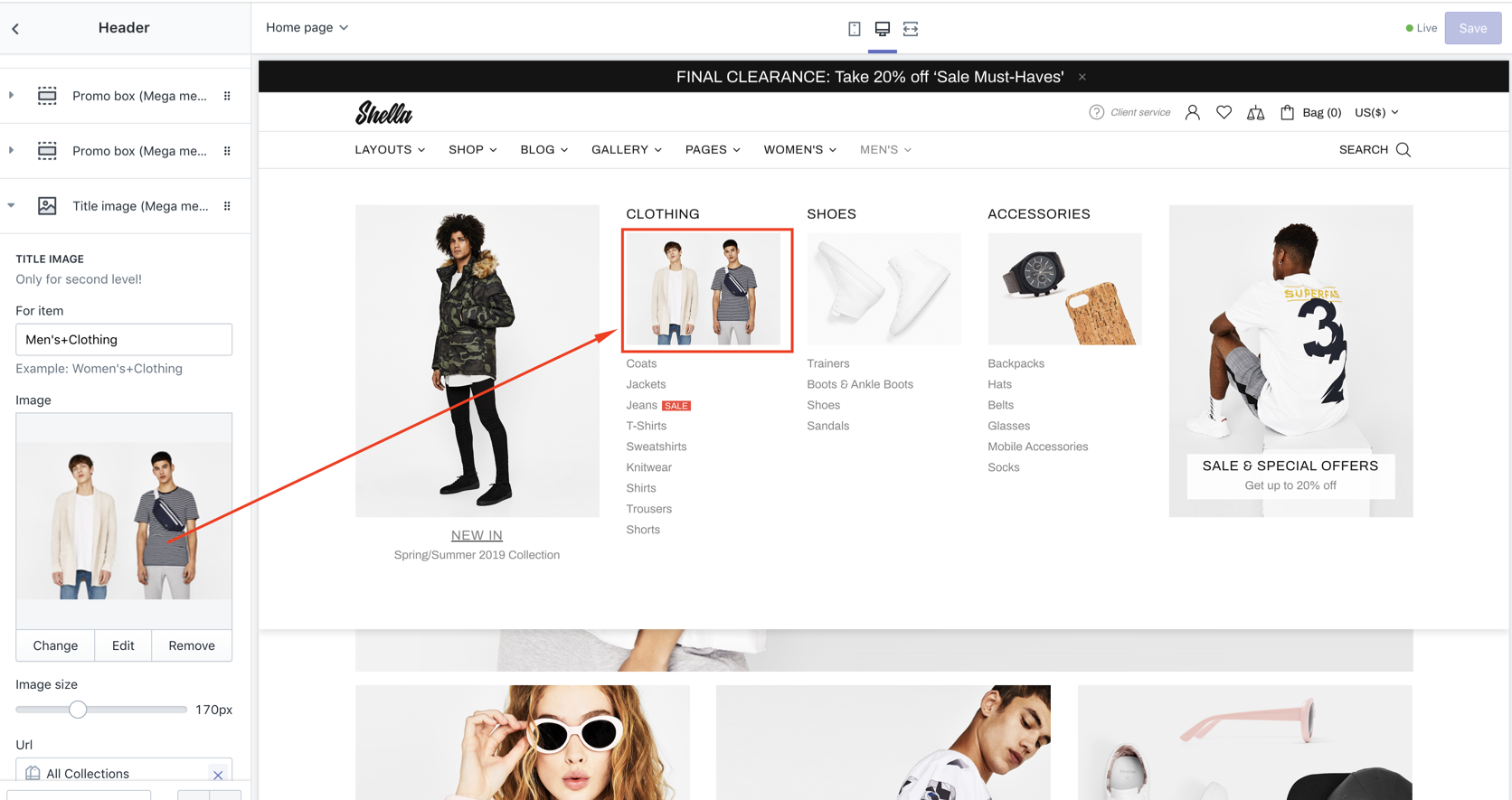
| # | Name | Value | Description |
| 1 | For item | Menu path |
Should match Navigation menu item path concatenated by "+" sign. For example, if you have navigation menu "Men's -> Clothing" Path will looks like "Men's+Clothing" |
| 2 | Image | image | Set image |
| 3 | Image size | number | Set image size |
| 4 | Url | url | Set image URL |
Label
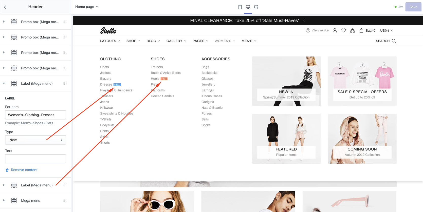
| # | Name | Value | Description |
| 1 | For item | Menu path |
Should match Navigation menu item path concatenated by "+" sign. For example, if you have navigation menu "Men's -> Clothing -> Coats" Path will looks like "Men's+Clothing+Coats" |
| 2 | Type |
New Sale Hot |
Set label type |
| 3 | Text | text | Overwrite text value |
Preview image
| # | Name | Value | Description |
| 1 - 40 | For item #1 - #20 ... Image #1 - Image #20 | Write item + choose image |
Icon
| # | Name | Value | Description |
| 1 - 40 | For item #1 - #20 ... Icon #1 - Icon #20 | Write item + write icon |
Advanced Menu
You can add whole menu from existing menus under selected item
| # | Name | Value | Description |
| 1 | For item | Write item + write icon | |
| 2 | Menu | Select Menu |
Footer
Video manuals:
Footer Options
| # | Name | Value | Description |
| 1 | Type |
Type #1 Type #2 Type #3 Type #4 Type #5 Type #6 |
Set footer type. Type #1 Type #2 Type #3 Type #4 Type #5 Type #6 Type #7 |
| 2 | Content width |
Inherit global settings Full width Boxed |
Set container width. Use value from "Theme settings -> Layout -> Default content width" or overwrite it. |
| 3 | Margin top | number | Set top margin from the Footer to Content. |
| 4 | Responsive margin top | number | Set top margin for responsive mode. |
| 5 | Enable fixed | true / false | Enable/Disable fixed mode of the Footer |
| 6 | Show top border | true / false | Enable/Disable top border line above whole Footer |
| 7 | Show bottom border | true / false | Enable/Disable bottom border line |
| 8 | Show button 'Back to top' | true / false | Show/hide scroll to top button |
| 9 | Button 'Back to top' scroll visible limit | number | Set scroll height when show back to top button |
Footer block: Menu
| # | Name | Value | Description |
| 1 | Show title on desktop | true / false | Show/hide title on desktop |
| 2 | Title | text | Overwrite menu title |
| 3 | Menu | navigation menu | Set navigation menu |
| 4 | Column size | Set column size | |
| 5 | Items limit | Set items limit |
Footer block: Custom html
| # | Name | Value | Description |
| 1 | Show title on desktop | true / false | Show/hide title on desktop |
| 2 | Title | text | Set title |
| 3 | Page content | Select page |
Choose from pages list the page "Include Footer Custom HTML" |
| 4 | Content | content | Make clean if you want to use selected above page |
Footer block: Social media
| # | Name | Value | Description |
| 1 | Title | text | Set title |
| 2 | Enable tooltip | true / false | Show/hide tooltips |
| 3 | Show facebook | true / false | Show/hide facebook icon |
| 4 | Show twitter | true / false | Show/hide twitter icon |
| 5 | Show google | true / false | Show/hide google plus icon |
| 6 | Show instagram | true / false | Show/hide instagram icon |
| 7 | Show pinterest | true / false | Show/hide pinterest icon |
| 8 | Show youtube | true / false | Show/hide youtube icon |
| 9 | Show behance | true / false | Show/hide behance icon |
| 10 | Show skype | true / false | Show/hide skype icon |
Footer block: Newsletter subscription
| # | Name | Value | Description |
| 1 | Title | text | Set title |
| 2 | Paragraph | text | Set description text |
| 3 | Placeholder | text | Set placeholder |
| 4 | Button text | text | Set button text |
Footer block: Logo
| # | Name | Value | Description |
| 1 | Image | image | Set image |
| 2 | Image width | number | Set image size |
| 3 | SVG logo | true / false | Enable / Disable SVG logo |
| 4 | Code of SVG logo | Enter code of SVG logo |
Footer block: Copyright
| # | Name | Value | Description |
| 1 | Enable custom | true / false | Overwrite default copyright |
| 2 | Page content | Select page |
Choose from pages list the page "Include Footer Copyright" |
| 3 | Content | content | Make clean if you want to use selected above page |
Footer block: Payments
| # | Name | Value | Description |
| 1 | Type |
Dark Light |
Set icon color style |
| 2 | Enable tooltip |
true/false |
Enable/Disable |
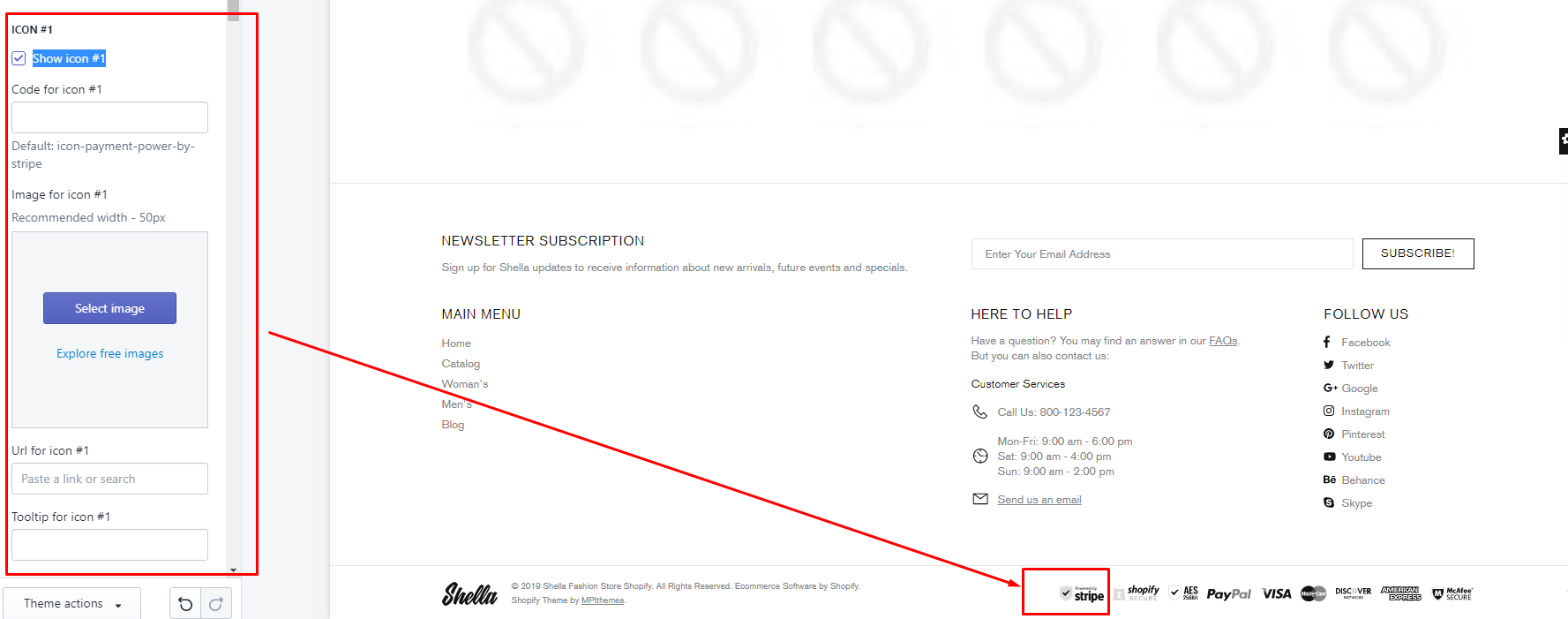
| 3-53 |
PAYMENTS: [options] Icon #1 - #10 |
Show icon #1 - #10 Code for icon #1 - 10 Image for icon #1 - #10 Url for icon #1 - #10 Tooltip for icon #1 - #10 |
|
Popups
Popups Options
| # | Name | Value | Description |
| 1 | SEARCH: Enable | true / false | Show/hide search popup |
| 2 | SEARCH: Ajax search | true / false |
If enabled the dropdown under search button will show content with corresponding search terms. If disabled - content will not appears. |
| 3 | CART: Enable | true / false | Show/hide cart popup |
| 4 | CART: Show free shipping | true / false | Show/hide free shipping |
| 5 | WISHLIST: Enable | true / false | Show/hide wishlist popup |
| 6 | COMPARE: Enable | true / false | Show/hide compare popup |
| 7 | ACCOUNT: Enable | true / false | Show/hide account popup |
| 8 | ACCOUNT: Page content | Select page |
Choose from pages list the page "Include Popup Account" |
| 9 | ACCOUNT: Sign up information | content | Make clean if you want to use selected above page |
| 10 | ACCOUNT: Show subscribe | true / false | Show/hide subscribe block |
| 11 | SERVICES: Enable | true / false | Show/hide service popup |
| 12 | SUBSCRIPTION: Enable | true / false | Show/hide newsletter subscription popup |
| 13 | SUBSCRIPTION: Layout | choose | Type #1 - Type #4 |
| 14 - 17 | SUBSCRIPTION: Texts | texts | Text line #1 - Text line #4 |
| 18 | SUBSCRIPTION: Show form | true / false | Show/hide form |
| 19 - 23 | SUBSCRIPTION: Input placeholder, Button submit text, Link button text, Text 'Don't show again', Text 'Close popup' | texts | Enter texts |
| 24 | SUBSCRIPTION: Image | choose image | Image in form |
| 25 | SUBSCRIPTION: Image width | Number | Choose image width |
| 26 | SUBSCRIPTION: Enable format 'pjpg' | true / false | Enable/Disable format 'pjpg' |
| 27 | SUBSCRIPTION: Link | Enter link | |
| 28 | SUBSCRIPTION: Show once? | true / false | Configure popup behaviour |
| 29 | SUBSCRIPTION: Delay | number | Set timeout delay to show popup |
| 30 | SUBSCRIPTION: Cookies life | time | How long to save user choice in cookies |
| 31 | SUBSCRIPTION CONFIRMATION: Enable | true / false | Show/hide newsletter subscription popup |
| 32 - 33 | SUBSCRIPTION CONFIRMATION: Success message, Success button text | texts | |
| 34 | SIZE GUIDE: Page content | Select page |
Choose from pages list the page "Include Popup Size Guide" |
| 35 | SIZE GUIDE: Content of 'Size guide' | content | Make clean if you want to use selected above page |
| 36 | DELIVERY RETURN: Page content | Select page |
Choose from pages list the page "Include Popup Delivery Return" |
| 37 | DELIVERY RETURN: Content of 'Delivery return' | content | Make clean if you want to use selected above page |
Popup block: Title
| # | Name | Value | Description |
| 1 | Title | text | Set title |
| 2 | Page Content | Select page |
Create and choose from pages list |
| 3 | Content | html code | Make clean if you want to use selected above page |
Popup block: Custom HTML
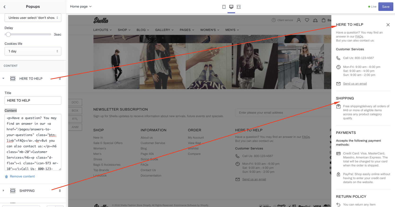
| # | Name | Value | Description |
| 1 | Title | text | Set title |
| 2 | Page content |
Choose from pages list the page "Include Popup Services" |
|
| 3 | Content | Your own text or html content | Make clean if you want to use selected above page |
Footbar
Video manual
Notification cookies
| # | Name | Value | Description |
| 1 | Enable | true / false | Enable/disable notification cookies |
| 2 | Text | This is a standard cookie notice which you can easily adapt or disable as you like in the admin. We use cookies to ensure that we give you the best experience on our website. |
Enter text |
| 3 | Button information | PRIVACY POLICY | Enter text |
| 4 | Button information link | text | Enter a link or search |
| 5 | Button close | ACCEPT | Enter text |
| 6 | Delay | number | Delay time |
| 7 | Show at once | true / false | Enable/disable |
| 8 | Cookies life | 1 day 3 days 1 week 1 month 1 year |
Enable/disable |
Notification products
| # | Name | Value | Description |
| 1 | Enable | true / false | Enable/disable notification products |
| 2 | Collection | Set collection to use | |
| 3 | Text line #1 | Set Text line #1 | |
| 4 | Text line #2 | Set Text line #2 | |
| 5 | Min time value in line #1 (minutes) | Set min time | |
| 6 | Max time value in line #2 (minutes) | Set max time | |
| 7 | Text for minutes | Text | Default: minute|minutes |
| 8 | Place values in line #2 | Set place values | |
| 9 | Delay | Set Delay | |
| 10 | Min interval | Set Min interval | |
| 11 | Max interval | Set Max interval | |
| 12 | Max time life | Set Max time life |
Product footbar
| # | Name | Value | Description |
| 1 | Enable | true / false | Enable/disable product footbar |
| 2 | Show title | true / false | Enable/disable title |
| 3 | Show price | true / false | Enable/disable price |
| 4 | Show sale price separator | true / false | Enable/disable price separator |
| 5 | Show reviews | true / false | Enable/disable reviews |
| 6 | Hide empty reviews | true / false | Hide/show empty reviews |
| 7 | Hide reviews counter | true / false | Hide/show reviews counter |
| 8 | Show options (variants) | true / false | Enable/disable options |
| 9 | Show quantity | true / false | Enable/disable quantity |
| 10 | Show button 'Add to cart' | true / false | Enable/disable button 'Add to cart' |
Swatches
By default theme shows CSS colors default colors. If you need to add some color with specific name or with specific image you can add this option using Global setting.
| # | Name | Value | Description |
| 1 | Product | Associate with the product. Is not required field. | Choose product if you need |
| 2 | Property | Write the word of your option | |
| 3 | Value |
The name of your color option. Don't forget that the same word should be placed in Sidebar COLOR filters and in Product Tags |
Set header type |
| 4 | Color/Image | Choose either color picker of uload image with your option | |
| 5 | Assign to | All Product Filters |
Choose either color picker of uload image with your option |
| 6 | Disable default color/Disable default image | Not required fields. |
Example:
-
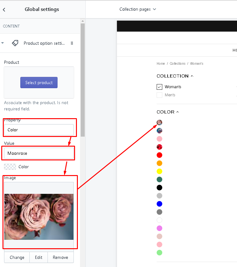
Fill such fields. -
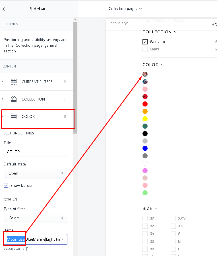
To see this new added option Collection Sidebar filters write the same name in the field Items in COLOR filter.