Builder section
Responsive levels are [1260, 1025, 778, 541]

Builder section options
| # | Name | Value | Description |
| 1 | Custom class for section | text | Set custom css class |
| 2 | Title | text | Set section title |
| 3 | Title style tag | h1-h6 | Choose tag for section title |
| 4 | Content width |
Inherit global settings Full width Boxed |
Set container width. Use value from "Theme settings -> Layout -> Default content width" or overwrite it. |
| 5 | Margin top | Choose margin top | |
| 6 | Responsive margin top | Choose responsive margin top | |
| 7 | Margin bottom | Choose margin bottom | |
| 8 | Responsive margin bottom | Choose responsive margin bottom | |
| 9 | Padding top | Choose padding top | |
| 10 | Padding bottom | Choose padding bottom | |
| 11 | Disable paddings | true / false | Disable section grid paddings |
| 12 | Horizontal align | Set horizontal align | |
| 13 | Vertical align | Set vertical align | |
| 14 | Overflow hidden | true / false | Enable/disable overflow hidden view |
| 15 | Enable 5 columns grid | true / false | Enable/disable 5 columns grid |
| 16 | COLORS: Background | color | Choose color |
Revolution Slider

| # | Name | Value | Description |
| 1 | Name | text | Set slider name. Use same name at Slide block to link blocks with slider |
| 2 | GRID: Size | number | Set slider width for all devices devices |
| 3 | GRID: Responsive size | coma separated list of numbers |
Set width per each screen size. Responsive levels are [1260, 1025, 778, 541] |
| 4 | GRID: Margin top | number | Set margin top value |
| 5 | GRID: Responsive margin top | coma separated list of numbers | Set margin top per each screen size. Responsive levels are [1260, 1025, 778, 541] |
| 6 | GRID: Margin bottom | number | Set margin bottom |
| 7 | GRID: Responsive margin bottom | coma separated list of numbers |
Set margin top per each screen size. Responsive levels are [1260, 1025, 778, 541] |
| 8 | SETTINGS: Grid width | coma separated list of numbers |
Set slider grid width per each screen size. Responsive levels are [1260, 1025, 778, 541] |
| 9 | SETTINGS: Grid height | coma separated list of numbers |
Set slider grid height per each screen size. Responsive levels are [1260, 1025, 778, 541] |
| 10 | SETTINGS: Min height | Default: 550 | Set min height |
| 11 | SETTINGS: Image height size | Default: 550 | Set min height |
| 12 | SETTINGS: Preload spacer | true / false | Enable/disable preload spacer |
| 13 | SETTINGS: Arrows | true / false | Enable/disable slider arrows |
| 14 | SETTINGS: Bullets | true / false | Enable/disable slider bullets |
| 15 | SETTINGS: Delay (seconds) | number | Set time interval to change slide |
Slide for Revolution

| # | Name | Value | Description |
| 1 | For slider (name) | text | Set slider name, same as at Slider block |
| 2 | Type | Clean (Without text) Type #1 (Over the image) |
Choose |
| 3 | Vertical position (Only for type #1) | Top Center Bottom |
Choose |
| 4 | Image | image | Set slider image |
| 5 | Url for image | url | Set slide ULR |
| 6 - 15 |
Show Text line 1 - 3 Text line 1 - 3 Show button #1 - #2 Button text #1 - #2 |
texts - true / false | Enter texts - Enable / Disable |
| 16 | Show list | true / false | Enable / Disable list |
| 17 | List | Choose | Set list |
| 18 | Custom HTML or Template | Enter own html or use Content Builder code | html |
| 19 - 23 | Url for text line #1 - #3, Url for button #1 - #2 | urls | Set urls |
| 24 | Video Url | url | Set url |
| 25 | Youtube or Vimeo video URL | url | Set url |
| 26 | Video autoplay | true / false | Enable / Disable Video autoplay |
| 27 | Video controls | true / false | Enable / Disable Video controls |
| 28 - 32 | COLORS: Text line 1 - 3, Hover text line 1 - 2 | colors | Set colors |
| 33 - 36 | COLORS: Button style #1 - #2, Transparent background for button #1 - #2 | Choose - true / false | Choose style - Enable / Disable |
| 37 | COLORS: Background | color | Set color |
| 38 - 42 | EFFECTS: Delay Slide animation HTML layer animation Parallax of image Parallax of content |
set effects |
Slick Slider
| # | Name | Value | Description |
| 1 | Name | text | Set block Name |
| 2 | GRID: Size | number | Set grid size |
| 3 | GRID: Responsive size | number | Set grid responsive size |
| 4 | GRID: Margin top | number | Choose margin top |
| 5 | SETTINGS: Responsive margin top | coma separated list | Set margin top per each screen size. |
| 6 | GRID: Margin bottom | number | Set margin bottom |
| 7 | GRID: Responsive margin bottom | coma separated list | Set margin bottom per each screen size. |
| 8 | SETTINGS: Responsive height | numbers | Enter responsive height |
| 9 | SETTINGS: Min height | number | Enter Min height |
| 10 | SETTINGS: Arrows | true / false | Enable / Disable Arrows |
| 11 | SETTINGS: Bullets | true / false | Enable / Disable Bullets |
| 12 | SETTINGS: Speed (seconds) | number | Enter Speed |
Slide for Slick
| # | Name | Value | Description |
| 1 | For slider (name) | text | Write slide name (or it will be filled automatically) |
| 2 | Type | Choose | Clean (Without text) Type #1 (over image) |
| 3 | Vertical position (Only for type #1) | Top Center Bottom |
Choose |
| 4 | Image | image | Choose image |
| 5 | Url for image | text | Write url |
| 6 | Image size | number | Choose size |
| 7 | Enable format 'pjpg' | true / false | Enable / Disable format 'pjpg' |
| 8 | Disable lazy load | true / false | Enable / Disable lazy load |
| 9 - 18 | Show texts, button - Enable / Disable texts, buttons | texts - true / false | Enter texts - Enable / Disable |
| 19 | Show list | true / false | Enable / Disable list |
| 20 | List | Choose | Set list |
| 21 | Custom HTML or Template | html | Enter html |
| 22 - 26 | Url for text line #1 - #3, Url for button #1 - #2 | urls | Set urls |
| 27 | Video Url | url | Set url |
| 28 | Youtube or Vimeo video URL | url | Set url |
| 29 | Video autoplay | true / false | Enable / Disable Video autoplay |
| 30 | Video controls | true / false | Enable / Disable Video controls |
| 31 - 35 | COLORS: Text line 1 - 3, Hover text line 1 - 2 | colors | Set colors |
| 36 - 39 | COLORS: Button style #1 - #2, Transparent background for button #1 - #2 | Choose - true / false | Choose style - Enable / Disable |
| 40 | COLORS: Background | color | Set color |
| 41 | ANIMATION: Animation text (Only for type #1) | None Scale In Scale Out Translate Top Translate Bottom Traslate Left Translate Right |
Choose |

| # | Name | Value | Description |
| 1 | GRID: Size | number | Set grid size |
| 2 | GRID: Responsive size | number | Set grid responsive size |
| 3 | GRID: Fixed height | number | Set fixed height size |
| 4 | GRID: Margin top | number | Choose margin top |
| 5 | SETTINGS: Responsive margin top | coma separated list | Set margin top per each screen size. |
| 6 | GRID: Margin bottom | number | Set margin bottom |
| 7 | GRID: Responsive margin bottom | coma separated list | Set margin bottom per each screen size. |
| 8 | SETTINGS: User name | text | Enter your User name |
| 9 | SETTINGS: Tag | text | Enter your Tag |
| 10 | SETTINGS: Show post details | true / false | Enable / Disable post details. |
| 11 | SETTINGS: Disable paddings | true / false | Enable / Disable paddings. |
| 12 | SETTINGS: Items limit | number | Set items limit |
| 13 | SETTINGS: Size | choose | 2/12 3/12 4/12 6/12 12/12 |
| 14 | SETTINGS: Responsive size | number | Set size |
Instagram block
You don't have to add this block. If you haven't added it posts from your Instagram account will be loaded.
It is developed for optimisation purposes. You can have in your Instagram optimised images which are not loaded from external resources.
| # | Name | Value | Description |
| 1 | Image | Choose image | |
| 2 | Image size | Choose image size | |
| 3 | Enable format 'pjpg' | true / false | Enable/disable format 'pjpg' |
| 4 | Disable lazy load | true / false | Enable/disable lazy load |
| 5 | Url | Paste a link or search | |
| 6 | Content | html code | Default demo code see Example html |
Promo box

| # | Name | Value | Description |
| 1 | GRID: Size | number | Set block width |
| 2 | GRID: Responsive size | coma separated list | Set block width per each screen size. |
| 3 | GRID: Visible | All Only desktop Only mobile |
Set visibility |
| 4 | GRID: Responsive height | number | Set Responsive height |
| 5 | GRID: Min height | number | Set MIin height |
| 6 | GRID: Margin top | number | Set margin top |
| 7 | GRID: Responsive margin top | coma separated list | Set margin top per each screen size. |
| 8 | GRID: Margin bottom | number | Set margin bottom |
| 9 | GRID: Responsive margin bottom | number | Set margin bottom per each screen size. |
| 10 | GRID: Padding top | number | Set Padding top |
| 11 | GRID: Padding bottom | number | Set Padding bottom |
| 12 | SETTINGS: Type |
Clean Text Type #1 Type #2 Type #3 Type #4 |
Set Promobox type |
| 13 | Vertical position (Only for type #1) | Top Center Bottom |
Choose |
| 14 | SETTINGS: Border image on hover | true / false | Enable / Disable Border image on hover |
| 15 | SETTINGS: Image | image | Set image |
| 16 | SETTINGS: Url for image | url | Set Url for image. |
| 17 | SETTINGS: Image size | number | Set image size |
| 18 | SETTINGS: Enable format 'pjpg' | true / false | Enable/disable format 'pjpg' |
| 19 | SETTINGS: Disable lazy load | true / false | Enable/disable lazy load |
| 20 - 29 | SETTINGS: Show texts, button - Enable / Disable texts, buttons | texts - true / false | Enter texts - Enable / Disable |
| 30 | SETTINGS: Show list | true / false | Enable / Disable list |
| 31 | SETTINGS: List | Choose | Set list |
| 32 | SETTINGS: Custom HTML or Template | content | Enter your own html or use Content Builder |
| 33 - 37 | SETTINGS: Url for text line #1 - #3, Url for button #1 - #2 | urls | Set urls |
| 38 | SETTINGS: Video Url | url | Set url |
| 39 | SETTINGS: Youtube or Vimeo video URL | url | Set url |
| 40 | SETTINGS: Video autoplay | true / false | Enable / Disable Video autoplay |
| 41 | SETTINGS: Video controls | true / false | Enable / Disable Video controls |
| 42 | SETTINGS: Enable curtain on hover | true / false | Enable / Disable curtain on hover. See examples of blocks with curtains in the Skin 10 - Kitchen |
| 43 | Custom HTML or Template for Curtain | content |
This content will be seen after hovering block. If this block is empty main html for promo box will be seen on hover For example: Promo box view  HTML on hover  |
| 44 | SETTINGS: Enable curtain scale effect | true / false | Enable / Disable curtain scale effect |
| 45 - 66 | COLORS: Text line 1 - 3 Image mask Image mask opacity Hover text line 1 - 2 Button style #1 - #2 Transparent background for button #1 - #2 Text background Background (All block) Curtain text line 1 - 3 Curtain button style #1 - #2 Curtain transparent background for button #1 - #2 Curtain background Curtain background opacity |
content | Enter your own html or use Content Builder |
| 67 - 72 | ANIMATION: [options] | Change options |
Products

| # | Name | Value | Description |
| 1 | GRID: Size | number | Set block width |
| 2 | GRID: Responsive size | coma separated list | Set block width per each screen size. |
| 3 | GRID: Margin top | number | Set margin top |
| 4 | GRID: Responsive margin top | coma separated list | Set margin top per each screen size. |
| 5 | GRID: Margin bottom | number | Set margin bottom |
| 6 | GRID: Responsive margin bottom | coma separated list | Set margin bottom per each screen size. |
| 7 | SETTINGS: Title | text | Set block title |
| 8 | SETTINGS: Collection | collection | Set product collection |
| 9 | SETTINGS: Maximum products in column | number | Set products limit |
| 9 | SETTINGS: Disable lazy load | true / false | Enable / Disable lazy load. |
Custom HTML

| # | Name | Value | Description |
| 1 | GRID: Size | number | Set block width |
| 2 | GRID: Responsive size | coma separated list | Set block width per each screen size. |
| 3 | GRID: Margin top | number | Set margin top |
| 4 | GRID: Responsive margin top | coma separated list | Set margin top per each screen size. |
| 5 | GRID: Margin bottom | number | Set margin bottom |
| 6 | GRID: Responsive margin bottom | coma separated list | Set margin bottom per each screen size. |
| 7 | SETTINGS: Page content | page code | Choose page |
| 8 | SETTINGS: Content | html code | Enter html or left empty |
Space for vertical menu
| # | Name | Value | Description |
| 1 | Menu | menu | Choose existing menu |
BUILDER: Spacer

| # | Name | Value | Description |
| 1 | Custom class for section | text | Set custom css class |
| 2 | Show separator | true / false | Enable / Disable lazy load |
| 3 | Content width | Full width Boxed Inherit global settings |
Choose |
| 4 | Margin top | Choose margin top | |
| 5 | Responsive margin top | Choose responsive margin top | |
| 6 | Margin bottom | Choose margin bottom | |
| 7 | Responsive margin bottom | Choose responsive margin bottom |
Articles carousel

| # | Name | Value | Description |
| 1 | Custom class for section | text | Set custom css class |
| 2 | Title | text | Set section title |
| 3 | Title style tag | h1-h6 | Choose tag for section title |
| 4 | Show top separator | true / false | Enable/disable top separator |
| 5 | Margin top | Choose margin top | |
| 6 | Responsive margin top | Choose responsive margin top | |
| 7 | Margin bottom | Choose margin bottom | |
| 8 | Responsive margin bottom | Choose responsive margin bottom | |
| 9 | Blog | blog | Select blog |
| 10 | Layout | #1 (in row) #2 (in row) |
Select layout |
| 11 | Show post details | true / false | Enable/disable post details |
| 12 | Button text (layout #2) | text | Set button text |
| 13 | Items per row | number | Set items per row |
| 14 | Autoplay | true / false | Enable/disable auto scroll |
| 15 | Autoplay speed | number | Set autoplay timeout |
| 16 | Is infinite | true / false | Enable/disable infinite scroll |
| 17 | Arrows | true / false | Show/hide arrows |
| 18 | Bullets | true / false | Show/hide bullets |
| 19 | Disable lazy load | true / false | Enable / Disable lazy load |
Brands carousel

| # | Name | Value | Description |
| 1 | Custom class for section | text | Set custom css class |
| 2 | Title | text | Set section title |
| 3 | Title style tag | h1-h6 | Choose tag for section title |
| 4 | Show top separator | true / false | Enable/disable top separator |
| 5 | Margin top | Choose margin top | |
| 6 | Responsive margin top | Choose responsive margin top | |
| 7 | Margin bottom | Choose margin bottom | |
| 8 | Responsive margin bottom | Choose responsive margin bottom | |
| 9 | Layout | Slider Grid |
Choose type of carousel |
| 10 | Items per row (Only for Slider) | number | Set items per row |
| 11 | Image max width | number | Chosse image max width |
| 12 | Bordered links | true / false | Enable/disable bordered links |
| 13 | Autoplay | true / false | Enable/disable auto scroll |
| 14 | Autoplay speed | number | Set autoplay timeout |
| 15 | Is infinite | true / false | Enable/disable infinite scroll |
| 16 | Arrows | true / false | Show/hide arrows |
| 17 | Bullets | true / false | Show/hide bullets |
| 18 | Disable lazy load | true / false | Enable / Disable lazy load |
Content - Brand block
| # | Name | Value | Description |
| 1 | Image | image | Set brand image |
| 2 | Link | url | Set brand URL |
Products carousel

| # | Name | Value | Description |
| 1 | Enable | true / false | Show/hide the block |
| 2 | Custom class for section | text | Set custom css class |
| 3 | Show title | true / false | Show/hide title |
| 4 | Title style tag | h1-h6 | Choose tag for section title |
| 5 | Show top separator | true / false | Show/hide 1px grey line separator |
| 6 | Content width | Boxed Full width Inherit global settings |
Choose |
| 7 | Margin top | Choose margin top | |
| 8 | Responsive margin top | Choose responsive margin top | |
| 9 | Margin bottom | Choose margin bottom | |
| 10 | Responsive margin bottom | Choose responsive margin bottom | |
| 11 | Items per row | number | Set number of products per row |
| 12 | Max count | number | Set products limit |
| 13 | Autoplay | true / false | Enable/disable auto scroll |
| 14 | Autoplay speed | number | Set timeout limit for auto scroll |
| 15 | Is infinite | true / false | Enable/disable infinite scroll |
| 16 | Arrows | true / false | Show/hide arrows |
| 17 | Bullets | true / false | Show/hide bullets |
| 18 | Disable lazy load | true / false | Enable / Disable lazy load |
| 19 | Async ajax loading | true / false | Enable/disable async ajax loading |
Content - Products carousel
| # | Name | Value | Description |
| 1 | Title | text | Set title |
| 2 | Collection | Choose collection |
Forms
Contact form
| # | Name | Value | Description |
| 1 | Custom class for section | text | Set custom css class |
| 2 | Title | text | Set section title |
| 3 | Margin top | Choose margin top | |
| 4 | Responsive margin top | Choose responsive margin top | |
| 5 | Margin bottom | Choose margin bottom | |
| 6 | Responsive margin bottom | Choose responsive margin bottom |
Content
| # | Name | Value | Description |
| 1 | Page content | Select page |
Choose any page from pages list |
| 2 | Content | content | Make clean if you want to use selected above page |
Search form
| # | Name | Value | Description |
| 1 | Custom class for section | text | Set custom css class |
| 2 | Content width | Boxed Full width Inherit global setting |
Choose |
| 3 | Margin top | Choose margin top | |
| 4 | Responsive margin top | Choose responsive margin top | |
| 5 | Margin bottom | Choose margin bottom | |
| 6 | Responsive margin bottom | Choose responsive margin bottom |
Content
| # | Name | Value | Description |
| 1 | Title | text | Set title |
| 2 | Paragraph | text | Set paragraph |
| 3 | Search design type | Type #1 Type #2 |
Choose search design type |
| 4 | Placeholder | text | Set placeholder |
| 5 | Button text | text | Set button text |
Subscription form
| # | Name | Value | Description |
| 1 | Custom class for section | text | Set custom css class |
| 2 | Show top separator | true / false | Enable/disable top separator |
| 3 | Show bottom separator | true / false | Enable/disable bottom separator |
| 4 | Margin top | Choose margin top | |
| 5 | Responsive margin top | Choose responsive margin top | |
| 6 | Margin bottom | Choose margin bottom | |
| 7 | Responsive margin bottom | Choose responsive margin bottom |
Content
| # | Name | Value | Description |
| 1 | Title | text | Write title text |
| 2 | Paragraph | text | Write text paragraph |
| 3 | Placeholder | text | Write placeholder text |
| 4 | Button text | text | Write button text |
| 5 | Subscription button type | Type #1 - Type #3 | Choose |
Information line

| # | Name | Value | Description |
| 1 | Custom class for section | text | Set custom css class |
| 2 | Title | text | Set section title |
| 3 | Show border | true / false | Show/hide top border |
| 4 | Margin top | Choose margin top | |
| 5 | Responsive margin top | Choose responsive margin top | |
| 6 | Margin bottom | Choose margin bottom | |
| 7 | Responsive margin bottom | Choose responsive margin bottom | |
| 8 | Icon color | color | Set icon color |
| 9 | Title color | color | Set title color |
| 10 | Paragraph color | color | Set text color |
| 11 | Background color | color | Set background color |
Content - Title text
| # | Name | Value | Description |
| 1 | Icon snippet name | html code |
theme-116 Open corresponding file in "Edit code" section -> Snippets -> open file: icon-theme-116.liquid |
| 2 | Title | text | Set title |
| 3 | Paragraph | text | Set text |
Collections

| # | Name | Value | Description |
| 1 | Custom class for section | text | Set custom css class |
| 2 | Products per row | number | Set number of products per row |
| 3 | Max count | number | Set product number per collection |
| 4 | Responsive size | coma separated list | Set block size per each screen size. |
| 5 | Margin top | Choose margin top | |
| 6 | Responsive margin top | Choose responsive margin top | |
| 7 | Margin bottom | Choose margin bottom | |
| 8 | Responsive margin bottom | Choose responsive margin bottom | |
| 9 | Disable lazy load | true / false | Enable / Disable lazy load |
Options
| # | Name | Value | Description |
| 1 | Custom class for section | text | Set custom css class |
| 2 | Products per row | number | Set number of products per row |
| 3 | Max count | number | Set product number per collection |
| 4 | Responsive size | coma separated list | Set block size per each screen size. |
| 5 | Margin top | Choose margin top | |
| 6 | Responsive margin top | Choose responsive margin top | |
| 7 | Margin bottom | Choose margin bottom | |
| 8 | Responsive margin bottom | Choose responsive margin bottom | |
| 9 | Disable lazy load | true / false | Enable / Disable lazy load |
One product
| # | Name | Value | Description |
| 1 | Custom class for section | text | Set custom css class |
| 2 | Margin top | Choose margin top | |
| 3 | Responsive margin top | Choose responsive margin top | |
| 4 | Margin bottom | Choose margin bottom | |
| 5 | Responsive margin bottom | Choose responsive margin bottom | |
| 6 | GENERAL: Product | Choose product | |
| 7 | GENERAL: Reverse layout | true / false | Change position of Product image and Product Information |
| 8 | GALLERY: Image | Choose image from existing images | |
| 9 | GALLERY: Image size | Choose size | |
| 10 | GALLERY: Arrows | true / false | Enable / Disable arrows |
| 11 - 21 | INFORMATION: [options] | true / false | Show/hide product elements in block |
| 22 | INFORMATION: Description content | Enter text or html | |
| 23 - 41 | INFORMATION: [options] | true / false | Show/hide product elements in block |
Spacer
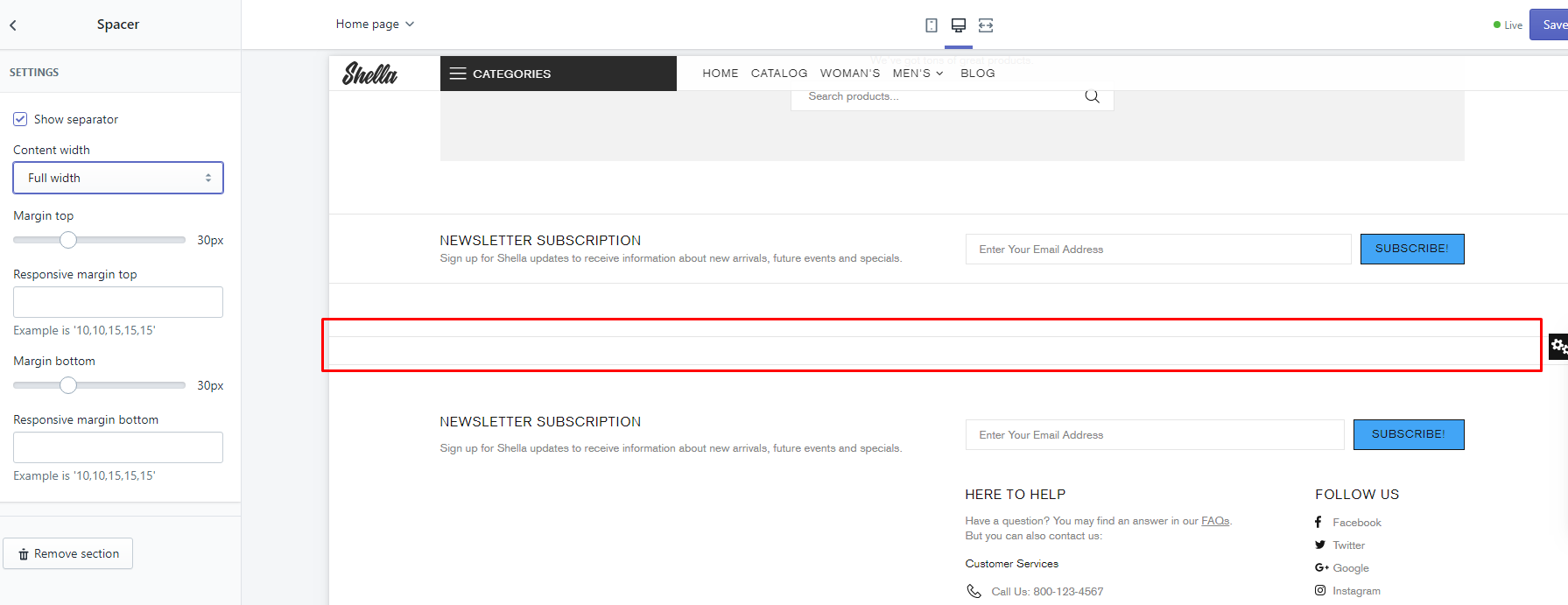
| # | Name | Value | Description |
| 1 | Custom class for section | text | Set custom css class |
| 2 | Show separator | true / false | Enable / Disable lazy load |
| 3 | Content width | Full width Boxed Inherit global settings |
Choose |
| 4 | Margin top | Choose margin top | |
| 5 | Responsive margin top | Choose responsive margin top | |
| 6 | Margin bottom | Choose margin bottom | |
| 7 | Responsive margin bottom | Choose responsive margin bottom |
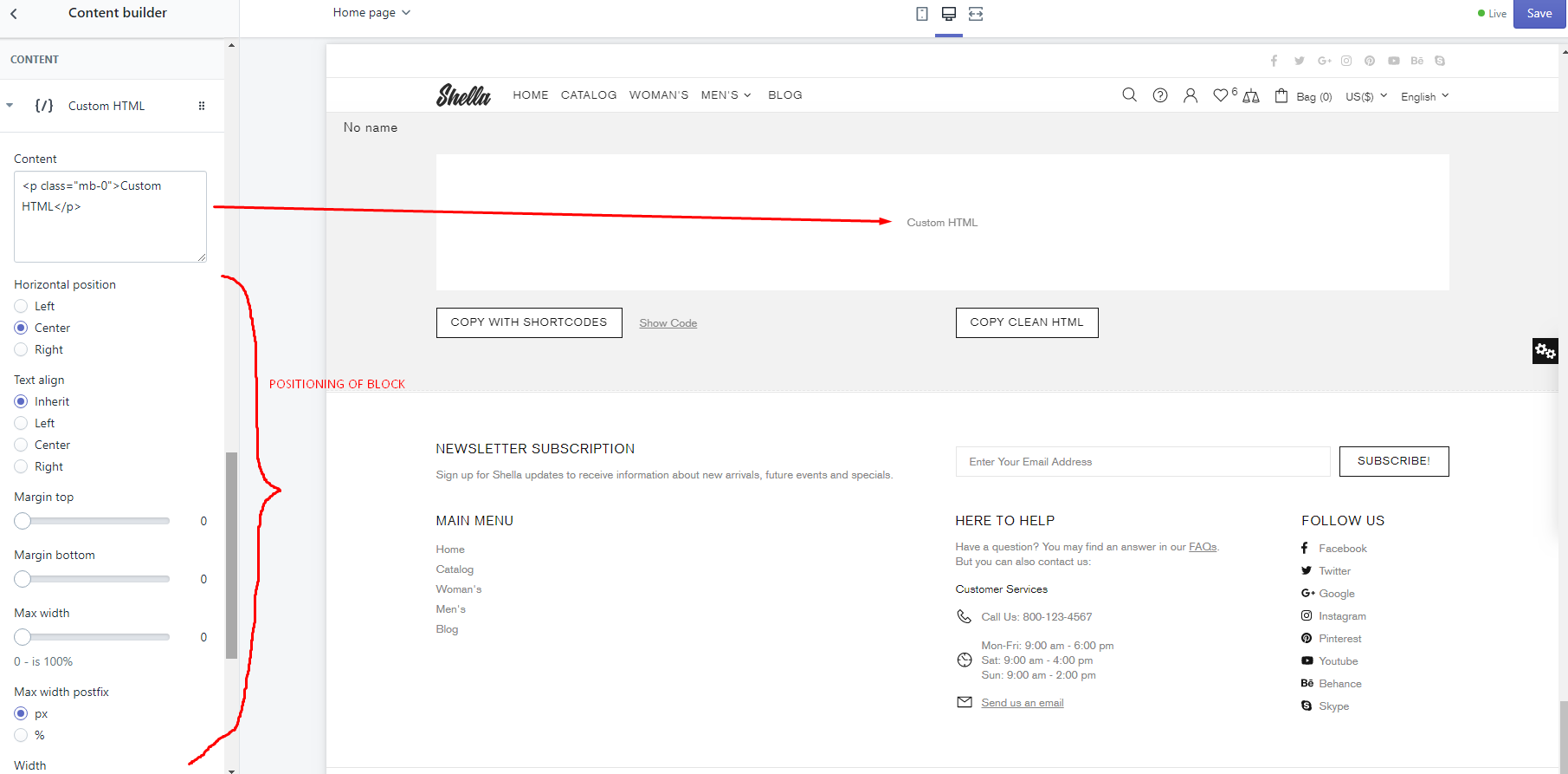
Content builder
This is not usual section. This section is used only to configure text content layout and copy result to needed block.
Some of theme sections has "Custom HTML" field or "Content" field. Where customer may add custom content. But many customers doesn't want to edit HTML code. In content builder you can configure custom content. Section will generate code, which you should paste to "Custom HTML" field or "Content" field.
Workflow
-
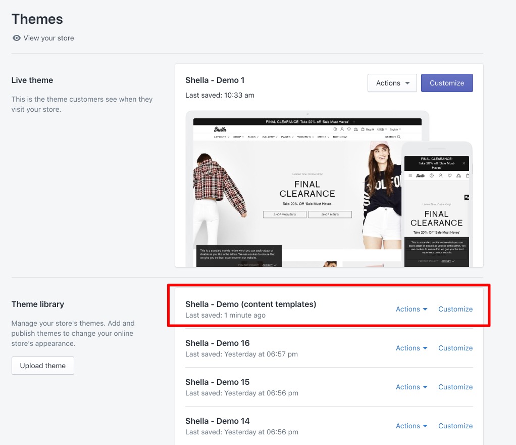
Duplicate your current Shella theme. Give it meaningful name. For example - Shella content builder.
-
Add Content builder section.
-
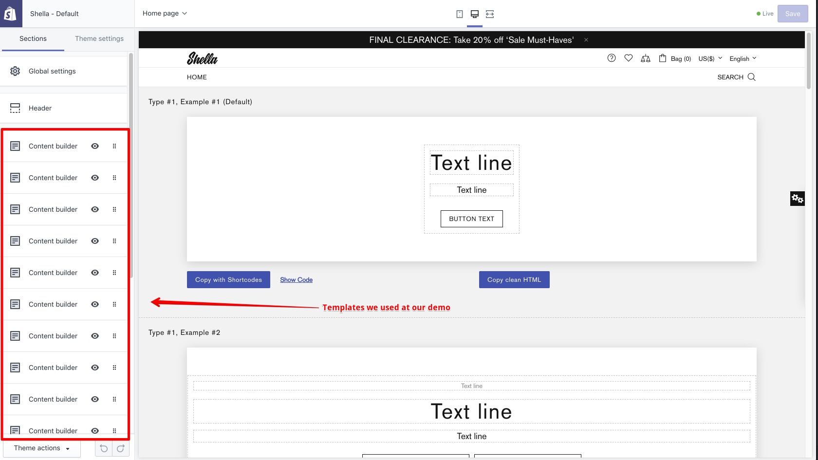
Configure content. You can build your own content layout or use templates from our demo - https://take.ms/1GssY
- Copy result configuration with shortcodes using "Copy with Shortcodes" button
- Paste result in PromoBox or Slide content field to main theme
-
Fill block text and link options. It values will be replaced in shortcodes.
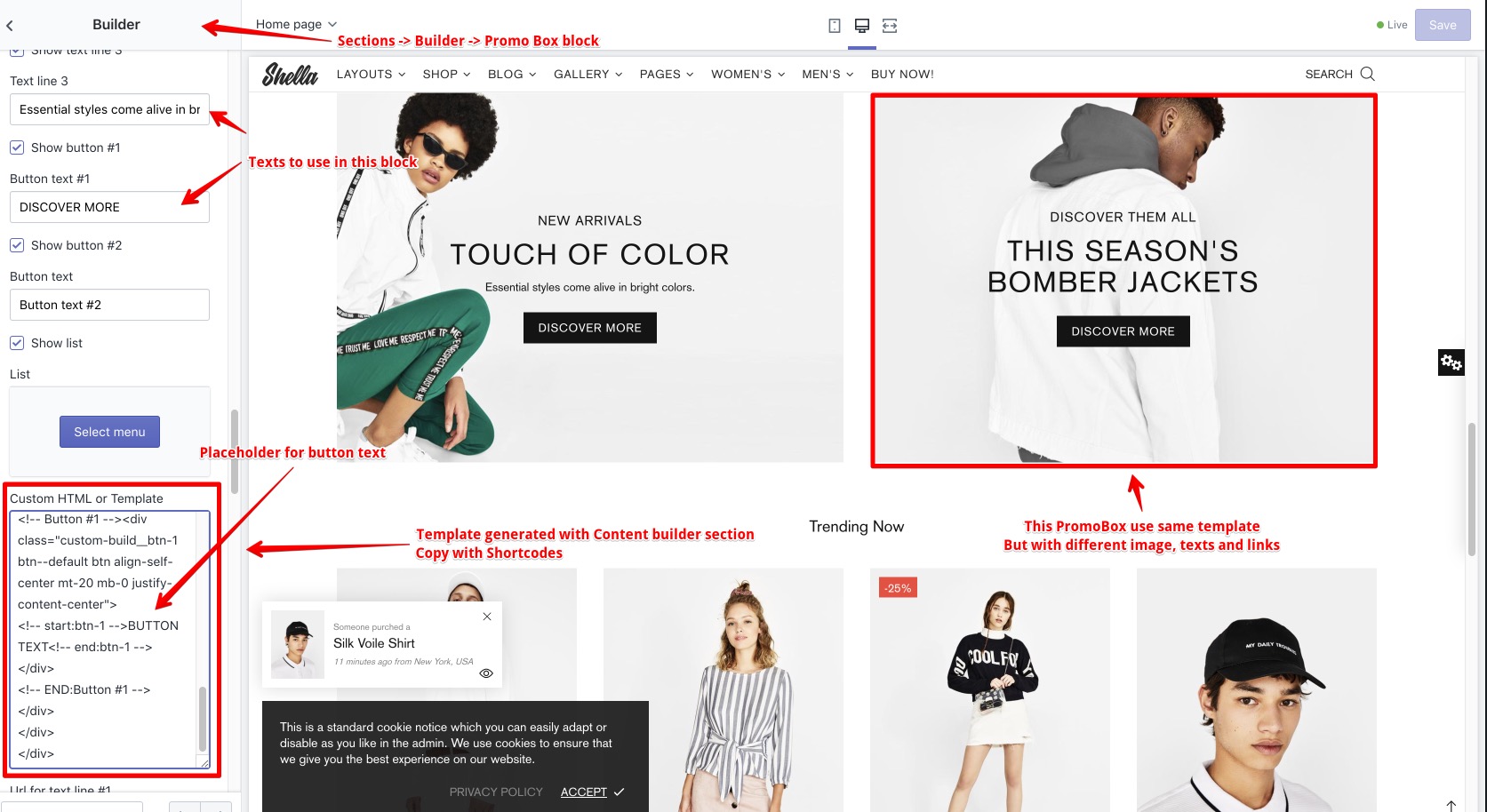
- Save this template in unpublished theme for future editing and usage
What is the difference between "Copy with Shortcodes" and "Copy clean HTML"?
Code with shortcodes is template, which you can reuse in multiple blocks. For example you want to add three banners with same layout. The difference is only in image, text and link. In this case you should build banner template, copy code with shortcodes and replace texts and links at final promobox block.
Code with shortcodes allow you to build banner template one time. And easily update texts and links without changing template.
Code with shortcodes has some limits. You can configure banner layout using up to 4 text lines and up to two buttons. If you need more complex layouts you should use clean HTML code.
Section options
DEVELOPMENT SETTINGS
This options work only at content builder section. And not effect generated code.
Name - to add name for template
Content width and Canvas background - to change canvas preview.
Enable developer mode - to show dotted line around content blocks. Hidden on hover.

SETTINGS
Section setting to configure position, width, margins, paddings, border and background. Section may include multiple content blocks.

You can configure section to have auto width, based on content length.
\

You can configure section width for all available space.

Content blocks
You can add next content blocks:
- Text
- Button
- Button group
- List
- Cutsom HTML

Content block: Text

Content block: Button

Content block: Buttons group and List
These blocks have same font, width and position options
Content block: Cutsom HTML