Full width head
To activate it go in Theme settings -> Collection page -> enable the option "Enable full width head section"
It has the same blocks as Head Section
Sidebar
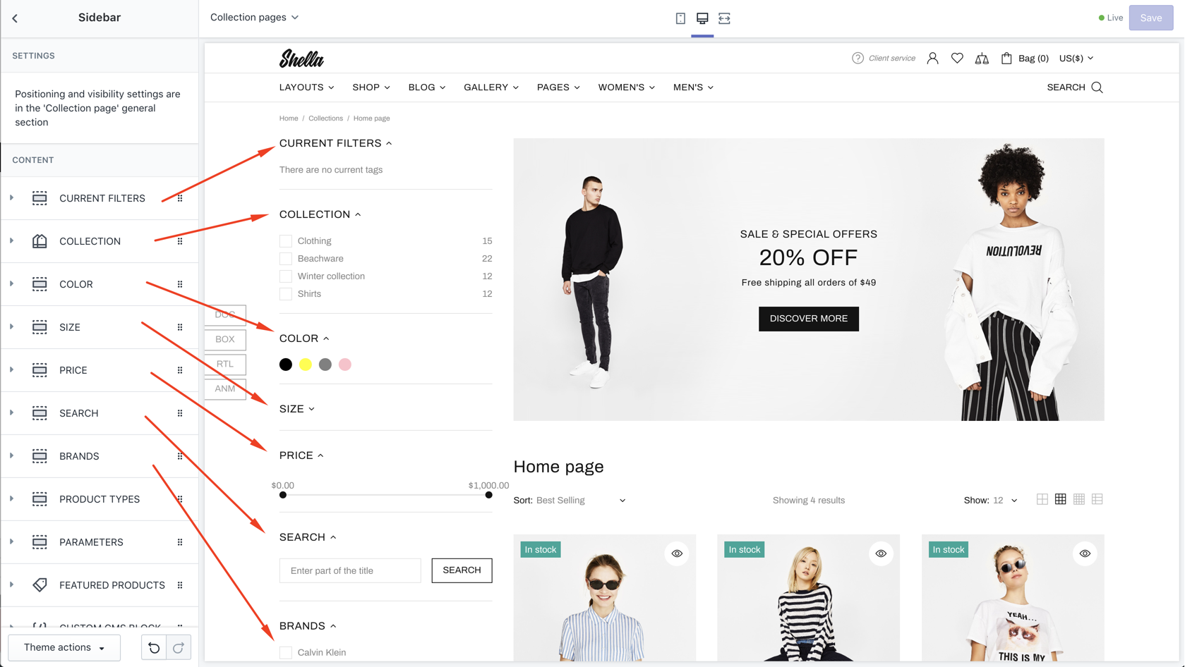
Sidebar: Current filters
| # | Name | Value | Description |
| 1 | Title | text | Set block title |
| 2 | Default state | Set block state | |
| 3 | Show border | true / false | Show/hide block border |
Sidebar: Parameters
| # | Name | Value | Description |
| 1 | Title | text | Set block title |
| 2 | Default state | Set block state | |
| 3 | Show border | true / false | Show/hide block border |
Sidebar: Collections
| # | Name | Value | Description |
| 1 | Title | text | Set block title |
| 2 | Default state | Set block state | |
| 3 | Show border | true / false | Show/hide block border |
| 4 | Menu | navigation menu | Set list of collections |
| 5 | Type of tags input |
Radio Checkbox |
Set filter input |
Sidebar: Filters
| # | Name | Value | Description |
| 1 | SECTION SETTINGS: Title | text | Set block title |
| 2 | SECTION SETTINGS: Default state | Set block state | |
| 3 | SECTION SETTINGS: Show border | true / false | Show/hide block border |
| 4 | CONTENT: Type of filter |
Tags Colors Vendors Product types |
Set filter type Tags - filter by tag, show as checkbox Color - filter by tag, show as color circle Vendors - filter by vendor, show as checkbox Product types - filter by product type, show as checkbox |
| 5 | CONTENT: Items | list of values, separated by "|" sign | Set list of values |
| 6 | CONTENT: Show all from collection | true / false | Show available values from products |
| 7 | CONTENT: Direction |
Rows Columns |
Set values alignment |
| 8 | CONTENT: Max column size | number |
Set maximum number of values per column. |
| 9 | CONTENT: Columns | number | Set columns number |
| 10 | CONTENT: For collections (default - is for all) | Write if you need to not display filter for all collections |
Sidebar: Filter by price
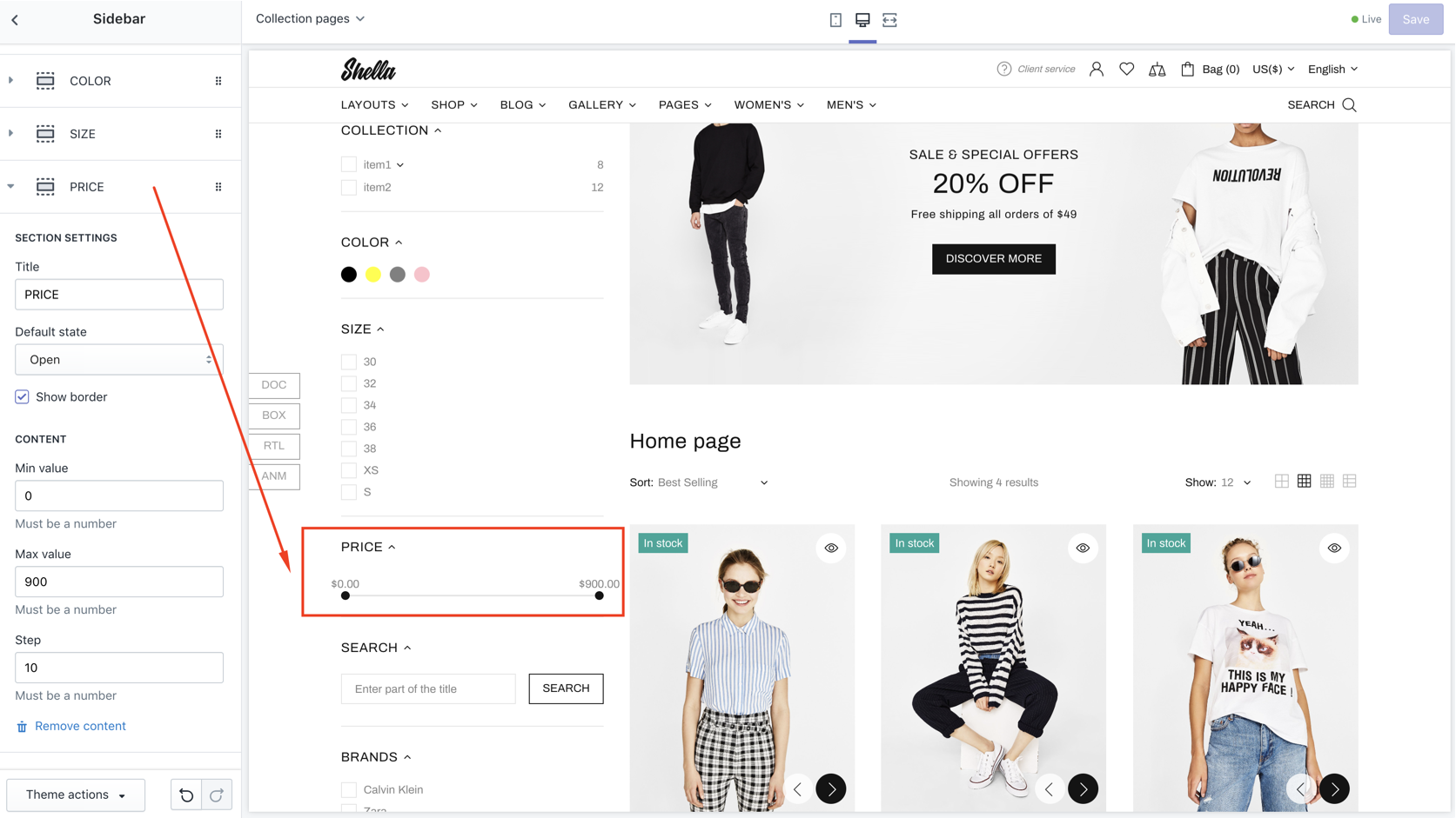
| # | Name | Value | Description |
| 1 | Title | text | Set block title |
| 2 | Default state | Set block state | |
| 3 | Show border | true / false | Show/hide block border |
| 4 | Min value | number | Set minimum price range |
| 5 | Max value | number | Set maximum price range |
| 6 | Step | number | Set step |
Sidebar: Filter by title
Add filter by title field, for example SEARCH
| # | Name | Value | Description |
| 1 | Title | text | Set block title |
| 2 | Default state | Set block state | |
| 3 | Show border | true / false | Show/hide block border |
| 4 | Placeholder | text | Set placeholder text |
| 5 | Button text | text | Set button text |
Sidebar: Products
| # | Name | Value | Description |
| 1 | Title | text | Set block title |
| 2 | Default state | Set block state | |
| 3 | Show border | true / false | Show/hide border |
| 4 | Collection | product collection | Set product collection |
| 5 | Max count | number | Limit products from collection |
| 6 | Products type |
Short Full |
Set product design |
Sidebar: Sidebar: Custom HTML
| # | Name | Value | Description |
| 1 | Title | text | Set block title |
| 2 | Default state | Set block state | |
| 3 | Show border | true / false | Show/hide block border |
| 4 | Page content | Select page |
Choose from pages list the page "Include Collection Sidebar" Example |
| 5 | Content | content | Make clean if you want to use selected above page |
Sidebar: Promobox
| # | Name | Value | Description |
| 1 | Title | text | Set block title |
| 2 | Default state | Set block state | |
| 3 | Show border | true / false | Show/hide block border |
| 4 | Type |
Clean (without text) Type #1 Type #2 Type #3 Type #4 |
Set promobox type. Same types as for home page section. Refer to home page Builder -> Promobox block for more details. |
| 5 | Border image on hover | true / false | Show/hide block border |
| 6 | Image | image | Set promobox image |
| 7 | Url for image | image | Set promobox image |
| 8 | Image size | number | Set image size |
| 9 | Enable format 'pjpg' | true / false | Enable / Disable format progressive jpg |
| 10 | Disable lazy load | true / false | Enable / Disable lazy load |
| 11 | Show text line 1 | true / false | Enable / Disable text line 1 |
| 12 | Text line 1 | text | Set text line 1 |
| 13 | Show text line 2 | true / false | Enable / Disable text line 2 |
| 14 | Text line 2 | text | Set text line 2 |
| 15 | Show text line 3 | true / false | Enable / Disable text line 3 |
| 16 | Text line 3 | text | Set text line 3 |
| 17 | Show button #1 | true / false | Enable / Disable button #1 |
| 18 | Button text #1 | text | Set button text |
| 19 | Show button #2 | true / false | Enable / Disable button #2 |
| 20 | Button text #2 | text | Set button text |
| 21 | Show list | true / false | Enable / Disable list |
| 22 | List | Choose menu | |
| 23 | Custom HTML or Template | html code | Enter html |
| 24-26 | Url for text line #1 - #3 | Enter url | |
| 27-28 | Url for button #1-#2 | Enter url | |
| 29 | Video Url | Enter Video Url | |
| 30 | Youtube or Vimeo video URL | Enter Youtube or Vimeo video URL | |
| 31 | Autoplay | true / false | Enable / Disable Autoplay |
| 32 | Controls | true / false | Enable / Disable Controls |
| 33-35 | COLORS: Text line 1 - Text line 3 | Choose color | |
| 36 | COLORS: Button style | Choose color | |
| 37 | COLORS: Button style | Choose color | |
| 38 | COLORS: Background | Choose color | |
| 39 | ANIMATION: Parallax of image | Choose Parallax of image | |
| 40 | ANIMATION: From | Choose begining type of animation | |
| 41 | ANIMATION: To | Choose end type of animation | |
| 42 | ANIMATION: From opacity | true / false | Enable / Disable first opacity |
| 43 | ANIMATION: To opacity | true / false | Enable / Disable end opacity |
| 44 | ANIMATION: Animation text (Only for type #1) | color | Set color for text line 1 |
Sidebar: Subscription
| # | Name | Value | Description |
| 1 | Title | text | Set block title |
| 2 | Default state | Set block state | |
| 3 | Show border | true / false | Show/hide block border |
| 4 | Paragraph | text | Set description |
| 5 | Placeholder | text | Set placeholder text |
| 6 | Button text | text | Set button text |
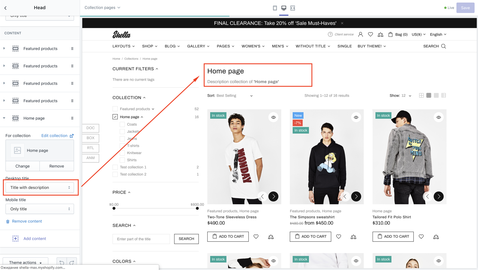
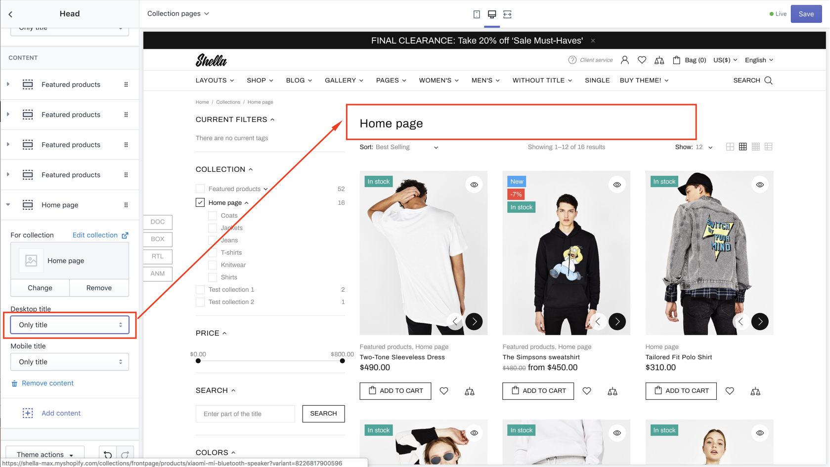
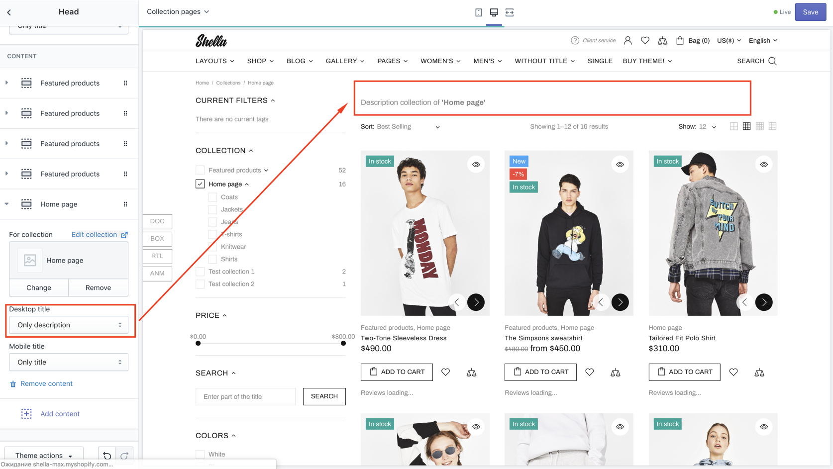
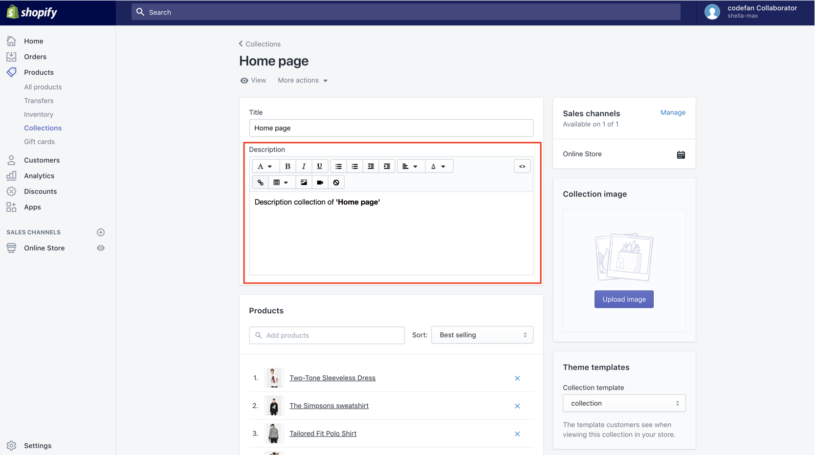
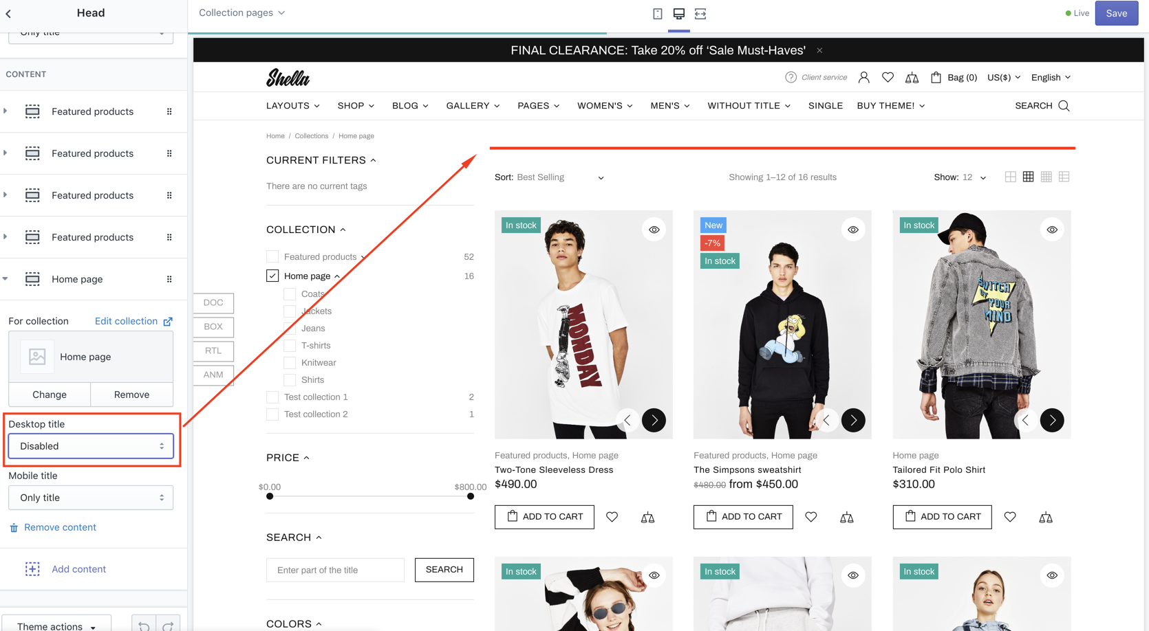
Head
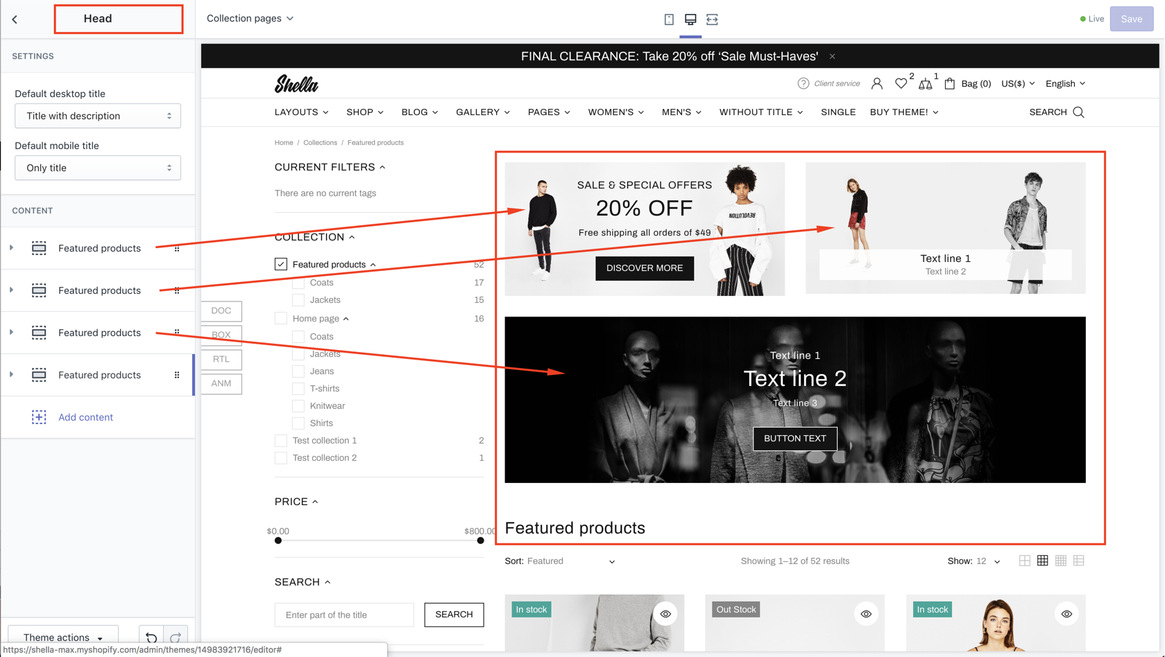
| # | Name | Value | Description |
| 1 | Default desktop title |
Only title Title with description Only description Disabled |
Set title type for desktop Title with description 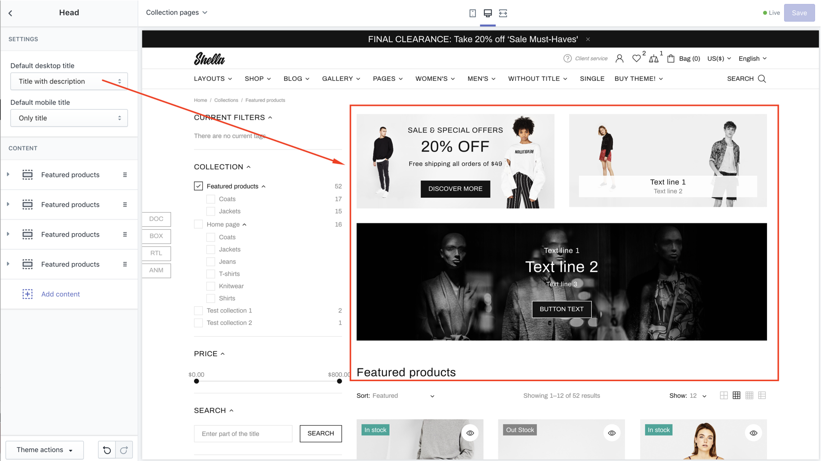
|
| 2 | Default mobile title |
Only title Title with description Only description Disabled |
Set title type for mobile |
Promo boxes have the same option as for home page section.
Banner Builder
To activate it go in Theme settings -> Collection page -> "Collections for Banner Builder Mode", enter the collection handles.
Open the collection and in Sections you will see the Banner Builder section
It has the same blocks as Head Section
Content
Set listing product options
| # | Name | Value | Description |
| 1 | SORT BY: Show | true / false |
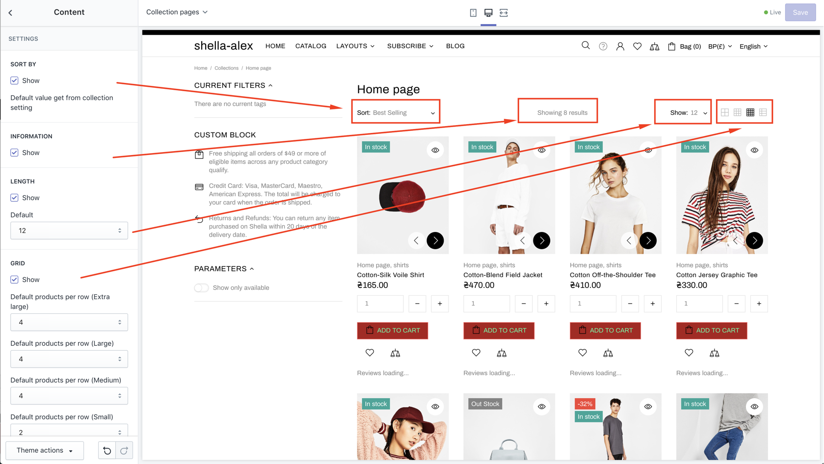
|
| 2 | INFORMATION: Show | true / false | Show/hide information text |
| 3 | LENGTH: Show | true / false | Show/hide number of product on page drop down |
| 4 - 8 |
LENGTH: Enable value 6 Enable value 12 Enable value 18 Enable value 24 Enable value 48 |
true / false |
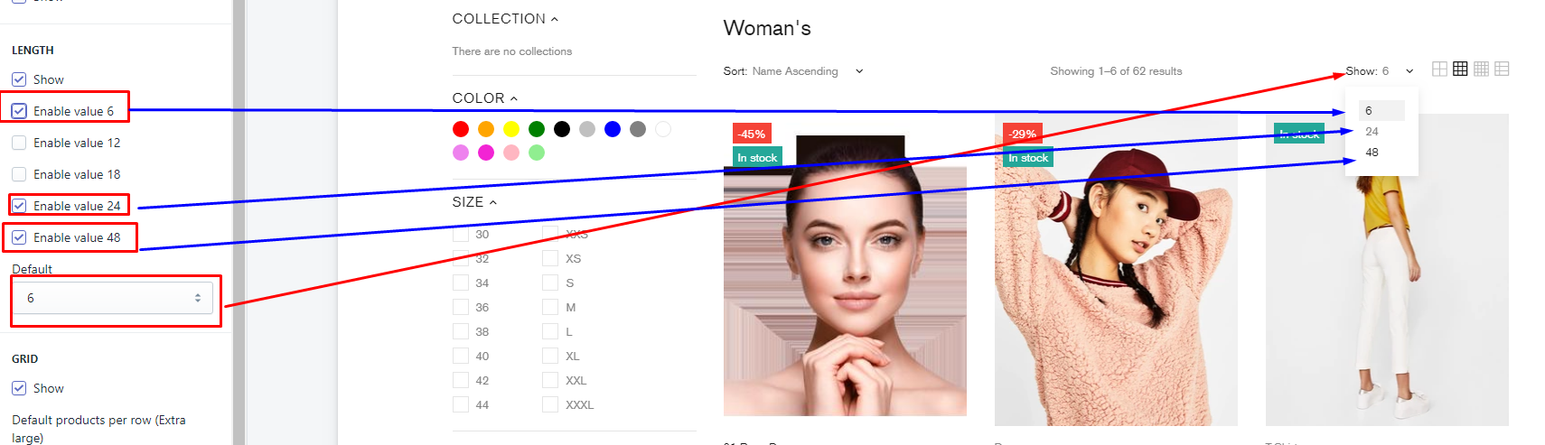
|
| 9 | LENGTH: Default | 6, 12, 18, 24, 48 | Set default value for number of products per page. |
| 10 | GRID: Show | true / false | Show/hide product listing mode controls |
| 11 | GRID: Default products per row (Extra large) | number | Set default grid mode for Extra large screens |
| 12 | GRID: Default products per row (Large) | number | Set default grid mode for Large screens |
| 13 | GRID: Default products per row (Medium) | number | Set default grid mode for Medium screens |
| 14 | GRID: Default products per row (Small) | number | Set default grid mode for Small large screens |
| 15 | GRID: Default view grid (Extra small) | number | Set default grid mode for Extra small screens |
| 16 | GRID: Enable tooltips | true / false | Enable / Disable tooltips |
Product carousel
| # | Name | Value | Description |
| 1 | Enable | true / false | Show/hide carousel |
| 2 | Custom class for section | Write css if you need | |
| 3 | Show title | true / false | Show/hide title |
| 4 | Title style tag | Choose from h1-h6 | |
| 5 | Show top separator | true / false | Show/hide top separator |
| 6 | Content width | Boxed Inherit global settings Full width |
Show/hide top separator |
| 7 | Margin top | Choose value | |
| 8 | Responsive margin top | Choose value | |
| 9 | Margin bottom | Choose value | |
| 10 | Responsive margin bottom | number | Write number |
| 11 | Items per row | Choose value | |
| 12 | Max count | Choose value | |
| 13 | Autoplay | true / false | Enable / Disable autoplay |
| 14 | Autoplay speed | Choose value | |
| 15 | Is infinite | true / false | Enable / Disable infinite |
| 16 | Arrows | true / false | Enable / Disable arrows |
| 17 | Bullets | true / false | Enable / Disable bullets |
| 18 | Disable lazy load | true / false | Enable / Disable lazy load |
| 19 | Async ajax loading | true / false | Enable / Disable async ajax loading |
CONTENT: Collection
| # | Name | Value | Description |
| 1 | Title | Write title | |
| 2 | Collection | Choose collection |