Theme Settings (part #1)
This is part #1 of the block Theme Settings. Press here to go to Part #2
Verification
Read chapter Activate theme
Layout
| # | Name | Value | Description |
| 1 | Default content width |
Full width Boxed |
Set default page width. You can overwrite this value in section options per each section. |
| 2 | Show breadcrumbs | true / false | Enable/disable breadcrumbs |
| 3 | Pagination type |
Classic Infinite scroll Button 'Load more' |
Set pagination type. |
| 4 | Pagination classic centered | true / false | Align classic pagination |
| 5 | Enable rtl | true / false | Enable/disable RTL mode |
| 6 | Enable images lazyload | true / false | Enabel/disable image lazy loading |
| 7 | Images lazyload effect | Fade in Show None |
Choose effect |
| 8 | Favicon image | image | Set favicon |
| 9 | Include 'Weglot' app snippents | true / false | Enable/disable Include 'Weglot' app snippents |
| 10 | Enable presentation | true / false | Enable/disable demo presentaion feature |
Pre-loader
| # | Name | Value | Description |
| 1 | Enable | true / false | Enable/disable Pre-loader |
| 2 | Preloader type |
1 2 3 |
Set Preloader type. Type of preloader regulates the order of content elements loading: text first and font later etc. Recommended to use default theme's type. |
| 3 | Custom image | Add image | |
| 4 | Custom image size | Choose size number | |
| 5 | Custom html | Write html for preloader | |
| 6 | Custom css | Write css for preloader | |
| 7 | Background opacity | Choose opacity number | |
| 8 | Cursor image | Add image |
Typography
Video manual:
Here you can find Main font family parameters, Headings fonts parameters, List font parameters, Buttons font parameters, Inputs font parameters, Header, Menu font, Product collection, Product page, Subscription, Footer
Collection page
| # | Name | Value | Description |
| 1 | SIDEBAR: Visibility |
Desktop and mobile Only desktop Hide |
Set sidebar visibility |
| 2 | SIDEBAR: Position |
Left Right Drop down |
Set sidebar position. |
| 3 | SIDEBAR: Enable sticky | true / false | Enable/disable sticky sidebar |
| 4 | SIDEBAR: Enable full width head section | true / false | Enable/disable full width head section |
| 5 | SIDEBAR: Tag filters logic | AND (default shopify logic) OR |
Choose the logic for filters |
| 6 | SIDEBAR: Vendor filters logic | AND (default shopify logic) OR |
Choose the logic for filters |
| 7 | SIDEBAR: Product type filters logic | AND (default shopify logic) OR |
Choose the logic for filters |
| 8 | SIDEBAR: Default 'Show only available' | true / false |
Show/hide out of stock products. You can add parameter block, to allow visitor manage this option. 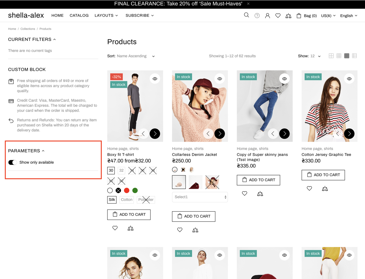
|
Product
| # | Name | Value | Description |
| 1 | GENERAL: Enable format 'pjpg' | true / false |
Format progressive jpg speeds up site optimisation. Disable this option if you add images with transperent background. Because you will see a black background instead. |
| 2 | GENERAL: Ajax adding to cart | true / false | Show/hide cart popup when press add to cart button |
| 3 | GENERAL: Show popup 'Add to cart' | true / false | Show/hide cart popup when press add to cart button |
| 4 | GENERAL: Icon for button 'Cart' | default value: theme-109 | Check full icons list. |
| 5 | GENERAL: Stock countdown min value | Choose value | |
| 6 | GENERAL: Hours of the day to reset delivery countdown | Choose value | |
| 7 | GENERAL: Average delivery time of delivery countdown (days) | Choose value | |
| 8 | GENERAL: Format of delivery countdown date | Write formula from letters, for example, Day DD/MM/YYYY | |
| 9 | GENERAL: Exclude days of the week | Write days of the week | |
| 10 | GENERAL: Visitors min value | Choose value | |
| 11 | GENERAL: Visitors max value | Choose value | |
| 12 | GENERAL: Visitors max value stroke | Choose value | |
| 13 | GENERAL: Visitors min update interval | Choose value | |
| 14 | GENERAL: Visitors max update interval | Choose value | |
| 15 | GENERAL: Show review loading text | true / false | Show/hide review loading text |
| 16 | GENERAL: Cursor image | Set image | |
| 17 | OPTIONS: Show custom options | true / false | Enable/disable advanced product swatches. |
| 18 | OPTIONS: Options type 'Circle color' | Option name or list of option names separated by "|" symbol |
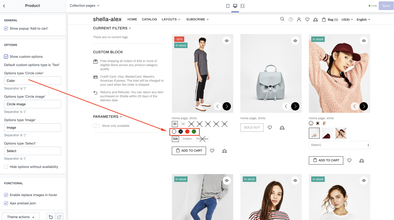
|
| 19 | OPTIONS: Options type 'Circle image' | Option name or list of option names separated by "|" symbol |
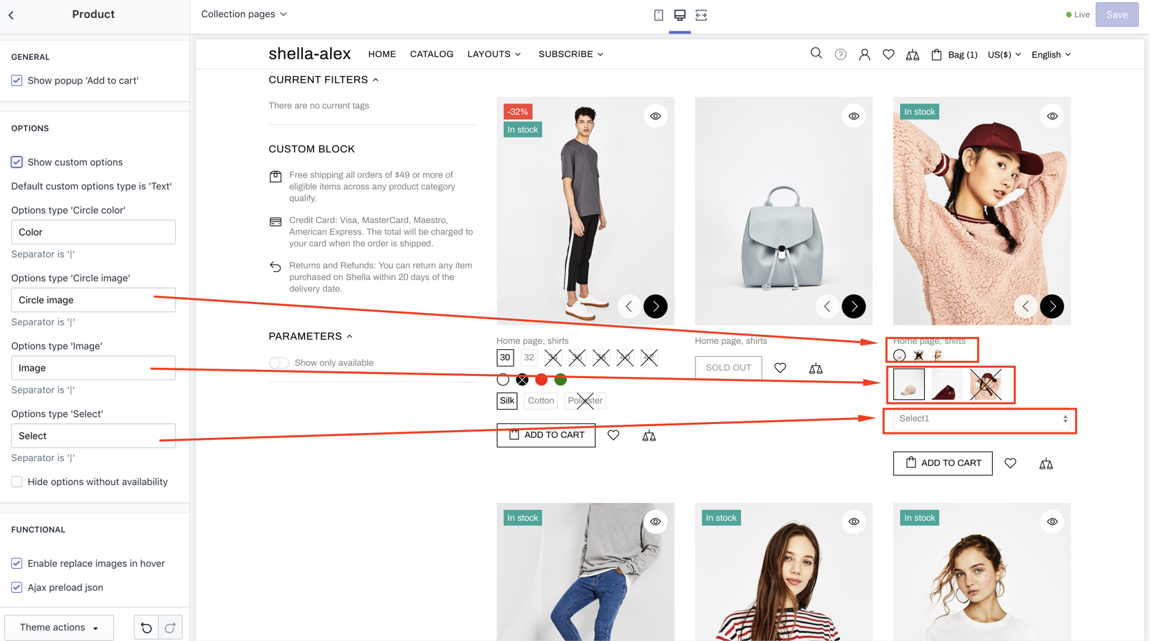
|
| 20 | OPTIONS: Options type 'Square color' | Option name or list of option names separated by "|" symbol |
List options which you want to show as "Square color" |
| 21 | OPTIONS: Options type 'Square image' | Option name or list of option names separated by "|" symbol |
List options which you want to show as "Square image" |
| 22 | OPTIONS: Options type 'Select' | Option name or list of option names separated by "|" symbol |
List options which you want to show as "Select" |
| 23 | OPTIONS: Options type 'Large text' | Option name or list of option names separated by "|" symbol |
List options which you want to show as "Large text" |
| 24 | OPTIONS: Visibility on listing |
Show all options Show only first option Show first and second options |
Choose mode of options displaying |
| 25 | OPTIONS: Hide options without availability | true / false | Show/hide not available options |
| 26 | FUNCTIONAL: Enable replace images in hover | true / false | Enable/disable change image on hover effect |
| 27 | FUNCTIONAL: Enable tooltips | true / false | Enable/disable tooltips |
| 28 | FUNCTIONAL: Enable payments tooltips | true / false | Enable/disable payments tooltips |
| 29 | FUNCTIONAL: Enable option tooltips | true / false | Enable/disable option tooltips |
| 30 | FUNCTIONAL: Change variants on hover | true / false | Enable/disable variants on hover |
| 31 | FUNCTIONAL: Ajax preload json | true / false | Enable/disable lazy loading for product data. |
| 32 | PRODUCT COLLECTION: Image size | Auto Contain Cover Stretch by width Stretch by height |
Choose image size mode |
| 33 | PRODUCT COLLECTION: Image responsive height (in % of width) | Choose image height mode | |
| 34 | PRODUCT COLLECTION: Centered information | true / false | Enable/disable centered information. |
| 35 | PRODUCT COLLECTION: Show collections | true / false | Enable/disable collections. |
| 36 | PRODUCT COLLECTION: Show more info for grid view (Collections, Vendor, Type) | true / false | Enable/disable more info. |
| 37 | PRODUCT COLLECTION: More info type | Choose | Product type Collections Vendor |
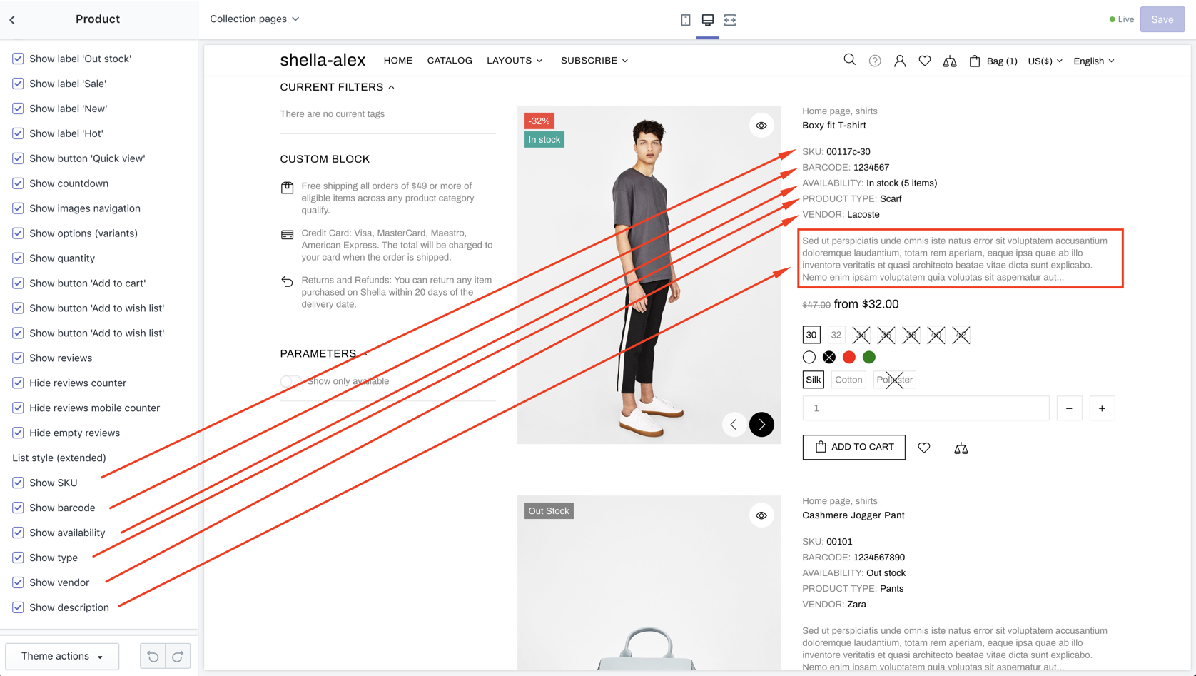
| 38-57 | PRODUCT COLLECTION: [options] | true / false |
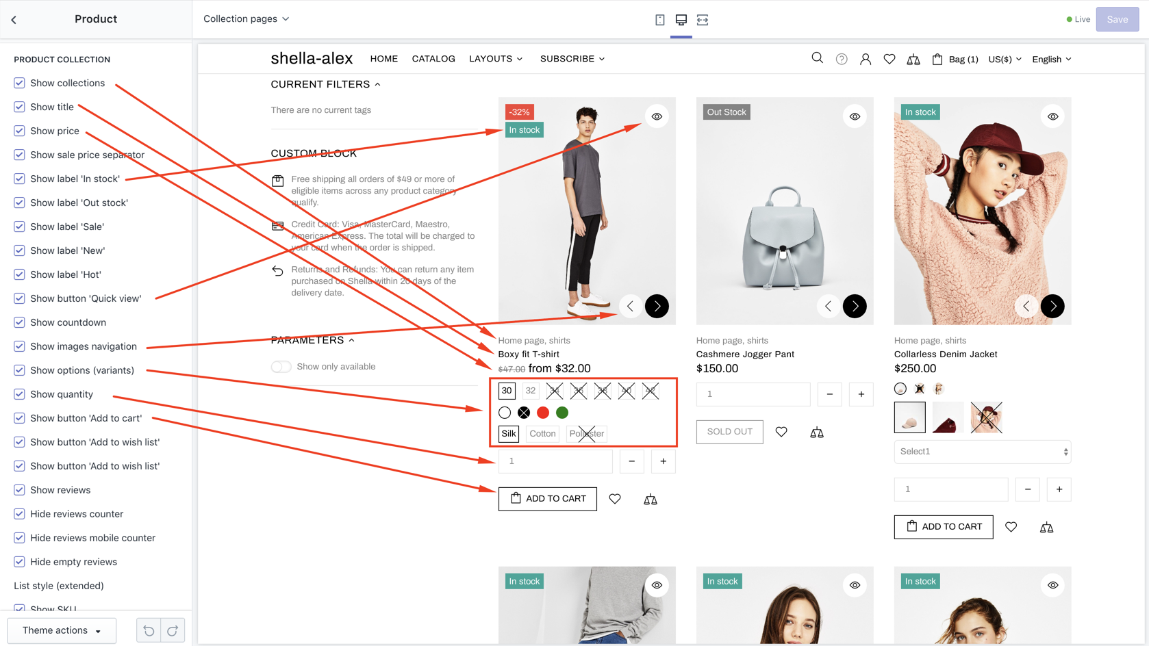
|
| 58-63 | PRODUCT COLLECTION: [options] | true / false |
|
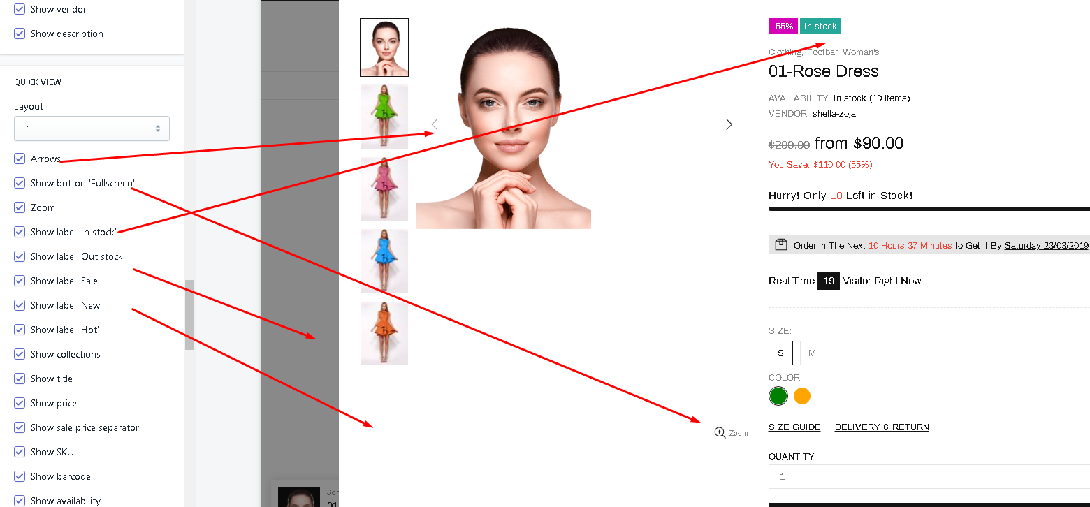
| 64 | QUICK VIEW: Layout | 1-6 | Choose QUICK VIEW block layout |
| 65-101 | QUICK VIEW: [options] | true / false |
|
| 102 | QUICK VIEW: Type | Dark Light |
Choose QUICK VIEW block color scheme |
| 103 | QUICK VIEW: Show full details button | true / false | Enable / Disable full details button |
| 104 | PRODUCT PAGE AND QUICK VIEW: Button 'Add to cart' size | Default Large |
Choose size |
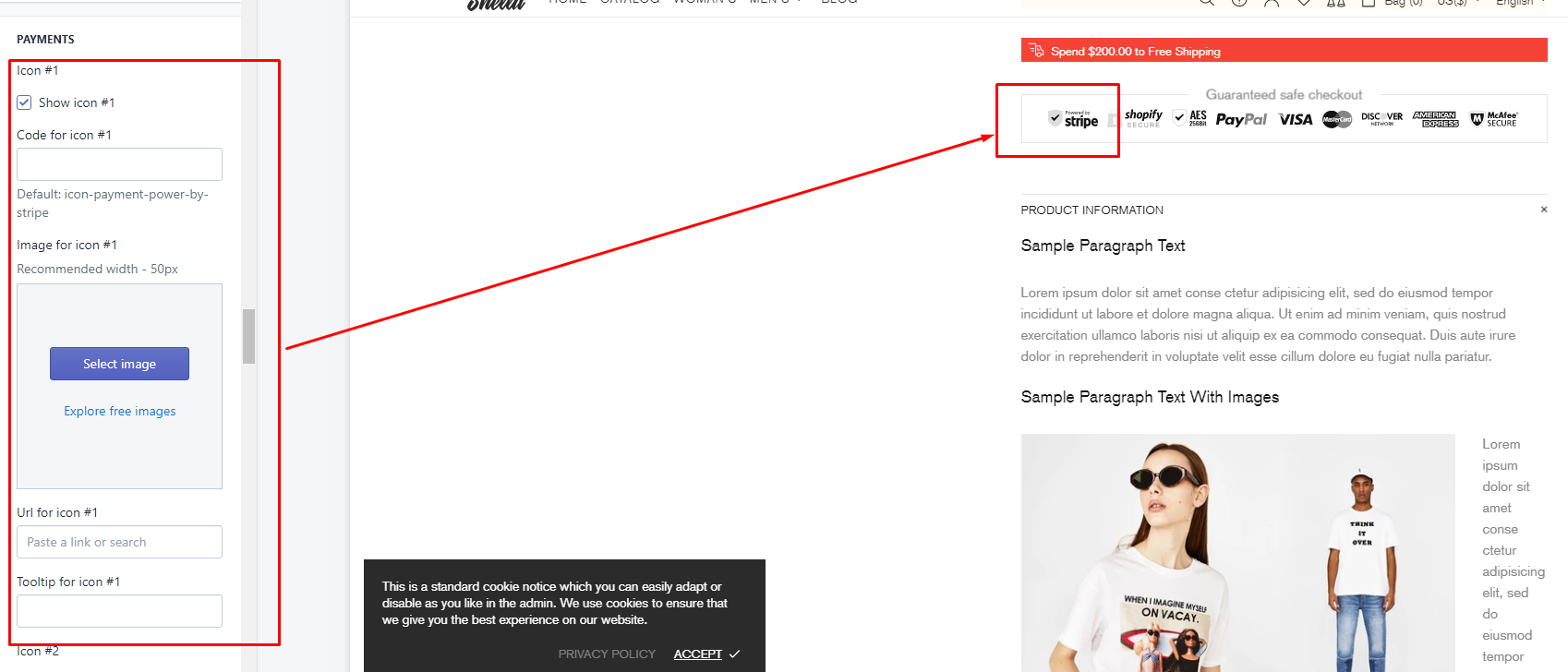
| 105-155 |
PAYMENTS: [options] Icon #1 - #10 |
Show icon #1 - #10 Code for icon #1 - 10 Image for icon #1 - #10 Url for icon #1 - #10 Tooltip for icon #1 - #10 |
|
Blog page
| # | Name | Value | Description |
| 1 | SIDEBAR: Visibility |
Desktop and mobile Only desktop Hide |
Set sidebar visibility |
| 2 | SIDEBAR: Position |
Left Right Drop down |
Set sidebar position. |
| 3 | SIDEBAR: Enable sticky | true / false | Enable/disable sticky sidebar |
Article page
| # | Name | Value | Description |
| 1 | SIDEBAR: Visibility |
Desktop and mobile Only desktop Hide |
Set sidebar visibility |
| 2 | SIDEBAR: Position |
Left Right Drop down |
Set sidebar position. |
| 3 | SIDEBAR: Enable sticky | true / false | Enable/disable sticky sidebar |
Social media
| # | Name | Value | Description |
| 1 | SOCIAL SHARING IMAGE | set image | Shown when sharing a link on social media |
| 2-4 | SOCIAL SHARING OPTIONS | true/false | Share on Facebook, Tweet on Twitter, Pin on Pinterest |
| 5-12 | SOCIAL ACCOUNTS | links | Set social media links for: Facebook, Twitter, Google+, Instagram, Pinterest, Youtube, Behance, Skype |
News subscription
| # | Name | Value | Description |
| 1 | Subscription method | Shopify (default) MailChimp |
Choose functionality of Newsletter subscription. |
| 2 | MailChimp URL | Set MailChimp subscription form URL. |
Check video manual for more details
You should copy only action string from form tag. |
Currency
By default the theme shows currencies configured at Shopify Payments.
Check more details at this page.
If you want to show unsupported currencies by Shopify Payments - enable advanced the currency conversion below.
| # | Name | Value | Description |
| 1 | ADVANCED CURRENCY: Enable advanced currency conversion | true / false | Even though prices are displayed in different currencies, orders will still be processed in your store's currency. |
| 2 | ADVANCED CURRENCY: Format | Configure currency format. With currency code or without it. | |
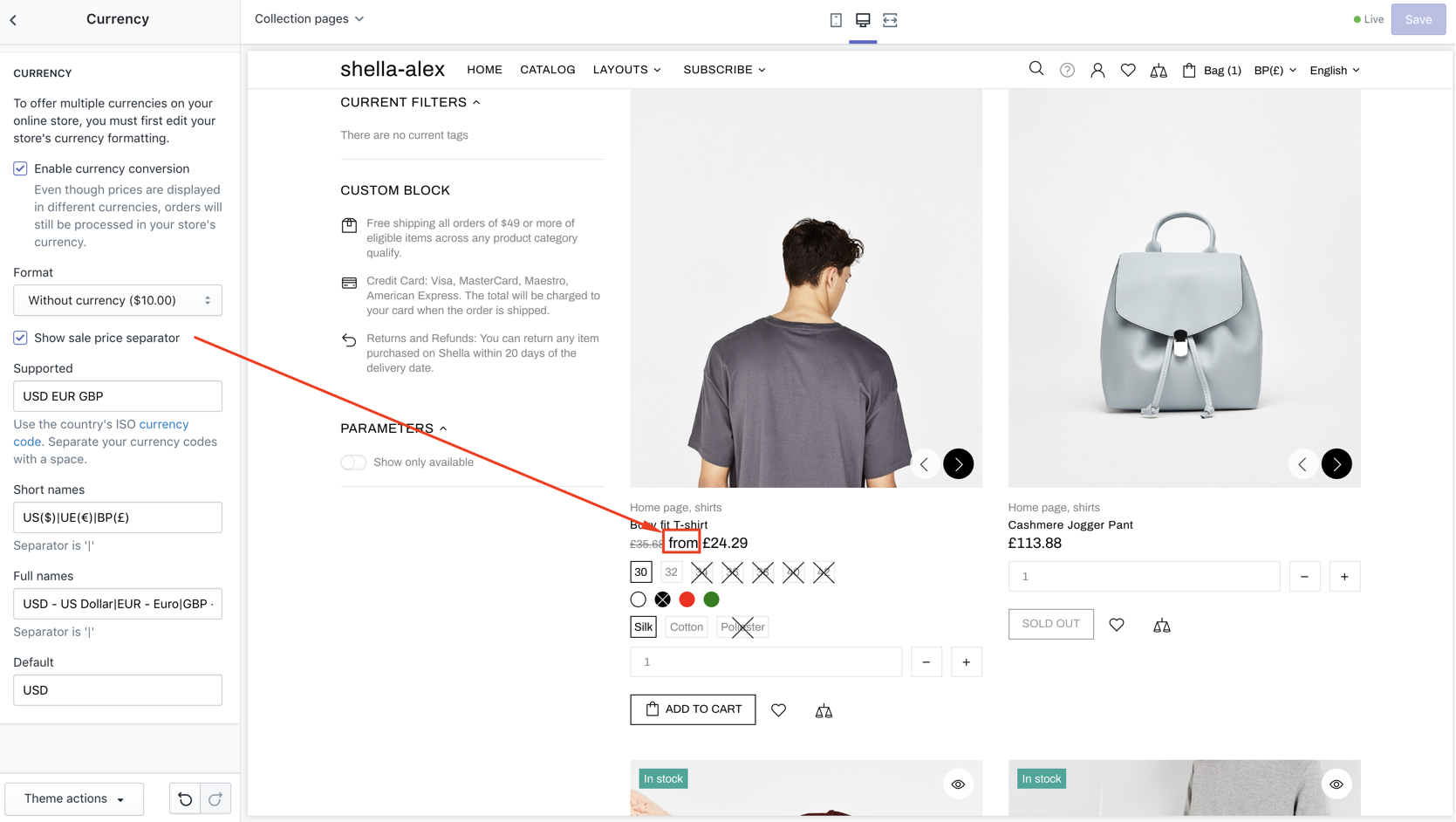
| 3 | ADVANCED CURRENCY: Show sale price separator | true / false |
|
| 4 | ADVANCED CURRENCY: Supported | Use the country's ISO currency code. | Set list of currencies you want to show on your store. Separate your currency codes with a space. |
| 5 | ADVANCED CURRENCY: Short names | Set short names | |
| 6 | ADVANCED CURRENCY: Full names | Set Full names | |
| 7 | ADVANCED CURRENCY: Default | Set default currency |