Theme Settings (part #2)
This is part #2 of the block Theme Settings. Press here to go to Part #1
Compare
Configure compare products popup.
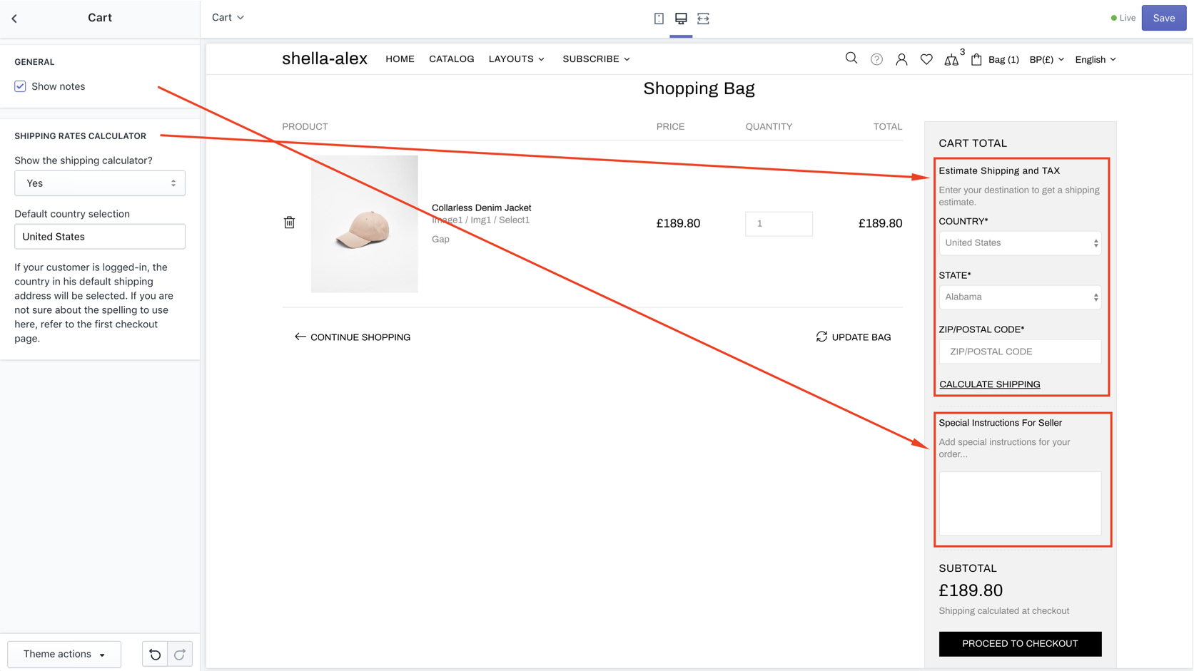
Cart
| # | Name | Value | Description |
| 1 | GENERAL: Show notes | true / false |
Show/hide notes field at shopping cart page 
|
| 2 | FREESHIP PROGRESS BAR: Enable bar | true / false | Show/hide bar |
| 3 | FREESHIP PROGRESS BAR: Free shipping value | true / false |
Show/hide Free shipping value at shopping cart page |
| 4 | SHIPPING RATES CALCULATOR: Show the shipping calculator? | Yes / No | Show/hide shipping calculator. |
| 5 | SHIPPING RATES CALCULATOR: Default country selection | text | Set default shipping country |
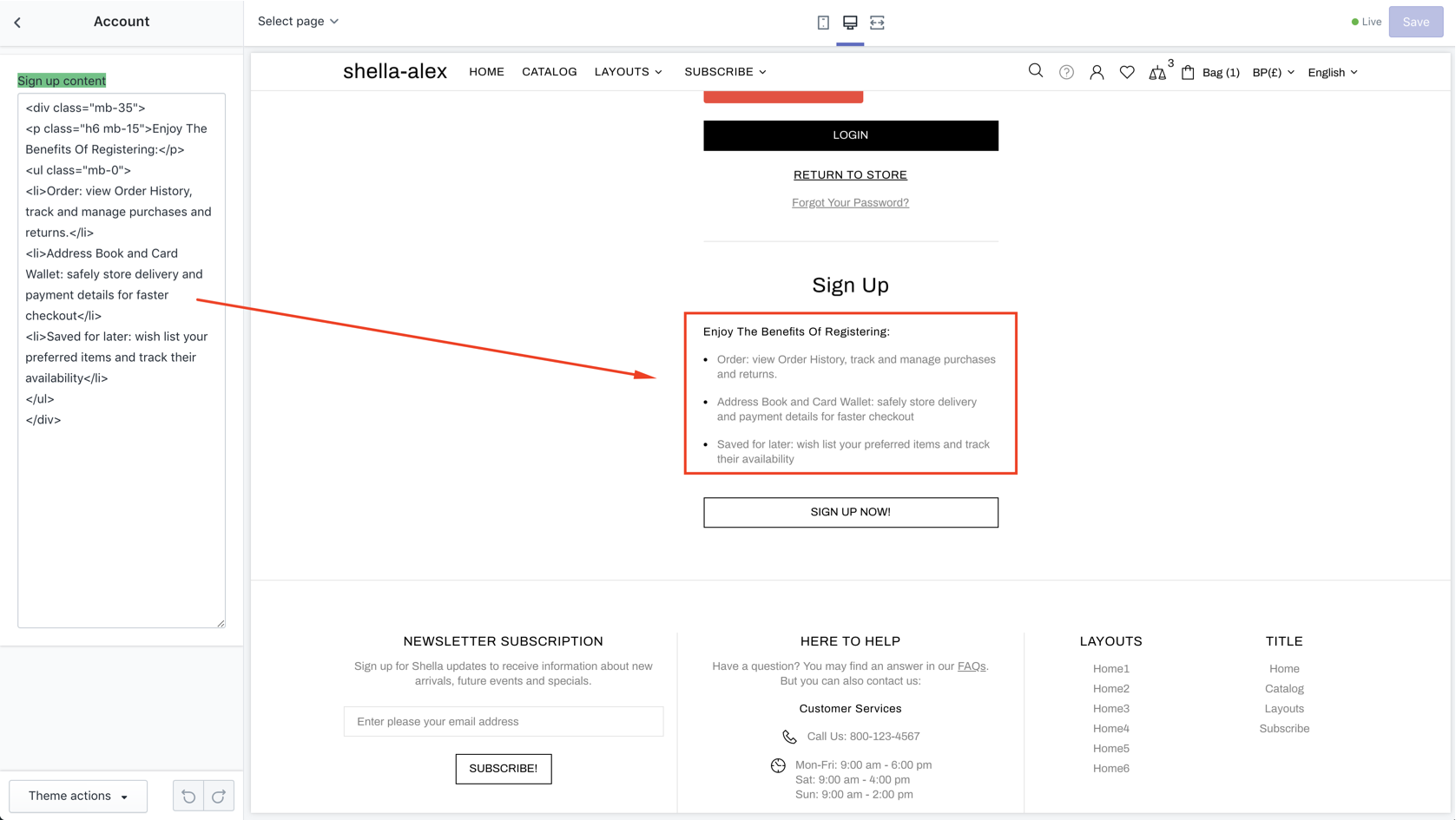
Account
Set content for signup page

Search
| # | Name | Value | Description |
| 1 | Show only products | true / false |
Choose search criteria. If uncheck - search will be done throughout full site content: products, articles, blog posts etc will be shown in the top search dropdown |
Other
| # | Name | Value | Description |
| 1 | Button border radius | number | Set border radius for all buttons in a site |
| 2 | Input border radius | number | Set border radius for all input fields in a site |
| 3 | Button horizontal padding (desktop) | number | Choose horizontal padding (desktop) for buttons |
| 4 | Button horizontal padding (mobile) | number | Choose horizontal padding (mobile) for buttons |
Offsets
-
COLLECTION PAGE
- Content margin top (desktop)
- Products margin top (desktop)
- Product (collection item) margin bottom (desktop)
- Pagination margin bottom (desktop)
-
PRODUCT PAGE
- Content margin top (desktop)
- Content margin bottom (desktop)
-
PAGES
- Margin top (desktop)
- Margin bottom (desktop)
Colors (General)
PAINT PALETTE, BODY, TYPOGRAPHY
Set colors palette for all theme elements.
In next color settings sections you may change particular elements like buttons, header, etc
Number of color options may scary at first. But don't worry it's easy to use and you will love them.
Cause you can change almost every color at your store.
Each color at palette has ID.
#1 - Primary color
#2 - Background, text color
#3 - Text color
...
Total 9 colors, which is widely used in theme.
All theme elements use one of these 9 colors.
You can create new theme skin by only changing 9 colors.
No need to set colors for each element, for each button, page element, icon, etc.
Only 9 options. Isn't amazing? :)
Of course we thought about people who want advanced color options.
All other color options (hundreds) for such people.
Don't worry you shouldn't configure each option. Only for elements which you want to customize.
Colors (Inputs)
Background, Border, Text, Focus background, Focus border
Colors (Buttons)
Set color for buttons. There are such type of buttons:
- TYPE #1 (DEFAULT)
- TEXT BUTTON (TEXT AND ICON)
- TYPE #2 (INVERT)
- TYPE #3 (SECONDARY)
- TYPE #4 (DYNAMIC CHECKOUT)
- TYPE #5 (CLEAN)
Colors (Header)
GENERAL, MENU,
Colors (Labels)
Text, Sale background, New background, Hot background, Out stock background, In stock background
Colors (Product)
PRODUCT COLLECTION, PRODUCT PAGE, ONE PRODUCT
Colors (Footer)
Footer texts, links, buttons
Colors (Subscription popup)
Subscription text, buttons, backgrounds
Colors (Notifications)
COOKIE NOTIFICATION: Background, Button info, Button info hover, Button close
Colors (Other)
SLIDERS, ARTICLE CAROUSEL SECTION, SUBSCRIPTION SECTION, HOME SECTIONS
Animations
| # | Name | Value | Description |
| 1 | CSS: Duration | Choose time | |
| 2 | PRODUCT HOVER: Duration | Choose time | |
| 3 | PRODUCT HOVER: Style | Emersion all Toggle Fade Emersion horizontal Emersion vertical Scale |
Choose style |
| 4 | PROMOBOX: Duration | Choose time | |
| 5 | TOOLTIPS: Enable | true/false | Enable/Disable tooltips use |
| 6 | TOOLTIPS: Style | Fade Scale Scale Shift-toward Shift-away Perspective |
Choose style |
| 7 | TOOLTIPS: Enertia | true/false | Enable/Disable enertia effect |
| 8 | TOOLTIPS: Show duration | Choose time | |
| 9 | TOOLTIPS: Hide duration | Choose time | |
| 10 | STICK HEADER FADE: Duration | Choose time | |
| 11 | STICK HEADER FADE: Opacity | Choose time | |
| 121 | MENU: Desktop duration | Choose time | |
| 13 | MENU: Mobile duration | Choose time | |
| 14 | HEADER TAPE: Duration | Choose time | |
| 15 | DROPDOWN: Duration | Choose time | |
| 16 | ACCORDION: Duration | Choose time | |
| 17 | POPUP: Duration | Choose time | |
| 18 | NOTIFICATION: Duration | Choose time | |
| 19 | FOOTBAR PRODUCT: Duration | Choose time | |
| 20 | TABS: Duration | Choose time | |
| 21 | TABS: Scroll duration | Choose time | |
| 22 | BUTTONS: Icon animation enable | true/false | Enable/Disable animation |
| 23 | PAGINATION: Duration | Choose time | |
| 24 | BUTTON 'BACK TO TOP': Duration | Choose time |
Java Script
| # | Name | Value | Description |
| 1 | Load jQuery first | true / false | Enable / Disable JavaScript |
Developer
| # | Name | Value | Description |
| 1 | Enable Shopify content for header | true / false | Enable / Disable custom CSS file |
| 2 | Enable custom CSS file | true / false | Enable / Disable custom CSS file |
| 3 | Enable custom JavaScript file | true / false | Enable / Disable custom JavaScript file |